PostHog Design System
PostHog's design system as a DESIGN.md file.
About PostHog DESIGN.md
Curated by Dov AzencotUpdated Source posthog.com
- Analytics & Data
- Developer Tools & IDEs
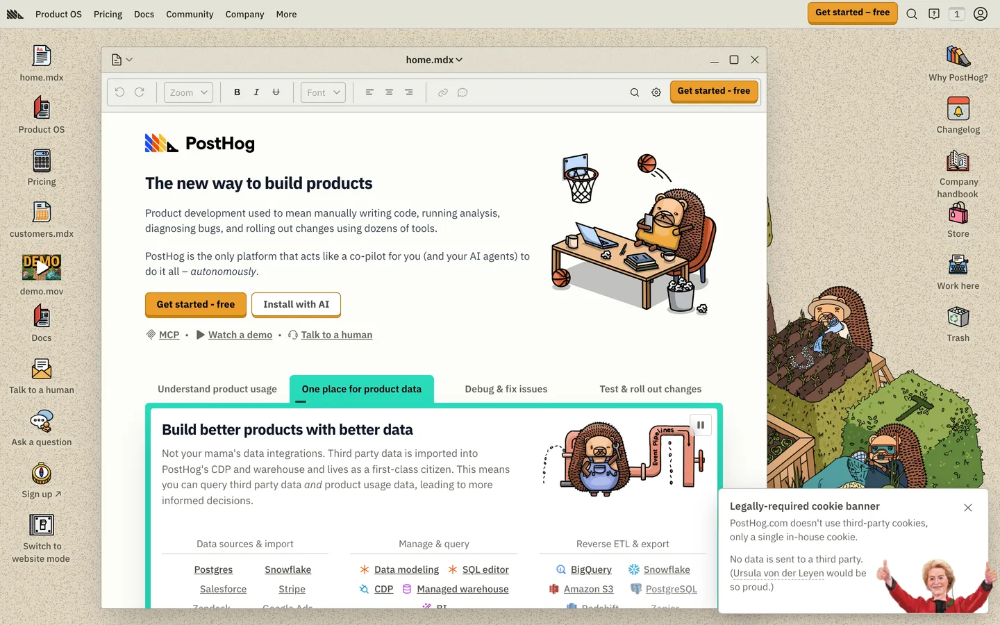
PostHog's design system pulls off an unusual feat: it makes a serious open-source product analytics platform feel like a friendly engineering sketchbook. The base canvas is a warm cream #eeefe9 — not white, not dark — and every page is dotted with hand-drawn hedgehog mascots in lab coats, hammocks, terminals, and reading glasses. Type runs IBM Plex Sans Variable at olive-gray #4d4f46 for body and deep olive-charcoal #23251d for headlines. Hierarchy is built from weight contrast (400, 500, 600, 700, 800) more than size, which gives the layout its textbook-chapter rhythm. The single saturated chromatic moment is the yellow-orange #f7a501 pill that anchors every primary CTA — "Get started — free" in the sticky nav, the hero call to action, and pricing-tier subscribes.
This page packages the full marketing surface into one DESIGN.md file built on the Google Labs spec. Inside: 30 color tokens covering cream surfaces, olive ink, four pastel callout pairs, and link blue/teal; 21 typography tokens at five weights across IBM Plex Sans Variable plus Source Code Pro for code; 6 radius steps (0, 2, 4, 6, 8, 9999px); 8 spacing values including an 80px section rhythm; and 32 components covering buttons, pill chips, doc cards, hedgehog mascot cards, four colored callout banners, code blocks, sticky doc sidebar, and a six-column footer.
Feed the file to Claude, Cursor, or GitHub Copilot and the agent reproduces PostHog's specific dialect — cream canvas, weight-driven type, dark code islands on white doc cards, hedgehog mascot in the margin — instead of defaulting to a generic dashboard theme. Or reference the tokens directly in Tailwind config or CSS variables. The system is worth studying because it solves a problem most analytics tools dodge: how to make a data-dense product feel approachable without infantilizing the engineers who actually use it.
What makes it distinct
- Cream canvas anchor#eeefe9 runs edge-to-edge on every page; pure white never carries the background
- Single saturated CTA#f7a501 yellow-orange pill is the only loud color in the entire 32-component system
- Hedgehog mascots as the decoration layerhand-drawn characters replace gradients, mesh, and atmospheric depth entirely
- Weight-driven hierarchyIBM Plex Sans Variable stepped across 400/500/600/700/800 instead of leaning on size or color
- Four-pastel doc calloutssoft blue/green/red/purple tinted bands restricted to inline documentation, never marketing
Live at posthog.com
A snapshot of the brand in production. Hover the frame to scroll the page; click to visit.
 posthog.com
Explore PostHog
Pick what you want to see — mockups, colors, typography, layout, or the full component list.
Brand & Accent
Sparing, CTA-only voltage.
Surface
Page and card backgrounds.
Text
Headlines, body, captions, muted.
Borders & Hairlines
Dividers, outlines, structural rules.
Other
Specialty colors.
PostHog design system FAQ
Common questions about PostHog's tokens, components, and how to use this DESIGN.md in your project.
Related reading
Specs, directories, and component libraries that pair with this design system.
The DESIGN.md specification
Google Labs' open spec for machine-readable design system files — the format this page is built on.
Browse all design systems
The full directory of DESIGN.md files on shadcn.io, with live mockups for each.
React blocks for shadcn/ui
Production-ready hero, pricing, CTA, and dashboard sections built with the same Tailwind + shadcn primitives.