Robinhood Design System
Robinhood's retail-investing design system as a DESIGN.md file.
About Robinhood DESIGN.md
Curated by Dov AzencotUpdated Source robinhood.com
- Fintech & Crypto
- Banking & Payments
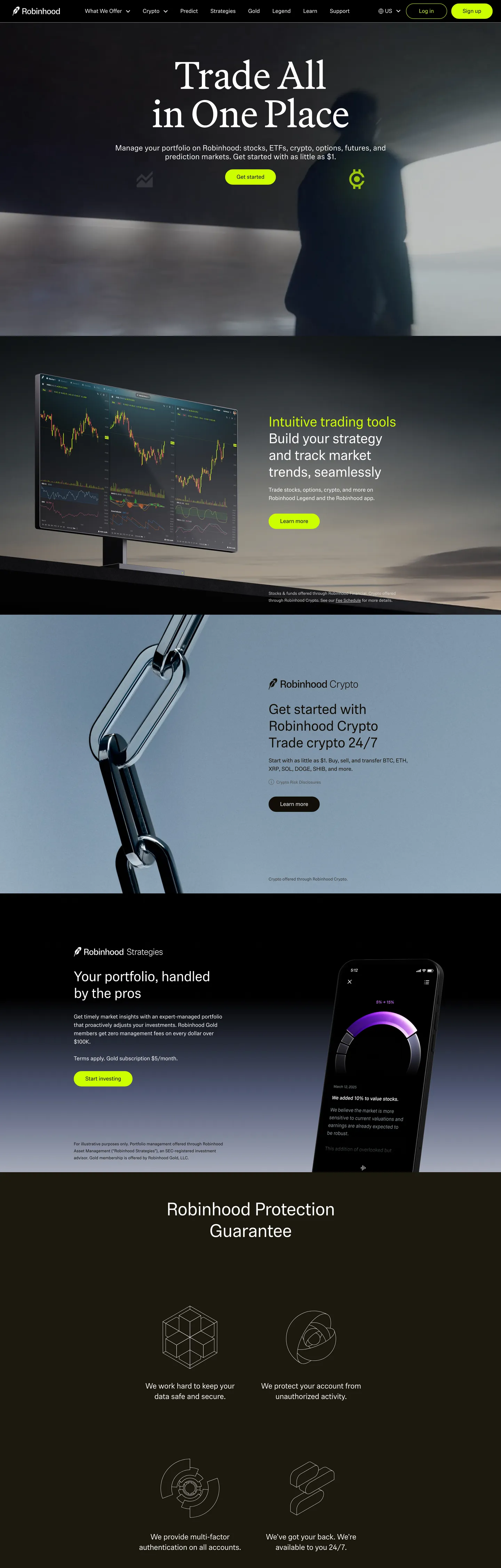
Robinhood's design language opens on warm black. The canvas sits at "#110e08" — a coffee-tinted near-black with a warmth that pure "#000000" never carries — and the hero headline lands in Martina Plantijn at 110px in regular weight. The serif choice is the brand's strongest typographic signal: where Coinbase, Stripe, and Kraken default to geometric sans display, Robinhood reaches for an editorial serif more at home in a magazine masthead than a trading dashboard. One brand voltage carries every primary action: lime-yellow "#ccff00", a high-chroma OKLCH 0.93 / 0.23 hit that fills the "Sign up" pill and nothing else. Below the hero, product mockups float as phone-frame screenshots stacked over the warm-black canvas, then a deeper warm-gray "Robinhood Protection Guarantee" band closes the page with four icon-led bullets in a 2-by-2 grid.
This page packages the spec into a single DESIGN.md file. Inside: 18 color tokens grouped into one brand voltage, six warm-gray ink steps, and a small surface ladder; 10 typography levels spanning Martina Plantijn display, Phonic running text, and Capsule Sans Text product chrome; one pill radius at 36px; eight spacing values on an 8px base; and 19 components — the lime pill CTA, the serif hero headline, the dark product-scene card, the protection-guarantee icon tile, the warm-black nav, the phone-frame mockup, and the dark CTA band. Every hex is quoted; every Phonic and Martina weight is named so an agent can reproduce the rhythm without guessing.
Feed the file to Claude, Cursor, or GitHub Copilot. The agent will reproduce Robinhood's particular dialect — warm-black canvas, serif display headline, lime voltage scarce to a single pill per band, two-family sans split between Phonic body and Capsule Sans Text buttons — instead of a generic dark fintech theme. If Martina Plantijn is unavailable, EB Garamond or Source Serif 4 at weight 400 with -0.5px tracking is the closest open path; Phonic falls back to Inter at weight 400 with -0.25px tracking, and Capsule Sans Text maps to Geist at the button size. Pull tokens directly into a Tailwind config or shadcn registry — the pill radius and the single-voltage rule are the two non-negotiables.
What makes it distinct
- Single voltage CTAlime
- Serif display headlineMartina Plantijn at 110px / 400 weight inverts the geometric-sans convention most retail trading brands default to
- Warm-black canvas
- Phonic body / Capsule Sans buttonstwo distinct sans families split duty across reading copy and product chrome
- 36px pill geometryone corner radius (frequency 8) for every interactive surface; no intermediate steps between 0px and the pill
Live at robinhood.com
A snapshot of the brand in production. Hover the frame to scroll the page; click to visit.
 robinhood.com
Explore Robinhood
Pick what you want to see — mockups, colors, typography, layout, or the full component list.
Brand & Accent
Sparing, CTA-only voltage.
Surface
Page and card backgrounds.
Text
Headlines, body, captions, muted.
Borders & Hairlines
Dividers, outlines, structural rules.
Robinhood design system FAQ
Common questions about Robinhood's tokens, components, and how to use this DESIGN.md in your project.
Related reading
Specs, directories, and component libraries that pair with this design system.