Samsung Design System
Samsung's design system as a DESIGN.md file.
About Samsung DESIGN.md
Curated by Dov AzencotUpdated Source samsung.com
- Consumer Electronics
- E-commerce & Retail
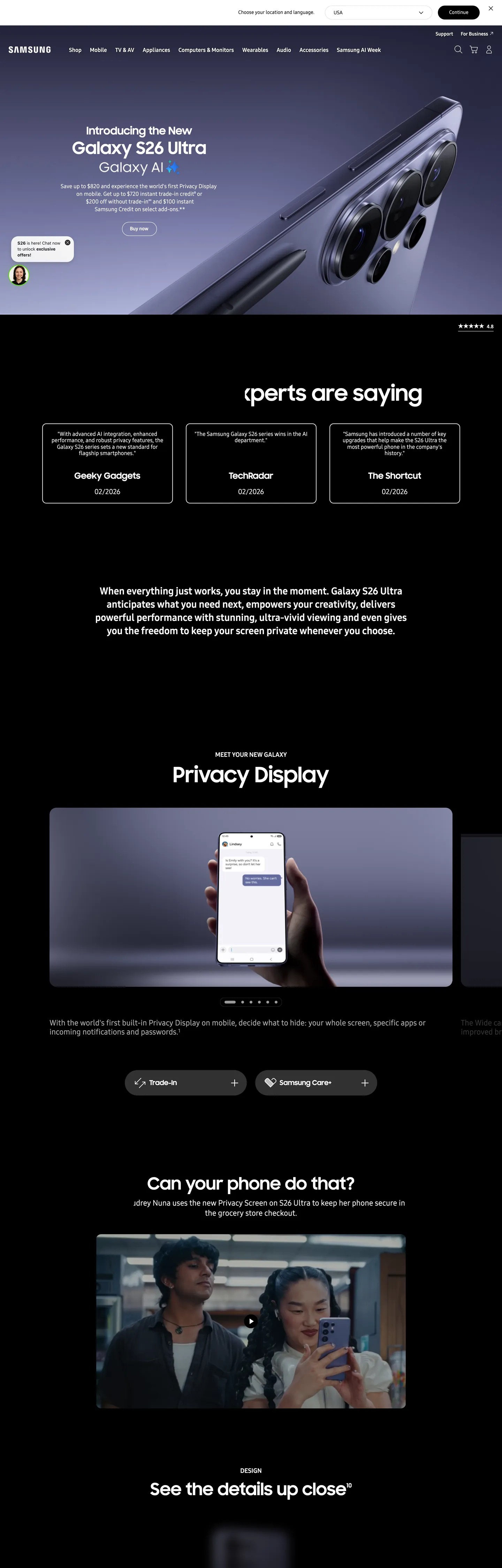
Samsung's marketing chrome operates as a chapter-book stacked vertically — every page descends through alternating hero and editorial bands, where lavender-to-cobalt Galaxy product renders push out of deep black surfaces and white modules carry the technical reading. The brand voltage lives entirely inside the photography. There is no flat cobalt fill, no decorative gradient overlay, no brand-tinted button — the Galaxy S26 Ultra body gradient (#9a9af8 to #3b57fe across six interpolated stops) appears only on the product render itself, and every other surface stays pure black, pure white, or one of seven graphite text grays. The Continue CTA is black, not cobalt. The hero heading is white on black at 60px / 700 SamsungSharpSans. The chrome refuses to compete with the device it is selling.
The file packages Samsung's chrome into a single Google Labs DESIGN.md spec: 22 color tokens (one black, one white, six structured graphite ramps, six Galaxy gradient stops, two link blues, a single Pro Yellow safety beacon at #fff01f, and four photographic neutrals), 11 typography tokens running on SamsungSharpSans for display ≥ 47px and SamsungOne for body and UI, a four-step radius ramp where 20px dominates with 70 captured occurrences, an 8-step spacing system snapped to 4 / 5 / 8 / 12 / 14 / 24 / 36 / 88px, and 19 component specs covering buttons, locale and category nav, the product hero band, testimonial cards, the horizontal video carousel, and the privacy-display photographic frame.
Drop the file into Claude, Cursor, or GitHub Copilot to produce React components that match Samsung's discipline rather than a generic electronics theme — black CTAs, gradient locked to product imagery, 20px radius everywhere, alternating black-and-white chapter rhythm. The system is worth studying because it inverts the category default: where most consumer-electronics brands paint their primary action in brand voltage, Samsung paints it black and lets the Galaxy gradient live exclusively on the artifact being sold.
What makes it distinct
- Gradient-only brand voltageGalaxy lavender #9a9af8 and cobalt #3b57fe appear only inside the product render, never as flat fill
- One radius, 70 occurrencesevery pill button, every disclaimer chip, every locale picker locks to 20px and the system refuses to deviate
- Two-canvas chapter rhythm#ffffff editorial bands stack against #1c1c1c hero chapters with the surface change acting as the section divider
- Two-family typography ladderSamsungSharpSans reserved for 47px and above, SamsungOne carries everything from the 60px AI Week wordmark down to 12px legal
- Black-on-white primary CTAthe Continue button is #000000 background with white SamsungOne 14px / 400, inverting the cobalt-CTA convention most consumer-electronics brands follow
Live at samsung.com
A snapshot of the brand in production. Hover the frame to scroll the page; click to visit.
 samsung.com
Explore Samsung
Pick what you want to see — mockups, colors, typography, layout, or the full component list.
Surface
Page and card backgrounds.
Text
Headlines, body, captions, muted.
Borders & Hairlines
Dividers, outlines, structural rules.
Other
Specialty colors.
Samsung design system FAQ
Common questions about Samsung's tokens, components, and how to use this DESIGN.md in your project.
Related reading
Specs, directories, and component libraries that pair with this design system.
Use Samsung in your project
One machine-readable file. Drop it into Claude, Cursor, or any AI tool that reads DESIGN.md.