Slacc Inspired Design System
Slack's design language as a DESIGN.md file.
About Slacc Inspired DESIGN.md
Curated by Dov AzencotUpdated Source slack.com
- Communication & Messaging
- Productivity & SaaS
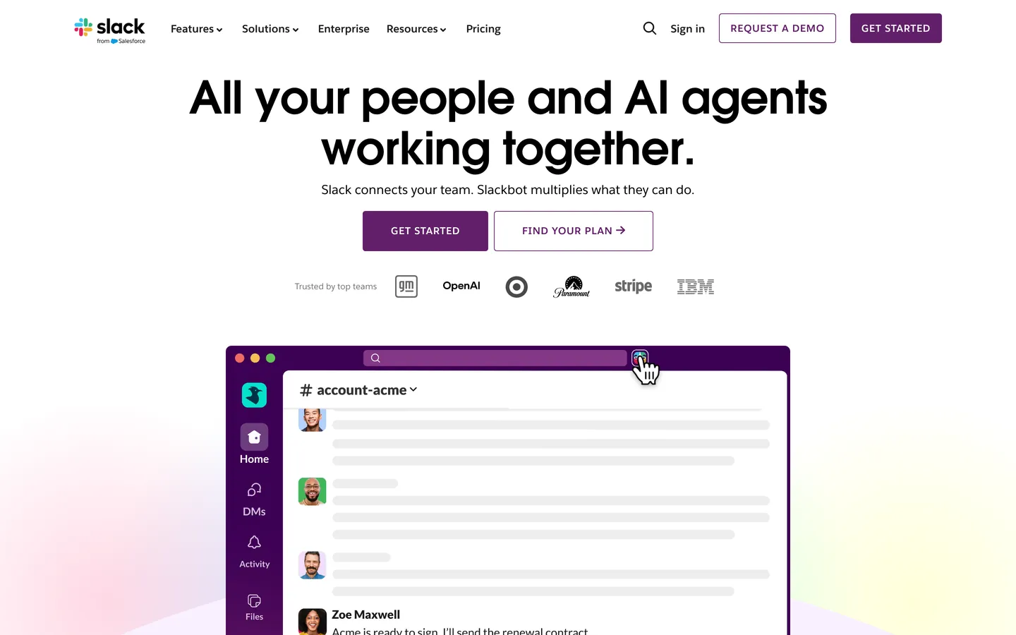
Slack's design language is built around one enduring decision: a single deep aubergine (#4a154b) carries the entire brand. The color appears on every filled CTA, the featured pricing tier, the closing marketing band, and the wordmark itself. Around that one voltage the system stages an unusually delicate ecosystem of cream and lavender canvases (#f4ede4, #f9f0ff), pastel-mesh atmospheric gradients, and floating product UI mockups composited above the wash. The shape vocabulary is dominated by 90px pill buttons with 28–30px horizontal padding — over-padded compared to typical SaaS defaults, which is what gives the brand its distinctly comfortable, almost generous feel.
This page packages that system into a single DESIGN.md file in the Google Labs spec format. Inside: 22 color tokens grouped into brand, surface, text, and semantic families, 16 typography styles across two proprietary humanist sans faces (Salesforce Avant Garde for display, Salesforce Sans for UI), 7 corner radii anchored on the 90px pill, 7 spacing tokens stepping from 4px to 28px, and 22 documented components covering buttons, pricing cards, navigation, the aubergine footer band, and the pastel-mesh hero composites that define the brand's atmosphere.
A working React or Next.js developer feeds this file to Claude, Cursor, or Copilot and the agent reproduces Slack's chromatic restraint rather than a generic shadcn theme — one aubergine CTA per viewport, blue links at #1264a3, pill buttons at 90px radius, display headlines pulled tight with -0.768px tracking at 64px. The Salesforce typefaces are proprietary, so substitute Inter from Google Fonts at matching weights. The system is worth studying because it proves chromatic monotheism still works at marketing-site scale when the supporting cast — cream canvases, pastel-mesh gradients, generous pill padding — is calibrated precisely.
What makes it distinct
- Chromatic monotheismaubergine #4a154b carries CTAs, the featured pricing tier, the footer band, and the wordmark in a single voltage
- Pill geometry at 90px radius with 28–30px horizontal paddingover-padded by SaaS-default standards, deliberately so
- Two proprietary humanist sans familiesSalesforce Avant Garde for display at 32–64px, Salesforce Sans for body at 1.55 leading
- Pastel-mesh hero gradientspeach, lavender, and dusty green stops blurred behind floating product UI mockups, never inside chrome
- Blue inline links #1264a3the only chromatic departure from the aubergine-and-cream world
Live at slack.com
A snapshot of the brand in production. Hover the frame to scroll the page; click to visit.
 slack.com
Explore Slacc Inspired
Pick what you want to see — mockups, colors, typography, layout, or the full component list.
Brand & Accent
Sparing, CTA-only voltage.
Surface
Page and card backgrounds.
Text
Headlines, body, captions, muted.
Borders & Hairlines
Dividers, outlines, structural rules.
Semantic
Status, errors, success, inline links.
Slacc Inspired design system FAQ
Common questions about Slacc Inspired's tokens, components, and how to use this DESIGN.md in your project.
Related reading
Specs, directories, and component libraries that pair with this design system.
The DESIGN.md specification
Google Labs' open spec for machine-readable design system files — the format this page is built on.
Browse all design systems
The full directory of DESIGN.md files on shadcn.io, with live mockups for each.
React blocks for shadcn/ui
Production-ready hero, pricing, CTA, and dashboard sections built with the same Tailwind + shadcn primitives.