Spotify Design System
Spotify's design system as a DESIGN.md file.
About Spotify DESIGN.md
Curated by Dov AzencotUpdated Source spotify.com
- Music, Video & Streaming
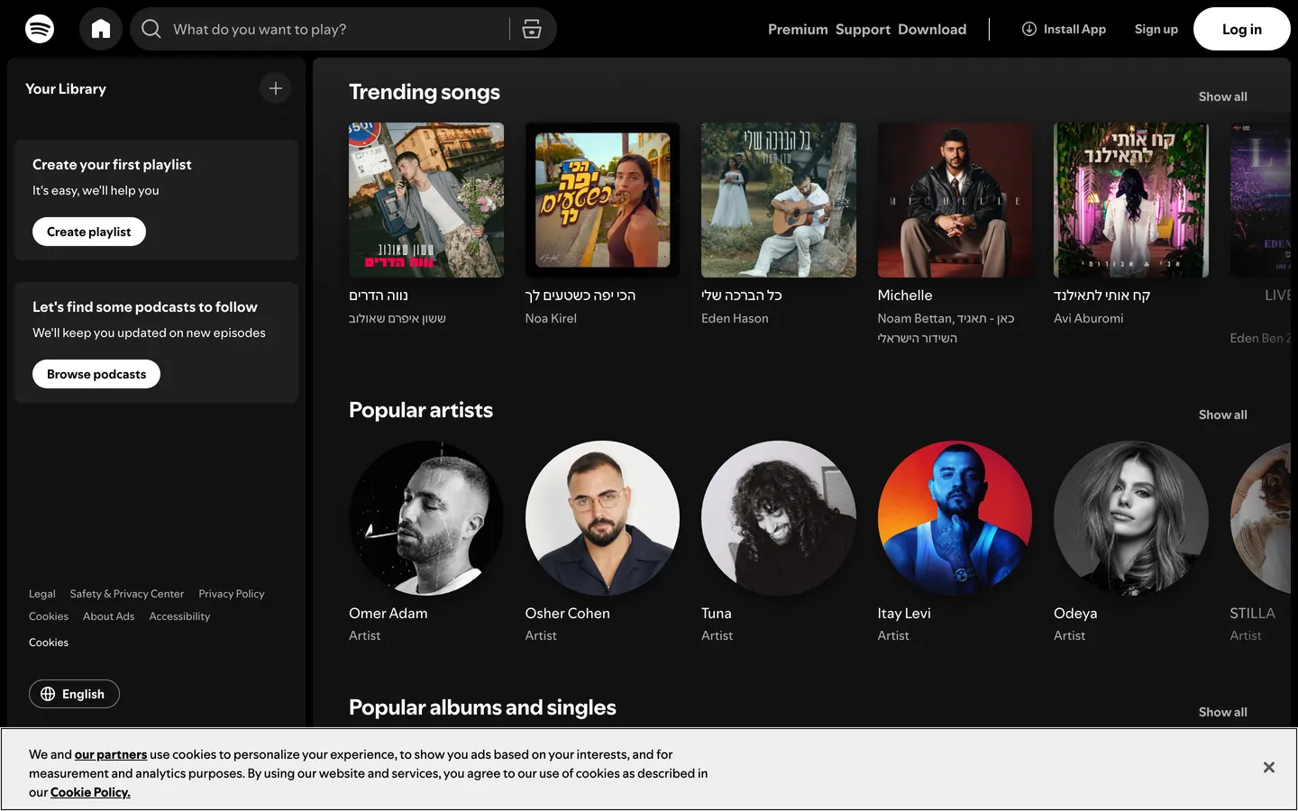
Spotify's web interface is a near-black theater built around one principle: the UI disappears so the content can glow. Three charcoal surfaces stack the page in shade (#121212 base, #181818 cards, #1f1f1f interactive fills), and the only true color comes from album artwork plus Spotify Green (#1ed760), which is reserved exclusively for play buttons, active navigation, and primary CTAs. The typography uses SpotifyMixUI and SpotifyMixUITitle — proprietary fonts from the CircularSp family with an extensive fallback stack covering Arabic, Hebrew, Cyrillic, Greek, Devanagari, and CJK scripts to serve Spotify's 180+ markets.
This page packages the full system into a single DESIGN.md file built on the Google Labs spec. Inside: 19 color tokens grouped into brand, text, semantic, surface, and shadow roles; 14 type styles spanning a compact 10px–24px range; 9 corner radii from 2px badges through 9999px full pills; a 20-step spacing scale built on an 8px base unit; and 30 component recipes covering dark pills, outlined pills, circular play buttons, search pills with inset borders, dark cards, and the achromatic sidebar navigation.
Feed the file to Claude, Cursor, or GitHub Copilot and the agent writes React components that match Spotify's voice — pill geometry, uppercase tracking, heavy dark-mode shadows — rather than a generic dashboard theme. Or reference the tokens directly: every hex, font-stack, radius, and shadow definition is quoted and ready to paste into Tailwind config or CSS variables. The system is worth studying for the discipline of letting one functional accent and a single typeface family carry an entire app — restraint as identity, not as compromise.
What makes it distinct
- Near-black immersive canvasthree charcoal surfaces (#121212, #181818, #1f1f1f) let album art carry every drop of color
- Single accent voltageSpotify Green (#1ed760) is functional only, reserved for play controls, active states, and CTAs
- Pill-and-circle geometry500px to 9999px radii on buttons, 50% on play controls, no square interactive surface anywhere
- Uppercase button labels with 1.4–2px trackinga systematic 'label voice' distinct from running content text
- Heavy shadow language0.5 opacity at 24px blur for dialogs, an inset rgb(124,124,124) border for tactile input depth
Live at spotify.com
A snapshot of the brand in production. Hover the frame to scroll the page; click to visit.
 spotify.com
Explore Spotify
Pick what you want to see — mockups, colors, typography, layout, or the full component list.
Brand & Accent
Sparing, CTA-only voltage.
Surface
Page and card backgrounds.
Text
Headlines, body, captions, muted.
Borders & Hairlines
Dividers, outlines, structural rules.
Other
Specialty colors.
Spotify design system FAQ
Common questions about Spotify's tokens, components, and how to use this DESIGN.md in your project.
Related reading
Specs, directories, and component libraries that pair with this design system.
The DESIGN.md specification
Google Labs' open spec for machine-readable design system files — the format this page is built on.
Browse all design systems
The full directory of DESIGN.md files on shadcn.io, with live mockups for each.
React blocks for shadcn/ui
Production-ready hero, pricing, CTA, and dashboard sections built with the same Tailwind + shadcn primitives.