Square Design System
Square's design system as a DESIGN.md file.
About Square DESIGN.md
Curated by Dov AzencotUpdated Source squareup.com
- Banking & Payments
- E-commerce & Retail
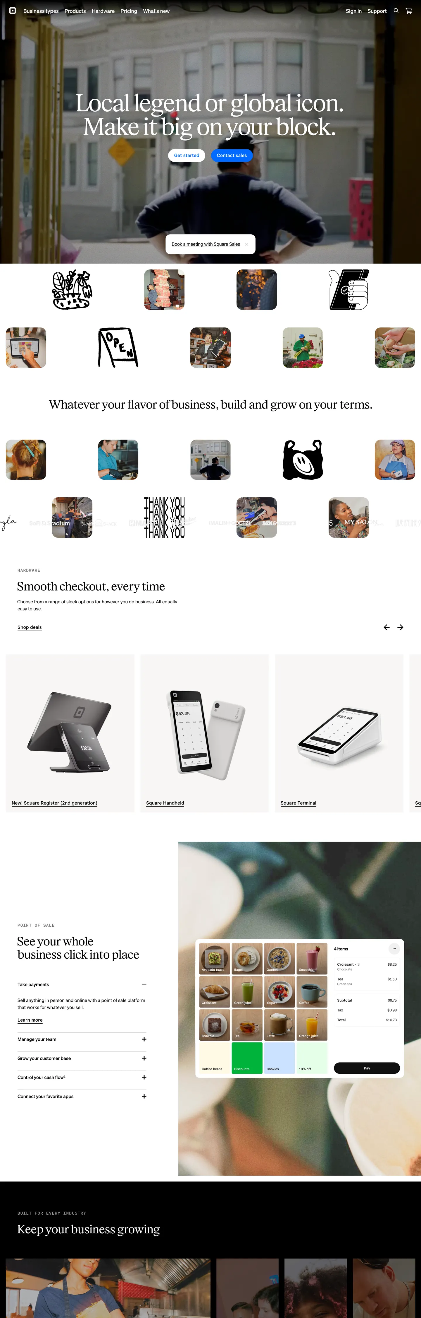
Square's marketing surface inverts the fintech convention. Where Stripe, Mercury, and Ramp lean on thin geometric sans-serifs for headlines, Square opens with an editorial serif — Exact Block at weight 400, 72px, -2.88px letter-spacing — sitting in white type over a full-bleed black-canvas photograph of a single merchant. The body type underneath runs Cash Sans (the parent Block company's house sans) at 16px / weight 400, with Square Sans Display VF taking the 24–40px sub-heading tier. Three families on one page, each scoped to a tier. The blue that gives Square its wordmark — #006aff — is rationed: 19 total occurrences across the entire page, every one as a 1px outline-button border or a focus-ring outline. Never a filled CTA fill.
This page packages the system into a single DESIGN.md file built on the Google Labs open spec. Inside: 22 colors organized into the brand-blue voltage, structural ink and cream surfaces, neutral text shades, and Block's sub-product accents (Plum, Rose, Green, Red); 14 typography tokens spanning Exact Block serif display, Square Sans Display VF sub-headings, Cash Sans and Square Sans Text VF body, and Cash Sans Mono uppercase eyebrows; 6 corner radii topped by the 50px card geometry and the 10000px nav pill; 8 spacing values clustered around the 17.5px / 20px / 40px / 80px Square rhythm; and 19 components covering buttons, the merchant-thumb grid, dual-canvas hero, cream feature bands, the email-capture input over black, and the dashboard composite.
Feed the file to Claude, Cursor, or GitHub Copilot and the model will reproduce Square's tier-strict typographic split — serif hero, sans display sub-heading, sans body — instead of collapsing everything to one Inter weight. Or paste tokens straight into Tailwind: every hex, font family, radius, and spacing value is a quoted YAML string. Treat the spec as a study in inversion — a payments brand that refuses the thin-sans-and-gradient convention, replaces it with serif headlines on merchant photography, and lets the brand's namesake "square" live in the 50px card corner rather than the logo.
What makes it distinct
- Serif-display fintechExact Block at 72px/400/-2.88px is the hero headline typeface, where most payment brands run thin geometric sans
- Outline-only blueSquare Blue #006aff appears 19 times page-wide, every instance as text or 1px border, zero filled CTAs
- Dual corner radiicards land on 50px (16 occurrences), nav-link buttons on 10000px (full pill), with no rounded-rectangle middle
- Cream feature canvas#f7f6f5 carries the alternating feature bands beneath the hero, replacing pure white as the dominant surface
- Merchant-square photographythe hero crops on a single tradesperson, with thumbnail merchant grids stacked in 8-up rows at 4px corner radius
Live at squareup.com
A snapshot of the brand in production. Hover the frame to scroll the page; click to visit.
 squareup.com
Explore Square
Pick what you want to see — mockups, colors, typography, layout, or the full component list.
Brand & Accent
Sparing, CTA-only voltage.
Surface
Page and card backgrounds.
Text
Headlines, body, captions, muted.
Borders & Hairlines
Dividers, outlines, structural rules.
Other
Specialty colors.
Square design system FAQ
Common questions about Square's tokens, components, and how to use this DESIGN.md in your project.
Related reading
Specs, directories, and component libraries that pair with this design system.
Browse all design systems
The full directory of DESIGN.md files on shadcn.io, with live mockups for each.
Square — official site
Square's marketing surface for sellers — point-of-sale hardware, payments, and Cash App's sibling commerce platform.
The DESIGN.md specification
Google Labs' open spec for machine-readable design system files — the format this page is built on.