Statsig Design System
Statsig's marketing design system as a DESIGN.md file — charcoal ink buttons, Geist display at 65px, 15 color tokens, 18 components for React and AI tools.
About Statsig DESIGN.md
Curated by Dov AzencotUpdated Source statsig.com
- Developer Tools & IDEs
- Analytics & Data
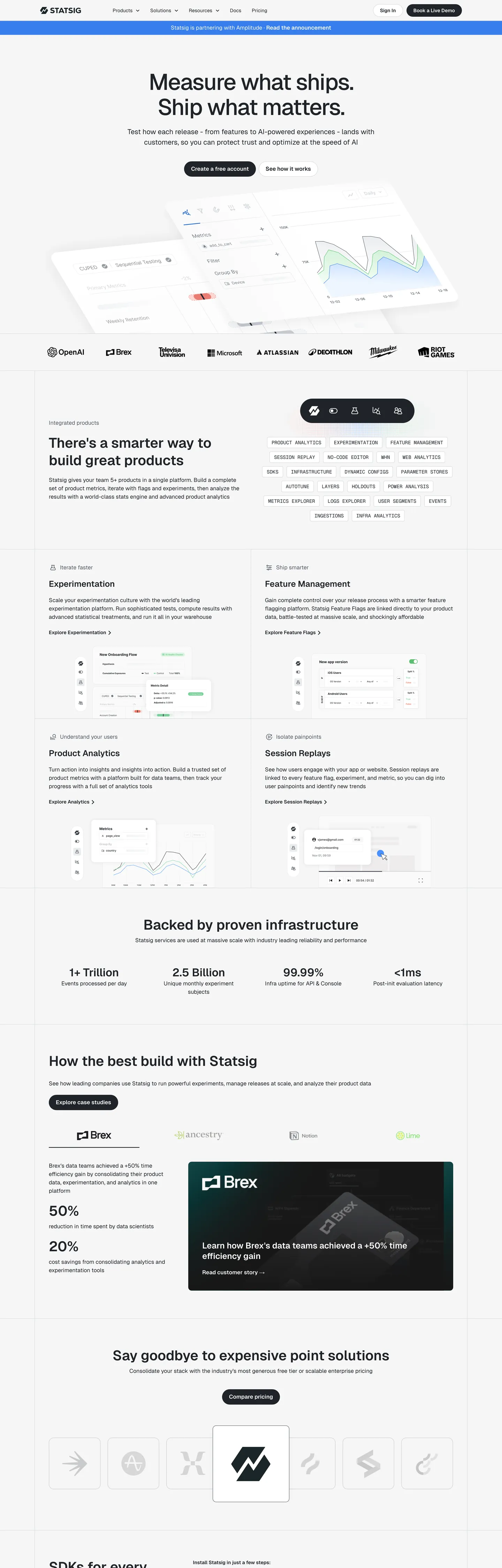
Statsig's marketing site is built with the same typeface Vercel ships its own product on — Geist — but the resemblance stops at the font stack. Where Vercel uses its brand identity on a dark canvas, Statsig uses Geist on a light off-white ground and replaces Vercel's white button with a charcoal-ink primary CTA. The hero headline reads "Measure what ships. Ship what matters." at 65px with -2px letter-spacing and weight 500. No chromatic voltage anywhere above the fold: the single registered brand color, a medium blue, appears once in the captured page as a background fill. The system communicates through density and typographic precision, not through saturated accent.
The DESIGN.md file packages the system into a machine-readable spec for React and AI tools. Inside: 15 color tokens drawn from the charcoal ink palette, the near-white canvas, and a declared-but-scarce blue accent family; 12 typography tokens spanning Geist at five size tiers and Geist Mono in two uppercase label contexts; 5 radius tokens centered on 10px standard and 30px pill; 8 spacing values on a 20px-dominant scale; and 18 component definitions covering the ink-fill primary button, the tag chips at 30px radius, the section-feature cards, and the monochrome logo wall.
Feed this file to Claude or Cursor and it reproduces Statsig's specific moves: structural-ink primary CTA instead of a chromatic accent, Geist at tight display tracking, 10px card rounding with pill-shaped interactive elements, and a pure off-white canvas rather than stark white. The one discipline worth borrowing even if you have a strong brand color: holding the blue in reserve creates more perceived confidence than spending it on every link and button. Statsig's system is the clearest example in the dev-tools category of trust signaled by chromatic restraint.
What makes it distinct
- Ink-as-CTAthe primary button fills with charcoal #1f2328 rather than any chromatic accent, inverting the SaaS convention of reserving brand color for primary actions
- Geist across all tiersVercel's open-source sans runs display through caption; Geist Mono handles code labels in uppercase at 14px/400
- Declared but unseen blue#367eed is wired as --color-blue but appears once on the captured page; the system trusts structure over chroma
- Pill-radius buttons at 30pxthe CTA geometry is fully-rounded while cards sit at 10px, creating a sharp contrast between interactive and container shapes
- 65px / -2px display trackingthe hero h1 uses tight negative letter-spacing and weight 500, not 700; density communicates precision rather than volume
Live at statsig.com
A snapshot of the brand in production. Hover the frame to scroll the page; click to visit.
 statsig.com
Explore Statsig
Pick what you want to see — mockups, colors, typography, layout, or the full component list.
Brand & Accent
Sparing, CTA-only voltage.
Surface
Page and card backgrounds.
Text
Headlines, body, captions, muted.
Borders & Hairlines
Dividers, outlines, structural rules.
Other
Specialty colors.
Statsig design system FAQ
Common questions about Statsig's tokens, components, and how to use this DESIGN.md in your project.
Related reading
Specs, directories, and component libraries that pair with this design system.
Browse all design systems
The full directory of DESIGN.md files on shadcn.io, with live mockups for each.
Statsig — official site
Statsig's public marketing site — the source of truth for the live tokens captured in this file.
The DESIGN.md specification
Google Labs' open spec for machine-readable design system files — the format this page is built on.