Supabase Inspired Design System
Supabase's design system as a DESIGN.md file.
About Supabase Inspired DESIGN.md
Curated by Dov AzencotUpdated Source supabase.com
- Backend, Database & DevOps
- Developer Tools & IDEs
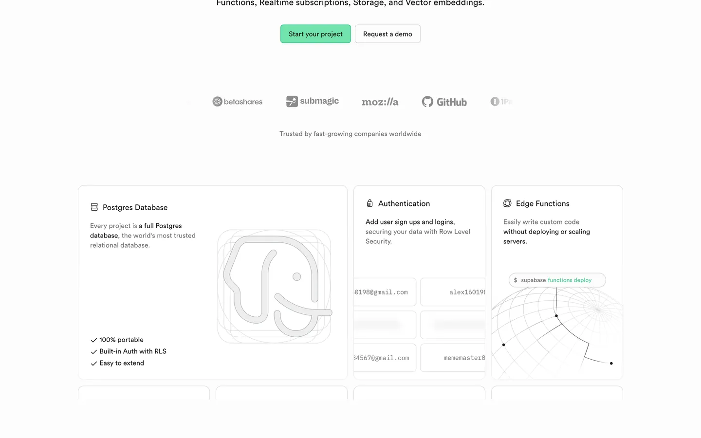
Supabase's design language is the open-source Postgres platform translated into a near-monochrome marketing surface. The canvas commits to pure white (#ffffff), text sits in near-black (#171717), and the only chromatic event across the entire page is a single emerald green (#3ecf8e) — used as the filled CTA background, the dot accent in the wordmark, and an occasional indicator. Everything else is a calibrated grey ladder from #ededed hairlines through #707070 mute text up to #171717 ink. There is no atmospheric gradient, no full-bleed photography, no dark marketing track. The brand commits to white the way Stripe commits to indigo gradients — with conviction.
This page packages the system into a single DESIGN.md file in the Google Labs open spec. Inside: 21 color tokens (3 emerald variants, 8 accent points reserved for chart and logo work, 5 surface fills, 6 text grades), 13 typography styles running Circular at weight 500 for display and 400 for body, 6 radius tokens topping out at 16px, an 8-token spacing scale anchored at 8px, and 21 component recipes spanning the green primary button, the inverted dark pricing tier, the canvas-night code block at #1c1c1c, and the composited product UI mockup pattern that does most of the page's visual work.
Feed the file to Claude, Cursor, or GitHub Copilot and the agent reproduces Supabase's specific restraint — square-ish 6px buttons, near-black text on emerald (never white), display tracking pulled tight at -1.92px, and a white canvas that refuses to fill itself with gradients. Reference the tokens directly inside Tailwind config or use it as a brand audit checklist. The system is worth studying because it proves a developer-facing brand can ship marketing without a single decorative flourish — the product screenshots ARE the decoration.
What makes it distinct
- Single emerald voltage#3ecf8e fills CTAs, dot accents, and the wordmark; nothing else is chromatic on the page
- Near-black text on greenthe primary button uses #171717 ink on #3ecf8e, not white, which reads as a lit surface
- Display tier at weight 500 with -1.92px tracking at 64pxCircular pulled into engineered editorial density
- Composited product UI mockups are the brand's argumentdashboards and SQL editors replace illustrations and photography entirely
- Square-ish 6px button radiusnever pill-shaped; the brand reads as technical, not friendly
Live at supabase.com
A snapshot of the brand in production. Hover the frame to scroll the page; click to visit.
 supabase.com
Explore Supabase Inspired
Pick what you want to see — mockups, colors, typography, layout, or the full component list.
Brand & Accent
Sparing, CTA-only voltage.
Surface
Page and card backgrounds.
Text
Headlines, body, captions, muted.
Borders & Hairlines
Dividers, outlines, structural rules.
Supabase Inspired design system FAQ
Common questions about Supabase Inspired's tokens, components, and how to use this DESIGN.md in your project.
Related reading
Specs, directories, and component libraries that pair with this design system.
The DESIGN.md specification
Google Labs' open spec for machine-readable design system files — the format this page is built on.
Browse all design systems
The full directory of DESIGN.md files on shadcn.io, with live mockups for each.
React blocks for shadcn/ui
Production-ready hero, pricing, CTA, and dashboard sections built with the same Tailwind + shadcn primitives.