sweetgreen Design System
sweetgreen design system as a DESIGN.md file.
About sweetgreen DESIGN.md
Curated by Dov AzencotUpdated Source sweetgreen.com
- Food & Delivery
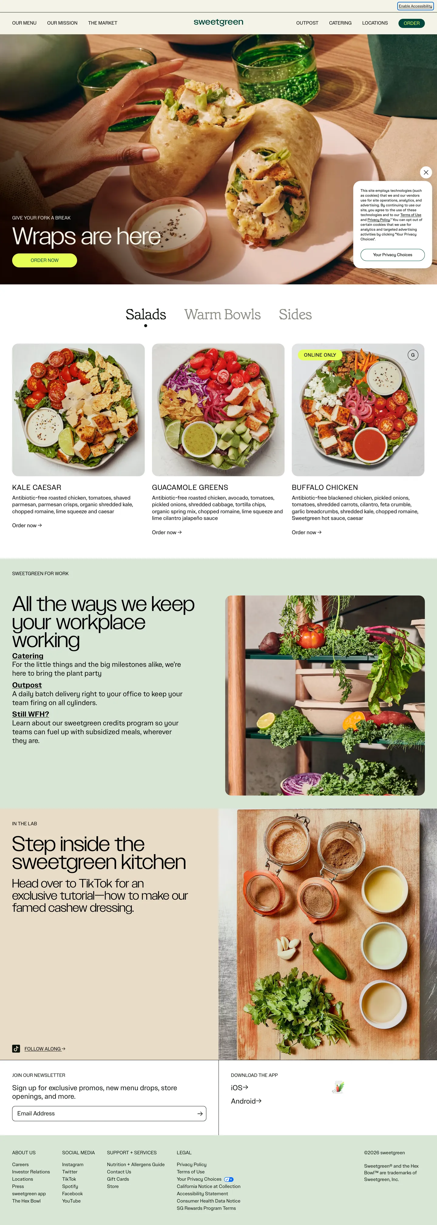
sweetgreen's web flagship reads like a printed café menu translated to the screen — a cream paper canvas ("#f4f3e7") instead of pure white, near-black ink ("#0e150e") for body, a single forest voltage ("#00473c") on the order button, and one electric chartreuse note ("#e6ff55") locked to that button's label. The hero word "Wraps" renders at 80px / 400 in SweetSans Display over a wrap-on-cutting-board photograph; a tiny Grenette italic serif at weight 200 hides inside the in-image CTA — the single editorial flourish in an otherwise photographic, uppercase, sans-only page.
This DESIGN.md packages the system into a single machine-readable spec. Inside: 18 color tokens grouped into canvas, forest, chartreuse, ink, oxblood-footer, and sage-em roles; 15 SweetSans typography tiers running from 12px footer fine print to an 80px hero display plus the lone 48px Grenette italic CTA face; 4 spacing tokens anchored on an 8px / 24px rhythm; 4 radii tokens dominated by 20px food cards (18 occurrences) and 1000px pill buttons (5 occurrences); and 18 components covering the photo-hero, food card grid, day-part tabs ("Salads / Warm Bowls / Sides"), workplace order rail, kitchen tutorial split, newsletter input, and footer surface.
Feed the file to Claude, Cursor, or GitHub Copilot and the agent reproduces sweetgreen's restraint — the cream canvas, the forest-green pill with chartreuse label, the uppercase 16px nav voice, the photo-first food cards — rather than a generic shadcn theme. Where most quick-service-restaurant brands stack a tomato-red CTA over a white canvas with a bold sans-serif marquee, sweetgreen inverts every default: cream over white, forest over red, photography over typography, lowercase wordmark over an all-caps logotype. The lesson worth studying is the two-token CTA discipline — most brands ship one accent and tint it for the label; sweetgreen ships two non-overlapping voltages and pairs them only inside the one shape they want you to tap.
What makes it distinct
- Cream paper canvas (`#f4f3e7`)the brand never uses pure white as the page floor, even on product cards
- Two-token CTAforest green (
- Universal 1000px full-pill buttons paired with 20px rounded-rectangle food cardsappearing 18 times in the radii table
- Two-typeface splitSweetSans handles 14 of 15 type tiers; Grenette serif italic at weight 200 surfaces only inside the wraps-CTA button
- Oxblood (
Live at sweetgreen.com
A snapshot of the brand in production. Hover the frame to scroll the page; click to visit.
 sweetgreen.com
Explore sweetgreen
Pick what you want to see — mockups, colors, typography, layout, or the full component list.
Brand & Accent
Sparing, CTA-only voltage.
Surface
Page and card backgrounds.
Text
Headlines, body, captions, muted.
Borders & Hairlines
Dividers, outlines, structural rules.
Other
Specialty colors.
sweetgreen design system FAQ
Common questions about sweetgreen's tokens, components, and how to use this DESIGN.md in your project.
Related reading
Specs, directories, and component libraries that pair with this design system.