TechCrunch Design System
TechCrunch's newsroom design as a DESIGN.md file.
About TechCrunch DESIGN.md
Curated by Dov AzencotUpdated Source techcrunch.com
- News & Publishing
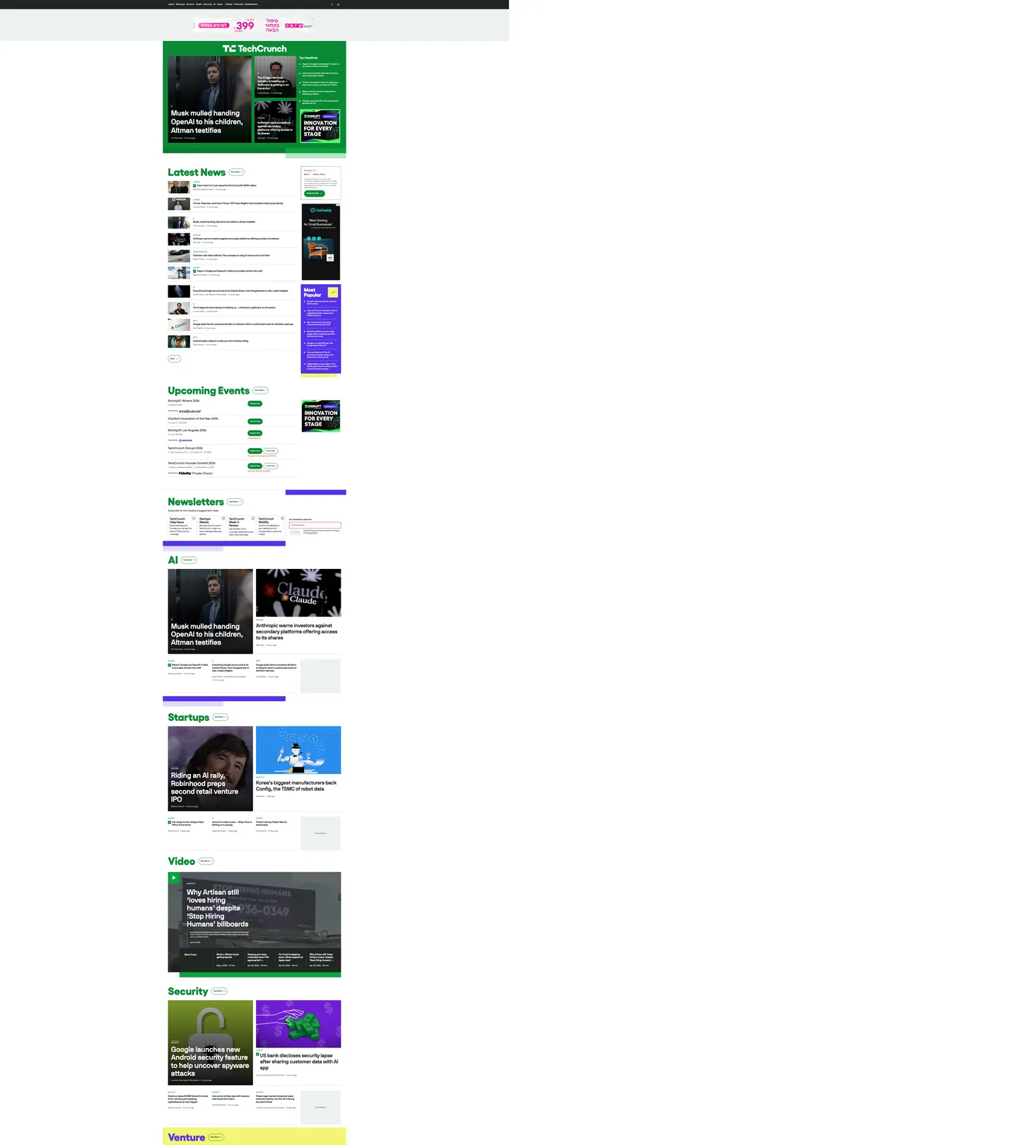
TechCrunch's homepage reads like a Bloomberg terminal rebuilt by a startup that cares about typography. The canvas is a pale hairline-gray (`#edf1ef` — almost white, but with enough green-leaning warmth to register as paper), and `#212623` near-black does the ink work. Money Green (`#0a8935`) paints every section masthead — "Latest News", "Startups", "AI", "Security", "Venture" — like a ticker indicator stamped above each editorial cluster, with a dark-green hover-rule sitting against it. Display headlines crash in at 83px in Yellix 700, a tightly drawn geometric sans by Type-O-Tones, while body and bylines run NB International Pro Regular from Nikolas Wrobel. Two scarcity accents — Founder Purple (`#5631ea`) and Highlighter Yellow (`#f2f673`) — surface only on newsletter and "Most Popular" tiles. The mood is serious enough to break a Series-B leak, energetic enough to host TechCrunch Disrupt.
This DESIGN.md file packages the homepage into a machine-readable spec built on the Google Labs format. Inside: 18 color tokens grouped into ink, canvas, hairline-grays, Money Green semantics, dual scarcity accents, and one alert red (`#e21c1c`) reserved for newsletter form borders; 11 typography tokens spanning Yellix display (83px / 40px / weight 700) and NB International Pro across nine UI registers from 11px caption to 57px byline-hero; a 4-step radius scale from 2px input corners to 80px pill cards; an 8-step spacing scale built strictly on a 4px unit; and 20+ component specifications covering section mastheads, story cards, the upcoming-events register, newsletter subscription tiles, navigation, buttons, and form inputs.
Feed the file to Claude, Cursor, or GitHub Copilot and the agent reproduces TechCrunch's ticker-page voice — near-black ink on hairline canvas, Money Green section heads, Yellix shouting at 83px above NB International body, 80px pill cards, dual scarcity accents reserved for newsletters. Reference the tokens directly to paste hex values into Tailwind config or to align a CMS theme with the WordPress Gutenberg variable graph. The system is worth studying because TechCrunch picked a typographic stance the rest of tech media avoided: a geometric sans display where every competitor reaches for a serif, paired with the most extreme pill geometry of any mainstream newsroom.
What makes it distinct
- Money Green masthead system`#0a8935` paints every section heading ("Latest News", "Startups", "AI") like a stock-ticker glyph rather than a brand wash
- Yellix display at 83px / 700the masthead headline weight is a sharp geometric sans, not the convention-default serif that magazine sites still default to
- Two scarcity accentsFounder Purple `#5631ea` and Highlighter Yellow `#f2f673` together appear in fewer than 10 surfaces, reserved for newsletter and subscription tiles
- 80px pill radiistory cards round at the largest pill value in any mainstream news site, far outside the 8–12px editorial convention
- WordPress-stable token graph300 `:root` custom properties expose the Gutenberg theme.json contract directly to AI tools, making variable mapping deterministic
Live at techcrunch.com
A snapshot of the brand in production. Hover the frame to scroll the page; click to visit.
 techcrunch.com
Explore TechCrunch
Pick what you want to see — mockups, colors, typography, layout, or the full component list.
Surface
Page and card backgrounds.
Text
Headlines, body, captions, muted.
Borders & Hairlines
Dividers, outlines, structural rules.
Other
Specialty colors.
TechCrunch design system FAQ
Common questions about TechCrunch's tokens, components, and how to use this DESIGN.md in your project.
Related reading
Specs, directories, and component libraries that pair with this design system.
Use TechCrunch in your project
One machine-readable file. Drop it into Claude, Cursor, or any AI tool that reads DESIGN.md.