The Verge Design System
The Verge's 2024 redesign as a DESIGN.md file.
About The Verge DESIGN.md
Curated by Dov AzencotUpdated Source theverge.com
- News & Publishing
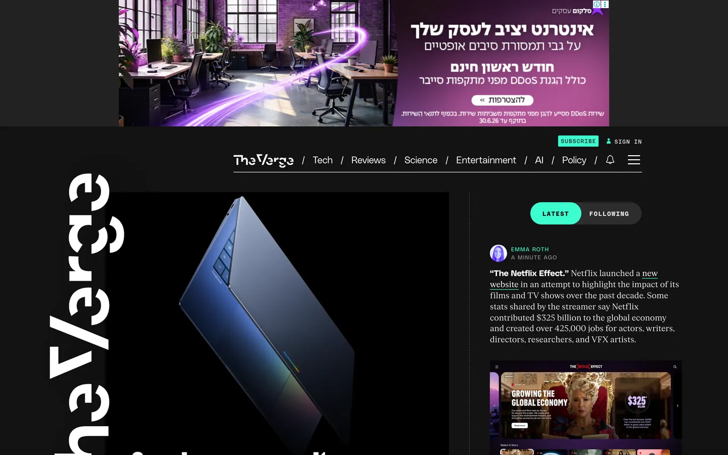
The Verge's 2024 redesign reads like a Condé Nast magazine wired to a chiptune soundboard. The canvas is almost-black (#131313 — not pure black, with just enough warmth to feel like a printed newsprint negative), and the whole page is peppered with acid-mint #3cffd0 and ultraviolet #5200ff that behave less like brand colors and more like hazard tape. Display headlines crash in at 107px in Manuka 900, a brutally heavy industrial sans from Klim Type Foundry. There is no light mode on the homepage. Story tiles are not quiet gray cards but saturated full-bleed color blocks in mint, purple, yellow, pink, and orange that feel like pasted-up rave flyers arranged into a timeline. The mood is serious enough to cover a congressional hearing, loud enough to review a synthesizer.
This DESIGN.md file packages the entire system into a single machine-readable spec. Inside: 23 color tokens organized into hazards, surfaces, neutrals, and semantics; 21 typography tokens spanning Manuka display (60–107px), PolySans body and label work, PolySans Mono for every UPPERCASE moment, and FK Roman Standard for rare print-voice excerpts; 8 corner-radius values from 2px typewriter tags to 40px outlined CTA pills; a 14-step spacing scale built on an 8px unit; and 30+ component specifications covering the StoryStream timeline, color-block tiles, navigation, buttons, forms, and image frames. The format follows the Google Labs DESIGN.md specification.
Feed the file to Claude, Cursor, or GitHub Copilot and the agent reproduces The Verge's hazard-tape voice — dark canvas, mint and ultraviolet as neon safety paint, Manuka shouting above thin-weight PolySans whispers, pill-cornered everything, color-as-elevation in place of shadows. Reference the tokens directly to paste hex values into Tailwind config or CSS variables. The system is worth studying because almost no other mainstream editorial site commits this hard to a single aesthetic — most news publishers play it safe with white-on-black serifs and a single brand accent. The Verge bet that loud, opinionated chrome could outlast a year of trend cycles, and it has.
What makes it distinct
- Dual-hazard accent systemJelly Mint #3cffd0 and Verge Ultraviolet #5200ff used as neon safety paint, never background washes
- Manuka 900 at 107px display headlines, the single loudest type move in mainstream tech publishing
- Color-as-elevationzero traditional box-shadows, hierarchy carried by 1px hazard borders and saturated tile fills
- Eight discrete radius values (2/3/4/20/24/30/40px plus 50%)square corners break the voice entirely
- StoryStream timeline rail with PolySans Mono 11px UPPERCASE timestamps replaces the traditional magazine grid
Live at theverge.com
A snapshot of the brand in production. Hover the frame to scroll the page; click to visit.
 theverge.com
Explore The Verge
Pick what you want to see — mockups, colors, typography, layout, or the full component list.
Brand & Accent
Sparing, CTA-only voltage.
Surface
Page and card backgrounds.
Text
Headlines, body, captions, muted.
Borders & Hairlines
Dividers, outlines, structural rules.
Other
Specialty colors.
The Verge design system FAQ
Common questions about The Verge's tokens, components, and how to use this DESIGN.md in your project.
Related reading
Specs, directories, and component libraries that pair with this design system.
The DESIGN.md specification
Google Labs' open spec for machine-readable design system files — the format this page is built on.
Browse all design systems
The full directory of DESIGN.md files on shadcn.io, with live mockups for each.
React blocks for shadcn/ui
Production-ready hero, pricing, CTA, and dashboard sections built with Tailwind + shadcn primitives.