Todoist Design System
Todoist's design system as a DESIGN.md file.
About Todoist DESIGN.md
Curated by Dov AzencotUpdated Source todoist.com
- Productivity & SaaS
- Project Management
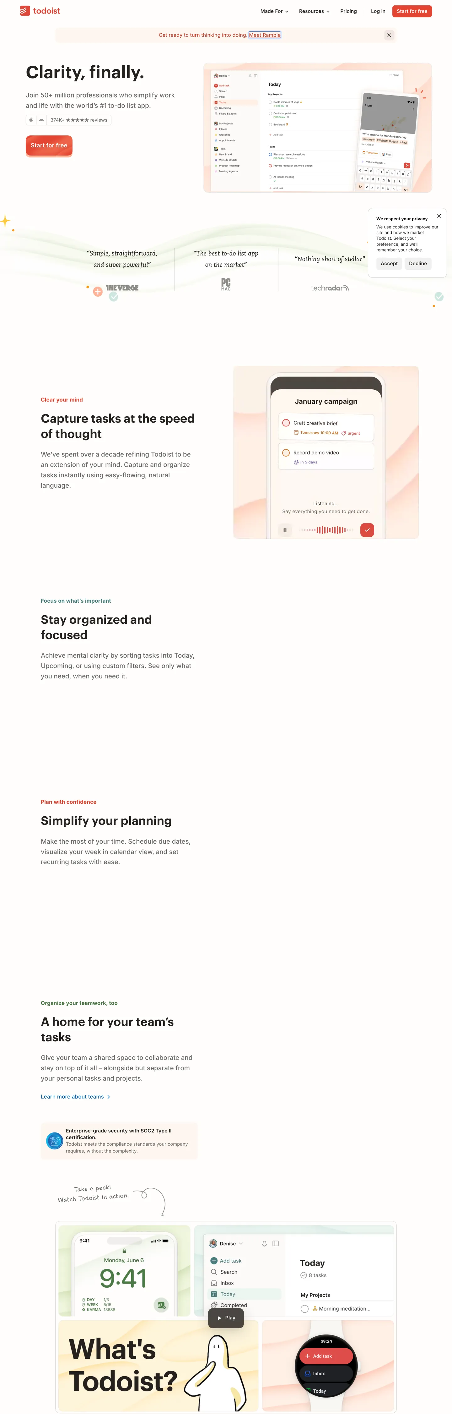
Todoist's marketing system reads like a warm paper notebook, not a SaaS landing page. The hero opens with "Clarity, finally." set in Graphik 600 at 55px with -0.55px tracking, sitting on an off-white canvas decorated with a wavy line doodle and pastel sparkles. The only chromatic voltage on the page is the Todoist Red ("#e34432") burning inside one pill button — "Start for free" — and a thin progress dot on the announcement bar above. Everything else (every headline, every body sentence, every 1px hairline, every checkbox outline) is rendered in the same warm-black ink "#25221e", a near-black that leans olive-brown rather than blue-gray.
This DESIGN.md packages the whole spec into one machine-readable file. Inside: 20 color tokens covering the warm-black ink scale, the Todoist Red press states, the four pastel tile tints (peach, mint, butter, sky), and the supporting semantic colors for the in-product priority dots; 9 typography tokens split across Graphik (display 38–55px) and Inter (body 12–18px at the unusual weight 475), with a Caecilia serif for testimonial quotes and a hand-drawn Shantell Sans for margin doodles; 5 corner radii anchored on the dominant 8px; 9 spacing steps from 4px to 64px; and 18 components covering the red primary CTA, the secondary outline button, the announcement bar, the testimonial slab, the pastel feature tile grid, the FAB, and the task-row checkbox. Format follows the Google Labs DESIGN.md spec.
A working React developer feeds this file to Claude, Cursor, or Copilot and gets components that match Todoist's discipline — warm-black hairlines instead of a Tailwind gray scale, one red CTA per fold, body text at weight 475 rather than 400, illustration-led pastel tiles instead of gradient cards — instead of a generic shadcn theme. Reference the tokens directly inside Tailwind config, CSS variables, or your own component library. The system is worth studying for one reason: it proves that a productivity brand can hold restraint and warmth at the same time — Linear holds restraint on a black canvas, Notion holds warmth with purple pills; Todoist holds both at once with a notebook-paper canvas and a single red button.
What makes it distinct
- Warm-black ink (
- Single-CTA disciplineTodoist Red (
- Two-typeface splitGraphik 600 for display at -0.55px tracking, Inter at weight 475 for body (heavier than the 400 default)
- 8px radius dominant (33 uses)buttons, pills, and tiles all share the same corner; pills are reserved for chips and the FAB
- Hand-drawn Shantell Sans script in the marginsTodoist signs its illustrations like a notebook, not a marketing site
Live at todoist.com
A snapshot of the brand in production. Hover the frame to scroll the page; click to visit.
 todoist.com
Explore Todoist
Pick what you want to see — mockups, colors, typography, layout, or the full component list.
Brand & Accent
Sparing, CTA-only voltage.
Surface
Page and card backgrounds.
Text
Headlines, body, captions, muted.
Borders & Hairlines
Dividers, outlines, structural rules.
Semantic
Status, errors, success, inline links.
Todoist design system FAQ
Common questions about Todoist's tokens, components, and how to use this DESIGN.md in your project.
Related reading
Specs, directories, and component libraries that pair with this design system.