Tumblr Design System
Tumblr's design system as a DESIGN.md file.
About Tumblr DESIGN.md
Curated by Dov AzencotUpdated Source tumblr.com
- Social & Community
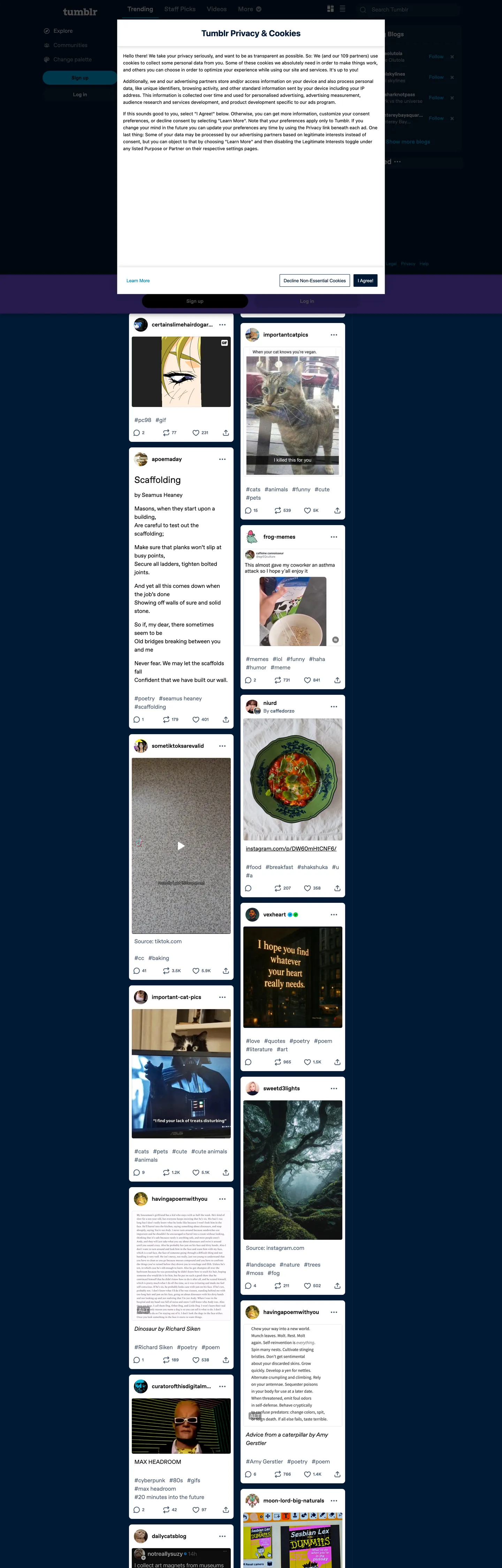
Tumblr's logged-out home page is two surfaces stacked on the same screen. The outer chrome is a deep navy ("#001935", wired to `--chrome`, `--top-menu`, `--side-menu`, and `--content-tint`) holding a sticky login modal in white at the top of the viewport, and beneath that a scrolling dashboard feed of light "#ffffff" post-cards — gifs, fan-art, text quotes, fandom screenshots — each at a 16px corner radius with #4c5e72 secondary text and #000000 titles. Where most social marketing pages reserve the dark band for a single hero, Tumblr commits its entire chrome to dark and lets the post imagery carry every warm tone on the page. The single chromatic CTA is cyan ("#00b8ff", `--brand-blue` / `--accent`), shaped as a fully-rounded pill at 40px tall — every button on every surface inherits that geometry.
This page packages the system as a single Google Labs DESIGN.md file. Inside: 22 color tokens grouped into chrome (navy register), content (post-card register), brand (the documented rainbow), and structural neutrals; 9 Favorit typography levels covering 26px hero down to "12px" caption Favorit Modern; a 5-step radius scale where pill ("9999px") and card ("16px") carry 412 of the page's 613 rounded surfaces; an 8-step spacing scale tuned to the "4 / 6 / 8 / 12 / 16" rhythm the extractor pulls straight from CSS variables; and 17 component recipes covering the cyan pill CTA, the dark top-nav, the floating login modal, the post-card variants, the rainbow tag chip, and the borderless text input the welcome modal uses.
Feed the file to Claude, Cursor, or GitHub Copilot and the model produces React components that match Tumblr's specific split — the dark navy chrome, the floating white post-card feed, the cyan pill CTA, the rainbow tag register used scarcely — rather than a generic dark social theme. Or reference the tokens directly: every hex is quoted, every component recipe paste-ready for Tailwind config or CSS custom properties. The system is worth studying because it inverts the typical social-app rule that the brand color is the load-bearing tone; here the navy carries the page, and the cyan is allowed to be small.
What makes it distinct
- Two-tier canvas systemnavy
- Single-accent pill CTAcyan
- Documented rainbow registerseven explicit `--color-rainbow-N` brand hexes wired up as CSS vars, used scarcely (counts of 1-2) for tag chips and badges
- Dual-Favorit typeface splitFavorit for reading body at 16/24, Favorit Modern at weight 500 for buttons and 12/18 labels
- Pill-everywhere geometry9999px radius appears 239 times, 16px card radius 173 times, 8px chip radius 119 times; the 4 / 8 / 16 / pill scale is the entire shape vocabulary
Live at tumblr.com
A snapshot of the brand in production. Hover the frame to scroll the page; click to visit.
 tumblr.com
Explore Tumblr
Pick what you want to see — mockups, colors, typography, layout, or the full component list.
Brand & Accent
Sparing, CTA-only voltage.
Surface
Page and card backgrounds.
Text
Headlines, body, captions, muted.
Borders & Hairlines
Dividers, outlines, structural rules.
Other
Specialty colors.
Tumblr design system FAQ
Common questions about Tumblr's tokens, components, and how to use this DESIGN.md in your project.
Related reading
Specs, directories, and component libraries that pair with this design system.
Browse all design systems
The full directory of DESIGN.md files on shadcn.io, with live mockups for each.
Tumblr — official site
Microblogging and social-blogging platform for fandom, GIFs, art, and long-form posts.
The DESIGN.md specification
Google Labs' open spec for machine-readable design system files — the format this page is built on.