Uber Inspired Design System
Uber's design system as a DESIGN.md file.
About Uber Inspired DESIGN.md
Curated by Dov AzencotUpdated Source uber.com
- Travel & Hospitality
- Marketplaces
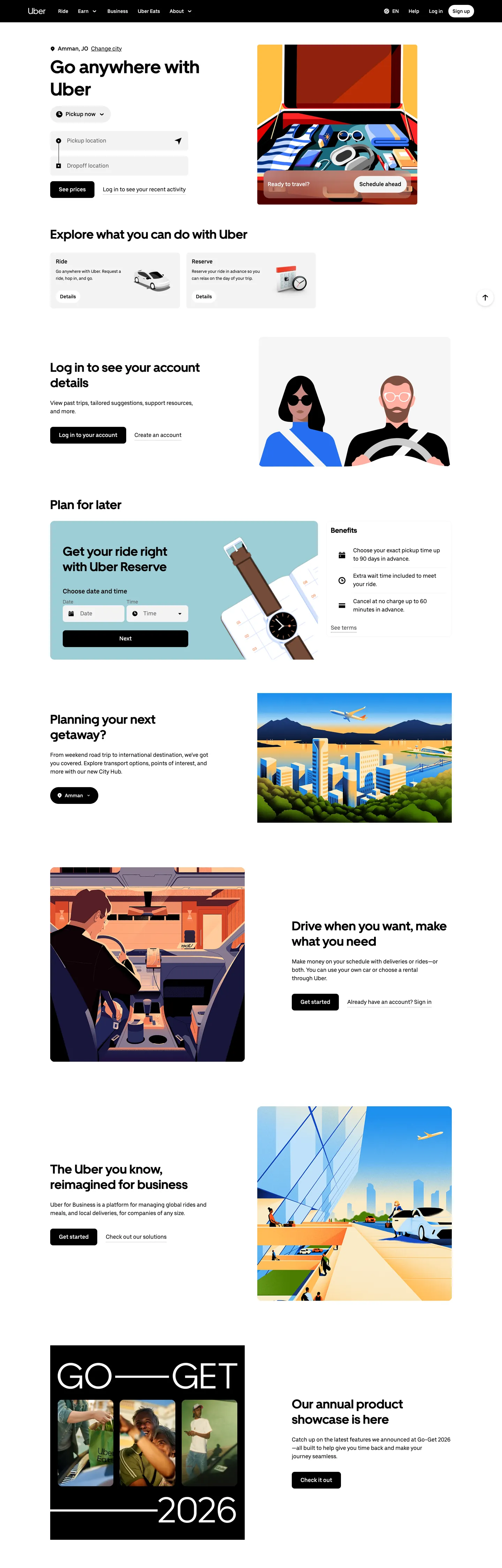
Uber's web surface is the most disciplined two-color system in consumer marketplaces. The brand strips every page down to a black-and-white duet — pure ink "#000000" anchors every primary CTA, every dark promo band, and the full-bleed footer; pure canvas "#ffffff" carries everything else. There is no secondary accent, no gradient, no atmospheric backdrop. The only chromatic element on the entire surface is the browser-default "#0000ee" link blue inside legal fine print, a deliberately mundane choice that signals the brand will not invent decoration where none is needed.
This page packages Uber's web design language into a single DESIGN.md file following the Google Labs spec. Inside: 11 color tokens grouped into surface, text, brand, and elevated roles; 13 type styles spanning UberMove display sizes from 20px to 52px and UberMoveText body weights at 400 and 500; 8 spacing values on a 4px base; 7 corner radii anchored on the signature 999px pill; and 40+ components covering buttons, cards, navigation, the hero ride-request form, and the polarity-flipped promo bands that punctuate the page.
Feed the file to Claude, Cursor, or GitHub Copilot and the agent renders React components that match Uber's restraint — black pill CTAs on white surfaces, sentence-case display headlines at weight 700, editorial 4:3 illustration frames inside "#rounded.xl" 16px cards. Or use the tokens directly as a reference: every hex, every font stack, every padding value is a quoted string you can paste into Tailwind config or CSS variables. The system is worth studying because it proves a marketplace brand can scale to global logistics on two colors and one shape — no third voltage required.
What makes it distinct
- Two-color duetpure black #000000 and pure white #ffffff carry the entire system with zero secondary accent
- Pill is the signature shape999px radius on every interactive element except cards (#rounded.xl 16px) and the off-shape 36px tab toggle
- Two custom faces, two rolesUberMove 700 for 20-52px headlines, UberMoveText 400/500 for body, button, and link
- Polarity-flipped black promo bands mid-page are the depth cuethe system has no progressive shadow tiers
- Editorial 4:3 illustrations of riders and drivers are the only decorationno gradients, no atmospheric backdrops
Live at uber.com
A snapshot of the brand in production. Hover the frame to scroll the page; click to visit.
 uber.com
Explore Uber Inspired
Pick what you want to see — mockups, colors, typography, layout, or the full component list.
Brand & Accent
Sparing, CTA-only voltage.
Surface
Page and card backgrounds.
Text
Headlines, body, captions, muted.
Borders & Hairlines
Dividers, outlines, structural rules.
Other
Specialty colors.
Uber Inspired design system FAQ
Common questions about Uber Inspired's tokens, components, and how to use this DESIGN.md in your project.
Related reading
Specs, directories, and component libraries that pair with this design system.
The DESIGN.md specification
Google Labs' open spec for machine-readable design system files — the format this page is built on.
Browse all design systems
The full directory of DESIGN.md files on shadcn.io, with live mockups for each.
Airbnb design system
The other canonical travel-and-marketplace brand, built on a single Rausch accent and Cereal VF type.