Vercel Inspired Design System
Vercel's design language as a DESIGN.md file.
About Vercel Inspired DESIGN.md
Curated by Dov AzencotUpdated Source vercel.com
- Web Infrastructure & Hosting
- Developer Tools & IDEs
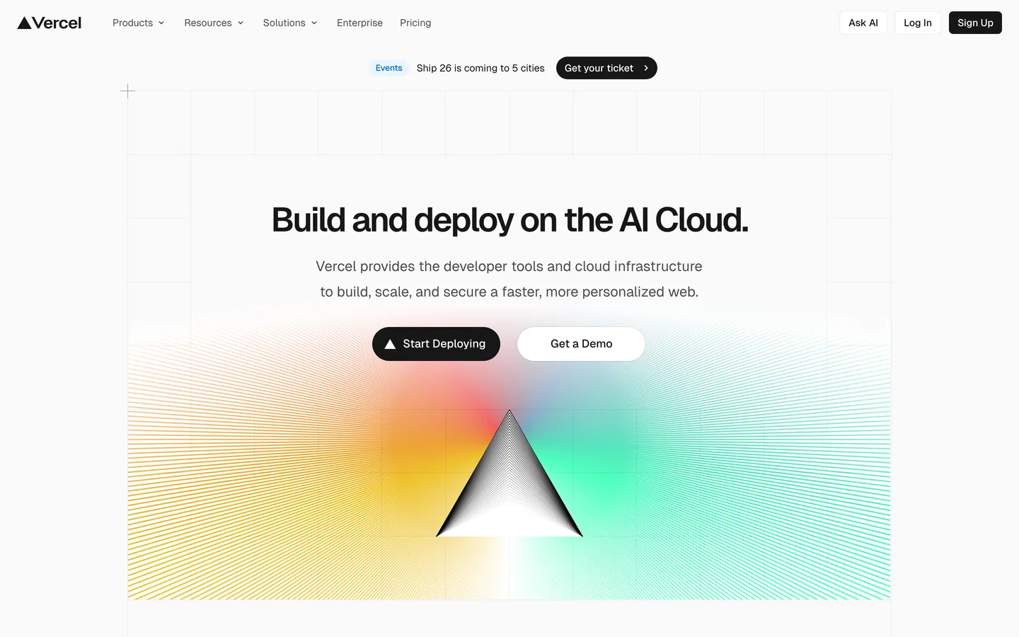
Vercel's design language is the dashboard marketing surface for a developer platform, written for engineers who already know the syntax. The page operates with one of the strictest stark systems on the web: a near-white #fafafa body, ink-near-black #171717 for type, and a 200-step gray scale where every divider, border, and disabled state lives on its own deliberate step. There is no brand-blue or marketing accent — the ink IS the brand. Conversion targets, dark bands, code mockups, and primary CTAs all share the same #171717 tone, polarity-flipped onto white when a section needs depth.
This DESIGN.md packages the system into a single machine-readable file. Inside: 40 color tokens (including the three-pair Develop / Preview / Ship gradient stack), 15 typography styles across Geist and Geist Mono, 9 corner radii (from 0px to 9999px, with the 100px pill as the marketing-CTA signature), 12 spacing values stepping from 4px to a 192px section gap, and 40+ components from `nav-bar` to `pricing-card-featured` to the polarity-flipped `showcase-band-dark`. The format follows the Google Labs DESIGN.md spec — colors, typography, rounded, spacing, components, all token-referenced.
Feed the file to Claude, Cursor, or Copilot when you need a React component that reads as Vercel rather than as a generic shadcn theme. The agent picks up the discipline — 100px pill CTAs, sentence-case headlines with -2.4px tracking, mono eyebrows above geometric-sans body, stacked shadows instead of heavy drops. Reference the tokens directly in Tailwind config, or use the spec as an audit checklist. The system is worth studying because of what it refuses: no second accent color, no display weight above 600, no gradient miniaturization. Restraint is the product.
What makes it distinct
- Single ink primary#171717 carries every CTA, never softened to a brand-blue or secondary accent
- One mesh gradientcyan #50e3c2, blue #007cf0, pink #ff0080, amber #f9cb28 fused, used only at hero scale
- Two pill scales coexist100px marketing CTAs and 6px nav buttons, never mixed inside one screen
- Geist display caps at weight 600aggressive -2.4px tracking carries voice instead of heavier weights
- Stacked shadows over single drops4-12% black opacity layered with an inset hairline ring on every card
Live at vercel.com
A snapshot of the brand in production. Hover the frame to scroll the page; click to visit.
 vercel.com
Explore Vercel Inspired
Pick what you want to see — mockups, colors, typography, layout, or the full component list.
Brand & Accent
Sparing, CTA-only voltage.
Surface
Page and card backgrounds.
Text
Headlines, body, captions, muted.
Borders & Hairlines
Dividers, outlines, structural rules.
Semantic
Status, errors, success, inline links.
Other
Specialty colors.
Vercel Inspired design system FAQ
Common questions about Vercel Inspired's tokens, components, and how to use this DESIGN.md in your project.
Related reading
Specs, directories, and component libraries that pair with this design system.
Vercel's design site
The Geist design system and brand resources direct from Vercel.
Browse all design systems
The full directory of DESIGN.md files on shadcn.io, with live mockups for each.
React blocks for shadcn/ui
Production-ready hero, pricing, CTA, and dashboard sections built with the same Tailwind + shadcn primitives.