Vodafone Inspired Design System
Vodafone's design language as a DESIGN.md file.
About Vodafone Inspired DESIGN.md
Curated by Dov AzencotUpdated Source vodafone.com
- Communication & Messaging
- Consumer Electronics
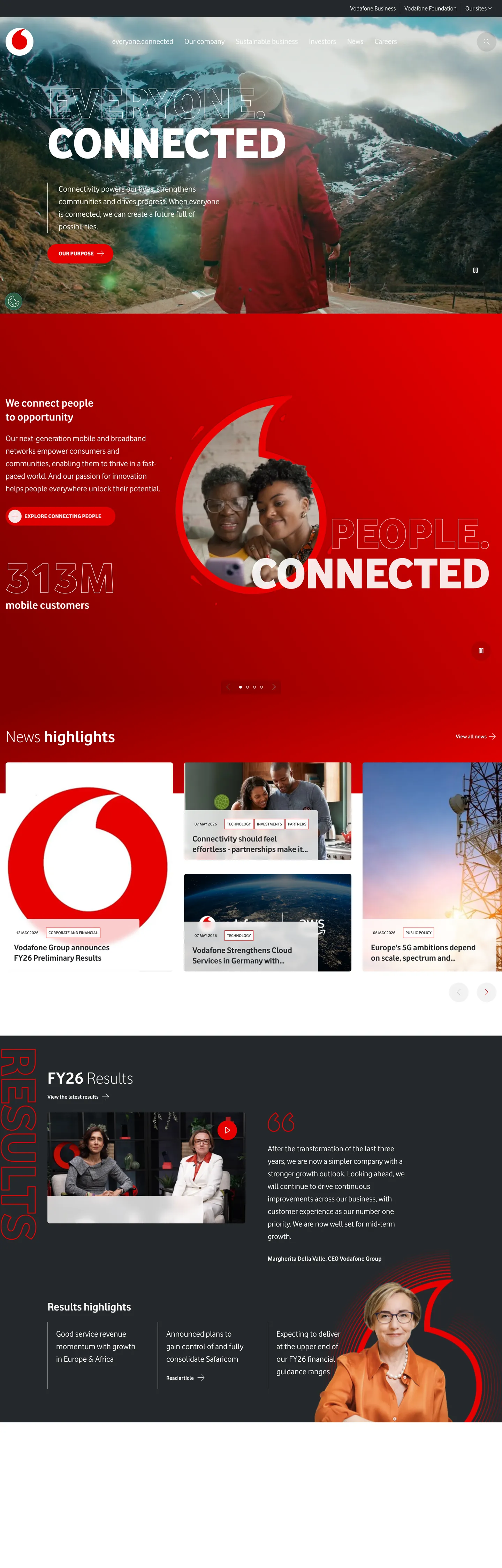
Vodafone's design system reads like a campaign poster more than a corporate website. The brand operates from a single voltage of scarlet red (#e60000) paired with near-black ink (#25282b), and trusts its proprietary display sans set at weight 800 in upper case to do the heavy lifting at hero scale. Editorial photography crops portraits and city scenes tight, then a single colossal stencil headline floats on top at 144px with -1px tracking. There is no second accent colour competing for attention, no decorative gradient, no soft drop shadow on cards. The depth cue is surface contrast between dark hero bands and light content bands.
This page packages that posture into a single DESIGN.md file built to the Google Labs spec. Inside: 8 colour tokens covering primary red, three ink/text greys, two surface tints, and on-dark white; 17 typography roles all drawing from the one custom Vodafone face at weights 300, 400, 600, 700, and 800; 8 spacing tokens on a 4px base; 6 radius tokens running from 0px through pill-lg at 60px; and 30+ components covering buttons, cards, the signature hero bands, the red speechmark logo orb, navigation, footer, and an example surface kit for downstream re-skinning.
Feed the file to Claude, Cursor, or GitHub Copilot and the agent will reproduce Vodafone's restraint — the red pill, the uppercase 800-weight hero, the two-band rhythm — rather than emit a generic telco theme. Or reference the tokens directly in Tailwind config and CSS variables. The system is worth studying for one reason: it shows how a brand can run a global web surface on three colours, one font, and zero shadow tiers, and still feel like a billboard. Restraint is the product.
What makes it distinct
- Single accent voltageVodafone Red #e60000 carries every primary CTA, the speechmark logo orb, and zero secondary use
- Weight 800 uppercase display at 144px with -1px trackingthe stencil hero is the brand's typographic signature
- Two-band page rhythmink #25282b hero into white #ffffff content, with no mid-band greys for elevation
- Pill geometry on every interactive60px CTA pills are non-negotiable, square buttons do not exist in the system
- No drop shadowsdepth comes entirely from surface polarity flip between ink and canvas bands
Live at vodafone.com
A snapshot of the brand in production. Hover the frame to scroll the page; click to visit.
 vodafone.com
Explore Vodafone Inspired
Pick what you want to see — mockups, colors, typography, layout, or the full component list.
Brand & Accent
Sparing, CTA-only voltage.
Surface
Page and card backgrounds.
Text
Headlines, body, captions, muted.
Other
Specialty colors.
Vodafone Inspired design system FAQ
Common questions about Vodafone Inspired's tokens, components, and how to use this DESIGN.md in your project.
Related reading
Specs, directories, and component libraries that pair with this design system.
The DESIGN.md specification
Google Labs' open spec for machine-readable design system files — the format this page is built on.
Browse all design systems
The full directory of DESIGN.md files on shadcn.io, with live mockups for each.
React blocks for shadcn/ui
Production-ready hero, pricing, CTA, and dashboard sections built with Tailwind + shadcn primitives.