Webflow Inspired Design System
Webflow's design system as a DESIGN.md file.
About Webflow Inspired DESIGN.md
Curated by Dov AzencotUpdated Source webflow.com
- Workflow & No-code
- Design & Creative Tools
Webflow's design system reads as a confident professional product, not a tech startup. The default page is a generous white canvas with one decisive ink colour — `#080808` near-black — carrying every primary CTA, every heading, and every wordmark. Around that restrained primary, the brand layers a five-stop chromatic accent palette (purple `#7a3dff`, pink `#ed52cb`, blue `#3b89ff`, orange `#ff6b00`, green `#00d722`) that maps directly to product categories: design, animation, SEO, hosting, ecommerce. These accents appear as full-card surface fills inside the category grid, never as button backgrounds. The proprietary WF Visual Sans family handles every typographic role at weights 500 and 600, with negative tracking on display sizes giving the hero its tight, engineered voice.
This page captures the system in a single DESIGN.md file built to the Google Labs open specification. Inside: 19 colour tokens (one primary, nine chromatic accents, four text roles, hairlines and canvas), 16 type styles all running WF Visual Sans Variable with Inconsolata as the documented mono fallback, an 8-step spacing scale from 2px to 32px, a five-step radius scale capped at 8px for cards, and 30+ component recipes spanning buttons, cards, hero bands, the five chromatic category cards, badges, inputs, and a kit-mirror block of 10 illustrative example surfaces.
Feed the file to Claude, Cursor, or GitHub Copilot and the AI produces React components that respect Webflow's discipline — `#080808` CTAs, 4px button corners, the 600 weight ceiling — rather than a generic shadcn theme. The tokens drop straight into Tailwind config or CSS variables. The system is worth studying for one reason: it shows how a brand can be visually distinctive without raising any individual element's voice. The chromatic palette does the heavy lifting on surfaces; the primary stays quiet on actions; the type never climbs past semibold. Restraint as a strategy.
What makes it distinct
- Two-colour conversion hierarchyevery primary CTA is `#080808` near-black, never one of the five chromatic accents
- Five-stop category palette`#7a3dff` purple, `#ed52cb` pink, `#3b89ff` blue, `#ff6b00` orange, `#00d722` green as full surface fills
- Weight ceiling at 600proprietary WF Visual Sans Variable carries every display and body role, never heavier than semibold
- Tight 4px button radiusthe brand's canonical `{rounded.sm}` geometry; pill CTAs do not exist in the system
- Hero display at 80px / 600 with -0.8px trackingconfident kerning rather than billboard weight
Live at webflow.com
A snapshot of the brand in production. Hover the frame to scroll the page; click to visit.
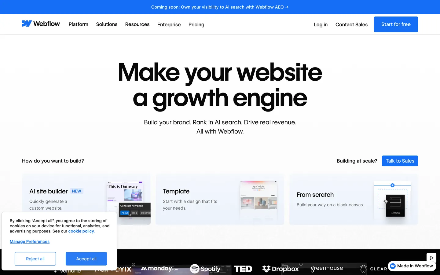 webflow.com
Explore Webflow Inspired
Pick what you want to see — mockups, colors, typography, layout, or the full component list.
Brand & Accent
Sparing, CTA-only voltage.
Surface
Page and card backgrounds.
Text
Headlines, body, captions, muted.
Borders & Hairlines
Dividers, outlines, structural rules.
Other
Specialty colors.
Webflow Inspired design system FAQ
Common questions about Webflow Inspired's tokens, components, and how to use this DESIGN.md in your project.
Related reading
Specs, directories, and component libraries that pair with this design system.
The DESIGN.md specification
Google Labs' open spec for machine-readable design system files — the format this page is built on.
Browse all design systems
The full directory of DESIGN.md files on shadcn.io, with live mockups for each.
React blocks for shadcn/ui
Production-ready hero, pricing, CTA, and dashboard sections built with the same Tailwind + shadcn primitives.