Xbox Design System
Xbox.com's design system as a DESIGN.md file.
About Xbox DESIGN.md
Curated by Dov AzencotUpdated Source xbox.com
- Gaming & Entertainment
- Consumer Electronics
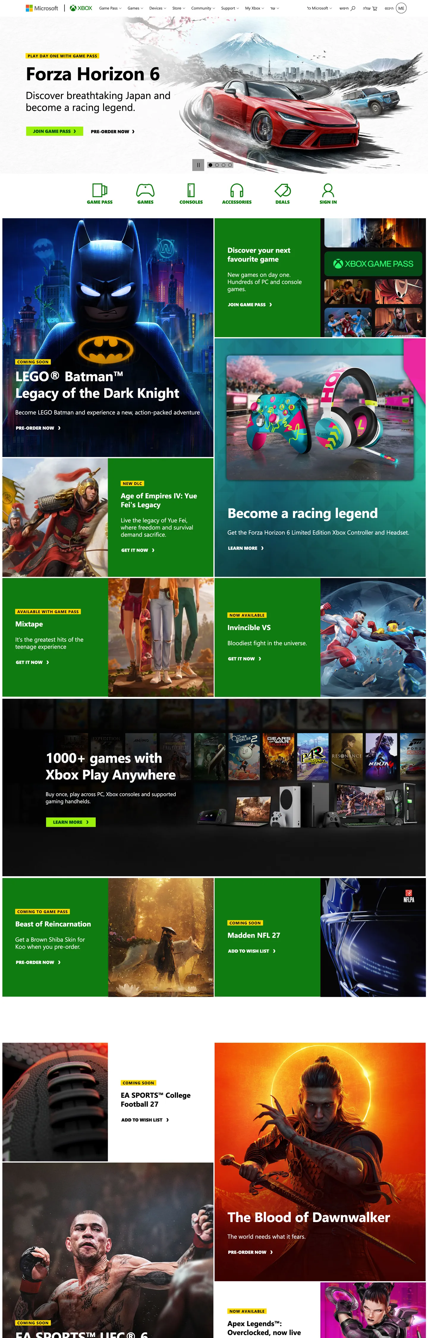
Xbox.com is what a console brand looks like when it commits to the color-block tile as the page's atomic unit. The home surface stacks a near-black "#171717" hero band over a vertical mosaic of large rectangular tiles — green Game Pass slabs, yellow ad alerts, red game-art panels, black product cards — each one capped in a 13px uppercase SegoeProBlack eyebrow ("XBOX GAME PASS", "GAMES", "ACCESSORIES") and titled at 24px weight 700 Segoe UI. Where PlayStation runs a three-canvas chapter rhythm and Nintendo runs a 12px-radius catalog grid on white, Xbox runs a hard-edged tile collage: every surface is a rectangle, every corner is 0px, and the tile fill colors do the structural work that hairlines and shadows would do elsewhere.
This file packages the chrome as a Google Labs DESIGN.md spec. Inside: 23 color tokens covering the two-green voltage (heritage "#107c10" and Game Pass lime "#9bf00b"), the dark canvas ladder ("#000000" / "#171717" / "#262626"), the gray ink ladder ("#616161" workhorse, "#333333" deep, "#505050" mid), the yellow alert "#ffd800", the Bootstrap-derived semantic palette (--blue "#0067b8", --red "#dc3545", --orange "#d83b01", --purple "#8661c5", --teal "#008575", --cyan "#30e5d0", --pink "#e83e8c", --indigo "#243a5e") declared as tokens but at 0 page uses; 12 typography roles split across Segoe UI body and SegoeProBlack display/CTA; a 4-step radius scale where 0px carries every surface and 50% appears only on circular feature icons; an 8-step spacing rhythm extracted from the page's actual padding values (2px, 4px, 5px, 8px, 16px, 24px, 36px, 43.2px, 72px); and 18 component recipes covering the JOIN GAME PASS lime button, the dark hero band, the color-block tile family, the yellow alert ribbon, and the SegoeProBlack uppercase eyebrow label.
Feed the file to Claude, Cursor, or GitHub Copilot and the agent will produce React components that match Xbox's actual chrome — lime CTAs on dark text, SegoeProBlack uppercase eyebrows, sharp 0px tiles on a dark canvas, and the yellow alert ribbon. Or reference the tokens directly when building any storefront where the product mosaic is the hero. The system's value as a study is that it proves a console brand can refuse Nintendo's white-canvas catalog AND PlayStation's chapter rhythm — the tile collage is its own grammar, and the two-green split (heritage versus Game Pass) is the named voltage move worth stealing.
What makes it distinct
- Two-green voltage systemheritage Xbox green '#107c10' for trust slots, Game Pass lime '#9bf00b' for the load-bearing CTA fill on dark '#054b16' ink
- SegoeProBlack at weight 900every CTA renders in proprietary uppercase 15px black with no tracking softening, the brand's typographic muscle move
- Sharp 0px corners on every chrome surfaceonly '50%' radius appears (circular feature icons), no card-radius rhythm at all
- Yellow alert eyebrow '#ffd800' on black inkthe persistent badge format that lets each color-block tile shout its product category
- Bootstrap semantic palette tokenized but unused on chrome'--blue', '--red', '--orange', '--purple', '--teal' all declared at 0 page uses, scoped to error/dev surfaces only
Live at xbox.com
A snapshot of the brand in production. Hover the frame to scroll the page; click to visit.
 xbox.com
Explore Xbox
Pick what you want to see — mockups, colors, typography, layout, or the full component list.
Brand & Accent
Sparing, CTA-only voltage.
Surface
Page and card backgrounds.
Text
Headlines, body, captions, muted.
Borders & Hairlines
Dividers, outlines, structural rules.
Semantic
Status, errors, success, inline links.
Other
Specialty colors.
Xbox design system FAQ
Common questions about Xbox's tokens, components, and how to use this DESIGN.md in your project.
Related reading
Specs, directories, and component libraries that pair with this design system.