Open source and free shadcn templates using UI Kits & Component Libraries
22 templates • 20 contributors • Open source & free
22
Templates
20
Authors
Available Templates (22)

Intent UI
Intent UI is an accessible React component library built on React Aria Components and Tailwind CSS, emphasizing web accessibility while providing easily customizable components through a copy-paste workflow. Written primarily in TypeScript (78.2%), the MIT-licensed library offers components designed with accessibility as a core principle, leveraging React Aria's robust primitives for keyboard navigation, screen reader support, and ARIA compliance. The chill, developer-friendly approach allows you to copy components directly into React projects and customize them to match specific design requirements without dealing with npm dependencies or version conflicts. With comprehensive documentation at intentui.com and design templates to accelerate interface creation, Intent UI bridges the gap between accessible component libraries and the flexibility of owned code. Perfect for developers who prioritize accessibility standards like WCAG while maintaining full control over component styling and behavior, Intent UI demonstrates how to build inclusive web applications with React Aria's powerful primitives and Tailwind's utility-first approach.
 Nextjs
 React
React Tailwind
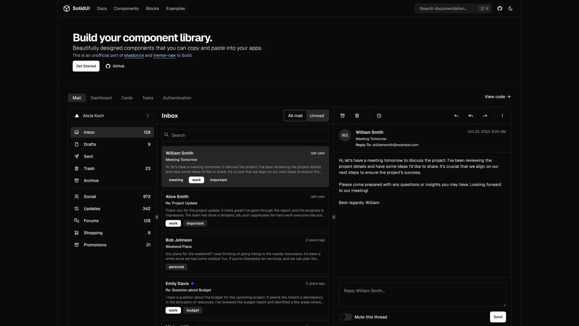
Solid UI
Solid UI is an unofficial port of shadcn/ui and tremor-raw to SolidJS, providing accessible and customizable components built with Kobalte, corvu, and Tailwind CSS that developers can copy and paste into their applications. With over 1,300 GitHub stars, this MIT-licensed library brings the shadcn/ui philosophy of component ownership to the SolidJS ecosystem, allowing developers to build their own component libraries with well-designed, accessible primitives. Built with TypeScript and leveraging Kobalte and corvu for headless, accessible component foundations, Solid UI offers a comprehensive collection of UI components styled with Tailwind CSS for rapid customization. The project maintains compatibility with SolidJS's reactive programming model while providing familiar patterns from the React ecosystem through shadcn/ui's design language. With comprehensive documentation at solid-ui.com and active community contributions from maintainers including stefan-karger and michaelessiet, Solid UI serves developers who prefer SolidJS's performance and reactivity model but want the component quality and design consistency of shadcn/ui. Perfect for building SolidJS applications that require professional UI components without sacrificing the framework's unique advantages in bundle size and runtime performance.
 Solid
Solid
Solid UI
Solid UI is an unofficial port of shadcn/ui and tremor-raw to SolidJS, providing accessible and customizable components built with Kobalte, corvu, and Tailwind CSS that developers can copy and paste into their applications. With over 1,300 GitHub stars, this MIT-licensed library brings the shadcn/ui philosophy of component ownership to the SolidJS ecosystem, allowing developers to build their own component libraries with well-designed, accessible primitives. Built with TypeScript and leveraging Kobalte and corvu for headless, accessible component foundations, Solid UI offers a comprehensive collection of UI components styled with Tailwind CSS for rapid customization. The project maintains compatibility with SolidJS's reactive programming model while providing familiar patterns from the React ecosystem through shadcn/ui's design language. With comprehensive documentation at solid-ui.com and active community contributions from maintainers including stefan-karger and michaelessiet, Solid UI serves developers who prefer SolidJS's performance and reactivity model but want the component quality and design consistency of shadcn/ui. Perfect for building SolidJS applications that require professional UI components without sacrificing the framework's unique advantages in bundle size and runtime performance.

Enhanced Button
Enhanced Button is a feature-rich button component extending shadcn/ui's Button with built-in loading states, success animations, error handling, and progress indicators for improved user feedback during async operations. The MIT-licensed component provides automatic state management for promises, displaying loading spinners during execution, success checkmarks on completion, and error states with retry capabilities. Built with React, TypeScript, Framer Motion for smooth animations, and Tailwind CSS for styling, the enhanced button eliminates boilerplate code for common patterns like form submissions, API calls, and async workflows. The component integrates seamlessly with shadcn/ui projects while adding sophisticated interaction patterns including disabled states during loading, customizable success/error messages, progress bars for long-running operations, and automatic state resets. Perfect for form submissions, data mutations, file uploads, or any user action requiring clear feedback about async operation status with professional loading indicators and success confirmations that enhance user experience.

RetroUI
RetroUI is a retro-styled UI library for modern web applications that combines nostalgic design aesthetics with contemporary web development practices using Tailwind CSS. The MIT-licensed library provides playful, nostalgic design components that bring vintage computing and classic web design styles to modern applications while maintaining accessibility and responsive behavior. Built with TypeScript (71.3%), MDX (25.5%) for documentation, CSS for custom styling, Next.js, and Tailwind CSS, RetroUI offers developers a distinctive styling option beyond typical modern minimalist designs. The library is supported by Vercel's Open Source Program and provides components with retro visual characteristics like pixel-art borders, vintage color palettes, classic button styles, and nostalgic typography treatments. Perfect for portfolio sites wanting unique personality, gaming-related applications, creative agency websites, nostalgic product showcases, or any project seeking to stand out with a distinctive retro aesthetic while maintaining modern web standards, performance, and accessibility, RetroUI demonstrates how classic design can be reimagined for contemporary web applications.
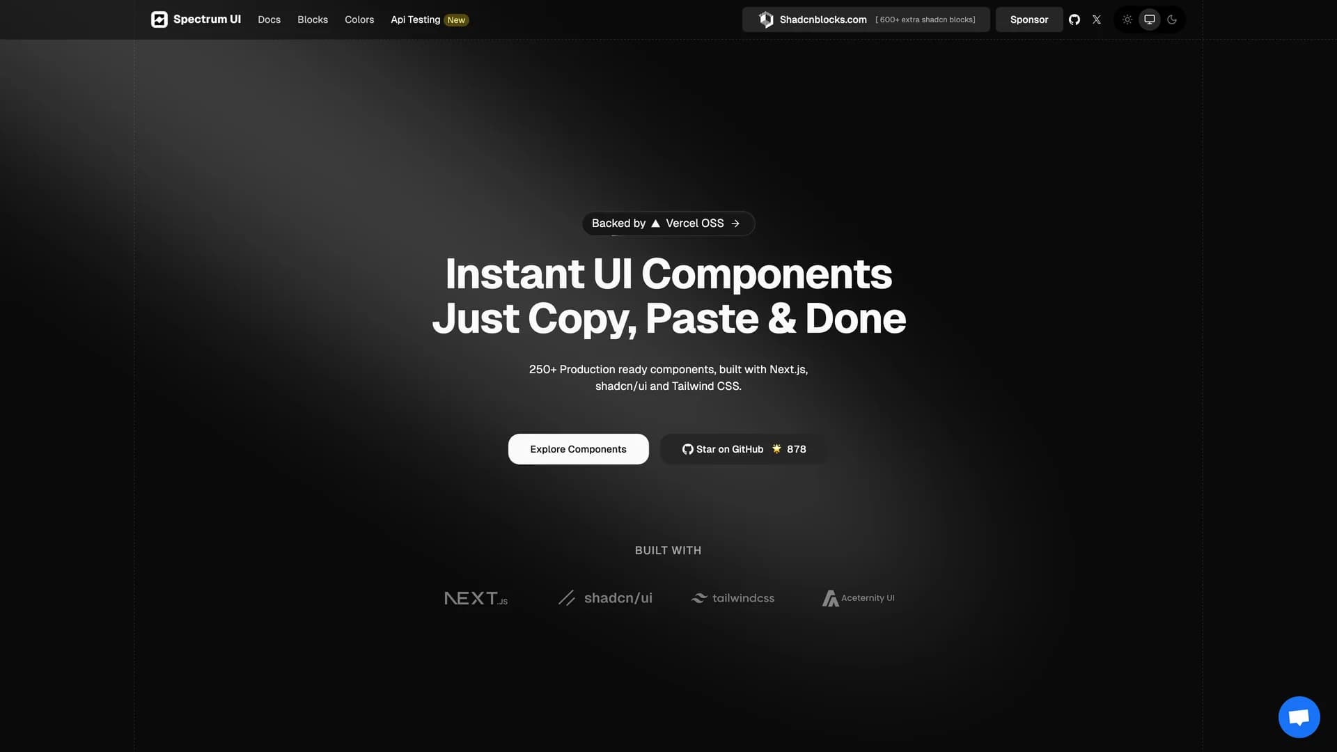
Spectrum UI
Spectrum UI is a collection of reusable components combining elements from Aceternity UI, Magic UI, and ShadCN UI into a unified, copy-and-paste component library for modern web applications. The Apache-2.0 licensed project provides modular UI components built with TypeScript (99.6% of codebase), Next.js, and Tailwind CSS, offering developers flexibility through easy integration without npm dependencies. The library draws from three popular UI libraries to provide comprehensive component coverage with diverse design patterns and interaction styles. With 878 stars and an active community of contributors, Spectrum UI welcomes open-source contributions and maintains documentation at ui.spectrumhq.in. Perfect for projects requiring diverse UI patterns, developers wanting best-of-breed components from multiple libraries, teams building design systems with varied aesthetics, or any application benefiting from high-quality components without committing to a single UI framework, Spectrum UI demonstrates how to harmonize different component libraries into cohesive, production-ready interfaces.
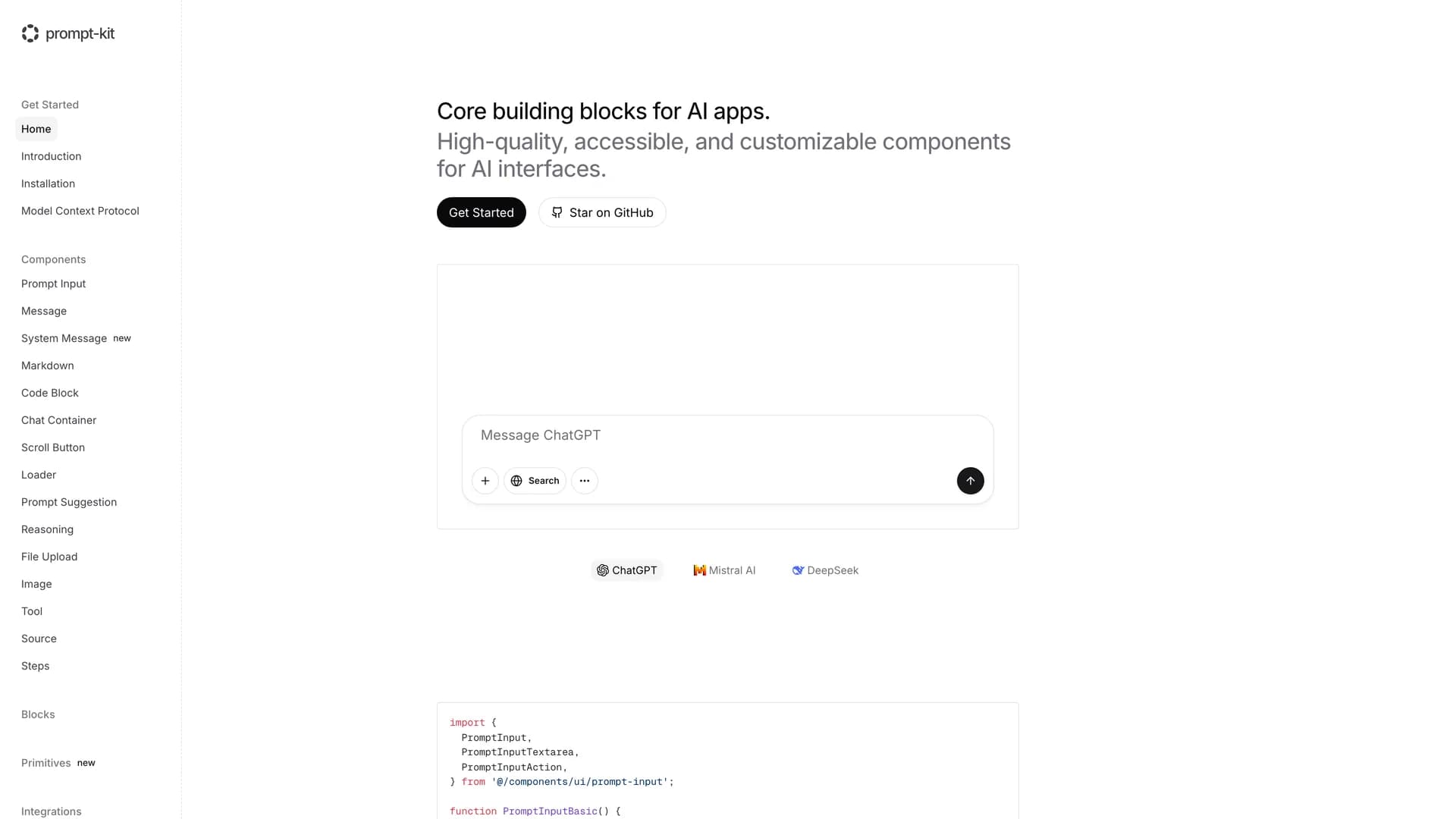
Prompt Kit
Core building blocks for AI apps. High-quality, accessible, and customizable components for AI interfaces.

Shadcn UI Customizer
Shadcn UI Customizer is an open-source web application built with Next.js, TypeScript, Tailwind CSS, and shadcn/ui, providing an intuitive visual interface with interactive color pickers for customizing shadcn/ui themes without manual CSS variable editing. This powerful tool enables developers and designers to customize comprehensive design tokens including background and foreground colors, primary, secondary, and accent colors, card, popover, and input styles, border properties, and border radius settings, all through a user-friendly web interface that provides real-time previews of changes. Inspired by the original shadcn/ui theme customizer, this enhanced version offers additional customization options and improved developer experience for teams establishing brand-specific design systems. Perfect for agencies customizing shadcn/ui for multiple clients, product teams aligning UI themes with brand guidelines, designers collaborating with developers on design system specifications, or any project where theme customization without diving into CSS files accelerates the design-to-development workflow. With deployment on Vercel and a TypeScript-heavy codebase (99%), the customizer demonstrates how visual tools can enhance the shadcn/ui ecosystem, making theme customization accessible to team members who may not be comfortable editing raw CSS variables while maintaining the flexibility and control that developers expect.

Shadcn Timeline
The shadcn Timeline is a fully accessible, customizable, and reusable React timeline component built on top of shadcn/ui, perfect for displaying chronological events, project milestones, order tracking, or any sequential information in an elegant vertical format. Built with React, Next.js, TypeScript, Tailwind CSS, and Framer Motion for smooth animations, this component follows shadcn/ui's copy-and-paste philosophy, allowing developers to integrate it directly into their projects with full customization control rather than installing it as a locked dependency. The component features comprehensive ARIA attributes for screen reader accessibility, responsive design that adapts seamlessly to mobile and desktop viewports, multiple size and color variants for different use cases, smooth entrance and transition animations powered by Framer Motion, loading and error states for async data scenarios, TypeScript definitions for type safety, and SSR compatibility for Next.js applications. The timeline supports custom icons and status indicators for different event types, configurable date formatting to match your locale preferences, and flexible configuration through props and Tailwind classes. Use cases include displaying company history and milestone timelines on about pages, tracking order or delivery status in e-commerce applications, showing project progress and phase completion in dashboards, visualizing user activity feeds and notification histories, and presenting educational content or tutorial steps in sequential format. The component is documented in Storybook with live examples, making it easy to understand all configuration options and see the component in action before implementing it in your project.
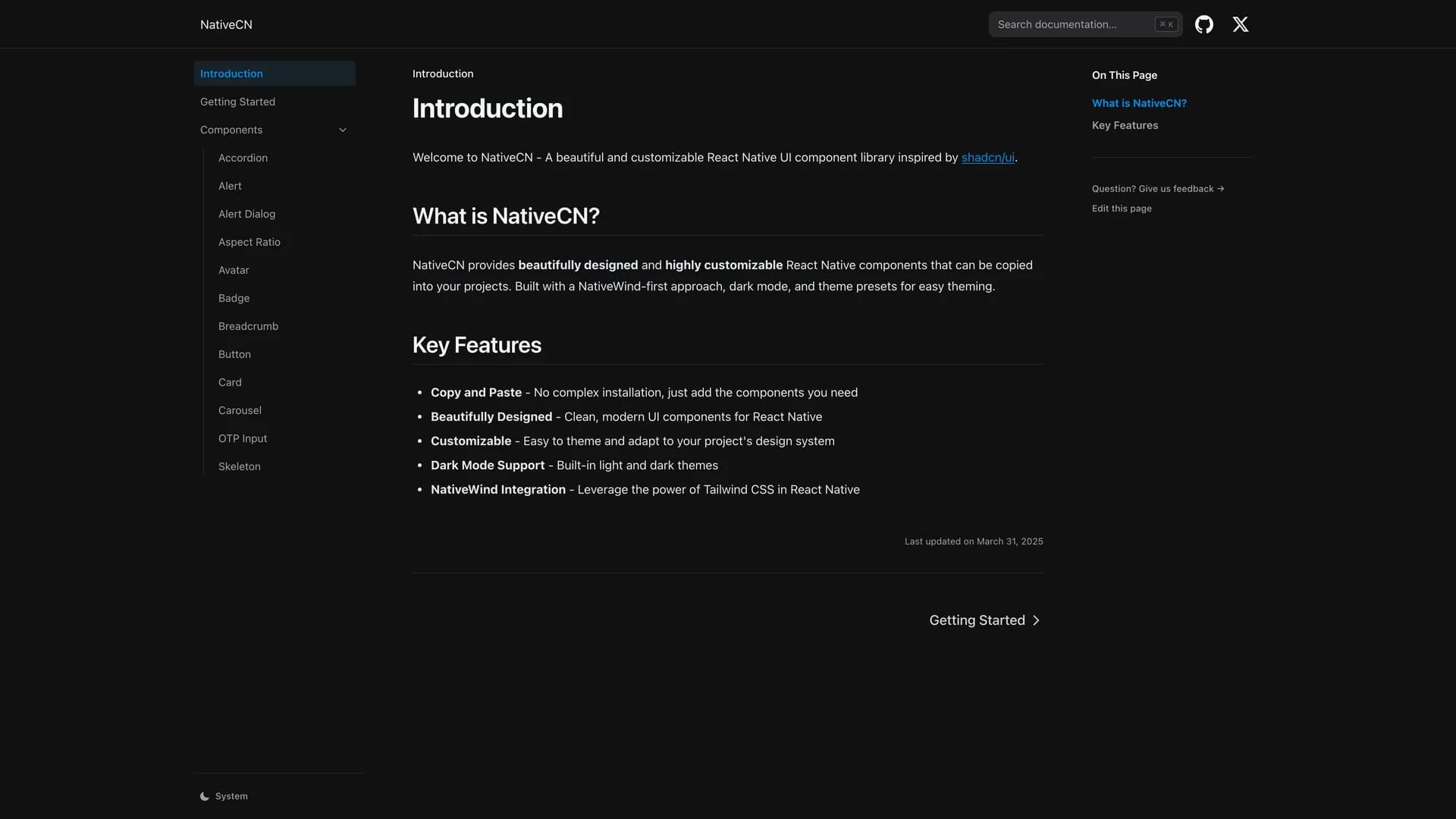
NativeCN
NativeCN brings the shadcn/ui philosophy to React Native, offering a comprehensive UI component library where you own the code through copy-paste integration rather than package dependencies. Built for mobile developers who want beautiful, customizable components without the overhead of traditional component libraries. The library features 40+ production-ready components including buttons, inputs, cards, modals, and navigation elements, all styled with NativeWind (Tailwind CSS for React Native) for consistent design. Components are fully typed with TypeScript, accessible following React Native best practices, and optimized for both iOS and Android platforms. NativeCN includes dark mode support, responsive layouts, animation utilities with Reanimated, and comprehensive documentation with interactive examples. Perfect for building mobile applications that require professional UI design, maintainable code architecture, and full customization control without external package dependencies.
 React native