Make your AI a shadcn expert
shadcn.io
Templates
Blocks
MCP
Browse
Pricing
Search
⌘
K
Sign in
Home
Templates
block library
React Templates - Block Library
7 templates • 6 contributors • Open source & free
Available Templates (7)
magicui.design
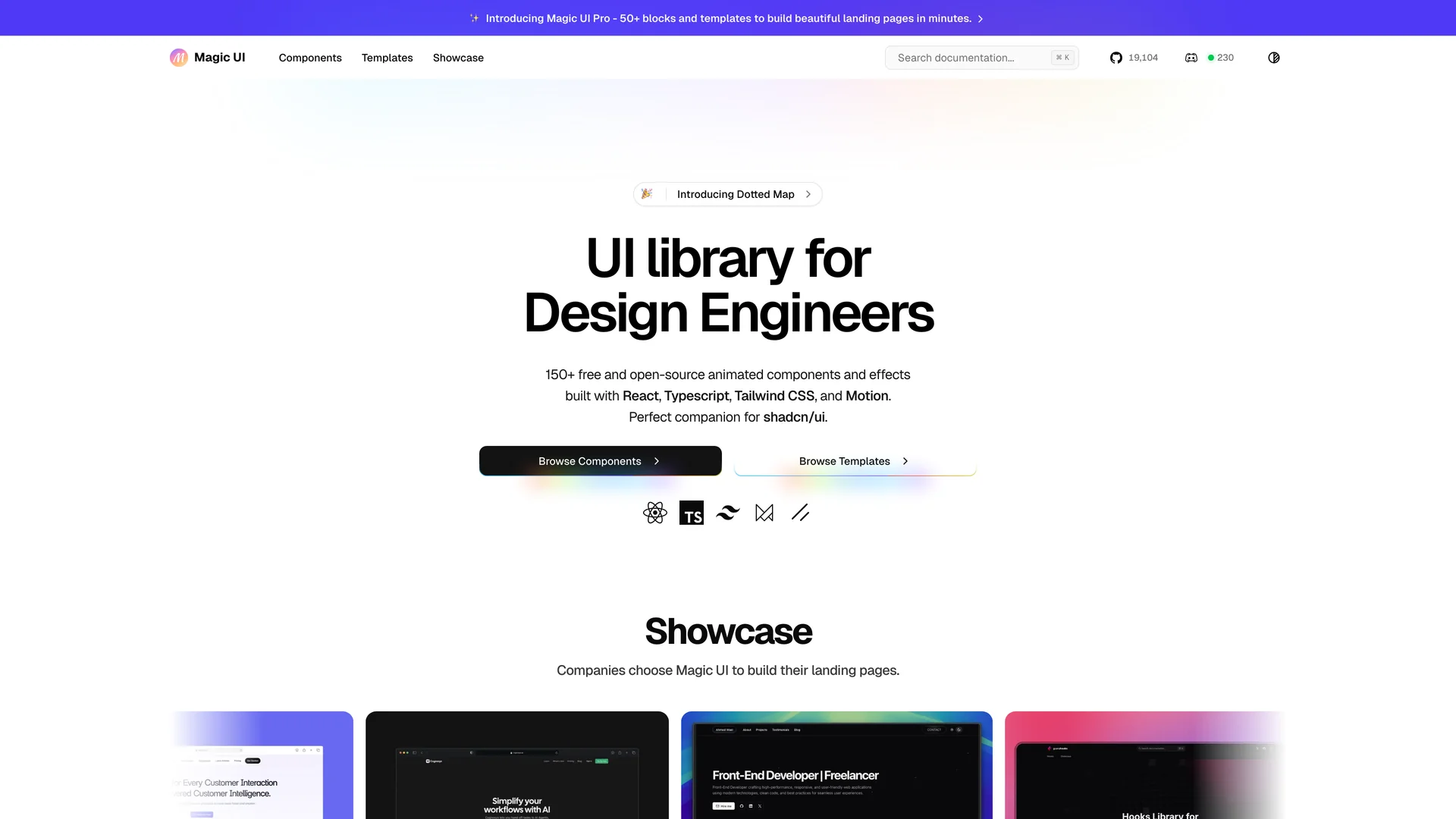
Magic UI
motion-primitives.com
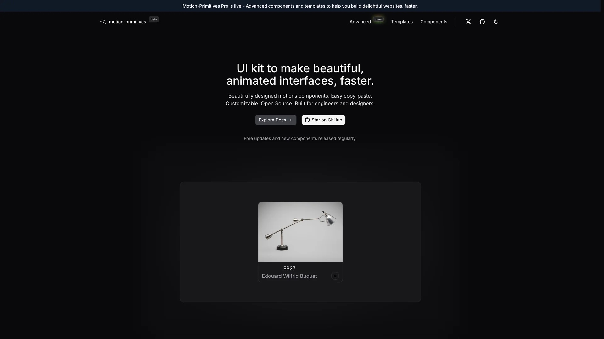
Motion Primitives
tremor.so
Tremor
cult-ui.com/?ref=builtatlightspeed
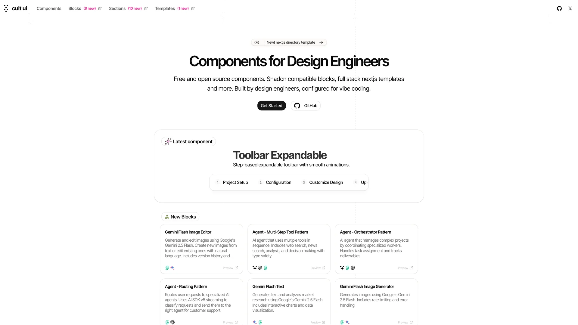
Cult UI
eldoraui.site
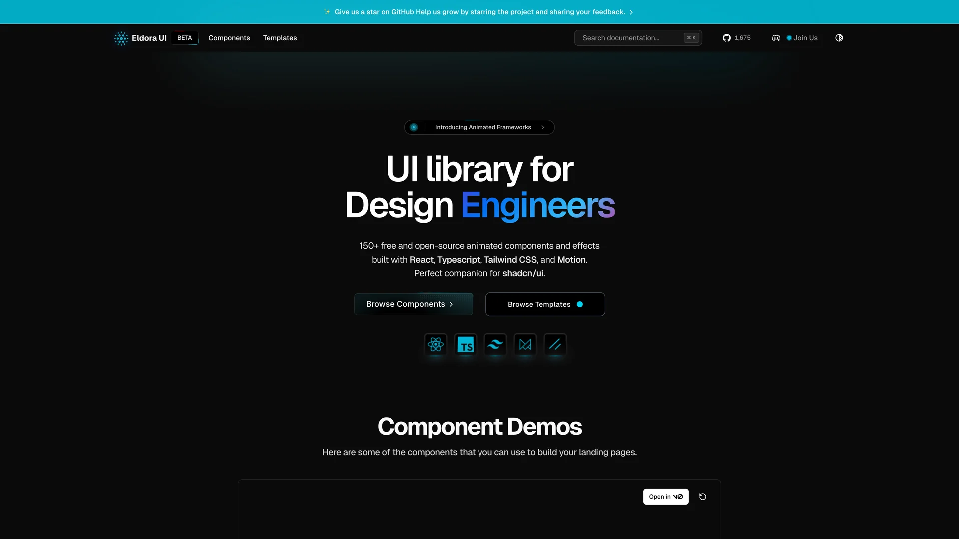
Eldora UI
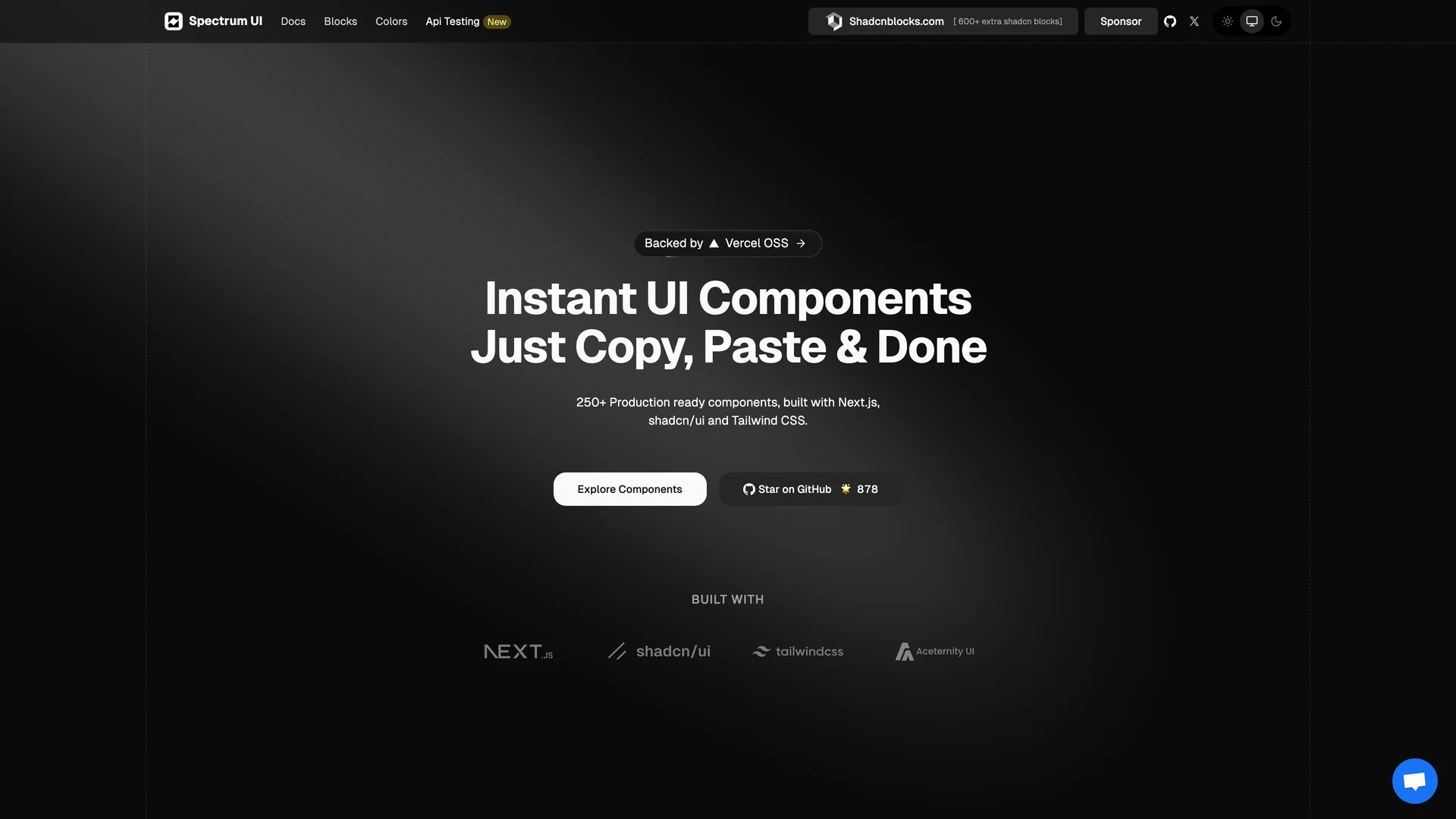
ui.spectrumhq.in
Spectrum UI
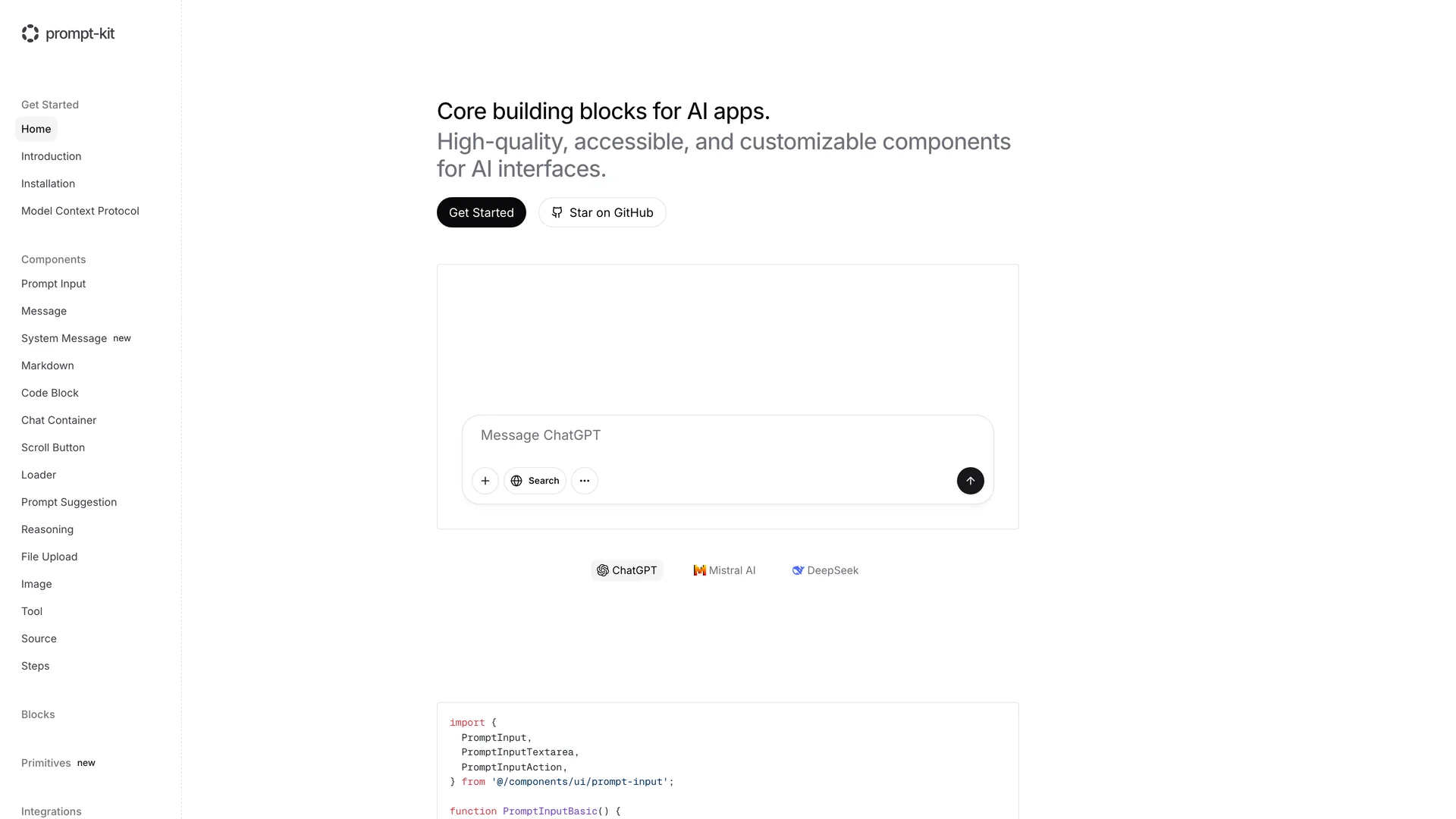
prompt-kit.com
Prompt Kit
Authors in block library
I
Ibelick
2 templates
M
Magicuidesign
1 templates
T
Tremorlabs
1 templates
N
Newcult
1 templates
K
Karthikmudunuri
1 templates
A
Arihantcodes
1 templates
Related Categories
Tailwind
10 templates
·
6 authors
React
9 templates
·
6 authors
Nextjs
7 templates
·
5 authors
Ui kits & component libraries
7 templates
·
6 authors
Vite
1 templates
·
1 authors
Headless ui
1 templates
·
1 authors
Scroll to top
Get Pro — Save 33%
·
Ends in
--:--:--
→
