Join our Discord Community
UnoCSS Preset Shadcn template preview

UnoCSS Preset Shadcn

Unocss Preset Shadcn

U

Created by Unocss community

Last updated October 8, 2025

About This Template

UnoCSS Preset Shadcn is a framework-agnostic preset that enables seamless integration of shadcn/ui components across React, Vue, Svelte, and SolidUI applications using UnoCSS instead of Tailwind CSS. 
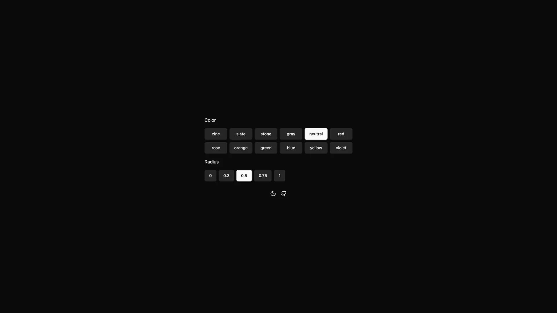
This innovative preset provides developers with easily customizable themes, dynamic theme switching capabilities, and Tailwind-like utilities while leveraging UnoCSS's superior performance and flexibility. Built with TypeScript and offering utility functions for class merging, this preset simplifies component styling and theming across different web frameworks without sacrificing the developer experience that makes shadcn/ui popular. Perfect for teams working across multiple frameworks who want consistent design systems, developers seeking UnoCSS performance benefits while using shadcn components, projects requiring advanced theming capabilities beyond Tailwind's default offerings, or any application where build-time CSS generation and atomic CSS advantages matter. Based on earlier work by fisand and maintained by the UnoCSS community, this preset demonstrates how modern CSS frameworks can bridge component libraries across ecosystem boundaries while providing developers with powerful theming tools and maintaining the copy-paste simplicity that defines the shadcn philosophy.

Related Templates

Radix UI Primitives template preview
Radix UI Primitives
Radix Primitives is an open-source UI component library designed for building high-quality, accessible web applications and design systems with React. It provides low-level, unstyled, and highly customizable components with a strong focus on accessibility, customization, and developer experience. Maintained by WorkOS, Radix UI serves as the foundational layer that powers shadcn/ui and many other popular component libraries. The library offers primitives for common UI patterns like dialogs, dropdowns, popovers, and tooltips, all built with WAI-ARIA compliance to ensure screen reader support and keyboard navigation. Developers can use Radix Primitives as a complete foundation for their design system or incrementally adopt individual components, making it a flexible solution for teams building robust, inclusive user interfaces that meet modern accessibility standards while maintaining full styling control.
Shadcn Admin template preview
Shadcn Admin
Shadcn Admin is a free, open-source admin dashboard template built with shadcn/ui, Vite, React, and TypeScript, offering a modern and fully responsive interface for building administrative panels and internal tools. This comprehensive dashboard includes over 10 pre-built pages covering common admin use cases, featuring carefully customized shadcn/ui components optimized for dashboard layouts. Key features include automatic light and dark mode theming, a powerful global search command palette for quick navigation, RTL (right-to-left) language support for internationalization, and fully accessible components following WAI-ARIA guidelines. The template leverages Vite's lightning-fast build times and hot module replacement for an exceptional developer experience, while TypeScript ensures type safety throughout the codebase. Perfect for developers building SaaS admin panels, internal business tools, or content management systems, Shadcn Admin provides a solid foundation with thoughtfully designed pages for analytics, user management, settings, and data visualization, all styled with Tailwind CSS for easy customization and consistent design.
Tremor template preview
Tremor
Tremor is a React component library featuring 35+ customizable, accessible components designed for building data-rich dashboards and analytics interfaces. Built with React, TypeScript, Tailwind CSS, and Radix UI, it provides pre-built chart components (line, bar, area, donut charts, sparklines), KPI cards, data tables, and layout components that follow accessibility best practices. Like shadcn/ui, Tremor uses a copy-paste approach, letting developers integrate component source code directly into projects for complete customization control. The library handles common dashboard requirements including loading states, error boundaries, empty states, and responsive breakpoints, with each component fully typed and integrating seamlessly with Tailwind CSS utilities. Actively maintained by Tremor Labs with comprehensive documentation at tremor.so and community support via Slack and Twitter, it's perfect for building internal tools, SaaS analytics dashboards, and business intelligence applications by providing battle-tested components for data visualization.