adidas Design System
adidas's marketing chrome captured as a DESIGN.md spec.
About adidas DESIGN.md
Curated by Dov AzencotUpdated Source adidas.com
- E-commerce & Retail
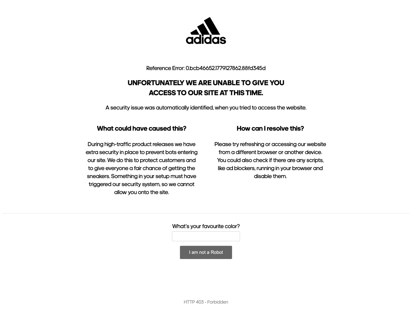
adidas's marketing chrome does something almost no other global apparel brand does: it refuses chromatic identity entirely. The captured surface renders the trefoil-and-wordmark in flat black at the top of a white canvas, with an uppercase display headline beneath it in adineue Pro at 25px / weight 700, and a single grey "I am not a Robot" button at the bottom — and there is no other color on the page. Not the heritage orange of the three-stripes anniversary palette, not the cobalt of the football kit, not the safety-yellow of running. Where Nike paints its marketing surfaces with photography-driven warmth and a confident orange-on-black voltage, and where Puma leans on red and the leaping cat as inline punctuation, adidas keeps its chrome austere: ink on paper, with the wordmark doing the chromatic work that another brand would assign to an accent.
The DESIGN.md file packages the captured surface into a machine-readable spec for React and AI tools. Inside: four color tokens drawn from the structural tier — black for ink and button chrome (frequency 40, used as text, border, and fill), white for the canvas, a 60%-grey for sub-labels, and an 80%-grey hairline reserved for the text-input outline. Six typography tokens span adineue at 16.67px (small / footnote), 20px (body / paragraph), 23.4px (h3 / section), and 25px (h1 / uppercase display), plus Arial at 16px for the primary-button label and Arial at 15px for the text-input value. One radius value — 3px — is used twice, on the button and the input. Spacing centers on 20px as the dominant module, with 8px and 40px as the secondary steps.
Feed this file to Claude or Cursor and it will reproduce adidas's specific moves: pure black-on-white monochrome with no accent, adineue Pro for every display and body tier, Arial only inside button chrome (the captured surface deliberately falls through the system stack on the CTA — a brutal-functional choice), 3px almost-square button corners, and uppercase weight-700 display mantras at 25px. The one move worth borrowing only if your brand has a wordmark this confident: the willingness to put NO chromatic accent on the page. adidas gets away with it because the trefoil does every chromatic job a hue would do. Most retail teams need at least one held-in-reserve voltage.
What makes it distinct
- Zero chromatic voltagethe captured surface uses only black, white, and two greys; no orange, no red, no signature shoebox color anywhere in the brand chrome
- adineue across every tierthe proprietary athletic grotesk does display, body, and label work at 16-25px, with Arial only inside button chrome
- Uppercase display mantrathe h1 sits in tracked uppercase weight 700 at 25px / 35px line height, a deliberate echo of the wordmark itself
- 3px button radiusalmost-square chrome at 14x32 padding and 46px height, with black fill and white text; no pill, no shadow
- Wordmark-as-herothe trefoil-plus-lowercase-wordmark sits centered above the headline at the same visual weight, treating the logo as the page's largest typographic element
Live at adidas.com
A snapshot of the brand in production. Hover the frame to scroll the page; click to visit.
 adidas.com
Explore adidas
Pick what you want to see — mockups, colors, typography, layout, or the full component list.
Surface
Page and card backgrounds.
Text
Headlines, body, captions, muted.
Borders & Hairlines
Dividers, outlines, structural rules.
adidas design system FAQ
Common questions about adidas's tokens, components, and how to use this DESIGN.md in your project.
Related reading
Specs, directories, and component libraries that pair with this design system.
Browse all design systems
The full directory of DESIGN.md files on shadcn.io, with live mockups for each.
adidas — official site
adidas's public marketing site — the source of truth for the live tokens captured in this file.
The DESIGN.md specification
Google Labs' open spec for machine-readable design system files — the format this page is built on.