Join our Discord Community
Kibo UI template preview

Kibo UI

H

Created by Haydenbleasel

Last updated October 8, 2025

About This Template

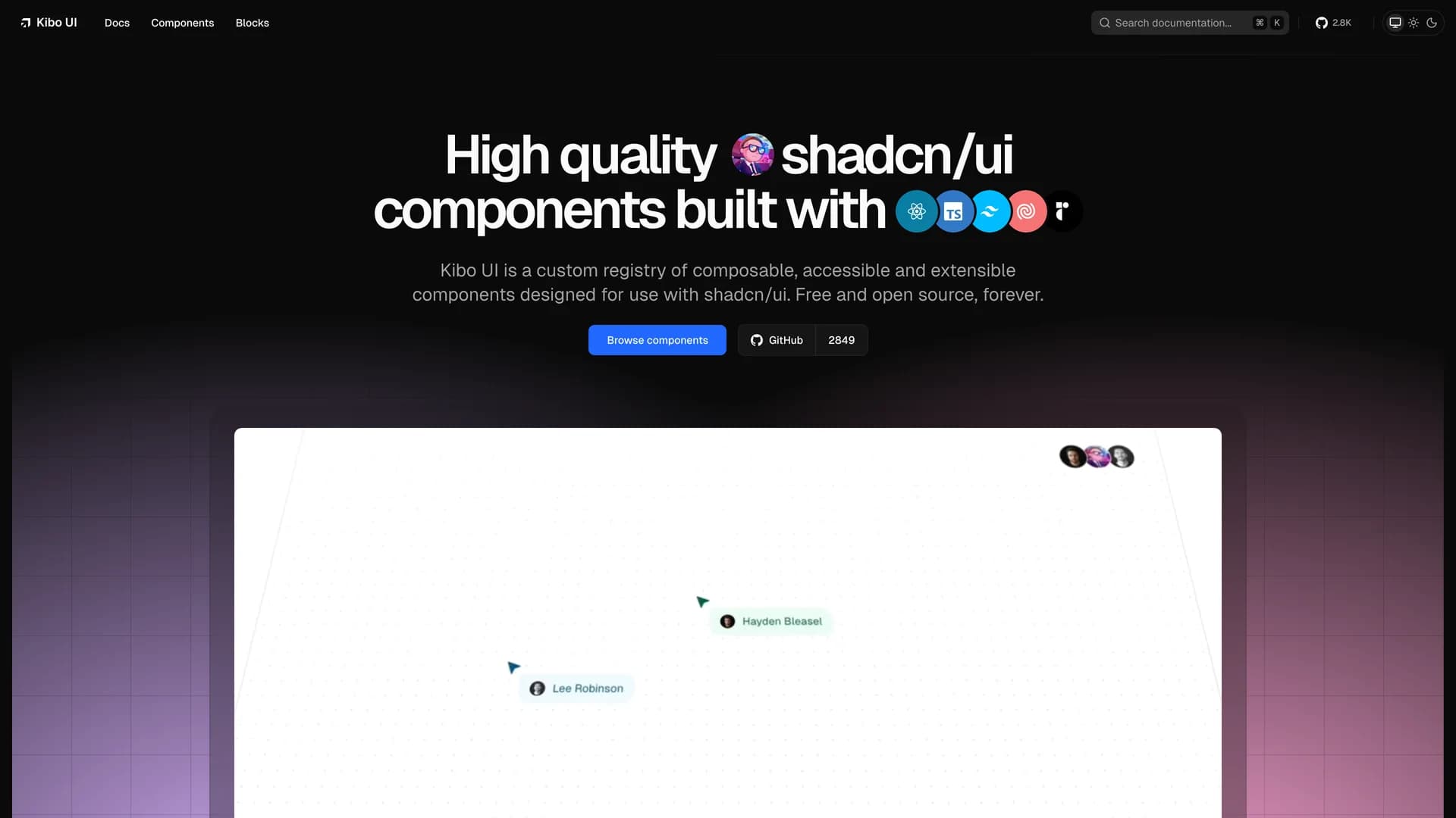
Kibo UI is a custom component registry template that extends shadcn/ui's philosophy to more complex, opinionated components requiring business logic and state management. The MIT-licensed project provides a curated collection of advanced UI components including enhanced data tables, multi-step forms, command palettes, and feature-rich input controls that go beyond shadcn/ui's primitive building blocks. Built with Next.js 15, TypeScript, Tailwind CSS, and Radix UI primitives, Kibo demonstrates how to create a custom registry following shadcn/ui's architecture while adding components with integrated functionality like drag-and-drop file uploads, advanced search interfaces, and complex form validation. The template includes a complete documentation site powered by Fumadocs, showing developers how to build, document, and distribute their own component libraries using the same CLI-based installation approach that makes shadcn/ui popular. Perfect for teams building design systems, developers creating reusable component libraries, or projects requiring sophisticated UI patterns with built-in business logic beyond basic primitives.

Related Templates

Tremor template preview
Tremor
Tremor is a React component library featuring 35+ customizable, accessible components designed for building data-rich dashboards and analytics interfaces. Built with React, TypeScript, Tailwind CSS, and Radix UI, it provides pre-built chart components (line, bar, area, donut charts, sparklines), KPI cards, data tables, and layout components that follow accessibility best practices. Like shadcn/ui, Tremor uses a copy-paste approach, letting developers integrate component source code directly into projects for complete customization control. The library handles common dashboard requirements including loading states, error boundaries, empty states, and responsive breakpoints, with each component fully typed and integrating seamlessly with Tailwind CSS utilities. Actively maintained by Tremor Labs with comprehensive documentation at tremor.so and community support via Slack and Twitter, it's perfect for building internal tools, SaaS analytics dashboards, and business intelligence applications by providing battle-tested components for data visualization.
Onborda template preview
Onborda
Onborda is a lightweight onboarding wizard and product tour library for Next.js applications that uses Framer Motion for smooth animations and Tailwind CSS for styling, with full shadcn/ui compatibility. The library enables developers to create customizable, interactive product tours that guide users through application features with configurable tooltips, pointers, and step-by-step flows. Supporting multiple tours in a single implementation, Onborda provides flexible step configuration including custom icons, positioning options (top, bottom, left, right), route navigation between steps, and custom card/tooltip designs. Features include customizable shadow and overlay effects, interactive overlay controls, smooth transitions between steps, and declarative tour definitions using simple selector-based targeting. The library handles complex scenarios like multi-page tours that navigate between routes, conditional step display, and custom styling for each tour step. Perfect for SaaS applications needing user onboarding, feature announcements, or guided walkthroughs, Onborda provides a polished user experience with minimal setup. With comprehensive documentation at onborda.dev, the library demonstrates how to create engaging product tours that improve user adoption and feature discovery.
Kokonut UI template preview
Kokonut UI
Kokonut UI is a collection of animated, accessible UI components built with React, Tailwind CSS, and Framer Motion, providing production-ready components with smooth animations and modern design patterns. The open-source library offers copy-and-paste components following shadcn/ui's philosophy, including animated cards, interactive buttons, smooth transitions, and engaging micro-interactions that enhance user experience. Built with TypeScript for type safety, the components integrate Framer Motion's animation capabilities with Tailwind CSS utility classes, creating visually polished interfaces without complex animation code. Each component is designed for accessibility with proper ARIA attributes, keyboard navigation support, and responsive behavior across devices. Perfect for marketing websites, landing pages, SaaS applications, or any project requiring eye-catching animations and professional polish beyond basic UI primitives, Kokonut UI demonstrates how to combine animation libraries with utility-first CSS for components that are both beautiful and maintainable.