Join our Discord Community
Shadcn Vue template preview

Shadcn Vue

U

Created by Unovue

Last updated October 8, 2025

About This Template

Shadcn Vue is an unofficial, community-driven Vue.
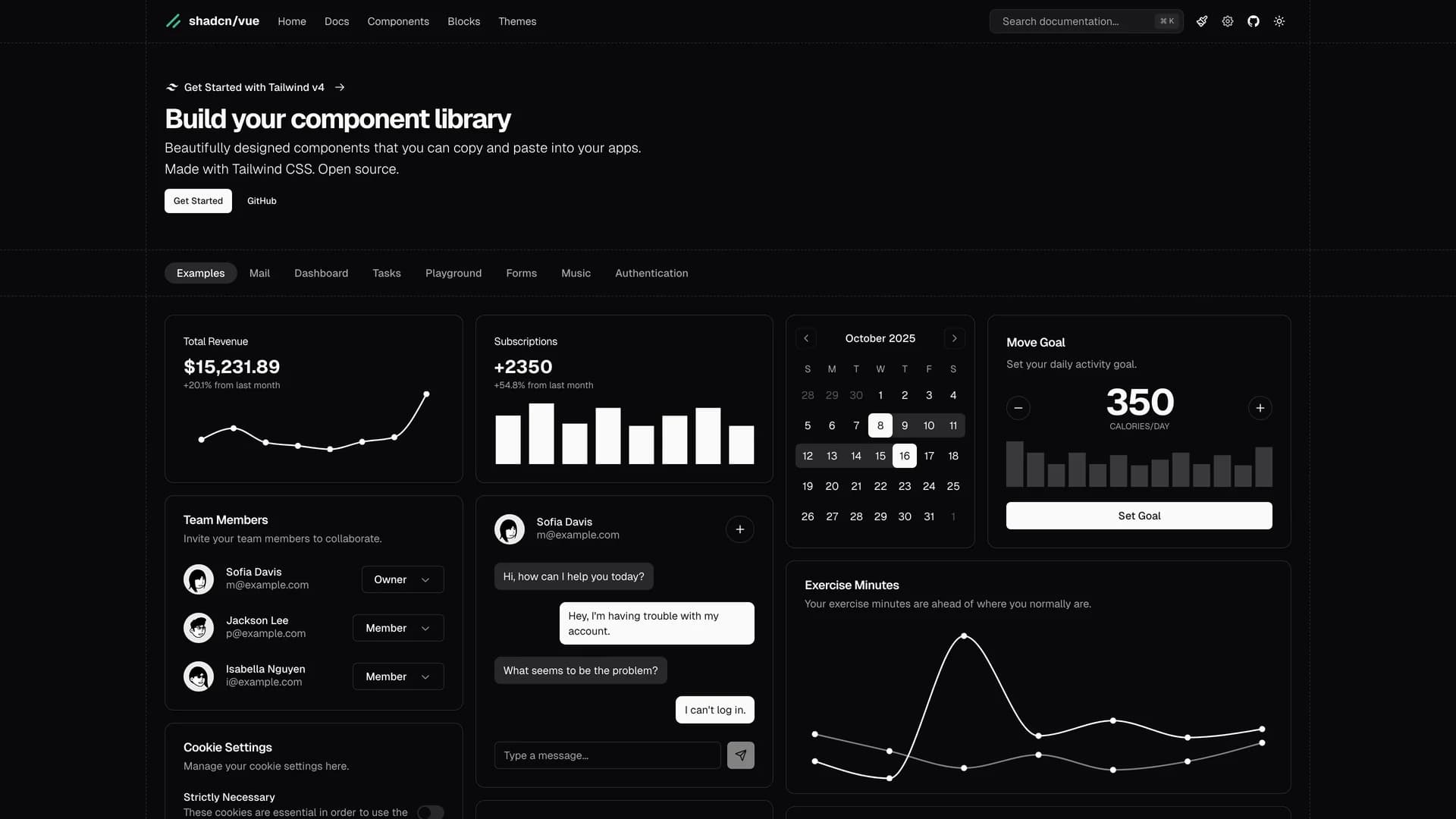
js port of the popular shadcn/ui component library, bringing the same accessible, customizable, and copy-paste component philosophy to the Vue ecosystem. Developed with the blessing of shadcn/ui's original creator, this open-source project provides Vue developers with beautifully designed components built on Radix Vue primitives and styled with Tailwind CSS, offering the same flexibility and ownership model that made shadcn/ui successful in the React community. The library includes a comprehensive collection of Vue components like buttons, dialogs, dropdowns, forms, and data tables, all designed with accessibility as a priority following WAI-ARIA standards. Unlike traditional Vue component libraries that require npm installations and updates, Shadcn Vue allows developers to copy components directly into their projects, giving them full control to customize, modify, and adapt components to their specific needs without dealing with dependency management. Perfect for Vue 3 applications, Nuxt projects, and any Vue-based web application, this library provides a solid foundation for building modern, consistent design systems while maintaining the composability and reactivity that Vue developers love, making it an ideal choice for teams seeking accessible, production-ready components with complete customization freedom.

Related Templates

Shadcn UI template preview
Shadcn UI
shadcn/ui is an open-source component library that provides beautifully designed, accessible, and customizable UI components built with React, Radix UI, and Tailwind CSS. Unlike traditional component libraries, shadcn/ui uses a unique copy-paste approach where developers directly copy components into their projects, giving them full ownership and control over the code. The library includes a comprehensive collection of reusable components ranging from basic elements like buttons and inputs to complex components like data tables, calendars, and command palettes. Built with TypeScript for type safety, it supports dark mode, offers a powerful CLI for easy installation, and integrates seamlessly with modern tools like Next.js, React Hook Form, and Zod. This developer-friendly approach makes shadcn/ui the perfect foundation for building custom design systems and production-ready applications across SaaS dashboards, e-commerce platforms, and admin panels.
Radix UI Primitives template preview
Radix UI Primitives
Radix Primitives is an open-source UI component library designed for building high-quality, accessible web applications and design systems with React. It provides low-level, unstyled, and highly customizable components with a strong focus on accessibility, customization, and developer experience. Maintained by WorkOS, Radix UI serves as the foundational layer that powers shadcn/ui and many other popular component libraries. The library offers primitives for common UI patterns like dialogs, dropdowns, popovers, and tooltips, all built with WAI-ARIA compliance to ensure screen reader support and keyboard navigation. Developers can use Radix Primitives as a complete foundation for their design system or incrementally adopt individual components, making it a flexible solution for teams building robust, inclusive user interfaces that meet modern accessibility standards while maintaining full styling control.
Magic UI template preview
Magic UI
Magic UI is an open-source component library designed specifically for design engineers, offering a collection of over 50 animated components and visual effects that can be easily copied and pasted into React applications. Built with TypeScript, Next.js, Tailwind CSS, and Framer Motion, this library focuses on providing high-quality, visually engaging UI elements that bring motion and interactivity to modern web projects. With over 19,000 GitHub stars and an MIT license, Magic UI streamlines the process of creating dynamic user interfaces by offering ready-to-use components like animated backgrounds, text effects, interactive cards, and smooth transitions. The library follows the same copy-paste philosophy as shadcn/ui, giving developers full ownership of the code while eliminating external dependencies. Perfect for landing pages, marketing sites, and applications that need eye-catching animations, Magic UI helps developers quickly enhance their projects with professional, customizable design elements.