Join our Discord Community
AutoForm template preview

AutoForm

Autoform

V

Created by Vantezzen

Last updated October 8, 2025

About This Template

AutoForm is an open-source React library that automatically generates dynamic, fully-functional forms from existing data schemas with built-in validation, eliminating the need to manually build form components. 
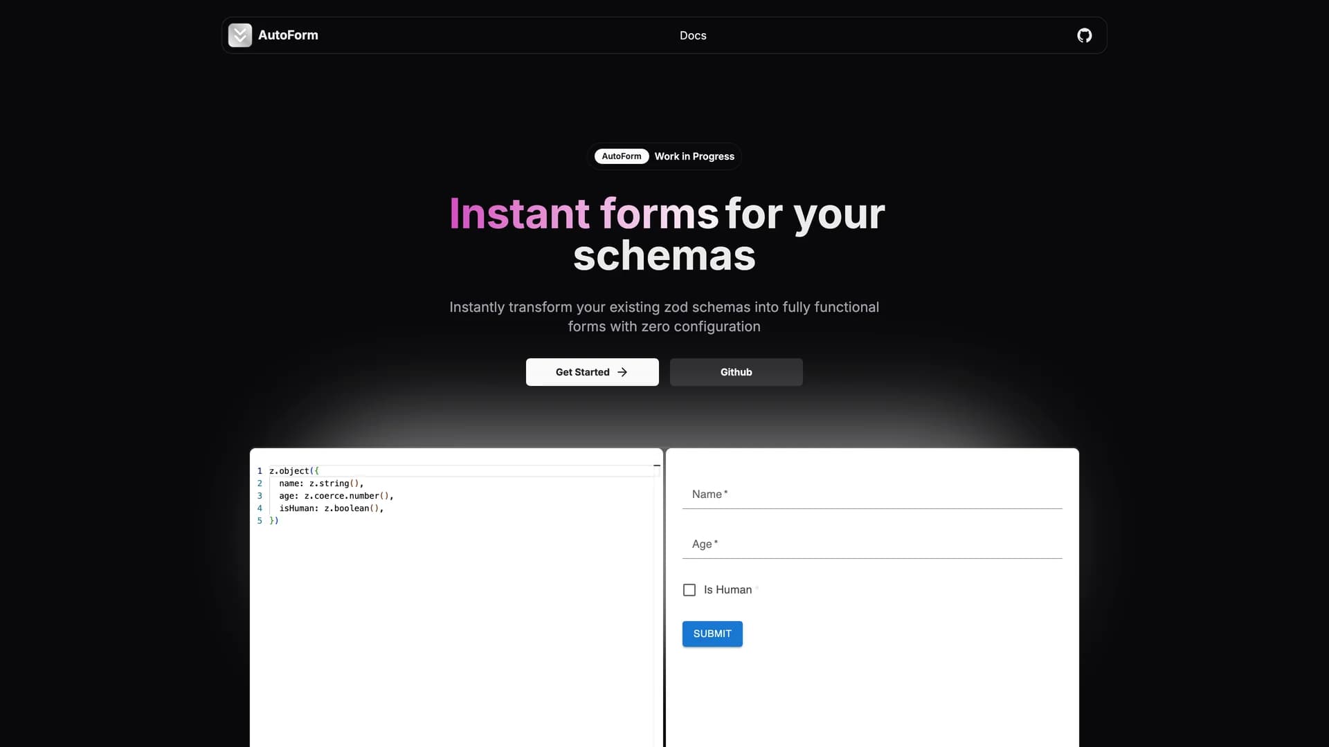
By simply passing a schema definition (such as Zod, Yup, or other validation libraries), AutoForm instantly renders production-ready forms with proper input types, validation rules, error messages, and submit handling. The library supports multiple UI frameworks including shadcn/ui, Material UI, Mantine, and custom renderers, making it incredibly versatile across different design systems and project requirements. Perfect for rapidly prototyping internal tools, admin panels, settings pages, or any scenario where forms need to be created quickly without sacrificing functionality, AutoForm handles complex field types including text inputs, checkboxes, select dropdowns, date pickers, file uploads, and nested object structures. The schema-agnostic design means it integrates seamlessly with your existing validation logic, while the customization options allow overriding default behavior for specific fields when needed. Developers save hours of repetitive form-building work, as AutoForm automatically infers field types from schema definitions, applies validation rules client-side and server-side, generates accessible form markup with proper labels and ARIA attributes, and handles form state management internally. Ideal for MVPs, prototypes, and low-priority forms where development speed is crucial, this library demonstrates how schema-driven development can dramatically accelerate UI implementation while maintaining type safety and code quality.

Related Templates

Tremor template preview
Tremor
Tremor is a React component library featuring 35+ customizable, accessible components designed for building data-rich dashboards and analytics interfaces. Built with React, TypeScript, Tailwind CSS, and Radix UI, it provides pre-built chart components (line, bar, area, donut charts, sparklines), KPI cards, data tables, and layout components that follow accessibility best practices. Like shadcn/ui, Tremor uses a copy-paste approach, letting developers integrate component source code directly into projects for complete customization control. The library handles common dashboard requirements including loading states, error boundaries, empty states, and responsive breakpoints, with each component fully typed and integrating seamlessly with Tailwind CSS utilities. Actively maintained by Tremor Labs with comprehensive documentation at tremor.so and community support via Slack and Twitter, it's perfect for building internal tools, SaaS analytics dashboards, and business intelligence applications by providing battle-tested components for data visualization.
Onborda template preview
Onborda
Onborda is a lightweight onboarding wizard and product tour library for Next.js applications that uses Framer Motion for smooth animations and Tailwind CSS for styling, with full shadcn/ui compatibility. The library enables developers to create customizable, interactive product tours that guide users through application features with configurable tooltips, pointers, and step-by-step flows. Supporting multiple tours in a single implementation, Onborda provides flexible step configuration including custom icons, positioning options (top, bottom, left, right), route navigation between steps, and custom card/tooltip designs. Features include customizable shadow and overlay effects, interactive overlay controls, smooth transitions between steps, and declarative tour definitions using simple selector-based targeting. The library handles complex scenarios like multi-page tours that navigate between routes, conditional step display, and custom styling for each tour step. Perfect for SaaS applications needing user onboarding, feature announcements, or guided walkthroughs, Onborda provides a polished user experience with minimal setup. With comprehensive documentation at onborda.dev, the library demonstrates how to create engaging product tours that improve user adoption and feature discovery.
Kokonut UI template preview
Kokonut UI
Kokonut UI is a collection of animated, accessible UI components built with React, Tailwind CSS, and Framer Motion, providing production-ready components with smooth animations and modern design patterns. The open-source library offers copy-and-paste components following shadcn/ui's philosophy, including animated cards, interactive buttons, smooth transitions, and engaging micro-interactions that enhance user experience. Built with TypeScript for type safety, the components integrate Framer Motion's animation capabilities with Tailwind CSS utility classes, creating visually polished interfaces without complex animation code. Each component is designed for accessibility with proper ARIA attributes, keyboard navigation support, and responsive behavior across devices. Perfect for marketing websites, landing pages, SaaS applications, or any project requiring eye-catching animations and professional polish beyond basic UI primitives, Kokonut UI demonstrates how to combine animation libraries with utility-first CSS for components that are both beautiful and maintainable.