React Templates - Next.js
158 templates • 128 contributors • Open source & free
Available Templates (158)
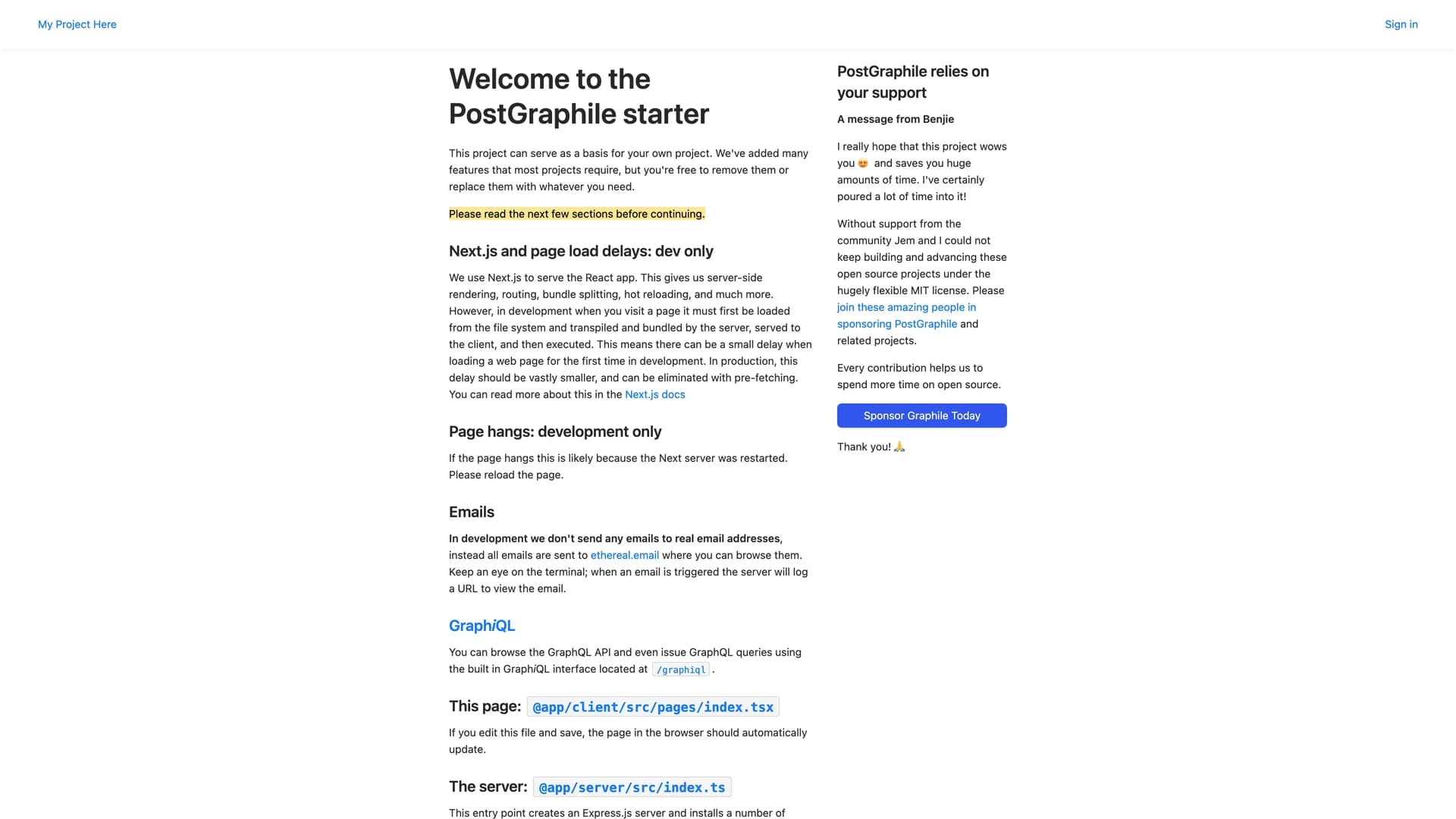
- Graphile StarterGraphile Starter is an opinionated, batteries-included full-stack SaaS template featuring pre-built user accounts, organization management, and a deeply integrated GraphQL-first architecture for rapid application development. Built with React, Next.js, Node.js, TypeScript, PostgreSQL, and PostGraphile, it provides a production-ready foundation with Apollo Client for GraphQL queries, Graphile Worker for background jobs, Graphile Migrate for database migrations, GraphQL Code Generator for type safety, and comprehensive testing with Jest and Cypress. The starter includes complete authentication flows, server-side rendering, automated code generation, and a job queue system, following best practices for type safety, performance, and scalability. Designed for developers familiar with the technology stack (not for beginners), it accelerates development by providing a cohesive, pre-configured environment that handles common SaaS requirements like user management, organizations, and GraphQL APIs. Perfect for building production web applications quickly, Graphile Starter is crowd-funded open-source software that eliminates setup overhead and provides a robust foundation for both small projects and large-scale applications.
- Shadcn UI ExpansionsShadcn UI Expansions is an open-source collection of additional components built on top of shadcn/ui, extending the library with specialized UI elements for React and Next.js applications. Built with TypeScript and Tailwind CSS, the project provides useful components like Autosize Textarea, Floating Label Input, Infinite Scroll, Loading Button, Multiple Selector, Datetime Picker, Responsive Modal, and Typewriter effect that complement shadcn/ui's core components. Following shadcn/ui's copy-paste philosophy, all components are free for personal and commercial use with full code ownership—simply copy the code into your project and customize to your needs. The MIT-licensed library is maintained by Hsuan Yi Chou with contributions from the community, offering live demos at shadcnui-expansions.typeart.cc where developers can preview components before integration. Perfect for projects that need specialized functionality beyond shadcn/ui's base components, Shadcn UI Expansions fills common gaps with well-designed, accessible components that maintain consistency with the shadcn design system while adding frequently requested features like datetime selection, infinite scrolling, and advanced input types.
- Eldora UIEldora UI is an open-source UI library designed for design engineers, offering a comprehensive collection of reusable components, blocks, and templates that can be easily copied and pasted into web applications. Built primarily with TypeScript (87.7% of the codebase), Next.js, React, Tailwind CSS, and Headless UI, the MIT-licensed library simplifies UI development by providing ready-to-use interface elements that maintain consistency and quality. The project features comprehensive documentation at eldoraui.site/docs and an active Discord community for support and collaboration. Eldora UI focuses on helping developers quickly integrate pre-built components into their projects without sacrificing customization flexibility, following a copy-paste approach where the code becomes yours to modify. With components ranging from basic UI elements to complex blocks and full templates, it provides building blocks for various application types. Perfect for design engineers and developers seeking high-quality, customizable components that accelerate development while maintaining professional design standards, Eldora UI bridges the gap between rapid development and polished user interfaces.
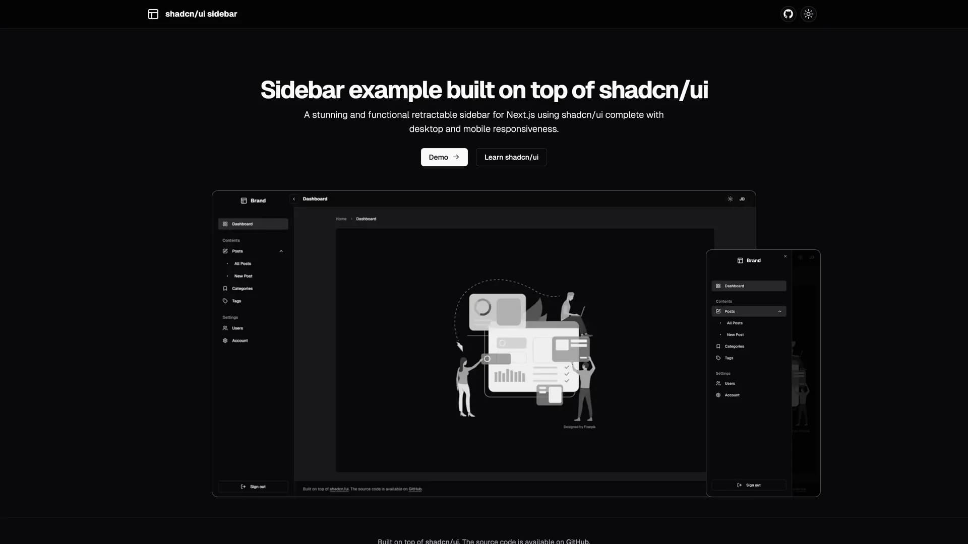
- Shadcn UI SidebarShadcn UI Sidebar is a stunning, functional, and fully responsive retractable sidebar component for Next.js applications built with shadcn/ui, TypeScript, and Tailwind CSS. The sidebar features multiple viewing modes including retractable mini and wide layouts, scrollable menu navigation, grouped menu items with labels, collapsible submenus, and a mobile-friendly sheet menu implementation. Built with Zustand for state management, it provides smooth transitions between expanded and collapsed states while maintaining full responsiveness across all device sizes. The component includes extracted menu items list for easy customization, supports both light and dark modes, and offers flexible navigation options that adapt to different screen sizes. Perfect for building admin dashboards, SaaS applications, or any project requiring professional navigation, the sidebar delivers a polished user experience with minimal setup. Available as open-source with comprehensive documentation and live demo at shadcn-ui-sidebar.salimi.my, it demonstrates best practices for building complex, interactive components with shadcn/ui and Next.js 16.
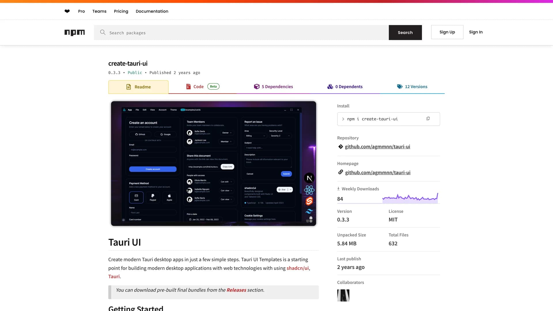
- Tauri UITauri UI is a project scaffolding tool for creating modern, lightweight cross-platform desktop applications using Tauri and shadcn/ui with support for multiple frontend frameworks including React, Next.js, and SvelteKit. The CLI tool (create-tauri-ui) enables developers to quickly set up new desktop app projects with a single command, providing templates that include native-looking window controls, dark and light mode support, Radix UI primitives, Lucide/Radix icons, and optimized bundle sizes around 2-2.5 MB per platform. Built with TypeScript and Tailwind CSS, Tauri UI bridges web development and native desktop apps, allowing developers to build performant, system-native applications using familiar web technologies. The templates follow best practices for Tauri development while maintaining the flexibility and design consistency of shadcn/ui components. Perfect for developers looking to create desktop applications for Windows, macOS, and Linux without learning platform-specific languages, Tauri UI simplifies the setup process and provides a modern development experience with hot reload, TypeScript support, and production-ready configurations.
- Data Table FiltersData Table Filters is a standalone demo playground by OpenStatus showcasing advanced data table implementations with Tanstack Table, featuring both client-side pagination and server-side infinite scroll with click-through details. Built with Next.js, Tanstack Query, shadcn/ui, cmdk, nuqs, and dnd-kit, the project demonstrates flexible, reusable data table patterns inspired by Datadog and Vercel log tables. The implementation includes sophisticated features like dynamic filtering, sorting, column management, drag-and-drop functionality, and URL-based state persistence for shareable filtered views. Designed as a reference implementation for the OpenStatus dashboard, it provides developers with production-ready patterns for building complex data tables in React applications. The project emphasizes accessibility and user experience while handling large datasets efficiently through virtualization and optimized rendering strategies. Perfect for developers building admin panels, analytics dashboards, or any application requiring powerful data visualization and manipulation, Data Table Filters demonstrates best practices for integrating Tanstack Table with modern React ecosystem tools and offers a foundation for MVP development with advanced table functionality.
- Intent UIIntent UI is an accessible React component library built on React Aria Components and Tailwind CSS, emphasizing web accessibility while providing easily customizable components through a copy-paste workflow. Written primarily in TypeScript (78.2%), the MIT-licensed library offers components designed with accessibility as a core principle, leveraging React Aria's robust primitives for keyboard navigation, screen reader support, and ARIA compliance. The chill, developer-friendly approach allows you to copy components directly into React projects and customize them to match specific design requirements without dealing with npm dependencies or version conflicts. With comprehensive documentation at intentui.com and design templates to accelerate interface creation, Intent UI bridges the gap between accessible component libraries and the flexibility of owned code. Perfect for developers who prioritize accessibility standards like WCAG while maintaining full control over component styling and behavior, Intent UI demonstrates how to build inclusive web applications with React Aria's powerful primitives and Tailwind's utility-first approach.
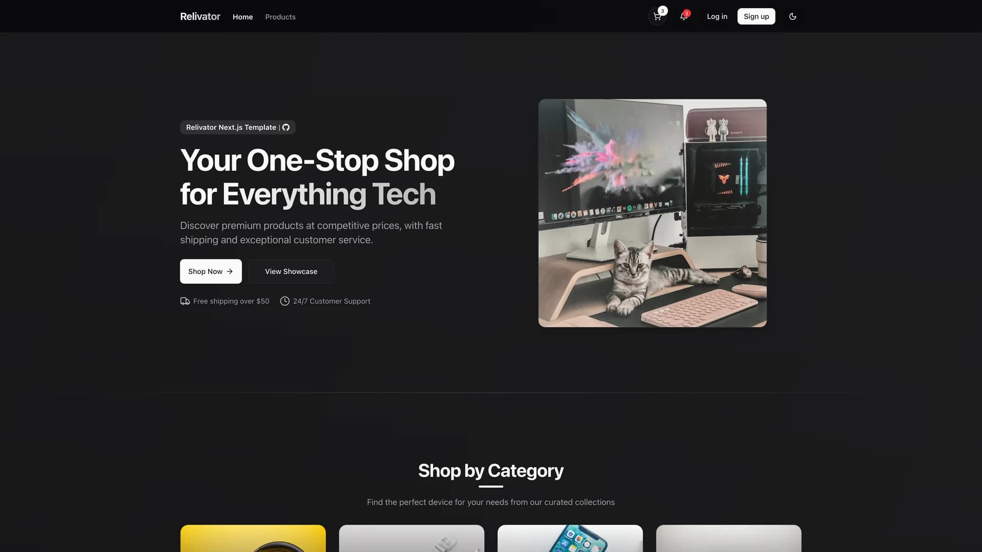
- RelivatorRelivator is a comprehensive Next.js 16 and React 19 ecommerce template designed for developers seeking a modern, scalable foundation for building full-stack web applications with robust commerce functionality. Built with TypeScript, Tailwind CSS, shadcn/ui, Drizzle ORM with Postgres/Neon database, better-auth for authentication, and Polar for payment processing and subscription management, it provides a feature-complete starting point for ecommerce projects. The template includes subscription checkout flows, dark mode support, AI-friendly development environment optimized for AI-powered IDEs, and a flexible, extensible architecture that scales from MVPs to production applications. Released under MIT license, Relivator emphasizes developer experience by integrating modern technologies without requiring extensive setup, allowing teams to focus on business logic rather than infrastructure. The comprehensive tech stack handles authentication, database operations, UI components, payments, and deployment, making it suitable for building SaaS products, online stores, marketplaces, or any application requiring ecommerce capabilities. Perfect for developers who want the productivity of a batteries-included template while maintaining the flexibility to customize every aspect of their application.
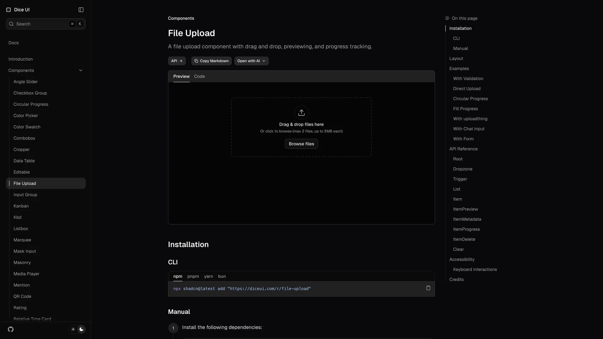
- File UploaderFile Uploader is a modern, user-friendly file upload component built with Next.js, shadcn/ui, Tailwind CSS, react-dropzone, uploadthing, and Zod for validation. The application provides a reusable file upload hook, drag-and-drop functionality with real-time progress bars, react-hook-form integration for seamless form workflows, and a file dialog for adding and removing files. Bootstrapped with create-t3-app, it offers a clean, modern interface that makes file uploading intuitive and visually appealing while handling validation, error states, and upload progress. The component supports multiple file uploads, file type restrictions, size limits, and custom validation rules through Zod schemas. With uploadthing integration, files are securely stored and managed with automatic URL generation and metadata tracking. Perfect for applications requiring document uploads, image galleries, profile pictures, or any file management functionality, File Uploader demonstrates best practices for building accessible, production-ready upload experiences. The project includes comprehensive documentation for local setup and deployment to platforms like Vercel, Netlify, and Docker.
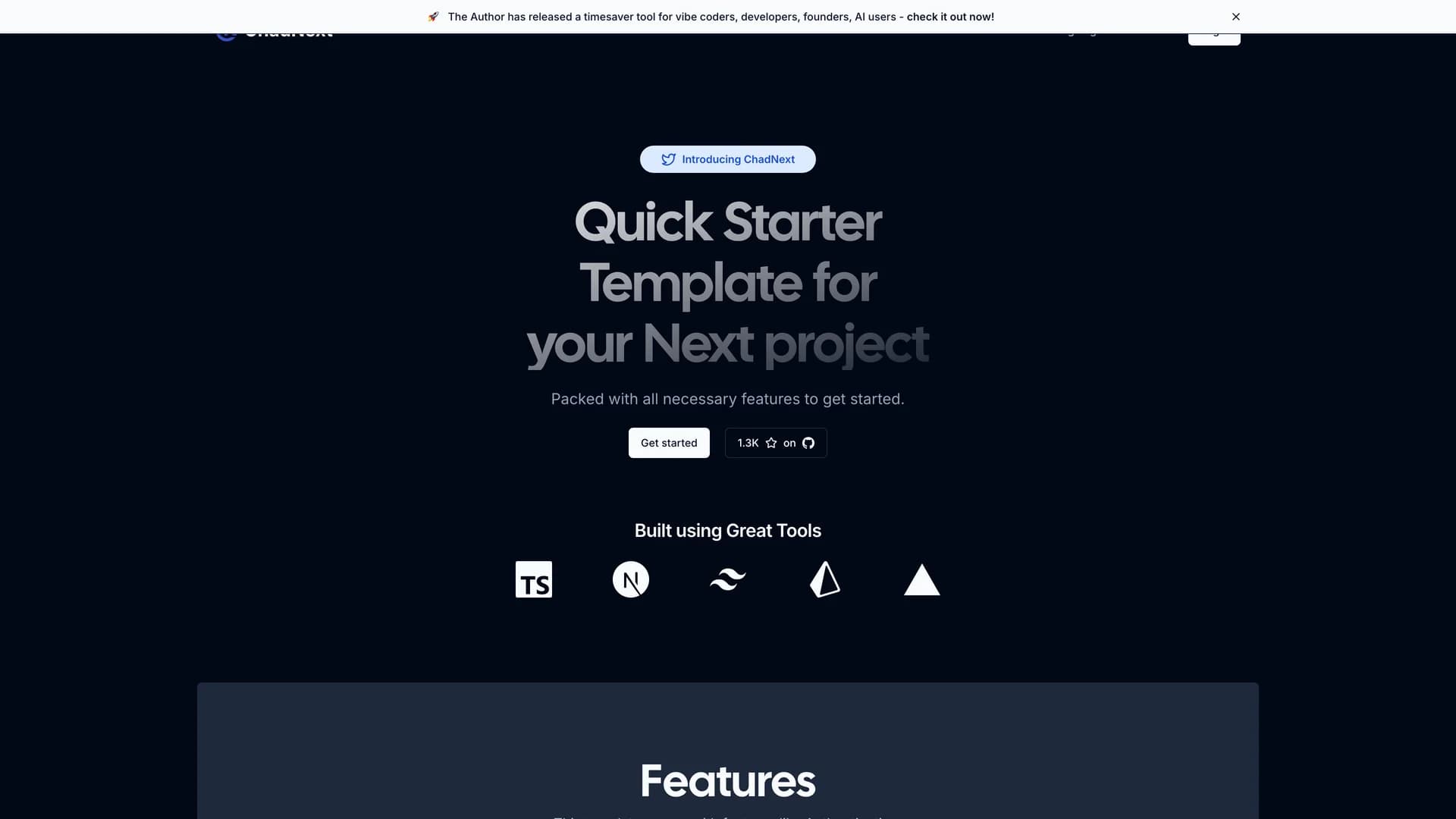
- ChadNextChadNext is a comprehensive Next.js 16 starter template designed to accelerate web development with a feature-rich stack including App Router, shadcn/ui, Lucia Authentication, Prisma ORM, Server Actions, Stripe integration, and internationalization support. Built with TypeScript, Tailwind CSS, and Radix UI primitives, this MIT-licensed template provides developers with a quick-start solution for building performant, full-stack applications with excellent developer experience. The template saves time and effort by providing pre-configured authentication flows, database interactions through Prisma, payment processing with Stripe, and beautiful UI components from shadcn/ui, all working together seamlessly. With support for rapid prototyping and streamlined deployment to platforms like Vercel, ChadNext eliminates hours of initial setup by providing a cohesive, production-ready foundation. The project includes server actions for type-safe mutations, internationalization for multi-language support, and a well-organized project structure that scales from MVPs to production applications. Perfect for developers building SaaS products, web applications, or any project requiring authentication, database management, and payment processing, ChadNext demonstrates best practices for modern Next.js development while maintaining flexibility for customization.
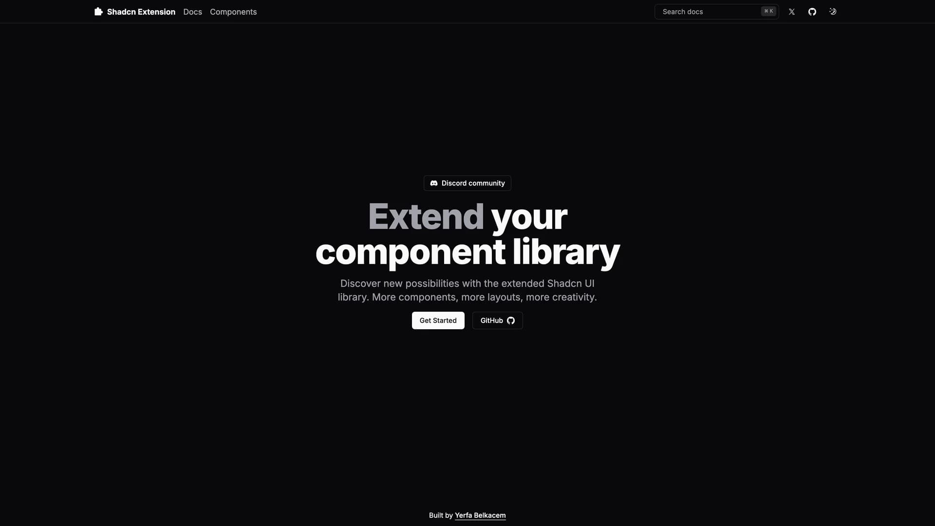
- Shadcn ExtensionShadcn Extension is an open-source component collection that extends UI libraries with additional shadcn/ui components, built using a Turborepo monorepo architecture with TypeScript, Next.js, Tailwind CSS, and Radix UI. The project provides a structured framework for developing and sharing reusable React components with a CLI that automates repetitive tasks like creating new components and managing dependencies. Organized into apps and packages directories, the extension offers a component registry mechanism that makes it easy to add custom components to projects while maintaining consistency with shadcn/ui's design principles. Built with pnpm for efficient package management, the monorepo structure allows developers to work on multiple related packages simultaneously while sharing common configuration and tooling. Perfect for teams building design systems or developers creating component libraries, Shadcn Extension provides the infrastructure to develop, test, and distribute high-quality UI components. The project demonstrates best practices for component library development including TypeScript for type safety, modular architecture for maintainability, and automated tooling for developer productivity.
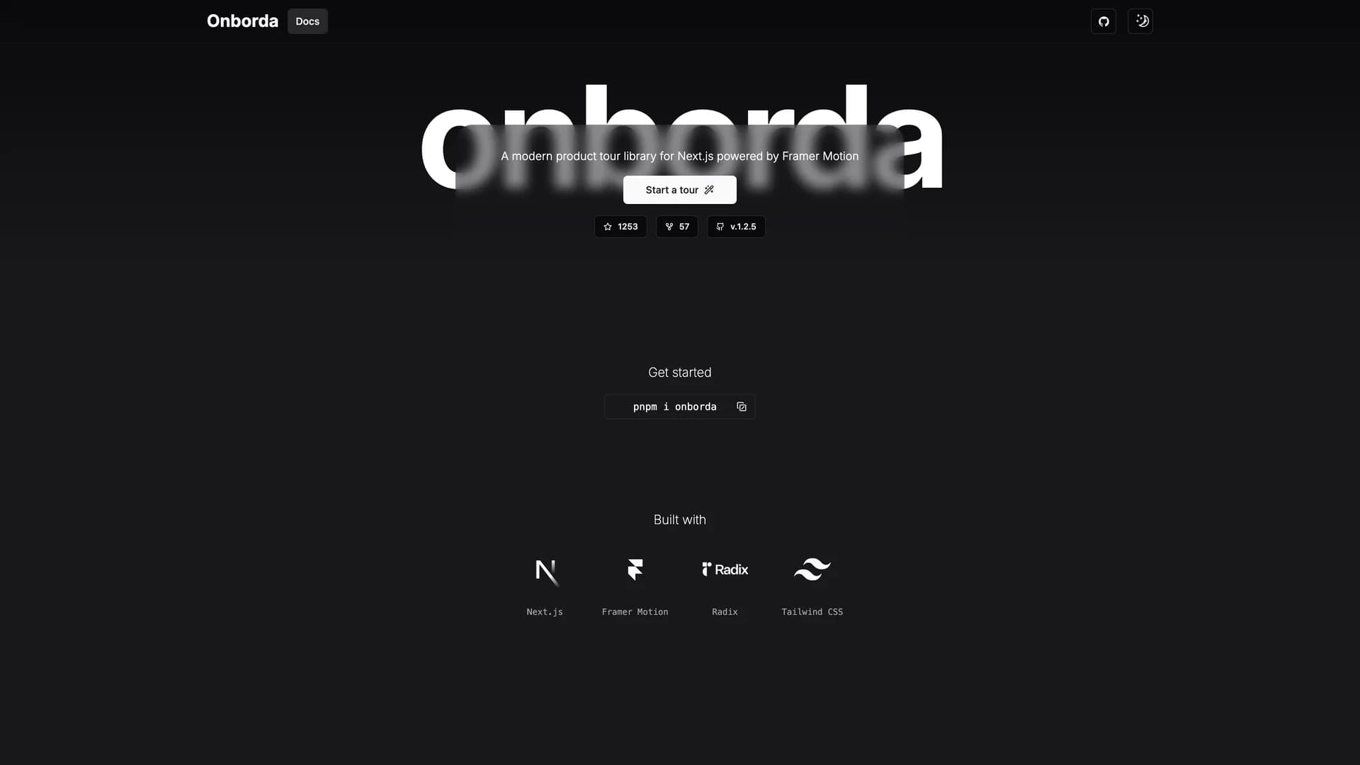
- OnbordaOnborda is a lightweight onboarding wizard and product tour library for Next.js applications that uses Framer Motion for smooth animations and Tailwind CSS for styling, with full shadcn/ui compatibility. The library enables developers to create customizable, interactive product tours that guide users through application features with configurable tooltips, pointers, and step-by-step flows. Supporting multiple tours in a single implementation, Onborda provides flexible step configuration including custom icons, positioning options (top, bottom, left, right), route navigation between steps, and custom card/tooltip designs. Features include customizable shadow and overlay effects, interactive overlay controls, smooth transitions between steps, and declarative tour definitions using simple selector-based targeting. The library handles complex scenarios like multi-page tours that navigate between routes, conditional step display, and custom styling for each tour step. Perfect for SaaS applications needing user onboarding, feature announcements, or guided walkthroughs, Onborda provides a polished user experience with minimal setup. With comprehensive documentation at onborda.dev, the library demonstrates how to create engaging product tours that improve user adoption and feature discovery.
 Nextjs
 Radix ui
 Drizzle orm
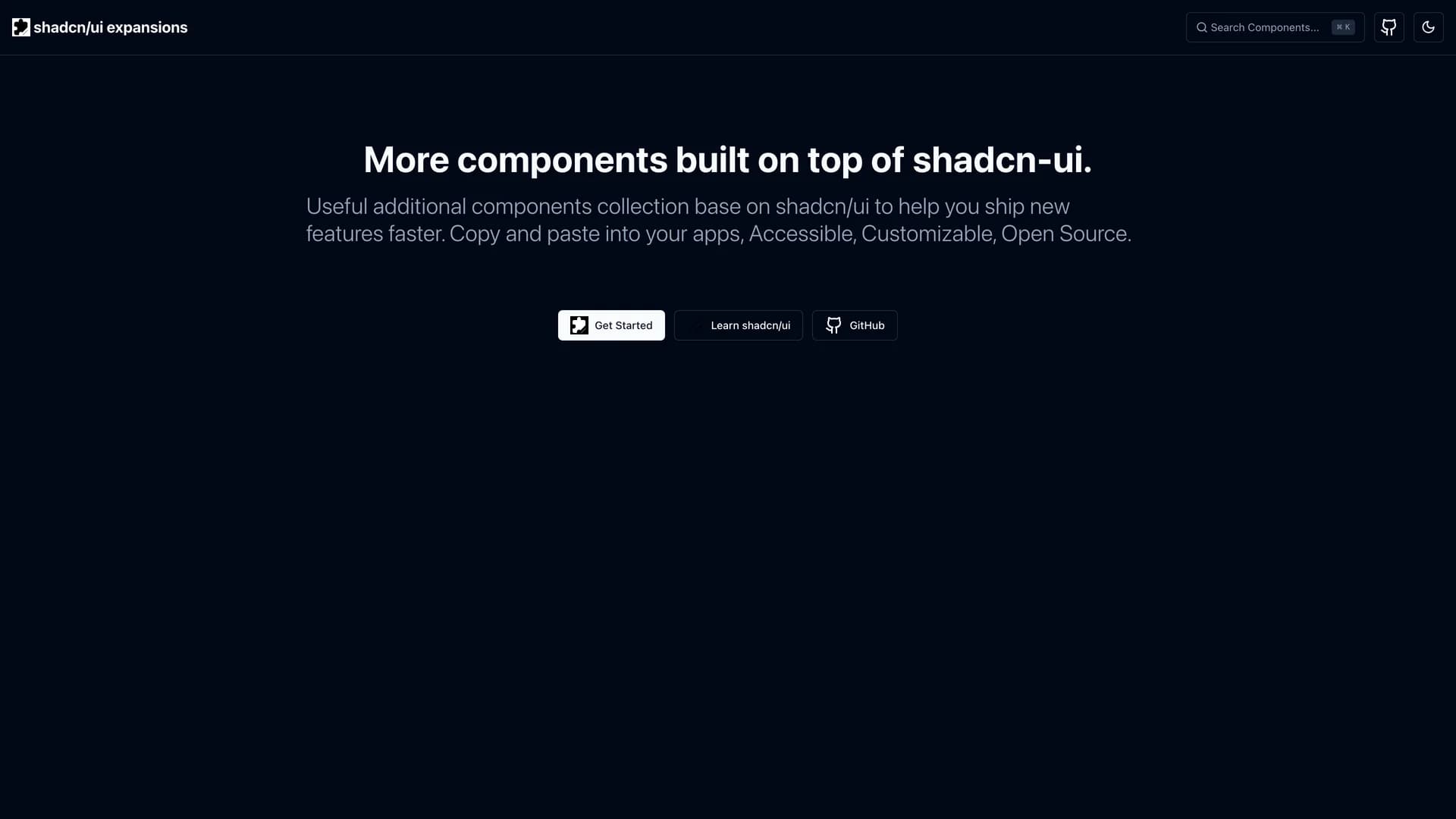
 React
React Tailwind
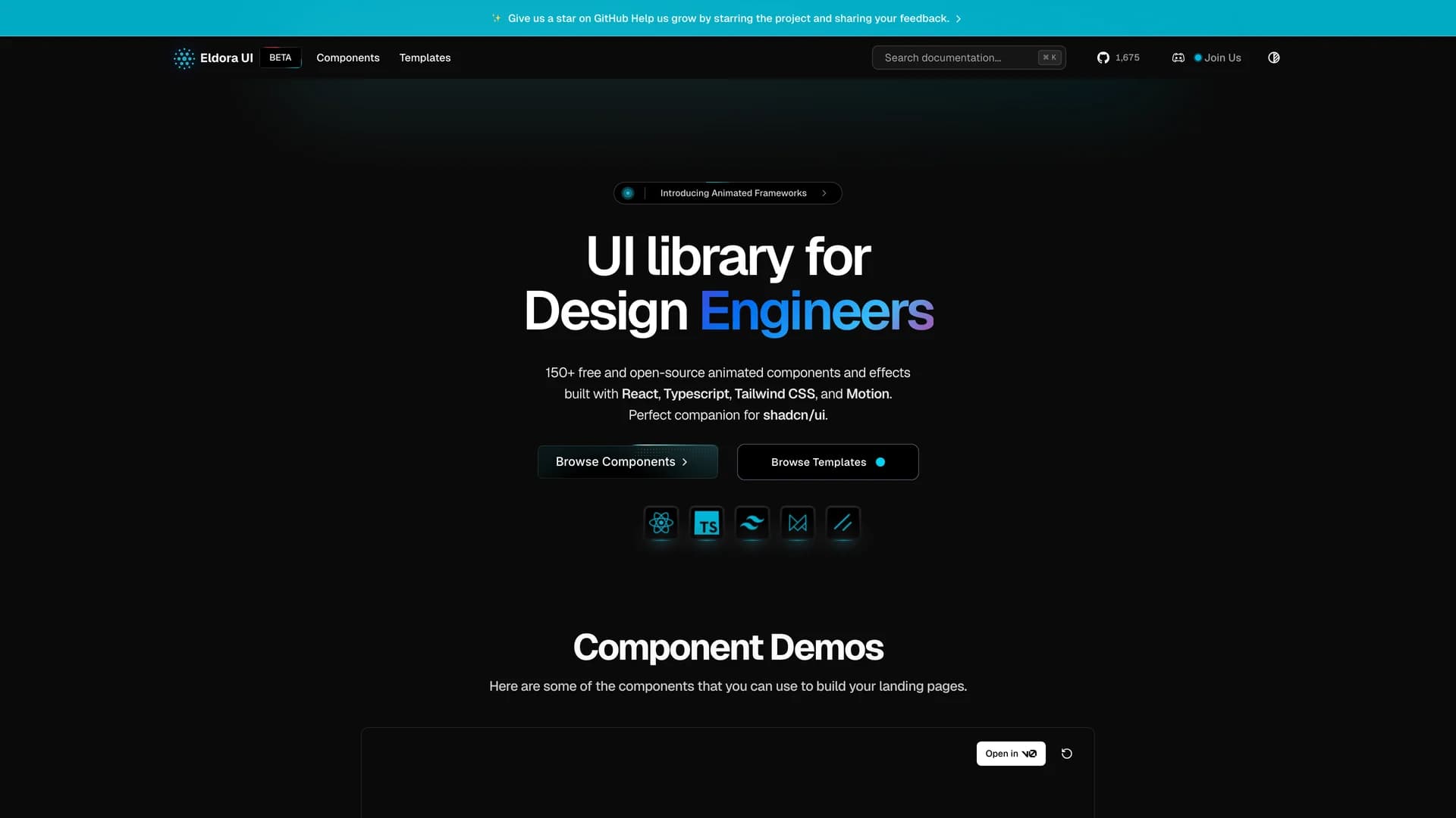
 Svelte
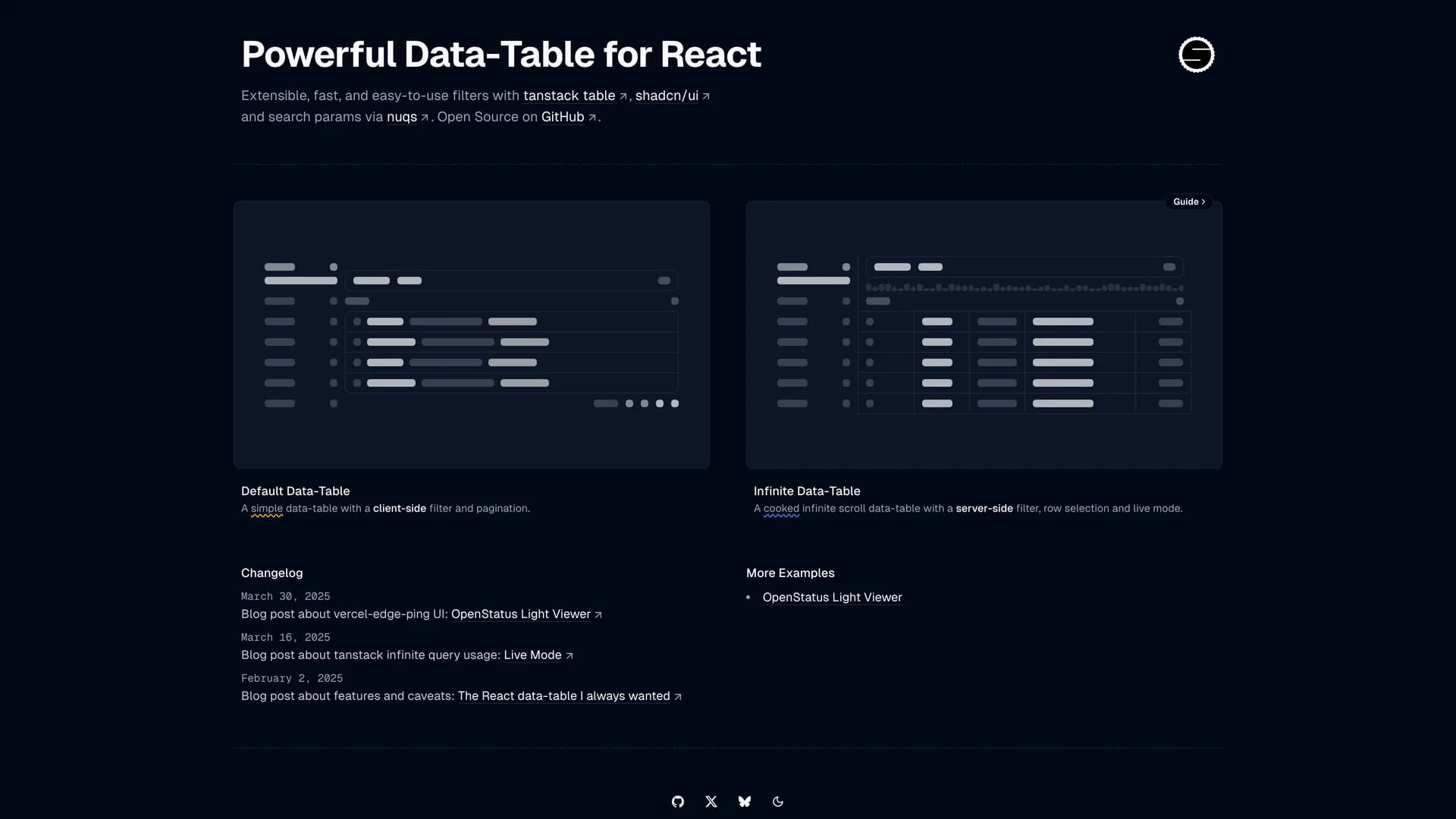
