solaris.shadcn.io

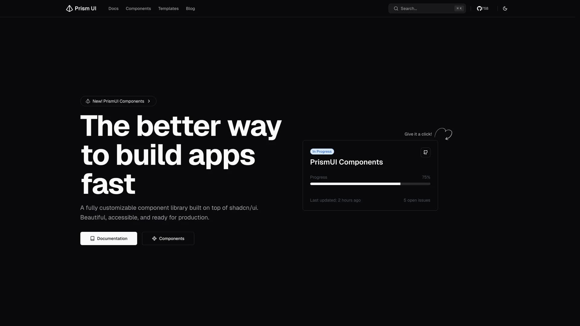
Prism UI is a fully customizable component library extending shadcn/ui with pre-built page sections, complex layouts, and production-ready templates for rapid application development.
by Codehagen · Updated October 8, 2025
Interact with the actual deployed template — every section, every interaction, no mockups.
The open-source library provides ready-to-use components including hero sections, feature grids, responsive navigation systems, footer variations, and MDX components for blogs and documentation, all built with accessibility and customization in mind. Built with Next.js 16 and React Server Components, Radix UI primitives, Tailwind CSS, and TypeScript, Prism UI offers developers a comprehensive ecosystem for creating stunning web applications faster than building from scratch.
The library extends shadcn/ui's primitive components with higher-level patterns and page sections, supporting dark mode, responsive design across all devices, and full TypeScript type safety. Perfect for marketing websites, landing pages, documentation sites, or any project requiring beautiful, accessible UI patterns beyond basic components, Prism UI helps developers ship polished interfaces quickly while maintaining the flexibility to customize every aspect of the design.
Hand-built premium templates from shadcn.io — production-ready and bundled in Pro.


