Join our Discord Community
Stepperize template preview

Stepperize

D

Created by Damianricobelli

Last updated October 8, 2025

About This Template

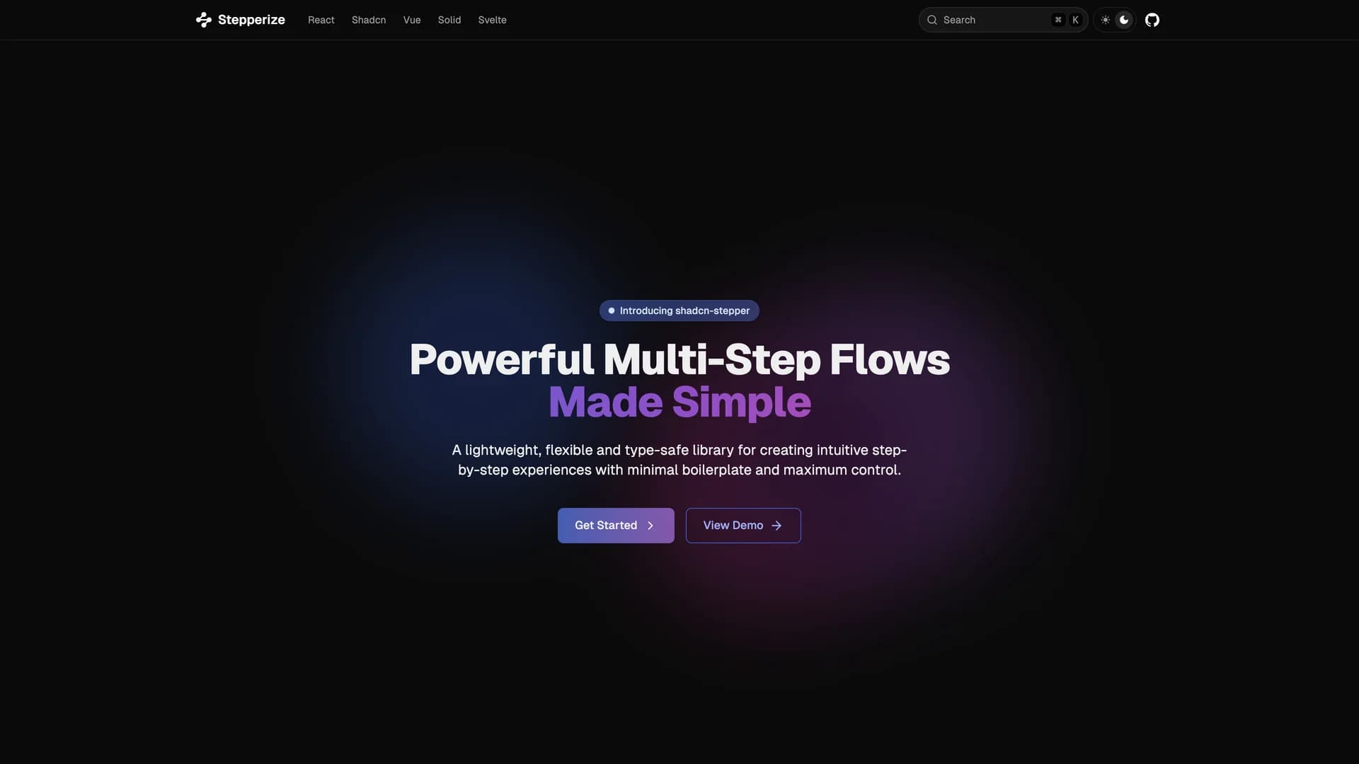
Stepperize is a lightweight, fully type-safe React library for creating step-by-step workflows and multi-step interfaces with minimal configuration and maximum flexibility. The library provides a simple defineStepper constructor for creating typed step definitions and a useStepper hook for managing step navigation, progression, and state in React and React Native applications. Built with TypeScript for complete type safety, Stepperize remains unstyled for maximum customization, allowing developers to implement any visual design while benefiting from robust step management logic. The composable architecture supports adding custom properties to steps while maintaining type inference, making it easy to build complex wizards, onboarding flows, checkout processes, or form sequences. With a focus on developer experience, Stepperize offers fast and efficient step progression with features like step validation, conditional navigation, and flexible step configuration. Perfect for applications requiring guided user experiences like multi-step forms, registration wizards, product tours, or checkout flows, the MIT-licensed library simplifies workflow management without imposing design constraints.

Related Templates

Tremor template preview
Tremor
Tremor is a React component library featuring 35+ customizable, accessible components designed for building data-rich dashboards and analytics interfaces. Built with React, TypeScript, Tailwind CSS, and Radix UI, it provides pre-built chart components (line, bar, area, donut charts, sparklines), KPI cards, data tables, and layout components that follow accessibility best practices. Like shadcn/ui, Tremor uses a copy-paste approach, letting developers integrate component source code directly into projects for complete customization control. The library handles common dashboard requirements including loading states, error boundaries, empty states, and responsive breakpoints, with each component fully typed and integrating seamlessly with Tailwind CSS utilities. Actively maintained by Tremor Labs with comprehensive documentation at tremor.so and community support via Slack and Twitter, it's perfect for building internal tools, SaaS analytics dashboards, and business intelligence applications by providing battle-tested components for data visualization.
Nativecn UI template preview
Nativecn UI
Nativecn UI is a beautiful, customizable React Native component library inspired by shadcn/ui, bringing the copy-paste component philosophy to mobile development with NativeWind and Tailwind CSS. Written primarily in TypeScript (91.5%), the MIT-licensed library provides essential components including Avatar, Badge, Button, Card, Checkbox, Dialog, Input, Progress, Radio Group, Skeleton, Switch, Tabs, Toast, Dropdown, and Select, all optimized for React Native and Expo. With built-in dark mode support using CSS variables and NativeWind's utility-first styling approach, Nativecn UI offers developers familiar Tailwind patterns for building mobile interfaces. The library includes a CLI for easy component initialization, making it simple to add components to React Native projects without managing complex dependencies. Comprehensive documentation at nativecn.mintlify.app provides light and dark mode examples, installation guides, and usage patterns. Perfect for developers building mobile applications with React Native and Expo who want the design consistency and developer experience of shadcn/ui combined with mobile-optimized components, Nativecn UI bridges web and mobile development with shared design principles and familiar tooling.
Shadcn Stepper template preview
Shadcn Stepper
Shadcn Stepper is a component registry template for creating custom component libraries using Next.js, TypeScript, and shadcn/ui, enabling developers to distribute custom React components, hooks, and pages to any project. Written primarily in TypeScript (85.8%), the template uses a registry.json file to define components and supports the shadcn build command to compile the registry into static JSON files served to consuming applications. Compatible with Shadcn CLI and v0 integration, it provides infrastructure for running your own component registry similar to shadcn/ui's official registry but for custom components. The template demonstrates how to package and distribute UI components in a way that developers can install via CLI commands, maintaining the copy-paste philosophy while adding discovery and versioning capabilities. Perfect for teams building internal design systems, component library maintainers, or developers wanting to share custom shadcn/ui-compatible components, the registry template handles the build process, serving, and CLI integration needed for a professional component distribution system.