Join our Discord Community
Nativecn UI template preview

Nativecn UI

M

Created by Mobilecn ui

Last updated October 8, 2025

About This Template

Nativecn UI is a beautiful, customizable React Native component library inspired by shadcn/ui, bringing the copy-paste component philosophy to mobile development with NativeWind and Tailwind CSS. 
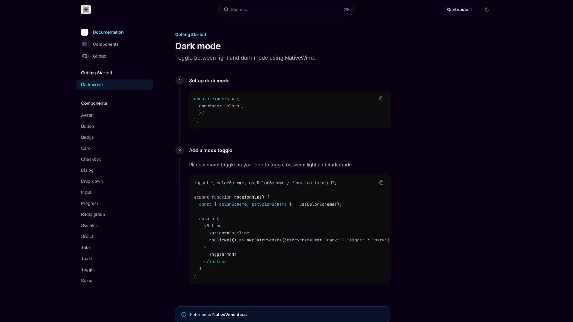
Written primarily in TypeScript (91.5%), the MIT-licensed library provides essential components including Avatar, Badge, Button, Card, Checkbox, Dialog, Input, Progress, Radio Group, Skeleton, Switch, Tabs, Toast, Dropdown, and Select, all optimized for React Native and Expo. With built-in dark mode support using CSS variables and NativeWind's utility-first styling approach, Nativecn UI offers developers familiar Tailwind patterns for building mobile interfaces. The library includes a CLI for easy component initialization, making it simple to add components to React Native projects without managing complex dependencies. Comprehensive documentation at nativecn.mintlify.app provides light and dark mode examples, installation guides, and usage patterns. Perfect for developers building mobile applications with React Native and Expo who want the design consistency and developer experience of shadcn/ui combined with mobile-optimized components, Nativecn UI bridges web and mobile development with shared design principles and familiar tooling.

Related Templates

Tremor template preview
Tremor
Tremor is a React component library featuring 35+ customizable, accessible components designed for building data-rich dashboards and analytics interfaces. Built with React, TypeScript, Tailwind CSS, and Radix UI, it provides pre-built chart components (line, bar, area, donut charts, sparklines), KPI cards, data tables, and layout components that follow accessibility best practices. Like shadcn/ui, Tremor uses a copy-paste approach, letting developers integrate component source code directly into projects for complete customization control. The library handles common dashboard requirements including loading states, error boundaries, empty states, and responsive breakpoints, with each component fully typed and integrating seamlessly with Tailwind CSS utilities. Actively maintained by Tremor Labs with comprehensive documentation at tremor.so and community support via Slack and Twitter, it's perfect for building internal tools, SaaS analytics dashboards, and business intelligence applications by providing battle-tested components for data visualization.
Kokonut UI template preview
Kokonut UI
Kokonut UI is a collection of animated, accessible UI components built with React, Tailwind CSS, and Framer Motion, providing production-ready components with smooth animations and modern design patterns. The open-source library offers copy-and-paste components following shadcn/ui's philosophy, including animated cards, interactive buttons, smooth transitions, and engaging micro-interactions that enhance user experience. Built with TypeScript for type safety, the components integrate Framer Motion's animation capabilities with Tailwind CSS utility classes, creating visually polished interfaces without complex animation code. Each component is designed for accessibility with proper ARIA attributes, keyboard navigation support, and responsive behavior across devices. Perfect for marketing websites, landing pages, SaaS applications, or any project requiring eye-catching animations and professional polish beyond basic UI primitives, Kokonut UI demonstrates how to combine animation libraries with utility-first CSS for components that are both beautiful and maintainable.
Prompt Kit template preview
Prompt Kit
Core building blocks for AI apps. High-quality, accessible, and customizable components for AI interfaces.