Join our Discord Community
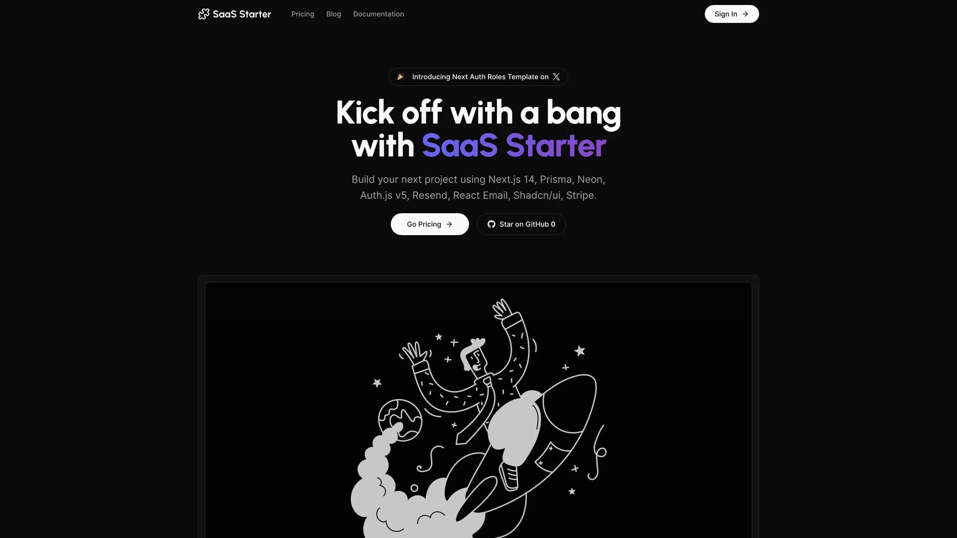
Next SaaS Stripe Starter template preview

Next SaaS Stripe Starter

Next Saas Stripe Starter

M

Created by Mickasmt

Last updated October 8, 2025

About This Template

Next SaaS Stripe Starter is a production-ready boilerplate that combines Next.js 14 with Stripe payments, Auth.js v5 authentication, and a comprehensive admin panel to launch subscription-based SaaS applications quickly. Built with TypeScript, Prisma ORM, Neon PostgreSQL, and shadcn/ui components, it provides essential features like user authentication with multiple providers, role-based access control, subscription management, payment processing with webhooks, customer billing portals, and transactional emails via Resend. The starter follows Next.js best practices with server components, server actions, and optimized data fetching, while the admin dashboard enables platform administrators to manage users, monitor subscriptions, and control access levels. Perfect for building productivity tools, analytics platforms, or B2B applications, this starter eliminates weeks of setup by providing authentication infrastructure, payment processing, database schemas, and deployment-ready code that can be customized for specific business requirements.
Related Templates

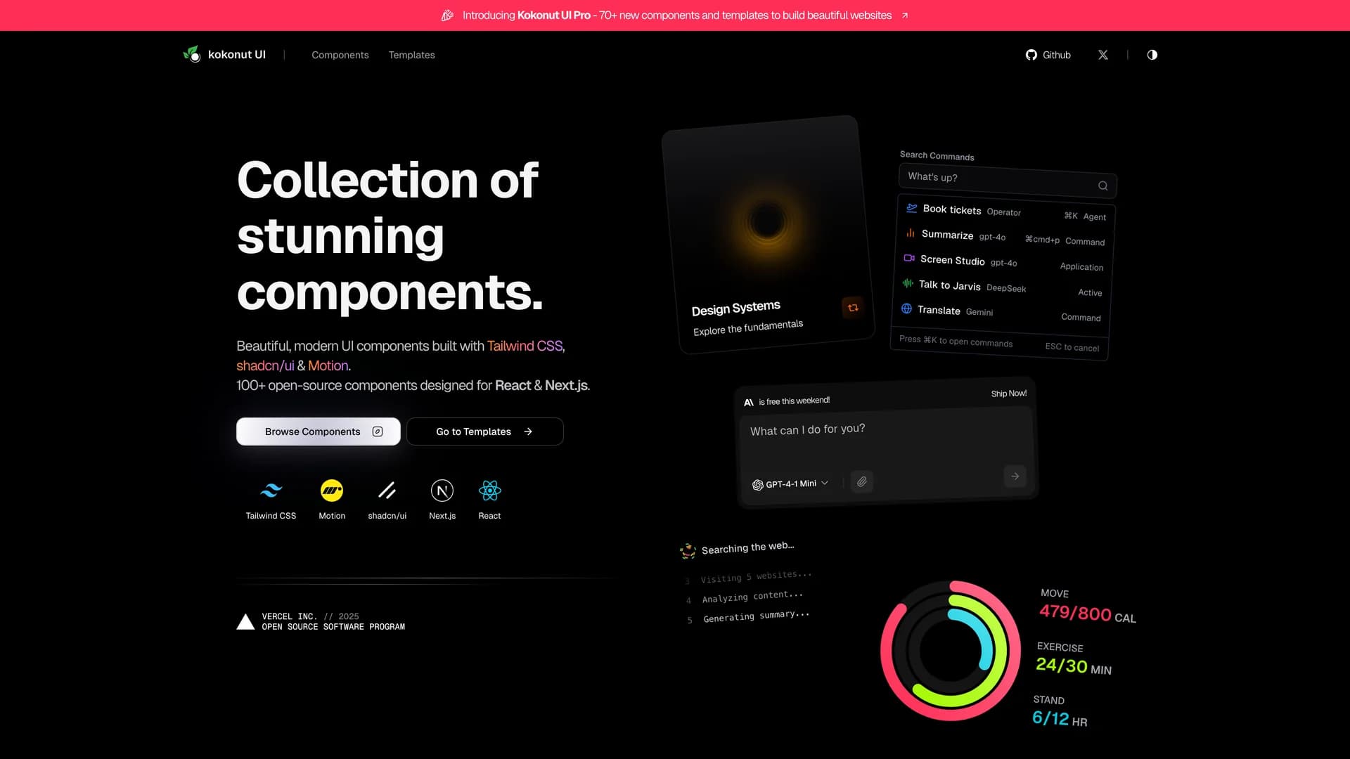
Kokonut UI template preview
Kokonut UI
Kokonut UI is a collection of animated, accessible UI components built with React, Tailwind CSS, and Framer Motion, providing production-ready components with smooth animations and modern design patterns. The open-source library offers copy-and-paste components following shadcn/ui's philosophy, including animated cards, interactive buttons, smooth transitions, and engaging micro-interactions that enhance user experience. Built with TypeScript for type safety, the components integrate Framer Motion's animation capabilities with Tailwind CSS utility classes, creating visually polished interfaces without complex animation code. Each component is designed for accessibility with proper ARIA attributes, keyboard navigation support, and responsive behavior across devices. Perfect for marketing websites, landing pages, SaaS applications, or any project requiring eye-catching animations and professional polish beyond basic UI primitives, Kokonut UI demonstrates how to combine animation libraries with utility-first CSS for components that are both beautiful and maintainable.
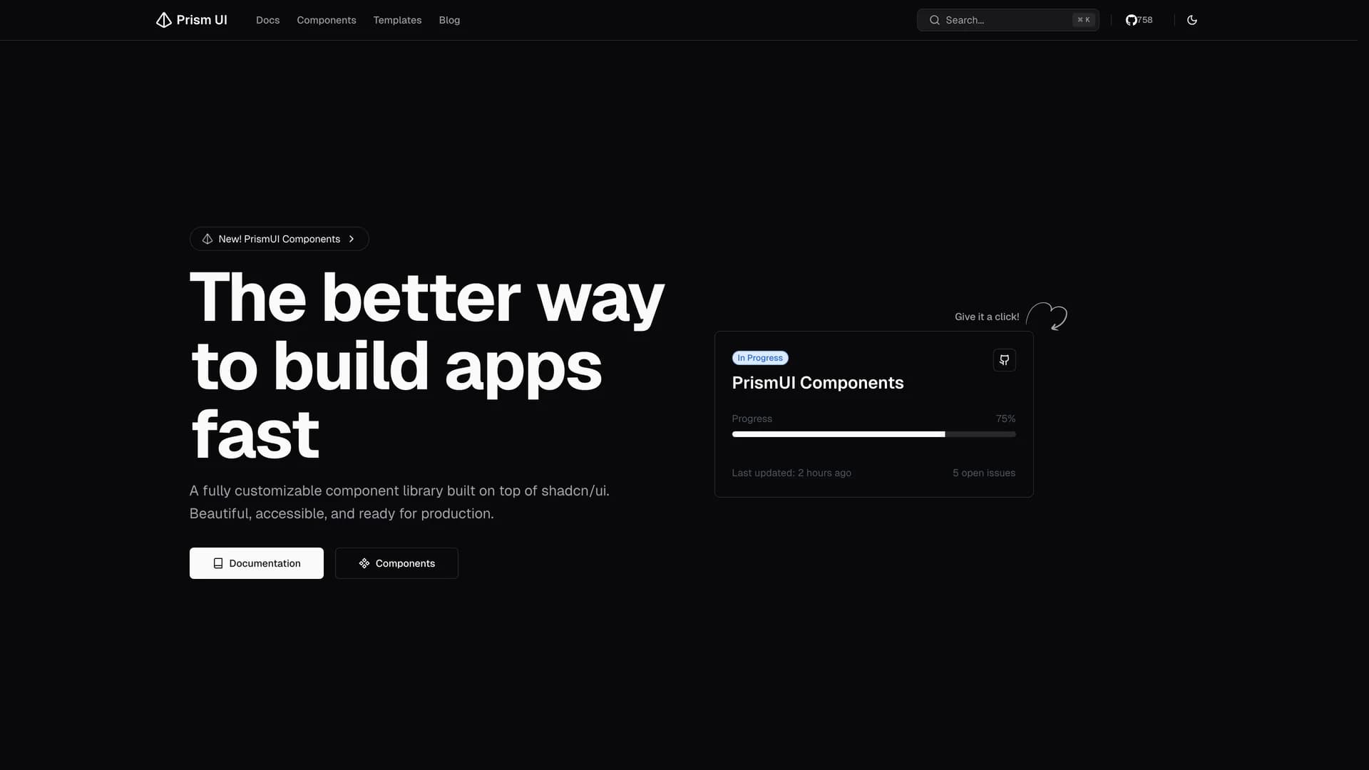
Prism UI template preview
Prism UI
Prism UI is a fully customizable component library extending shadcn/ui with pre-built page sections, complex layouts, and production-ready templates for rapid application development. The open-source library provides ready-to-use components including hero sections, feature grids, responsive navigation systems, footer variations, and MDX components for blogs and documentation, all built with accessibility and customization in mind. Built with Next.js 14 and React Server Components, Radix UI primitives, Tailwind CSS, and TypeScript, Prism UI offers developers a comprehensive ecosystem for creating stunning web applications faster than building from scratch. The library extends shadcn/ui's primitive components with higher-level patterns and page sections, supporting dark mode, responsive design across all devices, and full TypeScript type safety. Perfect for marketing websites, landing pages, documentation sites, or any project requiring beautiful, accessible UI patterns beyond basic components, Prism UI helps developers ship polished interfaces quickly while maintaining the flexibility to customize every aspect of the design.
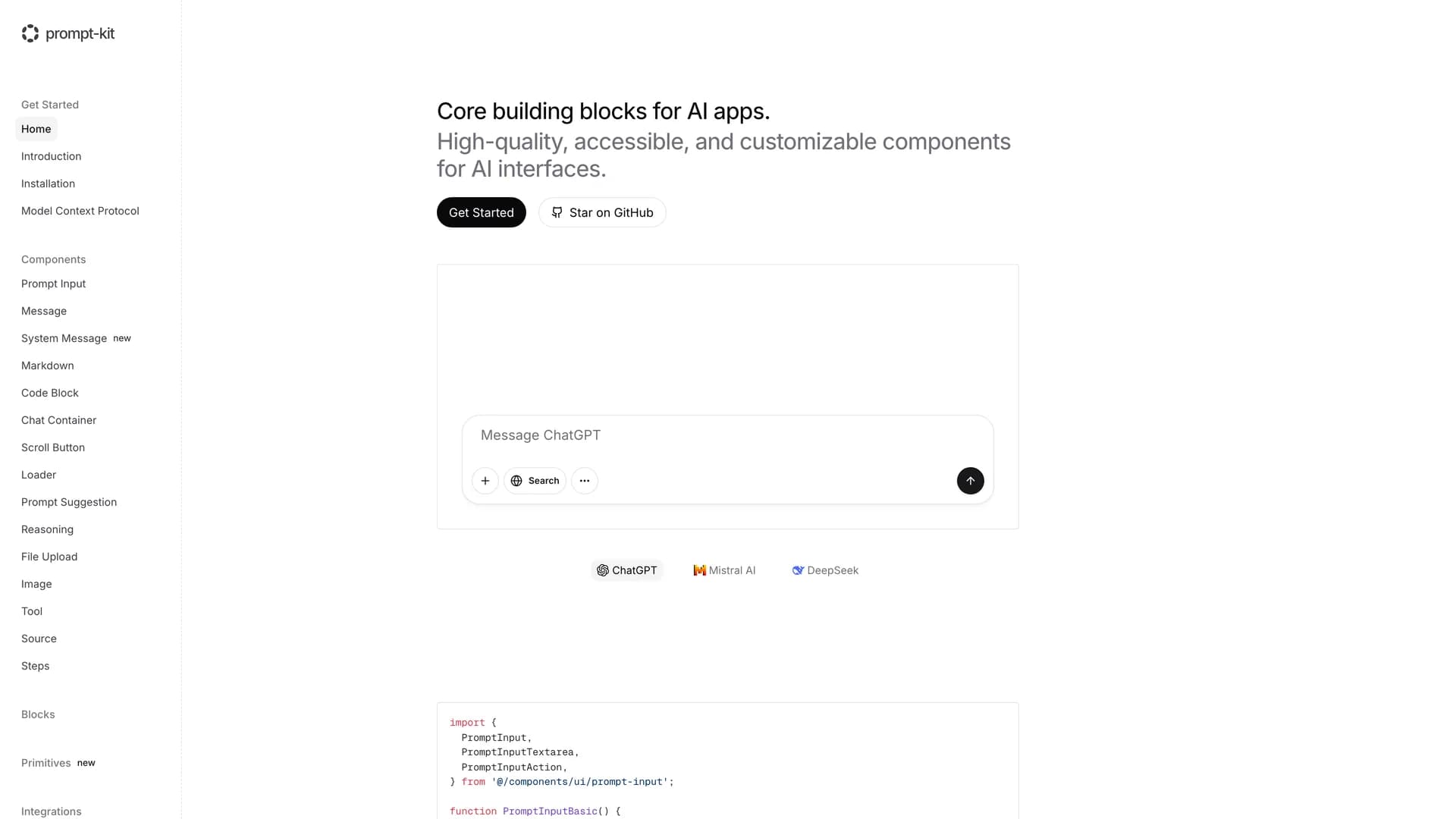
Prompt Kit template preview
Prompt Kit
Core building blocks for AI apps. High-quality, accessible, and customizable components for AI interfaces.