solaris.shadcn.io

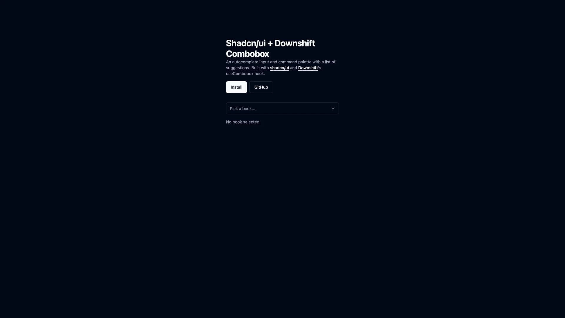
Downshift Shadcn Combobox provides a powerful autocomplete component that merges Downshift's robust state management with shadcn/ui's elegant design system for React applications.
by Omermakesstuff · Updated October 8, 2025
Interact with the actual deployed template — every section, every interaction, no mockups.
This production-ready component handles complex selection scenarios while maintaining full accessibility compliance and keyboard navigation support. The combobox features intelligent filtering and search algorithms, single and multi-select modes, grouped and nested options support, virtual scrolling for handling thousands of items efficiently, and comprehensive ARIA attributes for screen readers. Built with TypeScript for complete type safety, it integrates seamlessly with shadcn/ui styling using Tailwind CSS and supports full theme customization including dark mode.
The component includes customizable rendering for options and selected items, async data loading capabilities, and extensive keyboard shortcuts. Perfect for building advanced search interfaces, tag selection systems, data filtering controls, or any application requiring accessible autocomplete functionality with professional UI design and optimal performance.
Hand-built premium templates from shadcn.io — production-ready and bundled in Pro.


