Free React & shadcn/ui Templates
Discover the best open source templates built by the community. Production-ready Next.js starters you can copy and customize.
Free React Templates
Discover the best open source templates built by the community. Production-ready Next.js starters you can copy and customize.
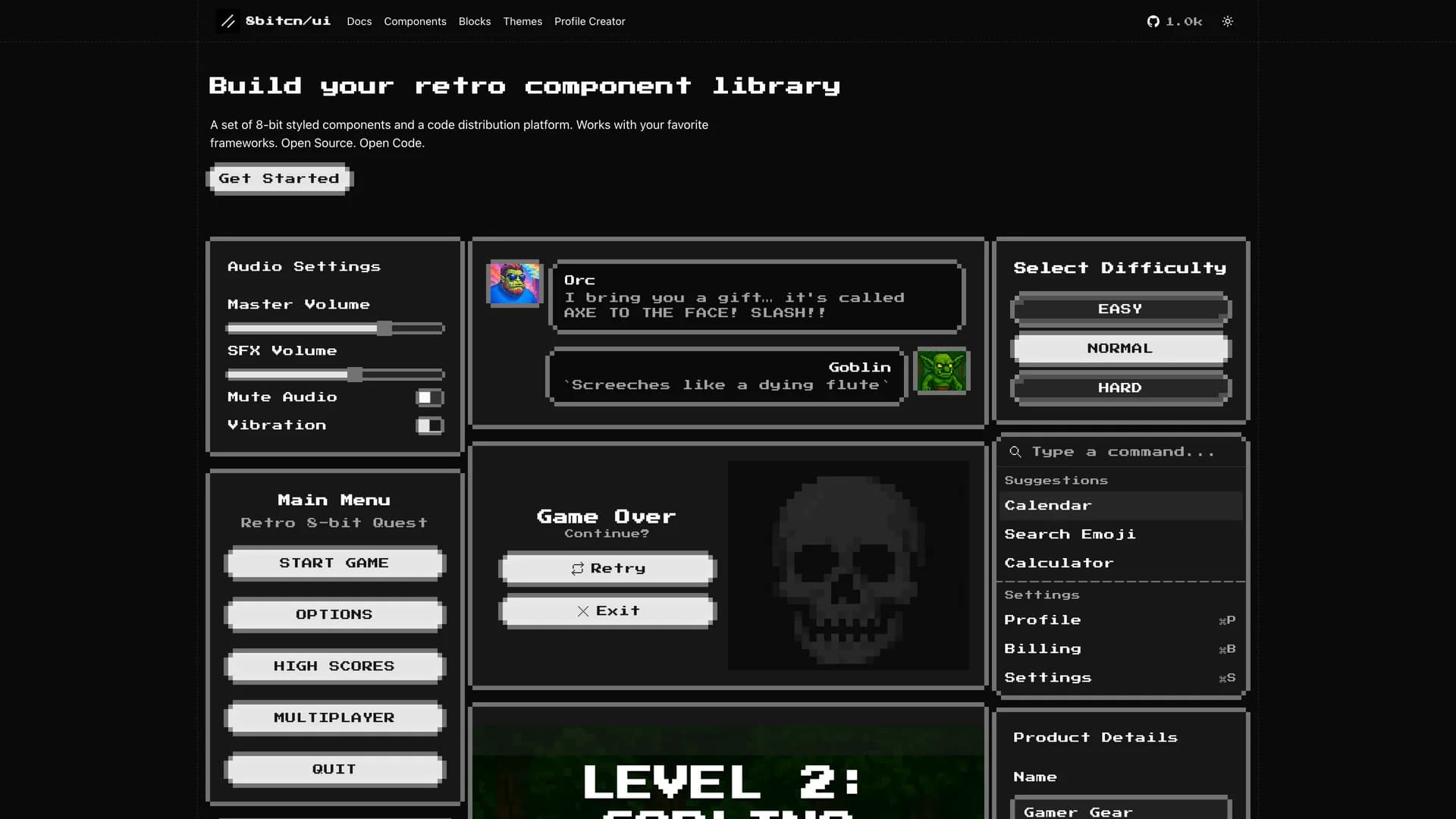
- 8bitcn UI8bitcn UI is a collection of retro-designed, accessible UI components offering a nostalgic 8-bit aesthetic for modern web applications, built with Next.js, TypeScript, and the shadcn/ui framework. This unique component library provides developers with copy-and-paste ready components that combine the charm of vintage computing interfaces with contemporary accessibility standards and responsive design principles. Each component maintains proper semantic HTML, keyboard navigation support, and screen reader compatibility while delivering the visual appeal of classic 8-bit gaming and early computing aesthetics. Available as an open-source project and supported by the Vercel Open Source Program, 8bitcn UI enables developers to create distinctive user interfaces that stand out in a sea of modern, minimalist designs. Perfect for gaming-related applications, retro-themed websites, creative portfolios seeking visual differentiation, nostalgic brand experiences, or any project where a unique visual identity matters more than following conventional design trends. The library's emphasis on accessibility ensures that the retro aesthetic doesn't compromise usability, making it suitable for production applications while offering a refreshing alternative to standard component libraries.
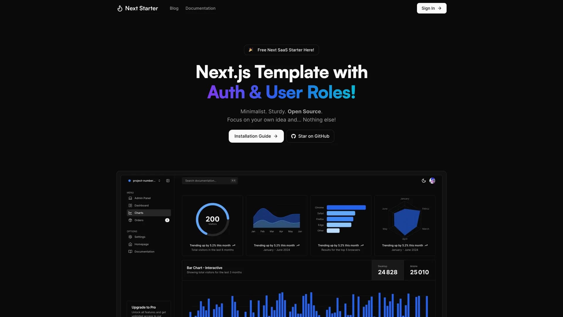
- Next Auth Roles TemplateNext Auth Roles Template is a comprehensive Next.js 16 starter with built-in authentication, user role management, and admin panel functionality powered by Auth.js v5, Prisma, and shadcn/ui. This opinionated template provides everything needed to build modern web applications with sophisticated access control: multiple authentication providers (Google, Twitter, GitHub), serverless PostgreSQL with Neon, React Email integration, Vercel Analytics, and a modular architecture that allows developers to remove unnecessary features via CLI commands. The template includes TypeScript for type safety, Tailwind CSS for styling, and high-quality code organization that reduces initial setup time from days to minutes. Perfect for SaaS applications requiring user management, multi-tenant platforms with role-based permissions, admin dashboards with secure access control, or any web application where authentication and authorization complexity would otherwise slow development velocity. The template's unique one-command content removal feature lets teams customize the starting point by eliminating blog or documentation sections they don't need, ensuring a clean codebase tailored to specific project requirements while maintaining all the authentication and authorization infrastructure essential for production applications.
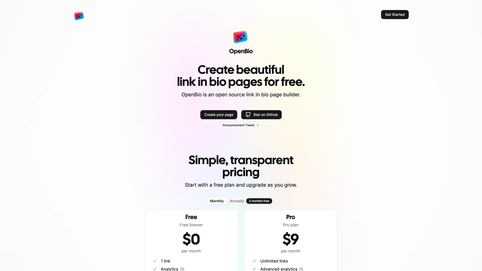
- OpenBioOpenBio is an open-source link-in-bio page builder that enables users to create beautiful, customizable personal landing pages for consolidating their online presence across multiple platforms. Built with Next.js, TypeScript, React, Tailwind CSS, Drizzle ORM, and leveraging serverless architecture with edge computing, this modern platform provides an alternative to proprietary services like Linktree with complete data ownership and customization freedom. The application uses Clerk for authentication, Upstash for data storage, tRPC for type-safe APIs, and supports server components for optimal performance. Perfect for content creators managing multiple social platforms, influencers needing a centralized hub for audience engagement, professionals showcasing work across various channels, or anyone seeking to replace subscription-based link-in-bio services with a self-hosted solution. As a community-driven project, OpenBio welcomes contributions and provides developers with the flexibility to customize every aspect of their link pages while maintaining a simple, accessible setup process that requires Node.js 18+ and pnpm 8+, making it easy to deploy and host on your own infrastructure or preferred hosting platform.
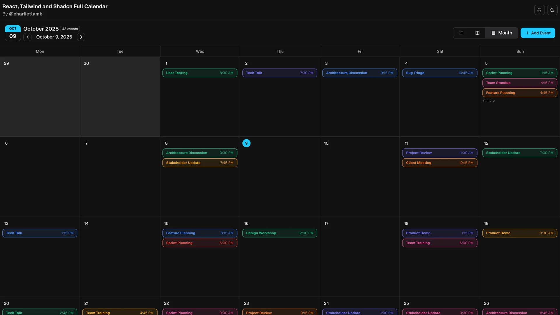
- CalendarCalendar is a feature-rich React calendar application built with shadcn/ui, Tailwind CSS, TypeScript, and Radix UI, designed specifically for integration into dashboards and applications requiring sophisticated scheduling capabilities. This fully customizable calendar supports multiple view modes (Day, Week, Month), advanced event management with create and edit dialogs, date/time picker functionality, event color categorization, and real-time event previews. The detailed day view provides hour-by-hour breakdowns for precise schedule management, while form validation ensures data integrity across all event operations. With dark mode support, responsive design, and accessible components built on Radix UI primitives, the calendar meets modern web application standards for both functionality and user experience. Inspired by Synergy CRM's calendar interface, this component is perfect for CRM applications, project management tools, team scheduling platforms, or any dashboard requiring comprehensive calendar functionality with professional polish. Released under the MIT license, the calendar provides developers with a production-ready scheduling component that eliminates weeks of development time while maintaining the flexibility to customize appearance and behavior to match specific application requirements and design systems.
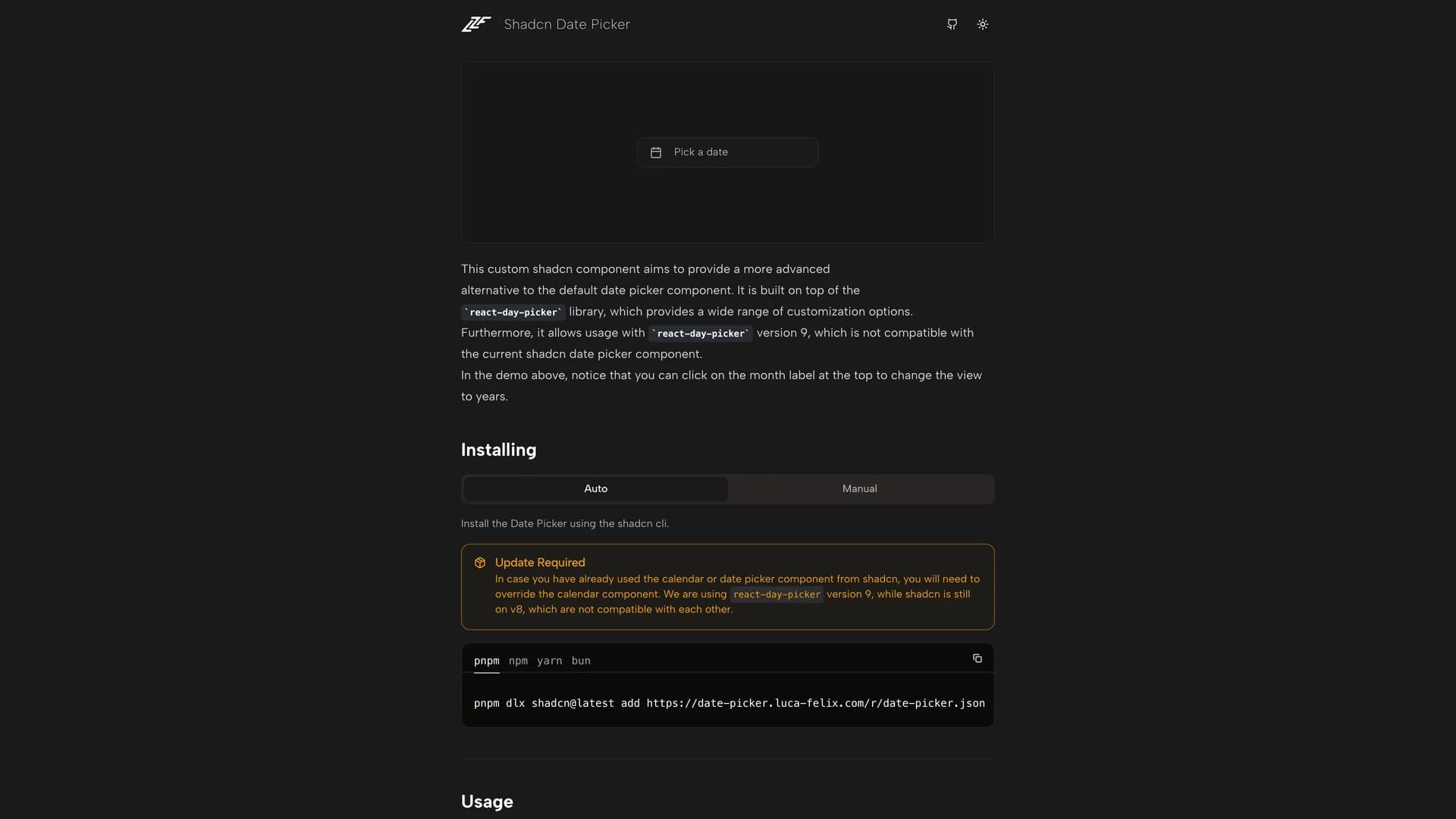
- Shadcn Date PickerShadcn Date Picker is an advanced date picker component built with React, TypeScript, and Tailwind CSS, offering a more sophisticated alternative to the default shadcn/ui date picker with enhanced navigation and selection capabilities. Built on the react-day-picker library, this custom component provides range date selection, year and month view navigation through intuitive month label clicking, and a highly customizable interface that improves the user experience of date selection in forms and applications. The component addresses common frustrations with basic date pickers by enabling users to quickly navigate across years and months without tedious clicking through individual months, making it particularly valuable for applications handling date ranges, historical data entry, or any scenario requiring efficient date selection across large time spans. Perfect for booking systems, analytics dashboards requiring date range filters, event management platforms, calendar applications, or any interface where date selection is a frequent user action and improved UX translates directly to productivity gains. Fully compatible with the shadcn/ui design system and responsive across devices, this date picker demonstrates how thoughtful enhancements to fundamental UI components can significantly improve user workflows and application usability.
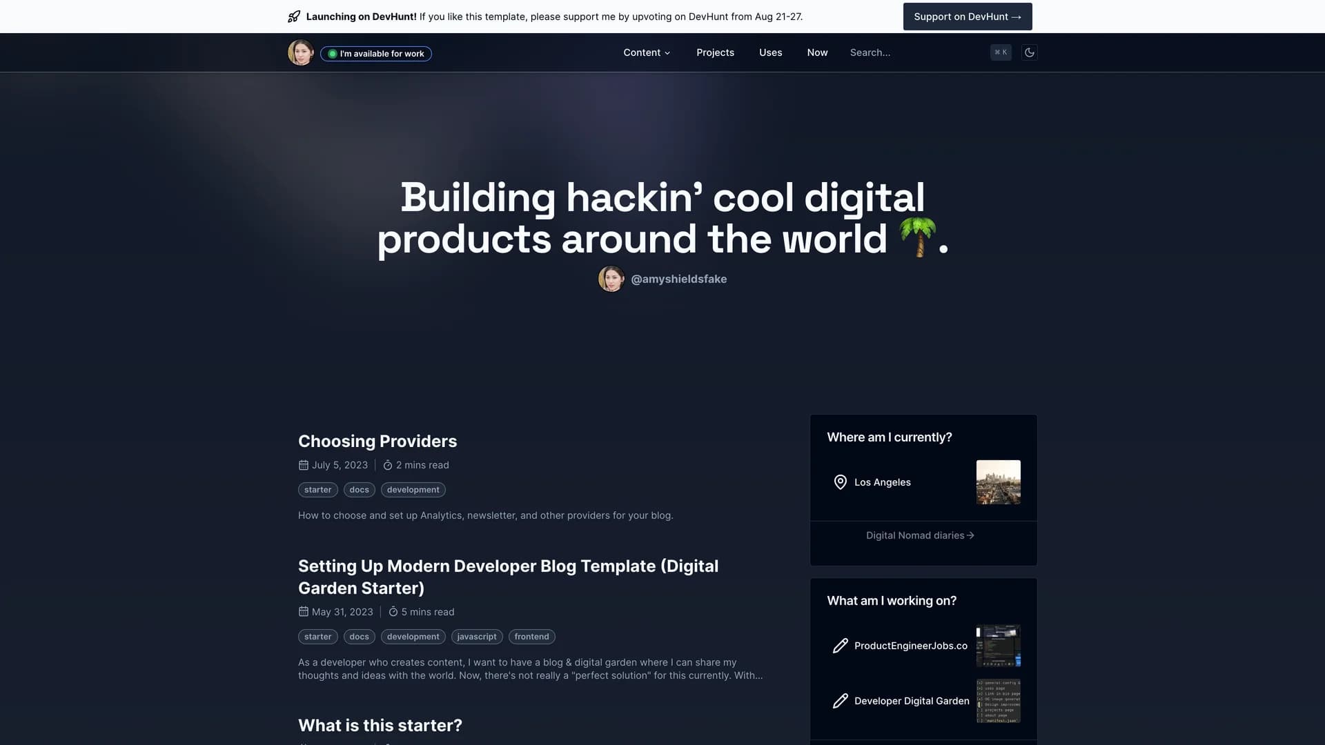
- Digital GardenDigital Garden is an open-source blog and digital garden template designed specifically for developers who create content and want to share their thoughts and ideas with the world. Built with Next.js App Router, Contentlayer, Tailwind CSS, shadcn/ui, and Lucide Icons, this modern platform provides everything needed to launch a professional developer blog with minimal setup. Features include Markdown/MDX content support for technical writing, dark/light mode for reader preference, code syntax highlighting optimized for sharing programming tutorials, multiple analytics integrations (Vercel, Umami, Plausible, Google Analytics), newsletter subscription capabilities, customizable hero sections, social links component, and fully responsive design across all devices. The template emphasizes developer-friendly customization with a clear component structure and ongoing development guided by a public roadmap. Perfect for developers building personal brands through technical writing, software engineers documenting their learning journey, educators creating programming tutorials, or anyone in tech seeking a polished platform for sharing knowledge without the overhead of complex CMS systems. With one-click Vercel deployment and extensive documentation, Digital Garden eliminates the typical friction of setting up a developer blog, allowing creators to focus on writing content rather than managing infrastructure.
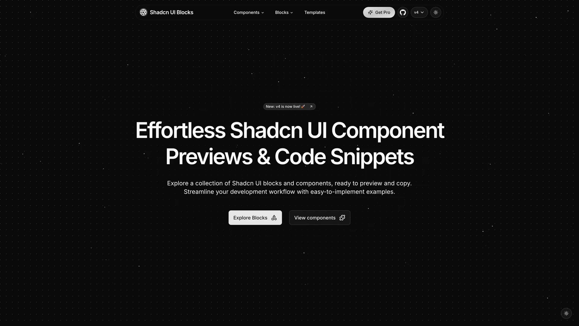
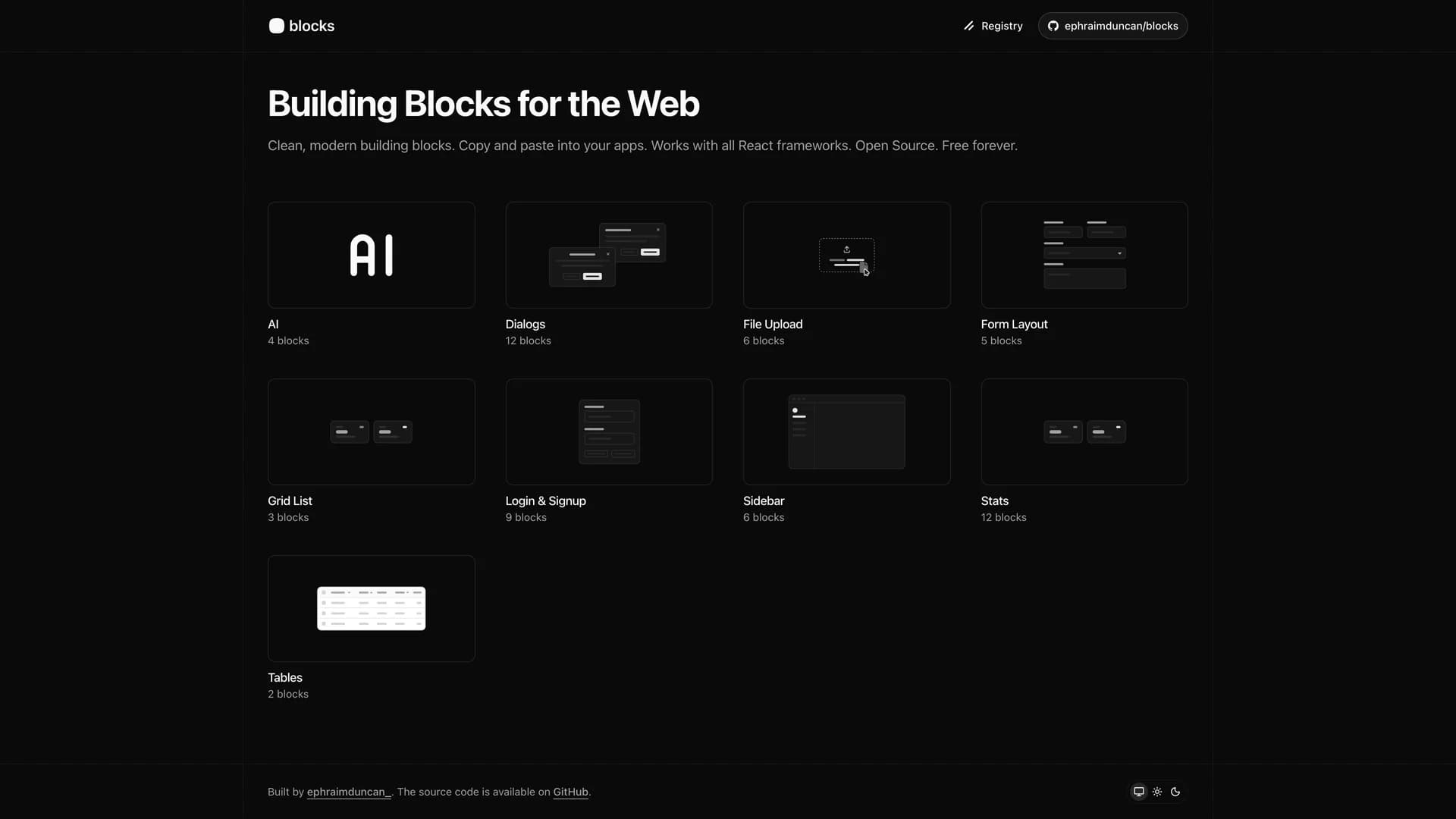
- Shadcn UI BlocksShadcn UI Blocks is a curated collection of customized shadcn/ui component blocks built with Next.js, TypeScript, and Tailwind CSS, designed to help developers quickly preview and copy ready-made code snippets for accelerated UI development. This comprehensive library provides instant component previews showing how each element looks and functions, effortless code snippet copying for rapid integration, a variety of components including buttons, forms, modals, and navigation elements, and a clean, developer-friendly interface with intuitive layout for easy browsing and selection. The platform addresses the common challenge of UI development speed by offering pre-built, production-ready component blocks that developers can easily integrate into their projects without building from scratch. Perfect for developers working under tight deadlines, teams standardizing UI patterns across applications, designers and developers collaborating on consistent design systems, or any project where faster UI development translates directly to reduced time-to-market. Available at shadcnui-blocks.com, this resource simplifies the UI development workflow by providing thoroughly tested, accessible, and customizable components that maintain the quality and flexibility of shadcn/ui while dramatically reducing the time spent on common interface patterns and component implementation.
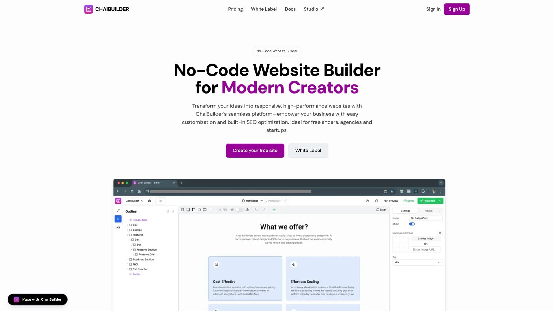
- Chai BuilderChai Builder is an AI-enabled, open-source low-code visual builder for React and Tailwind CSS that allows developers and non-technical users to create web pages through intuitive drag-and-drop interactions. This innovative platform integrates seamlessly with React applications, uses Tailwind CSS for styling, supports custom block rendering, and provides a simple React component for embedding the builder directly into existing applications. The visual page building interface enables rapid web page development without extensive coding, making it possible for designers, product managers, and other team members to contribute to UI development while developers maintain control over component libraries and design systems. Perfect for agencies building client websites quickly, SaaS platforms offering customizable user-facing pages, marketing teams needing landing page flexibility without developer bottlenecks, or any project where visual development accelerates iteration cycles and enables non-technical stakeholders to participate in UI creation. As a community-driven, extensible platform with a Next.js starter project and live demo at chaibuilder-sdk.vercel.app, Chai Builder demonstrates how low-code tools can enhance rather than replace traditional development workflows, providing a bridge between visual design tools and production-ready React applications while maintaining code quality and customization capabilities.
- Blocks.soBlocks.so is an open-source library of accessible and customizable UI blocks built with React, TypeScript, Tailwind CSS, and shadcn/ui, designed for easy copy-and-paste integration into applications. This modular component system provides developers with pre-built, reusable blocks that can be added directly to projects via the shadcn CLI with commands like 'npx shadcn@latest add @blocks/login-01', streamlining the process of implementing common UI patterns. The library focuses on accessibility and customization, offering thoroughly tested components with proper semantic HTML, keyboard navigation, and screen reader support while maintaining the flexibility to adapt to specific design requirements. With live previews available at blocks.so and comprehensive TypeScript definitions (71.2% of codebase) with MDX documentation (27.2%), the project provides developers with confidence in component behavior and usage patterns. Perfect for development teams establishing consistent design systems, developers building MVPs with limited design resources, agencies delivering client projects with tight timelines, or any application where UI implementation speed and accessibility compliance are critical success factors. Released under the MIT license, Blocks.so demonstrates the power of community-driven component libraries to accelerate development without sacrificing code quality or user experience.
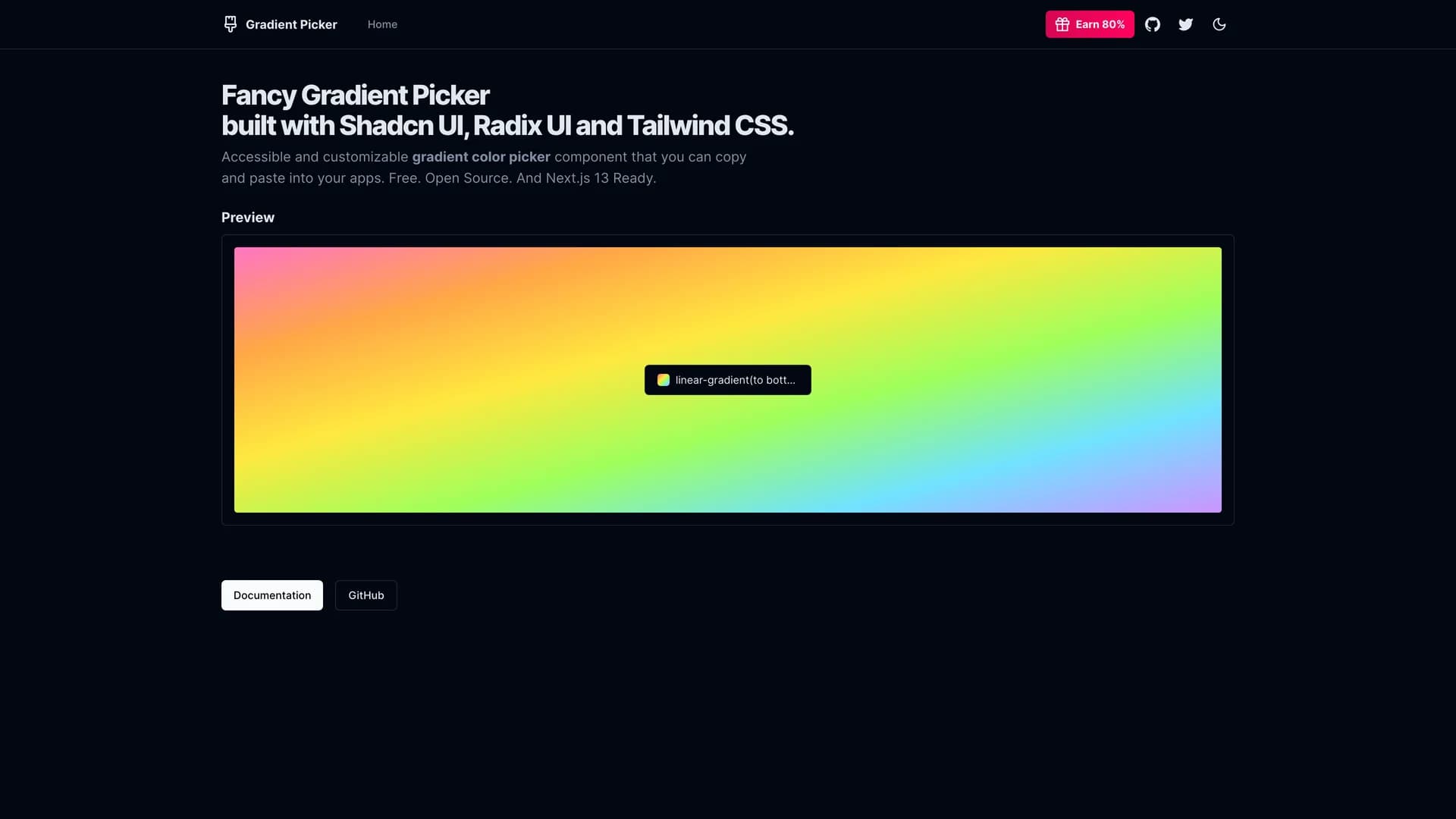
- Gradient PickerGradient Picker is a fancy, visually appealing web application built with Next.js, React, TypeScript, Tailwind CSS, shadcn/ui, and Radix UI, designed to help developers and designers select and customize color gradients with an intuitive interface. This comprehensive color tool enables users to select solid colors, create and customize complex gradients, browse background images, and generate complete color themes for UI components, all within a unified, accessible interface. The application provides free samples for exploration and includes an affiliate program offering significant commissions, demonstrating a sustainable open-source business model. Perfect for design systems teams establishing brand colors and gradient patterns, developers building themed applications requiring dynamic color generation, marketing teams creating branded assets and landing pages, or designers working on visual identities where gradient exploration and theme generation accelerate creative workflows. With easy integration into existing design systems and released under the MIT license, Gradient Picker showcases how specialized tools can bridge the gap between design inspiration and implementation, providing developers with a practical utility that generates production-ready CSS while offering designers the creative freedom to explore color combinations without technical barriers.
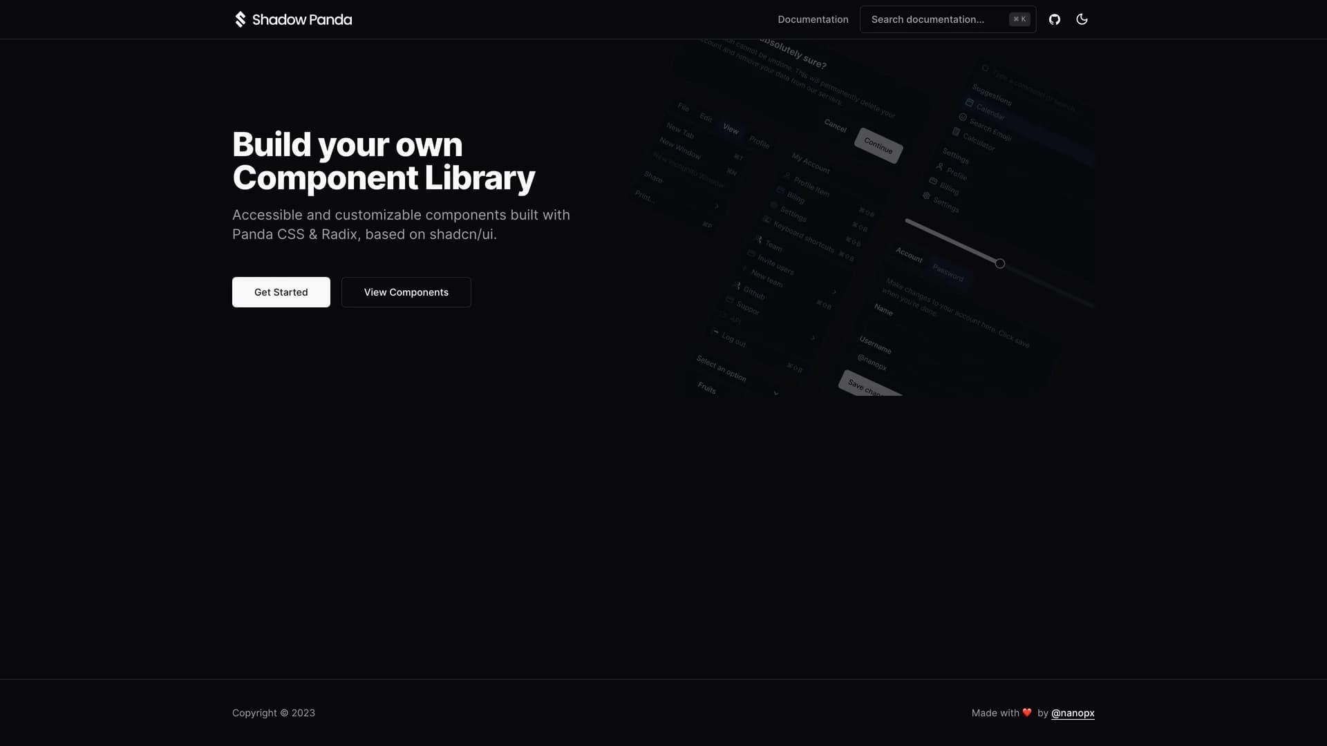
- Shadow PandaShadow Panda is an open-source UI component library built with TypeScript, Panda CSS, and Radix UI, providing accessible and customizable components based on shadcn/ui's design philosophy for developers seeking an alternative to Tailwind CSS. This innovative library maintains the same component structure and design patterns as shadcn/ui while leveraging Panda CSS's build-time CSS generation, type safety, and zero-runtime overhead, offering developers the familiar shadcn experience with different styling technology. The project includes a comprehensive preset for Panda CSS, supports React applications, and emphasizes both developer experience and accessibility compliance through proper semantic HTML and ARIA attributes. Perfect for teams standardizing on Panda CSS across projects, developers seeking type-safe styling with better IDE support, projects requiring fine-grained CSS control beyond utility classes, or applications where build-time CSS generation and smaller bundle sizes matter for performance optimization. Maintained primarily by Atsushi Yoshitake and welcoming community contributions under the MIT license, Shadow Panda demonstrates how the component-driven philosophy can transcend specific CSS frameworks, enabling developers to choose their preferred styling solution while benefiting from proven component designs and accessibility patterns established by the shadcn/ui ecosystem.
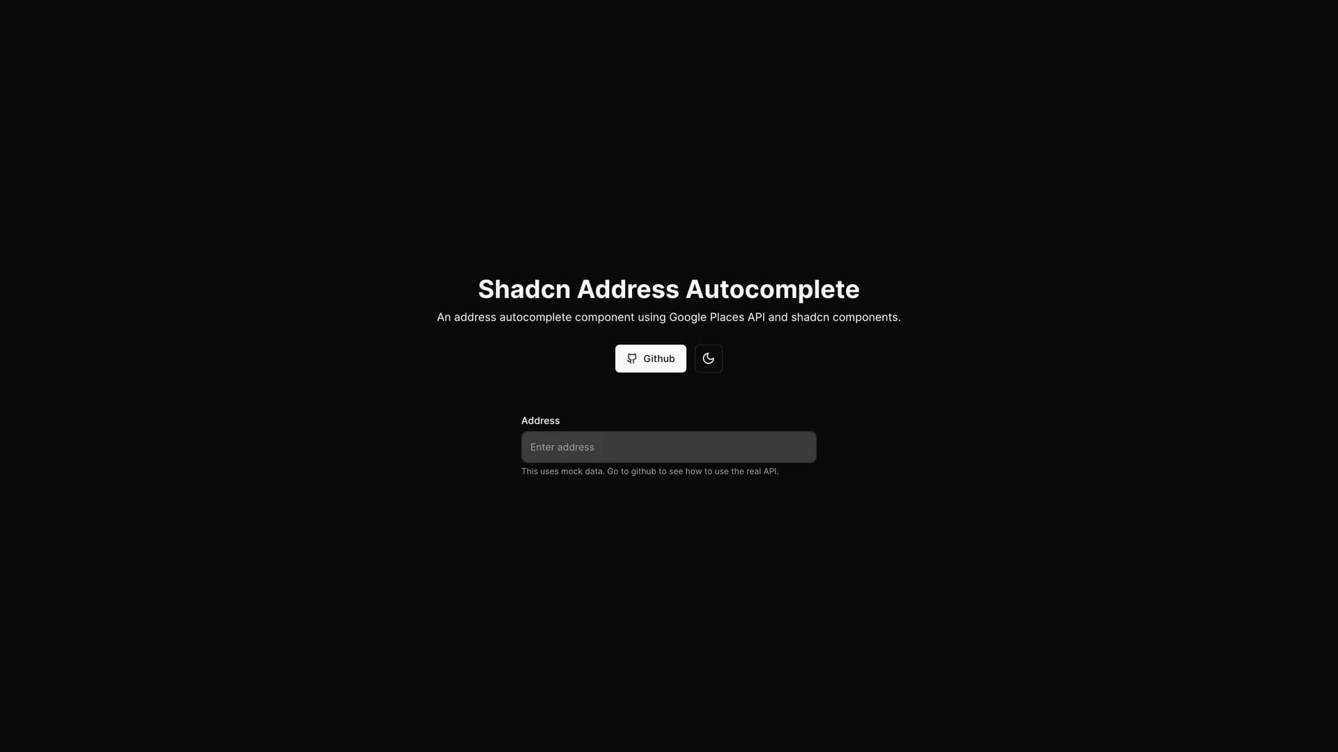
- Shadcn Address AutocompleteShadcn Address Autocomplete is an intelligent address input component built with Next.js, Tailwind CSS, shadcn/ui, Zod validation, and Google Places API integration, designed to simplify and improve the accuracy of address entry in web applications. This responsive, user-friendly component provides autocomplete suggestions as users type, leveraging Google's extensive location database to help users quickly and accurately enter complete address information without tedious manual input. The integration with shadcn/ui ensures consistent styling and accessibility standards, while Zod validation provides runtime type safety for address data. Perfect for e-commerce checkout flows, delivery service applications, real estate platforms, form builders requiring address fields, or any application where address accuracy directly impacts business operations and user satisfaction. The component handles the complexity of API integration, rate limiting, and result formatting, allowing developers to implement professional address autocomplete functionality without building from scratch. Important implementation note: the live demo uses mock data for demonstration purposes, and developers should properly configure their own Google Places API keys for production use to ensure reliable, accurate autocomplete functionality with appropriate usage limits and security measures.
Template Categories
Find templates organized by technology stack, use case, and purpose. From Next.js dashboards to React landing pages.
Tailwind
194 templates·158 authorsReact
179 templates·146 authorsNextjs
158 templates·128 authorsFullstack
46 templates·43 authorsRadix ui
31 templates·29 authorsVite
23 templates·20 authorsDrizzle orm
23 templates·22 authorsUi kits & component libraries
22 templates·20 authors
Template Creators
Meet the talented developers building open source templates with shadcn/ui, React, and Next.js.
- M
Mickasmt
5 templates - S
Sadmann7
4 templates - R
Redpangilinan
4 templates - I
Ibelick
3 templates - N
Niazmorshed2007
3 templates - S
Sujjeee
3 templates - S
Shreyas 29
3 templates - L
Ln dev7
3 templates - S
Stack auth
2 templates - C
Codehagen
2 templates - N
Nolly studio
2 templates - O
Openstatushq
2 templates
Frequently Asked Questions
Everything you need to know about this community-curated collection of open source shadcn/ui templates.
