Join our Discord Community

About This Template

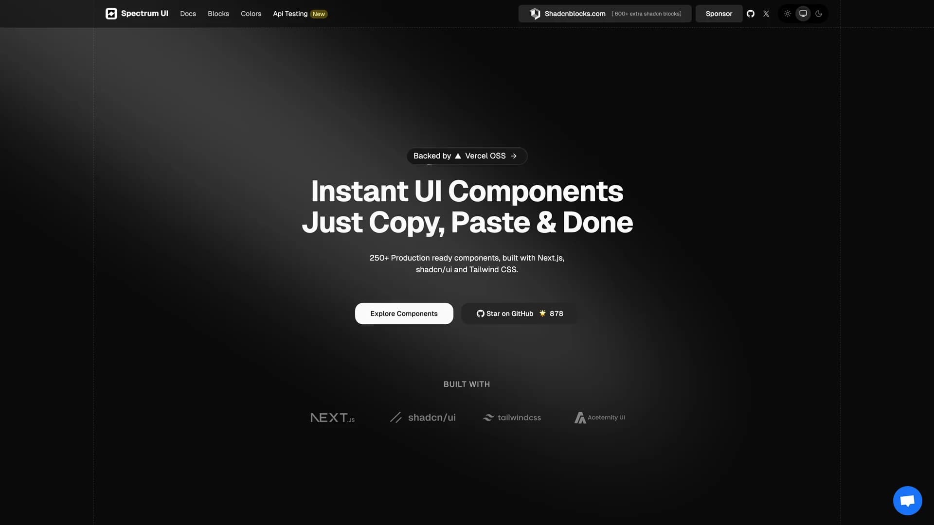
Spectrum UI is a collection of reusable components combining elements from Aceternity UI, Magic UI, and ShadCN UI into a unified, copy-and-paste component library for modern web applications. The Apache-2.0 licensed project provides modular UI components built with TypeScript (99.6% of codebase), Next.js, and Tailwind CSS, offering developers flexibility through easy integration without npm dependencies. The library draws from three popular UI libraries to provide comprehensive component coverage with diverse design patterns and interaction styles. With 878 stars and an active community of contributors, Spectrum UI welcomes open-source contributions and maintains documentation at ui.spectrumhq.in. Perfect for projects requiring diverse UI patterns, developers wanting best-of-breed components from multiple libraries, teams building design systems with varied aesthetics, or any application benefiting from high-quality components without committing to a single UI framework, Spectrum UI demonstrates how to harmonize different component libraries into cohesive, production-ready interfaces.

Related Templates

Prompt Kit template preview
Prompt Kit
Core building blocks for AI apps. High-quality, accessible, and customizable components for AI interfaces.
Motion Primitives template preview
Motion Primitives
Motion Primitives is an open-source UI component library designed to help engineers and designers create beautiful, animated interfaces faster using Framer Motion and Tailwind CSS. This comprehensive animation toolkit provides ready-to-use motion components that simplify the process of adding sophisticated animations to web applications without requiring deep animation expertise. The library offers a growing collection of customizable components including animated buttons, cards, modals, page transitions, scroll-triggered animations, and interactive micro-interactions, all built with performance and accessibility in mind. Each component is crafted to be developer-friendly with clear documentation, live previews, and copy-paste installation, following the same philosophy as shadcn/ui. Currently in active development with regular component releases and updates, Motion Primitives eliminates the complexity of configuring Framer Motion from scratch by providing pre-built, production-ready animation patterns that work seamlessly with Next.js and React applications. Perfect for developers building landing pages, marketing sites, SaaS applications, or any project requiring engaging user experiences, the library helps teams add professional-grade animations and transitions that enhance usability and delight users, while maintaining clean code and excellent performance through optimized animation techniques and GPU-accelerated transforms.
Tremor template preview
Tremor
Tremor is a React component library featuring 35+ customizable, accessible components designed for building data-rich dashboards and analytics interfaces. Built with React, TypeScript, Tailwind CSS, and Radix UI, it provides pre-built chart components (line, bar, area, donut charts, sparklines), KPI cards, data tables, and layout components that follow accessibility best practices. Like shadcn/ui, Tremor uses a copy-paste approach, letting developers integrate component source code directly into projects for complete customization control. The library handles common dashboard requirements including loading states, error boundaries, empty states, and responsive breakpoints, with each component fully typed and integrating seamlessly with Tailwind CSS utilities. Actively maintained by Tremor Labs with comprehensive documentation at tremor.so and community support via Slack and Twitter, it's perfect for building internal tools, SaaS analytics dashboards, and business intelligence applications by providing battle-tested components for data visualization.