React Templates - Next.js
158 templates • 128 contributors • Open source & free
Available Templates (158)
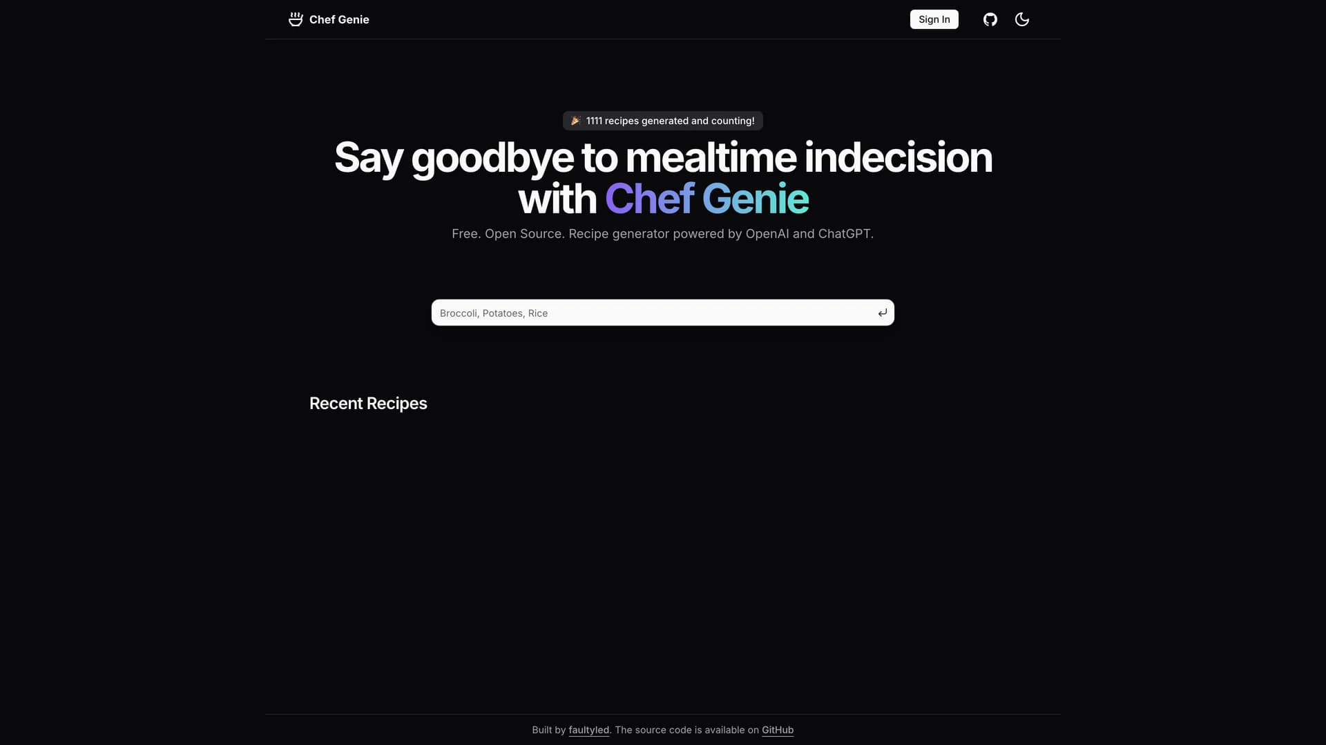
- Chef GenieChef Genie is an AI-powered recipe generation application that leverages OpenAI's GPT 3.5 Turbo to create personalized recipes based on user preferences, dietary restrictions, and available ingredients. Built with Next.js 16 Server Actions, Supabase for database and authentication, Clerk for user management, Tailwind CSS, Radix UI, and shadcn/ui components, this project demonstrates how to integrate cutting-edge AI capabilities into modern web applications for practical, everyday use cases. The application features intelligent recipe generation by analyzing user inputs for ingredients, cuisines, and dietary needs, personalized recommendations considering allergies, preferences, and skill levels, recipe saving and organization in user accounts powered by Supabase, beautiful, responsive UI with shadcn/ui components ensuring excellent user experience, server-side rendering for optimal performance and SEO, Zod validation for type-safe form inputs and API requests, and Vercel Analytics integration for monitoring user behavior and performance. The AI integration showcases proper OpenAI API implementation including prompt engineering for consistent recipe outputs, error handling for API failures and rate limits, streaming responses for real-time recipe generation feedback, and cost-effective token usage patterns. This project is currently in active development and serves as an excellent reference for developers building AI-powered food and cooking applications, learning how to integrate OpenAI with Next.js Server Actions, creating personalized content generation systems, implementing user authentication with Clerk and Supabase together, and studying modern full-stack architecture patterns. Chef Genie solves the common problem of "what should I cook" by providing creative, AI-generated recipes tailored to what users have on hand and their dietary needs, making cooking more accessible and enjoyable.
- Threads CloneThe Threads Clone is a comprehensive, full-featured recreation of Meta's Threads social media platform built with the T3 stack, showcasing modern web development practices for building complex, production-ready social applications. Created with Next.js 16, TypeScript, tRPC for end-to-end type-safe APIs, Tailwind CSS, shadcn/ui components, Prisma ORM with Neon PostgreSQL, and Clerk authentication, this project demonstrates how to architect scalable social networking features with contemporary tools. The application includes complete user authentication and profile management via Clerk, file upload capabilities for images and media, threaded conversations with nested replies and interactions, text and image content filtering for moderation, custom notification systems for user engagement, recursive thread rendering for deep conversation trees, real-time updates reflecting new posts and interactions, Zod validation ensuring data integrity throughout the stack, and advanced Prisma ORM patterns for complex relational queries. Built with create-t3-app, the project follows T3 stack principles emphasizing type safety, developer experience, and rapid iteration. The implementation showcases tRPC's ability to provide fully typed API routes without code generation, Prisma's sophisticated ORM features for managing complex database relationships, Clerk's comprehensive auth solution including social logins and user metadata, and Next.js 16's app router for optimal performance and SEO. This clone is invaluable for developers learning to build social media platforms from scratch, studying how to implement threaded conversations and notifications, understanding T3 stack architecture and patterns, creating portfolio pieces demonstrating full-stack expertise, and exploring how to scale social features with modern tooling. The codebase serves as both a functional social platform and an educational resource for contemporary web development.
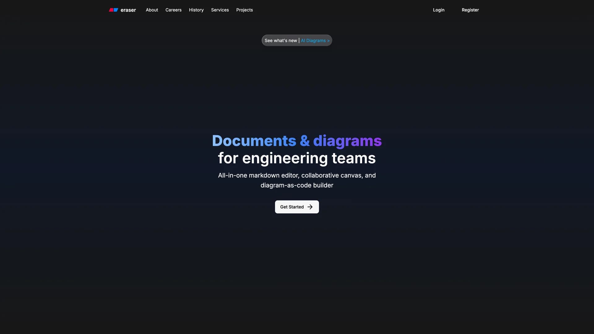
- Eraser CloneThe Eraser Clone is an open-source recreation of Eraser.io, a popular web-based diagramming and collaborative whiteboarding tool, built with Next.js 16, TypeScript, Tailwind CSS, shadcn/ui components, Convex as a real-time database, and Kinde for authentication. With 178 stars on GitHub, this project demonstrates how to build sophisticated, real-time collaborative applications using modern web technologies, pushing the boundaries of what's possible with contemporary JavaScript frameworks. The application features a web-based diagramming canvas for creating flowcharts, wireframes, and technical diagrams, real-time collaboration powered by Convex's real-time database capabilities allowing multiple users to work simultaneously, authentication and user management through Kinde's streamlined auth service, beautiful, responsive UI built with shadcn/ui components and Tailwind CSS, TypeScript throughout for type safety and improved developer experience, and deployment on Vercel for global edge network distribution. The tech stack showcases Convex's unique approach to backend development where database queries and mutations are written as TypeScript functions with automatic real-time subscriptions, Kinde's modern authentication solution eliminating the complexity of building auth from scratch, and Next.js 16's app router for optimal performance and developer ergonomics. This clone is valuable for developers learning to build real-time collaborative applications similar to Figma or Miro, understanding how Convex enables reactive, real-time features without WebSocket management, studying how to implement drawing and diagramming interfaces in the browser, exploring Kinde as an alternative to traditional auth providers, and creating portfolio projects demonstrating advanced full-stack capabilities. The project encourages community contributions and collaboration, exemplifying the spirit of building extraordinary tools together through open-source development. As a learning resource, it provides practical insights into architecting applications where multiple users interact with shared state in real-time.
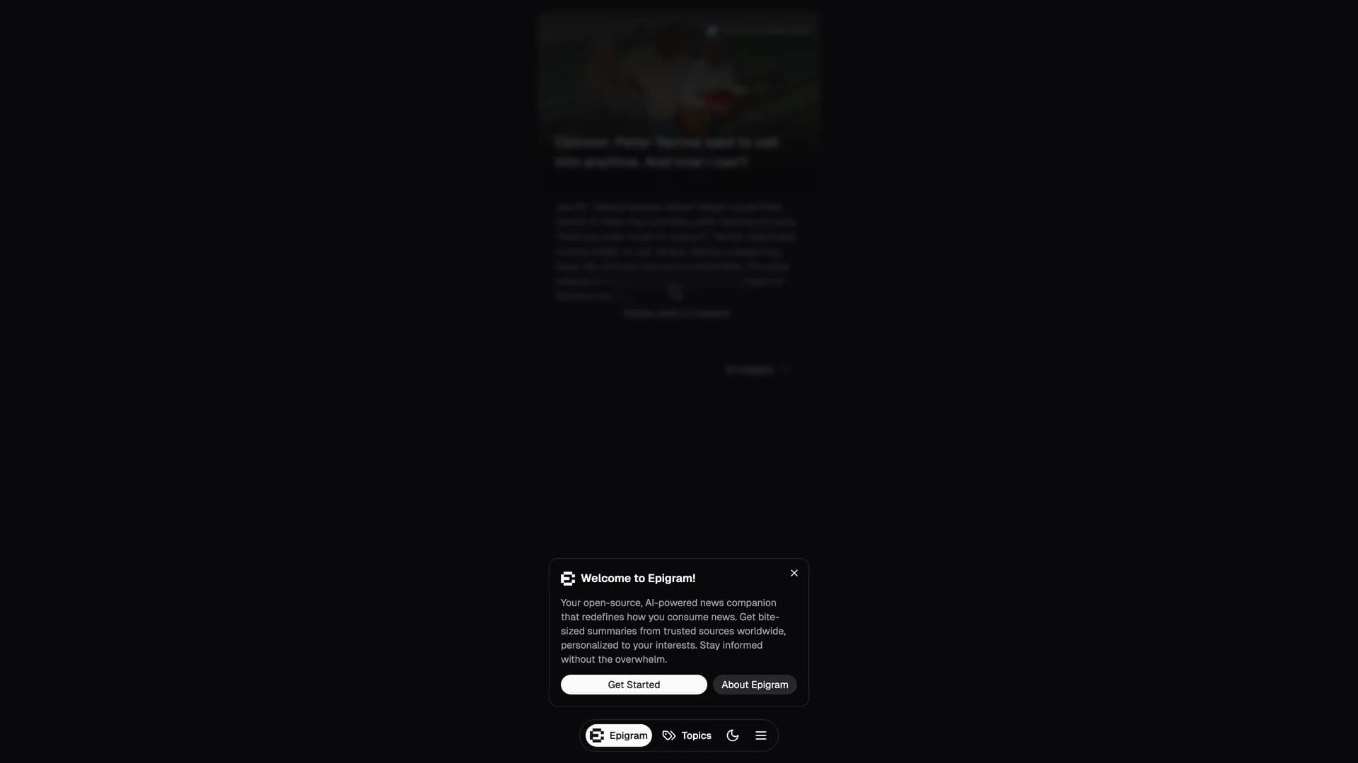
- EpigramEpigram is an open-source, AI-powered news summarization platform that uses AI to make quality news easy to access, understand, and personalize by delivering concise summaries from trusted global sources. Built with Next.js, React, Tailwind CSS, shadcn/ui components, OpenAI's GPT-4o-mini for intelligent summarization, Mediastack API for news data aggregation, and Upstash Redis for caching and rate limiting, this platform solves the problem of information overload by providing quick, clear summaries tailored to individual user preferences. The application features a personalized news feed that adapts to user interests and reading habits, AI-generated concise summaries that distill articles to their essential points, access to trusted global news sources ensuring credible information, in-depth AI article analysis for deeper understanding of complex topics, a responsive, user-friendly interface that works seamlessly across all devices, and intelligent caching with Upstash Redis for fast load times and rate limiting. Deployed on Google Cloud Run with support for Vercel, Netlify, and AWS Amplify, Epigram uses the Exa API for AI-powered news summarization and recommends periodic news data refresh via cron jobs to keep content current. The platform is designed for busy professionals who want to stay informed without spending hours reading, students and researchers needing quick overviews of current events, anyone overwhelmed by the volume of daily news across multiple sources, readers who prefer personalized content over generic news feeds, and people seeking credible, summarized information from reliable sources. This project demonstrates how to build intelligent content aggregation platforms, implement AI-powered text summarization at scale, integrate multiple APIs for data enrichment, design personalized recommendation systems, and optimize performance with Redis caching. Epigram makes staying informed effortless by cutting through the noise and delivering what matters most to each user.
- Instagraph Next.js FastAPIInstaGraph is an open-source knowledge graph generator inspired by Yohei Nakajima's Instagraph.ai that transforms unstructured text into interactive visual knowledge graphs using AI. Built with a Next.js frontend for the web interface, FastAPI backend for AI processing, React Flow for graph visualization, Tailwind CSS and Headless UI for styling, and OpenAI API for intelligent graph generation, this full-stack application demonstrates how to build AI-powered data visualization tools that make complex information easier to understand. The platform features automatic knowledge graph generation from user-provided text, interactive graph visualization with zoom, pan, and node manipulation, streaming and server-sent event endpoints for real-time updates, clean web interface for easy text input and graph viewing, and seamless integration between modern frontend and Python backend technologies. Users simply navigate to the application, input their text content, click submit, and watch as the AI analyzes relationships and concepts to generate a visual knowledge graph showing connections between ideas, entities, and topics. This visualization approach is invaluable for students and researchers organizing study materials and research notes, content creators mapping out article structures and topic relationships, product managers visualizing feature dependencies and user flows, educators creating visual learning aids from textual content, and anyone trying to understand complex information through visual connections. The project showcases how to architect full-stack AI applications with separate frontend and backend concerns, implement OpenAI integration for natural language understanding, build interactive data visualizations with React Flow, handle streaming responses for real-time feedback, and create intuitive interfaces for AI-powered tools. InstaGraph makes knowledge more accessible by transforming dense text into clear, visual representations of how concepts connect.
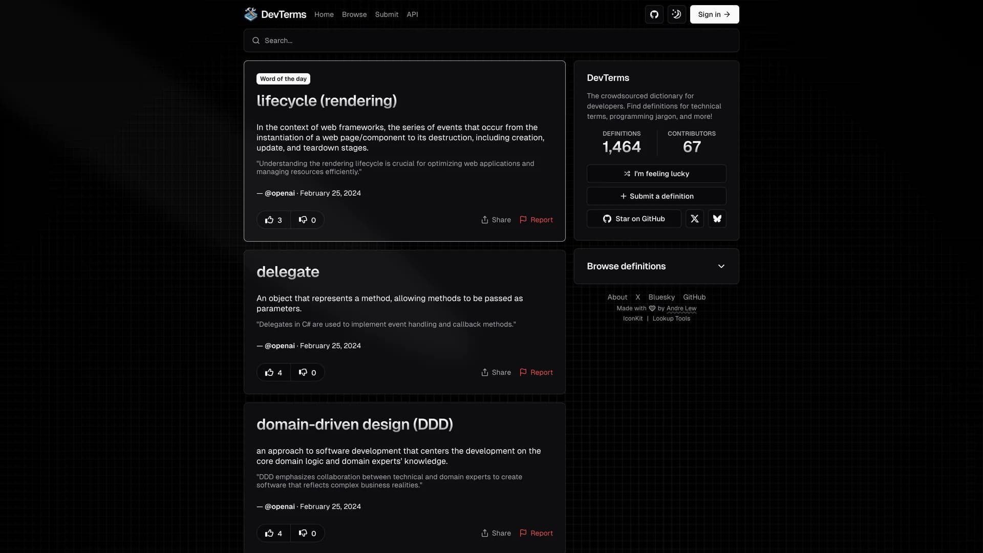
- DevTermsDevTerms is a crowdsourced dictionary website specifically designed to help developers find clear, community-contributed definitions for technical terms, programming jargon, acronyms, and industry concepts that often confuse newcomers and experienced developers alike. Built with Next.js, React, Tailwind CSS, shadcn/ui components, Drizzle ORM for type-safe database queries, Turso for SQLite database hosting, and Meilisearch for powerful, typo-tolerant search functionality, this platform creates a collaborative knowledge base where the developer community can contribute, refine, and discover technical definitions. The application features crowdsourced definitions allowing multiple perspectives on technical concepts, lightning-fast search powered by Meilisearch with autocomplete and fuzzy matching, community voting and curation to surface the best explanations, social media integration sharing daily developer wisdom on X (Twitter) and Bluesky, clean, distraction-free interface optimized for quick reference, and comprehensive coverage of programming languages, frameworks, tools, and methodologies. Hosted on Vercel for global edge delivery, DevTerms addresses the common frustration of encountering unfamiliar technical terminology in documentation, code reviews, or technical discussions without an accessible, developer-friendly resource to consult. The platform is perfect for junior developers learning industry terminology and best practices, experienced developers encountering unfamiliar acronyms in new domains, technical writers ensuring accurate usage of terms in documentation, coding bootcamp students building their technical vocabulary, and anyone in tech who values clear, community-validated definitions over generic dictionary entries. The open-source nature encourages community contributions, making DevTerms a living resource that evolves with the industry. This project demonstrates how to build community-driven content platforms, implement advanced search with Meilisearch, use Drizzle ORM with SQLite databases, create engaging developer tools, and foster collaborative knowledge sharing in technical communities.
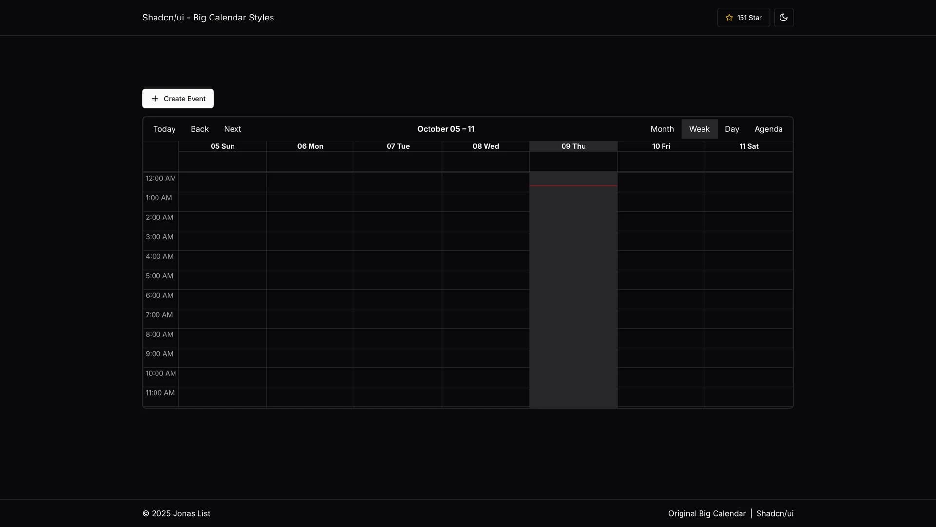
- Shadcn UI Big CalendarThe shadcn/ui Big Calendar is a beautifully styled integration of React Big Calendar with shadcn/ui's design system, providing seamless light and dark theme support through pure CSS variable-based theming without JavaScript manipulation. Built with Next.js, React, Tailwind CSS, and shadcn/ui components, this reusable calendar component automatically adjusts its appearance based on the selected theme using shadcn's CSS variables, creating smooth theme transitions and consistent visual experiences across your application. The implementation features automatic theme switching that respects user preferences and system settings, pure CSS-based theming eliminating JavaScript overhead for theme management, Next.js compatibility with server-side rendering support, multiple calendar views including month, week, day, and agenda layouts, full React Big Calendar functionality for event scheduling and management, responsive design adapting to mobile and desktop screen sizes, and a dedicated CSS stylesheet that leverages shadcn's color tokens for unified styling. Unlike standard React Big Calendar implementations that require manual theme configuration or complex JavaScript solutions, this integration uses CSS variables to ensure calendar colors, backgrounds, borders, and text automatically match your shadcn/ui theme, whether users prefer light mode during the day or dark mode at night. The component is perfect for building appointment scheduling applications for services, healthcare, or consulting, team calendar interfaces for project management and collaboration, event management platforms for conferences or community events, resource booking systems for meeting rooms or equipment, and any application requiring a full-featured calendar with professional, theme-aware styling. This project demonstrates how to integrate third-party React components with shadcn/ui's theming system, implement CSS variable-based theming for complex UI components, create reusable calendar solutions for Next.js applications, and maintain visual consistency across light and dark modes.
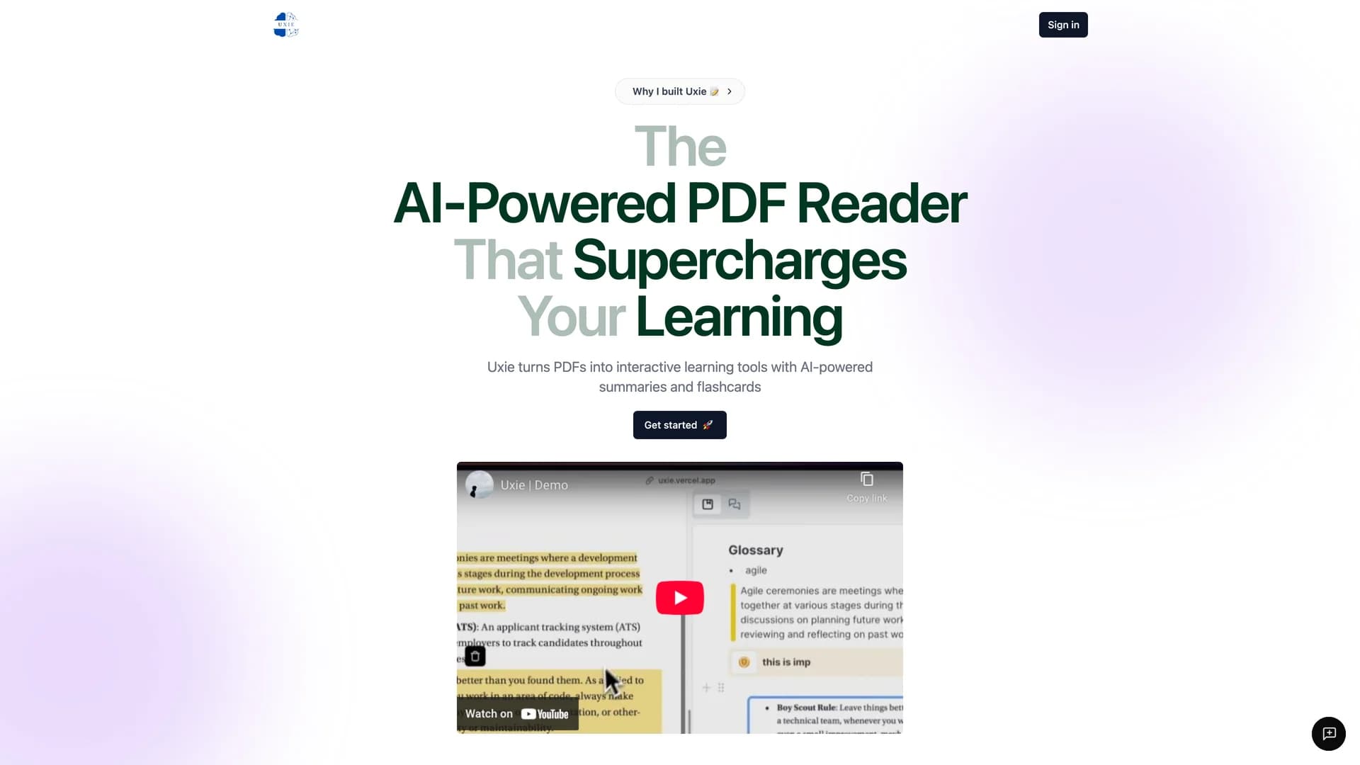
- UxieUxie is an intelligent PDF reader application that started as a first-place hackathon project and evolved into a comprehensive learning platform combining PDF annotation, note-taking, real-time collaboration, and AI-powered features including chat, flashcard generation with AI feedback, text-to-speech, and OCR capabilities. Built with Next.js, TypeScript, Tailwind CSS, shadcn/ui components, tRPC for type-safe APIs, Prisma ORM for database management, Supabase for backend services, Vercel AI SDK and Langchain for AI features, Pinecone for vector embeddings, Next Auth for authentication, and Liveblocks for real-time collaboration, this full-stack application transforms static PDFs into interactive learning experiences. The platform features comprehensive PDF annotation tools with highlighting, underlining, and margin notes, intelligent note-taking with custom editor blocks and AI-powered text autocompletion, AI chat functionality that answers questions about document content using RAG (Retrieval Augmented Generation), automatic flashcard generation from document content with LLM-generated feedback on answers, sentence-by-sentence text-to-speech with visual highlighting (English only), OCR support for extracting text from scanned documents and images, real-time collaborative editing powered by Liveblocks allowing multiple users to annotate simultaneously, and vector embedding storage in Pinecone for semantic search and AI context. The AI integration uses the Vercel AI SDK and Langchain to provide contextual understanding of PDFs, enabling students to ask questions and receive answers grounded in the actual document content. This application is invaluable for students who want to enhance their study sessions with AI-powered learning tools, researchers annotating academic papers and collaborating on document analysis, professionals reviewing contracts or reports with team members, educators creating interactive reading materials with embedded questions and flashcards, and anyone who learns better through active engagement rather than passive reading. Uxie demonstrates how to build AI-enhanced document viewers, implement real-time collaboration in React applications, integrate vector databases for semantic search, create custom text editors with AI features, and design engaging learning experiences through technology.
- Next Ecommerce ShopcoShopco is a fully functional, open-source e-commerce website that converts a professional Figma design into a responsive, production-ready web application using Next.js 16 App Router, TypeScript, Tailwind CSS, shadcn/ui components, Framer Motion for animations, and Redux Toolkit for state management. This project demonstrates best practices for building modern e-commerce platforms with server-side rendering, static site generation, smooth animations, and global state management while maintaining excellent performance and SEO optimization. The application features a complete product catalog with filtering, sorting, and search functionality, responsive, mobile-first design that works beautifully across all devices, shopping cart management powered by Redux Toolkit, smooth page transitions and micro-interactions using Framer Motion, accessible and customizable UI components from shadcn/ui, optimized images and fonts for fast loading times, type-safe development with TypeScript throughout, and well-organized project structure following Next.js 16 best practices. The tech stack showcases how to combine Redux for complex state management with Next.js server components, implement animations that enhance rather than hinder user experience, structure large applications with clear separation of concerns in app routing, components, Redux features, and styles, and build SEO-friendly e-commerce sites with proper meta tags and semantic HTML. This project is valuable for developers learning to build production-ready e-commerce applications from design to deployment, studying how to convert Figma designs into pixel-perfect web implementations, understanding Redux Toolkit patterns in modern Next.js applications, exploring animation best practices with Framer Motion, and creating portfolio pieces demonstrating full-stack e-commerce capabilities. Released under the MIT License, Shopco serves as both a functional e-commerce template and an educational resource for contemporary web development practices in the e-commerce domain.
- Image Upload ShadcnImage Upload shadcn is a clean, reusable image upload component built with Next.js, TypeScript, shadcn/ui components, and Cloudinary integration for cloud-based image storage and management. This implementation demonstrates best practices for handling file uploads in modern React applications, including drag-and-drop functionality, image preview, upload progress feedback, and seamless integration with Cloudinary's powerful image CDN and transformation API. The component features intuitive drag-and-drop interface for effortless image selection, instant image preview before upload confirmation, responsive UI built with shadcn/ui components ensuring consistent styling, Cloudinary integration for scalable, cloud-based image storage, TypeScript throughout for type safety and better developer experience, optimized image delivery through Cloudinary's global CDN, and easy deployment on Vercel for production-ready hosting. Unlike basic file upload inputs, this component provides a polished user experience with visual feedback, error handling, and professional styling that matches shadcn/ui's design language. The Cloudinary integration eliminates the need for custom server-side upload handling, providing automatic image optimization, transformation capabilities, and reliable storage without managing your own infrastructure. This component is perfect for building user profile picture uploads in social applications, product image management in e-commerce platforms, document or receipt uploads in business applications, media galleries requiring cloud storage and CDN delivery, and any form requiring image input with professional UX. The project demonstrates how to implement file uploads in Next.js applications, integrate third-party services like Cloudinary with proper environment configuration, create reusable upload components with shadcn/ui, handle user feedback during asynchronous operations, and deploy image-heavy applications on Vercel. The TypeScript implementation ensures type safety when working with file objects and Cloudinary responses.
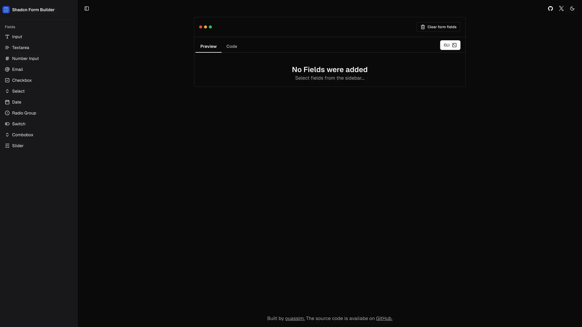
- Shadcn UI Form BuilderThe shadcn/ui Form Builder is a powerful WYSIWYG (What You See Is What You Get) form generation tool that revolutionizes form development by allowing developers to visually select input fields and automatically generate production-ready code with integrated shadcn/ui components, React Hook Form, and Zod validation schemas. Built with Next.js, TypeScript, Tailwind CSS, Drizzle ORM for database management, and shadcn/ui components, this tool eliminates the tedious manual work of writing form boilerplate, validation schemas, and component wiring. The form builder features a visual drag-and-drop interface for selecting and configuring input fields, automatic Zod schema generation ensuring type-safe validation, seamless integration with React Hook Form for performant form state management, one-click code generation producing copy-paste ready form components, support for various input types including text, email, number, select, checkbox, radio, and more, multi-field line configurations for complex form layouts, and customizable styling following shadcn/ui's design patterns. The platform's philosophy is simple: imagine selecting the input fields you need and having everything else—validation, state management, error handling, accessibility—done automatically. The ambitious roadmap includes expanding input field types with file uploads, OTP inputs, and multi-select components, support for alternative validation libraries beyond Zod, and pre-built form templates for common use cases like contact forms, registration forms, and surveys. This tool is invaluable for developers building forms who want to skip repetitive boilerplate and focus on unique logic, teams establishing consistent form patterns across multiple projects, rapid prototyping scenarios where form creation speed matters, applications requiring numerous forms with different field configurations, and anyone frustrated with manually wiring React Hook Form and Zod together. The Form Builder demonstrates how to create developer productivity tools, implement code generation with proper formatting and imports, integrate form libraries for optimal developer experience, and design intuitive interfaces for technical tasks.
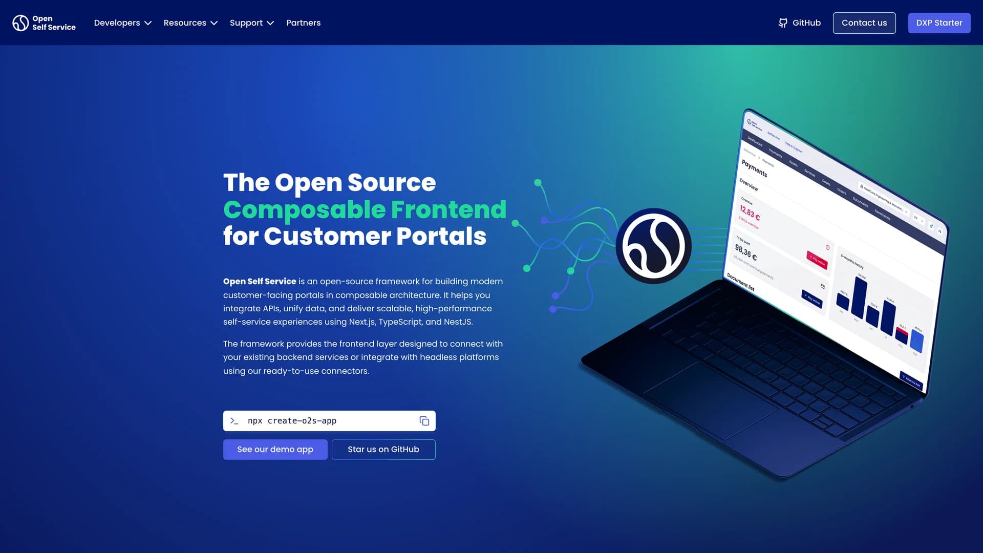
- OpenSelfServiceOpen Self Service (O2S) is an open-source development kit for building composable, future-proof customer self-service portals with API-agnostic architecture that allows you to swap backends without breaking the frontend. Maintained by Hycom, this framework combines Next.js for the frontend, NestJS for an API harmonization server, TypeScript for type safety, shadcn/ui components, and Tailwind CSS to create flexible customer portals that compose experiences by combining multiple backend capabilities from different sources. The architecture features headless and API-first design allowing any backend to be plugged in, composable backend capabilities where you mix services from different providers, pre-built integrations including StrapiCMS for content management, Auth.js for authentication, Redis for caching, and Algolia for search, extensible UI components and API integration layers, and modular design enabling easy customization without vendor lock-in. Unlike monolithic customer portal solutions that tie you to specific backends and limit flexibility, O2S treats backends as interchangeable building blocks, allowing enterprises to integrate their existing CMS, IAM, CRM, ERP, and other systems without rebuilding the entire frontend when backend providers change. This approach is invaluable for enterprises building customer portals that need to integrate with multiple legacy systems, organizations wanting to avoid vendor lock-in by maintaining backend flexibility, teams managing complex architectures with services from multiple providers, companies planning to migrate backends over time without disrupting customer experience, and developers who need a production-ready portal foundation with modern UX patterns. The framework demonstrates how to build API-agnostic frontends with proper abstraction layers, integrate multiple backend services through a unified harmonization layer, implement pre-built integrations while maintaining composability, design scalable customer portal architectures, and future-proof applications against backend technology changes. Open Self Service makes building sophisticated customer portals accessible while ensuring long-term flexibility and maintainability.
 Nextjs
 React
React Tailwind
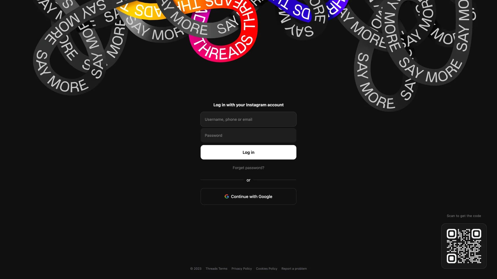


 Scss
Scss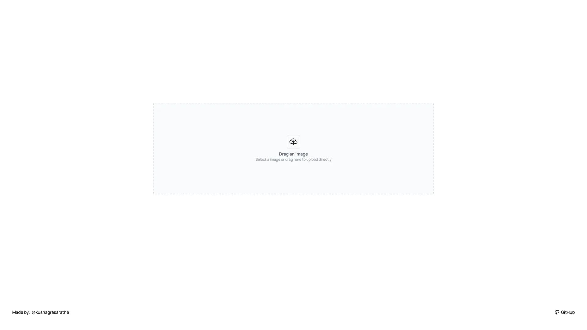
 Nestjs