React Templates - Tailwind
194 templates • 158 contributors • Open source & free
Available Templates (194)
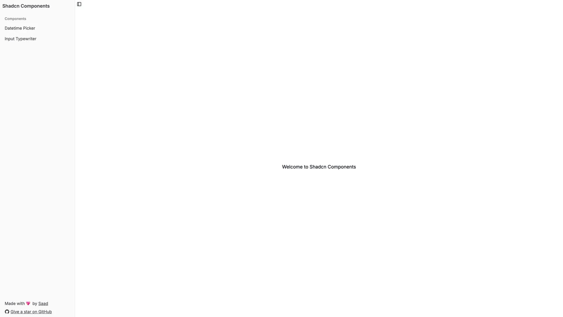
- Shadcn Datetime PickerShadcn Datetime Picker is a beautifully crafted datetime picker component built with React, Next.js, TypeScript, shadcn/ui, and Tailwind CSS, providing seamless date and time selection, customizable layouts easily adaptable to fit various design requirements, and responsive design ensuring optimal user experience across different devices from mobile to desktop. With a TypeScript-heavy implementation (96% of codebase) ensuring type safety and excellent IDE support, this component addresses the universal need for reliable datetime input in modern web applications while maintaining the aesthetic quality and accessibility standards expected from shadcn/ui components. Perfect for appointment scheduling systems, event registration forms, task management applications with deadline setting, booking platforms handling reservations and availability, or any application where datetime selection is a frequent user interaction that directly impacts data accuracy and user satisfaction. The customizable layout enables developers to adapt the picker's appearance to match specific design systems without fighting against opinionated defaults, while the responsive design ensures consistent functionality whether users interact via touch on mobile devices or mouse and keyboard on desktop workstations. Deployed on Vercel with a live demo for evaluation, this component demonstrates how focusing on visual appeal and user experience can transform a routine form input into a polished interaction that enhances perceived application quality and professionalism.
- Next.js 16 Starter ShadcnNext.js 16 Starter Shadcn is a comprehensive starter template built with Next.js 16, React 19, TypeScript 5, Tailwind CSS 4, shadcn/ui, ESLint 9, and Prettier 3, designed to accelerate web development projects with powerful tools and configurations optimized for VS Code development workflows. This robust, opinionated starter features App Directory structure for modern Next.js development, system, light, and dark mode support for user preferences, Next.js Bundle Analyzer for performance optimization, Docker support with both Node.js and Bun configurations for containerization, comprehensive ESLint and Prettier configurations ensuring code quality, recommended VS Code extensions for enhanced developer experience, and cloud development environment options for remote collaboration. Supporting multiple package managers (npm, yarn, pnpm, bun) and providing extensive code quality tooling, this template reduces initial project setup time from hours to minutes while promoting best practices in modern web development. Perfect for development teams standardizing project structure and tooling, agencies delivering consistent client projects, individual developers building multiple applications with similar requirements, or any scenario where reducing boilerplate setup and decision fatigue enables faster progression from idea to implementation. The preconfigured development environment eliminates the common friction of setting up linting, formatting, and build tools, while the Docker configurations ensure consistent development and deployment environments across team members and production infrastructure, creating a foundation that scales from solo projects to team-based development.
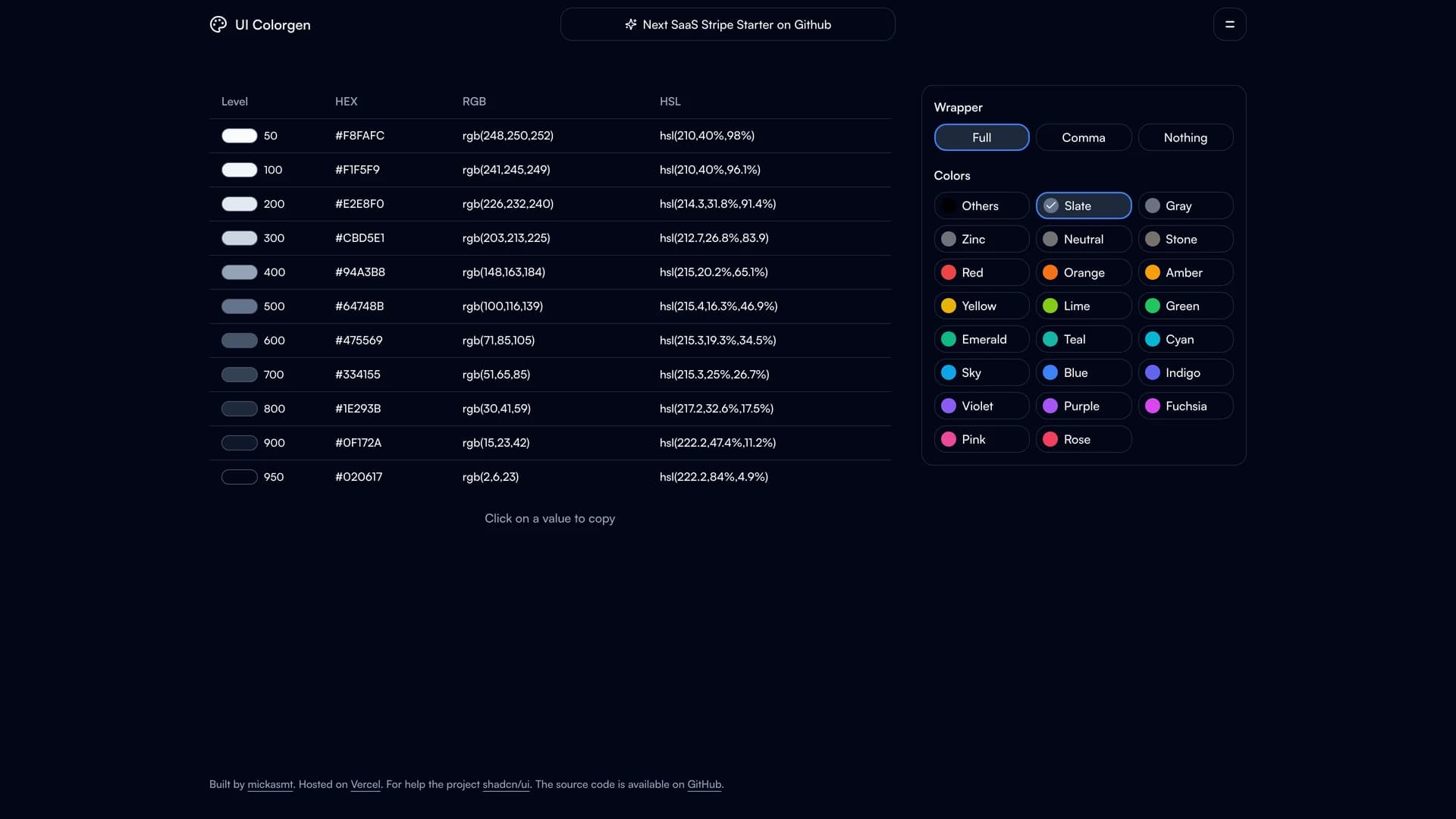
- UI ColorgenUI Colorgen is a web application built with Next.js 16, TypeScript, Tailwind CSS, and Radix UI, designed to simplify shadcn/ui color configuration by providing an interactive interface for listing TailwindCSS colors in multiple formats (hex, rgb, hsl), using a color picker to update CSS variables in real-time, adding custom color variables beyond defaults, selecting initial colors and preferred color formats, generating CSS root variables for theme files, and creating Tailwind color configuration for projects. This specialized tool addresses the complexity of color system setup in shadcn/ui projects where manual CSS variable management becomes error-prone and time-consuming as color schemes evolve. Perfect for design systems teams establishing brand colors across shadcn/ui components, developers implementing client-specific themes in white-label applications, agencies customizing shadcn/ui for multiple clients with different brand guidelines, or any project where efficient color configuration directly impacts development velocity and design consistency. The TypeScript-heavy codebase (94.8%) provides excellent type safety for color manipulation operations, while the multi-format color display helps developers work with colors in their preferred format whether designing in Figma (hex), working with CSS (hsl), or integrating with existing systems (rgb). By generating ready-to-use CSS variables and Tailwind configurations, UI Colorgen eliminates the manual translation between design decisions and code implementation, reducing errors and enabling rapid theme iterations that respond to design feedback or A/B testing results.
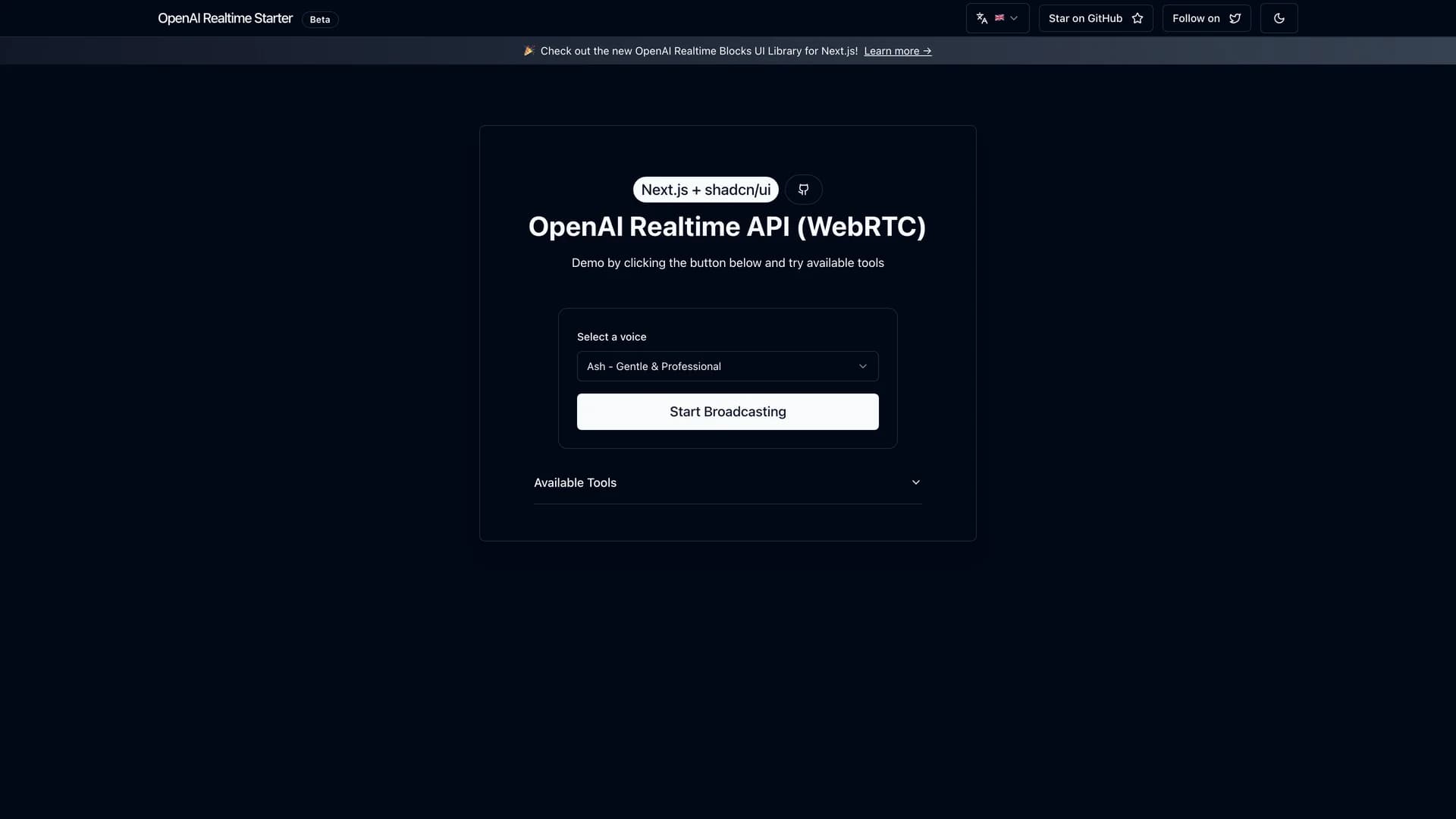
- OpenAI Realtime API Next.jsOpenAI Realtime API Next.js is a comprehensive starter template built with Next.js 16, TypeScript, OpenAI Realtime API, WebRTC, Tailwind CSS, shadcn/ui, and Framer Motion, designed for building Voice AI applications with real-time voice interaction capabilities and advanced tool-calling features. This robust framework provides WebRTC-based voice AI streaming for low-latency audio, Next.js server-side rendering for optimal performance, modern UI with smooth animations via Framer Motion, abstracted WebRTC handling through custom React hooks, six example tool-calling functions demonstrating capabilities like getCurrentTime, partyMode, and changeBackground, and multilingual support for English, Spanish, French, and Chinese with strict TypeScript checking ensuring type safety. Supporting both Deno and Node.js runtimes and deployable to Vercel with one-click setup, the template emphasizes ease of use and developer experience while enabling sophisticated voice AI interactions. Perfect for customer service applications with voice-based support, accessibility tools enabling voice control, educational platforms with conversational tutoring, productivity applications supporting voice commands, or any interface where voice interaction provides more natural engagement than traditional text inputs. The custom hook abstraction simplifies WebRTC complexity, enabling developers to focus on application logic and AI capabilities rather than connection management and audio streaming protocols, while the example tool-calling functions demonstrate how voice AI can trigger application actions, creating interactive experiences that respond to user speech in real-time.
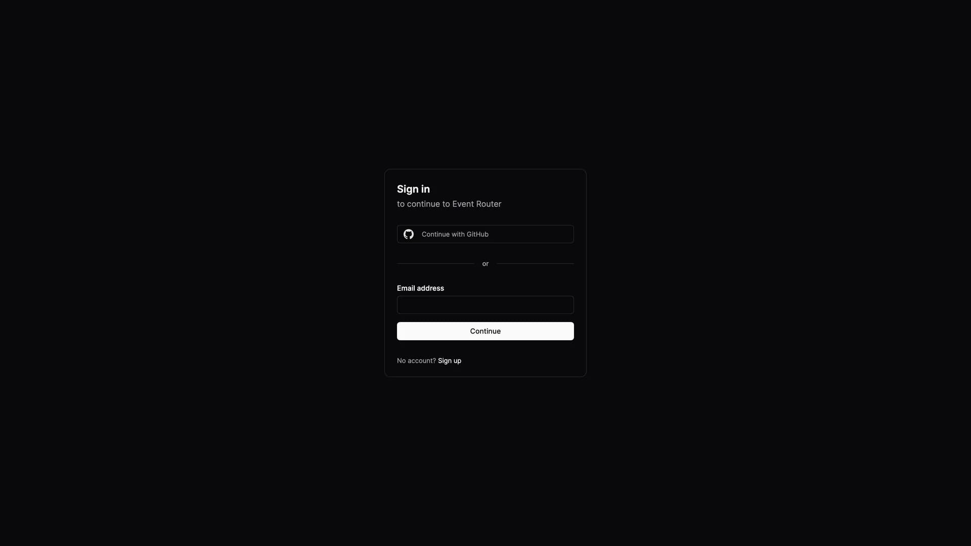
- FlowlyFlowly is a study project built with Next.js 13, Tailwind CSS, shadcn/ui, Clerk authentication, and Radix UI, designed to help teams document event-driven architecture by providing structured registration of services, events, event publications and subscriptions, optional markdown descriptions for events, and JSON schema support for event payloads. Currently under development as an educational exercise, Flowly addresses the challenge of maintaining accurate, accessible documentation for event-driven systems where services communicate through asynchronous events rather than synchronous API calls, making system behavior harder to understand and debug. The planned features enable backward-compatible event design, potential TypeScript typing generation from schemas, automatic NPM package publishing for event contracts, and checking for unused event data fields that bloat payloads. Perfect for microservices architectures using event-driven patterns, distributed systems teams maintaining event catalogs, organizations adopting domain-driven design with bounded contexts, or development teams where lack of event documentation leads to integration problems and duplicate event definitions. By centralizing event documentation with schema definitions, Flowly aims to create a single source of truth for event contracts across services, enabling teams to evolve systems confidently by understanding event dependencies, consumers, and schema compatibility before making breaking changes that could cascade through distributed architectures and cause production incidents.
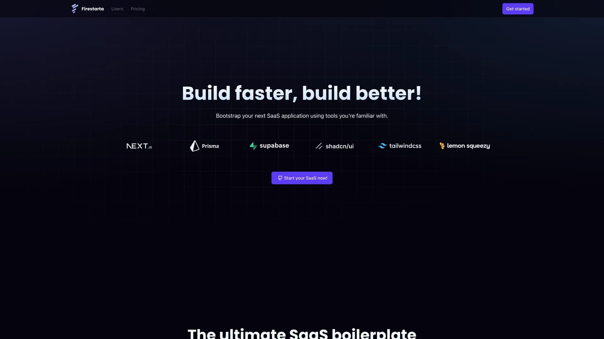
- FirestartaFirestarta is a comprehensive Next.js SaaS boilerplate built with TypeScript, NextAuth for authentication, Prisma ORM, Supabase Postgres, Lemon Squeezy for subscription management, Sass, shadcn/ui, and Lucide icons, designed to provide a robust starting point for web applications requiring user authentication, subscription payments, and modern development practices. This production-ready template features App directory structure with Route Groups, Intercepting and Parallel Routes, server-side and client-side rendering for optimal performance, comprehensive user authentication flows, integrated subscription management with Lemon Squeezy, responsive design across all devices, internationalization support for global markets, and custom components following best practices. Built with modern web development standards and a flexible, extensible architecture, Firestarta eliminates weeks of initial setup work that every SaaS application requires before addressing unique product features. Perfect for developers building subscription-based products, entrepreneurs launching SaaS businesses with limited technical teams, agencies delivering custom SaaS solutions for clients, or any project where rapid development without sacrificing code quality and scalability determines market success. The integration of NextAuth, Prisma, and Supabase provides a complete authentication and data management stack, while Lemon Squeezy handles the complexity of subscription billing, tax compliance, and payment processing, enabling founders to focus on product differentiation and customer acquisition rather than infrastructure and payment integration challenges.
- Mantine Theme BuilderMantineHub (previously Mantine Theme Builder) is an open-source web tool built with TypeScript, Next.js, CSS, SCSS, and Tailwind CSS, designed to create modern, customizable shadcn-inspired themes for Mantine UI components by providing extensive color palette selection, border radius control, light/dark mode toggling, theme object export functionality, and support for all Mantine components with pre-built UI component "Blocks". This comprehensive toolkit evolved from an experimental project into a full-featured theme generation interface that simplifies the process of modernizing Mantine's styling by enabling developers to quickly generate and integrate contemporary design systems. The shadcn design inspiration brings the elegant aesthetics popularized by shadcn/ui to the Mantine ecosystem, bridging the gap between Mantine's comprehensive component library and modern design trends. Perfect for development teams using Mantine UI seeking modern aesthetics, designers creating custom themes for Mantine applications, agencies building multiple projects with consistent Mantine styling, or developers transitioning from other UI libraries who want Mantine components with familiar design patterns. The theme export functionality generates ready-to-use configuration objects that can be copied and pasted directly into projects, eliminating manual theme construction and reducing the time from design decision to implementation. By providing a visual interface for theme customization, MantineHub makes sophisticated Mantine theming accessible to team members who may not be familiar with Mantine's theming API structure while maintaining the full power and flexibility that experienced developers expect.
- Photography WebsitePhotography Website is an open-source photography travel blog built with Next.js 16, Neon serverless Postgres, Drizzle ORM, Better Auth, shadcn/ui, tRPC, and Cloudflare R2 storage, designed to provide photographers with a sophisticated platform for sharing and documenting travel photography experiences with modern web technologies. This feature-rich application offers responsive design optimized for all devices from mobile to desktop, automatic EXIF data extraction from photos capturing camera settings and technical details, secure authentication protecting user accounts and content, cloud storage with Cloudflare R2 for scalable image hosting, location-based photo organization enabling geographical browsing, SEO optimization for discoverability through search engines, and dark and light themes matching user preferences. The platform addresses the unique needs of photographers who want to showcase work with context (location, camera settings, technical details) while maintaining a clean, gallery-focused presentation that emphasizes images over text. Perfect for travel photographers documenting journeys with rich metadata, professional photographers building portfolios with technical credibility, photography enthusiasts sharing work with communities, or anyone creating visual narratives where images, locations, and technical details combine to tell complete stories. The automatic EXIF extraction eliminates manual data entry for technical information, while location-based organization enables viewers to explore photography by destination, creating engaging browsing experiences that traditional chronological blogs cannot provide, making this platform ideal for photographers whose work is intrinsically connected to places and technical craft.
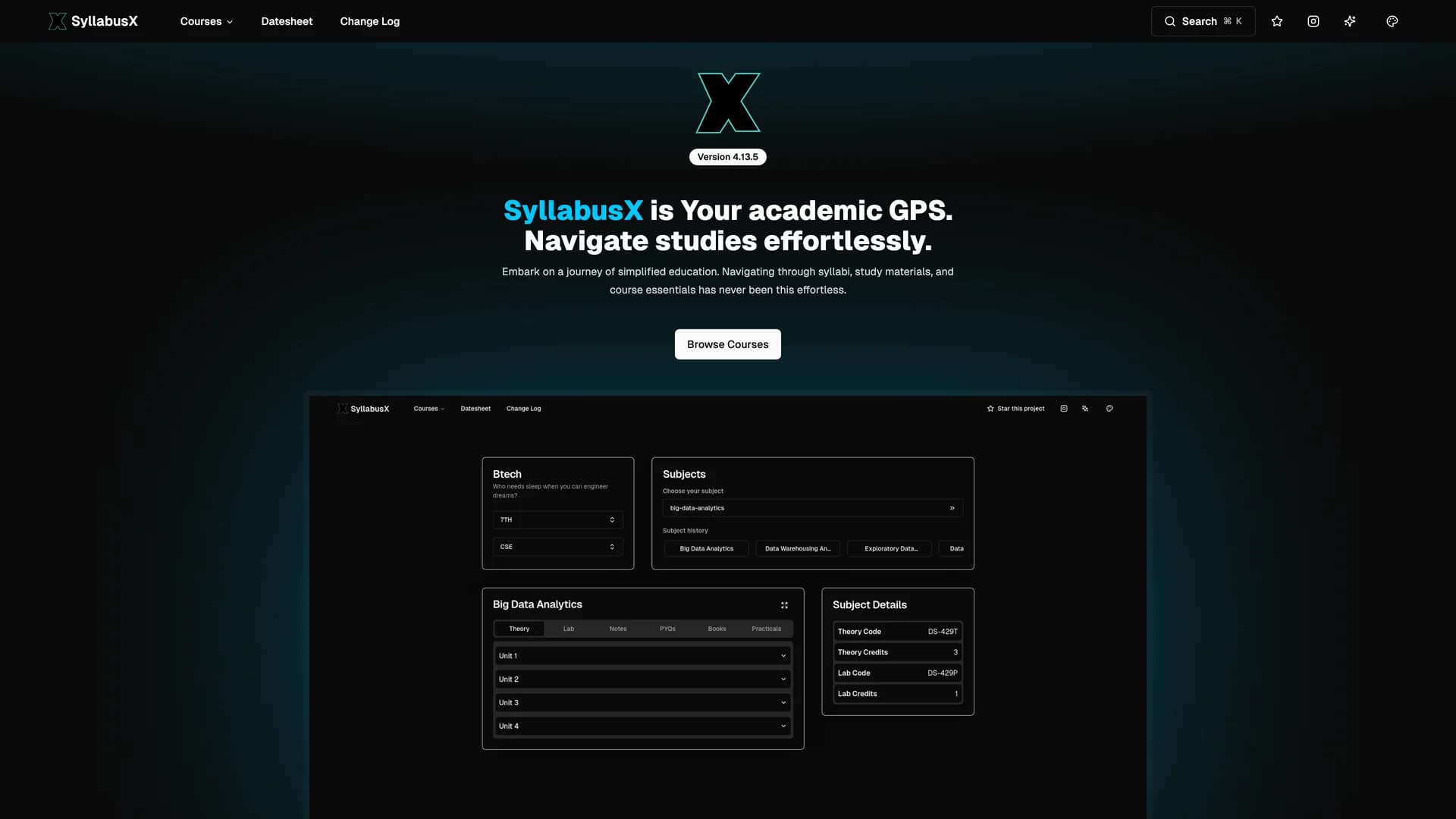
- SyllabusX ClientSyllabusX is an open-source academic resource platform built with Next.js, TypeScript, shadcn/ui, Tailwind CSS, and Contentful, designed specifically for B.Tech students at GGSIPU to serve as an academic GPS that centralizes syllabi, handwritten notes, previous year questions (PYQs), and practical files in one accessible platform. This comprehensive educational tool addresses the common frustration that gathering syllabi and study materials for each subject is hassling and time-consuming, providing complete syllabus coverage for Batch 2021-2025, curated handwritten notes highlighting key concepts, previous year question papers for exam preparation, practical files and lab resources, and coverage across all engineering branches. Perfect for university students managing multiple courses with scattered resources, educators sharing structured content with classes, study groups collaborating on exam preparation, or academic institutions seeking centralized resource distribution platforms. The web-based platform at syllabusx.live makes navigating through syllabi, study materials, and course essentials effortless by organizing content logically and providing quick access to frequently needed resources without hunting through email attachments, university portals, or social media groups. As a community-driven, open-source project, SyllabusX demonstrates how student-led initiatives can solve real educational challenges by creating tools that directly address pain points in academic workflows, enabling students to spend less time searching for materials and more time actually studying them, improving preparation efficiency and reducing the stress of locating essential resources during crucial exam periods.
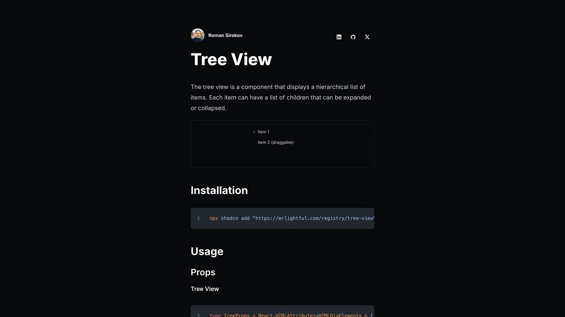
- Shadcn Tree ViewShadcn Tree View is a React component built with TypeScript, Tailwind CSS, and shadcn/ui, designed for creating hierarchical tree views with nested, expandable, and collapsible data lists that support custom icons, action buttons, drag-and-drop functionality, and disabled states. This versatile component enables developers to navigate complex hierarchical data structures through expand, collapse, and select operations, customize icons for different item states (default, open, selected), add action buttons to individual tree items, implement click handlers for both individual items and the entire tree, support drag-and-drop reordering, and disable specific items when needed. Based on community implementations by WangLarry and bytechase while following shadcn/ui design principles, the component provides modular, configurable tree views with a roadmap including programmatic item control, striped/non-striped variants, and custom item renderers. Perfect for file system browsers, organizational hierarchies, category navigation, nested menu systems, or any application requiring visual representation of hierarchical relationships with user interaction. Installable via 'npx shadcn add' from the author's registry, this component fills a gap in the shadcn/ui ecosystem by providing tree view functionality that many applications need but few component libraries include, making it valuable for developers building admin panels, content management systems, or any interface where hierarchical data visualization and navigation are essential to user workflows and information architecture understanding.
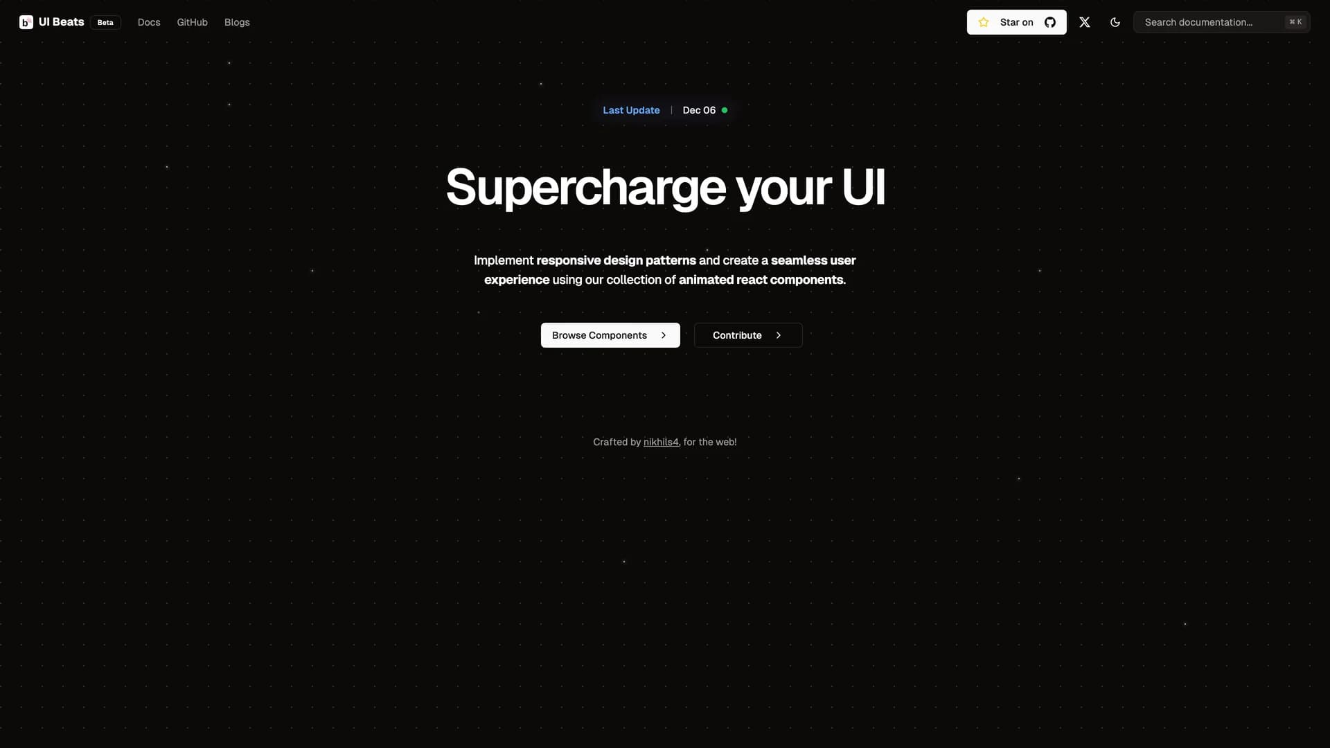
- UI BeatsUI Beats is an open-source component library built with React, TypeScript (84.9%), Tailwind CSS, Framer Motion, and Next.js, designed to level up UI development by providing reusable, animated components with comprehensive documentation at uibeats.com/docs. This MIT-licensed resource focuses on component-based UI development by offering pre-built, customizable components that simplify and accelerate frontend creation through consistent design patterns, smooth animations via Framer Motion, comprehensive MDX documentation for easy integration, and an active contribution guide enabling community involvement. With 211 stars on GitHub and emphasis on developer experience, UI Beats demonstrates how focused component libraries can streamline development workflows by providing production-ready building blocks rather than requiring developers to build every interface element from scratch. Perfect for frontend developers seeking animated components without complex implementation, design systems teams establishing animation standards, prototyping workflows requiring rapid UI assembly, or projects where polished, animated interfaces differentiate user experience but limited time and resources prevent custom animation development. The combination of TypeScript for type safety, Tailwind for styling flexibility, and Framer Motion for sophisticated animations creates components that are both developer-friendly and visually engaging, enabling teams to deliver professional, animated UIs without deep animation expertise or extensive development time, making modern UI patterns accessible to developers at all skill levels through well-documented, copy-paste-ready components.
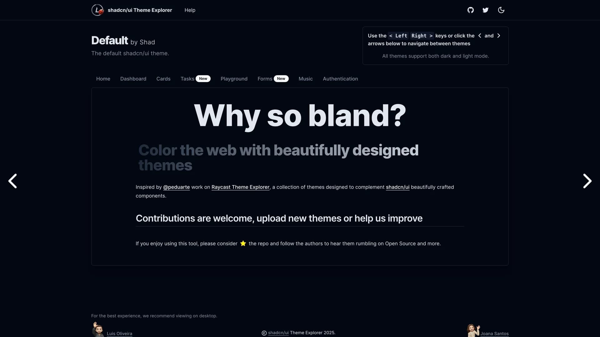
- Shadcn UI Theme ExplorerShadcn UI Theme Explorer is a community-driven platform built with Next.js 13, TypeScript, Tailwind CSS, and React, designed to help developers explore, preview, customize, and share beautifully designed themes for shadcn/ui components with light and dark mode variations. Inspired by the Raycast Theme Explorer, this collaborative tool enables users to upload and contribute new themes through a simple process of adding theme information to an index, creating CSS files with color definitions, and importing themes into global stylesheets, effectively coloring the web with community-created designs. The platform provides a centralized repository where designers and developers can discover diverse color schemes, test themes with live component previews, understand how themes affect different UI elements, and contribute their own creations to benefit the broader shadcn/ui community. Perfect for design teams exploring brand color applications, developers seeking theme inspiration, open-source contributors sharing design work, or any project where theme experimentation and discovery accelerate design decisions and ensure cohesive visual systems. By emphasizing community involvement with a clear code of conduct and inclusive approach, the Theme Explorer demonstrates how collaborative design tools can expand the creative possibilities of component libraries, enabling the shadcn/ui ecosystem to support diverse aesthetic preferences while maintaining the underlying component architecture and accessibility standards that make the library valuable across varied applications and industries.
 Nextjs
 React
React Tailwind
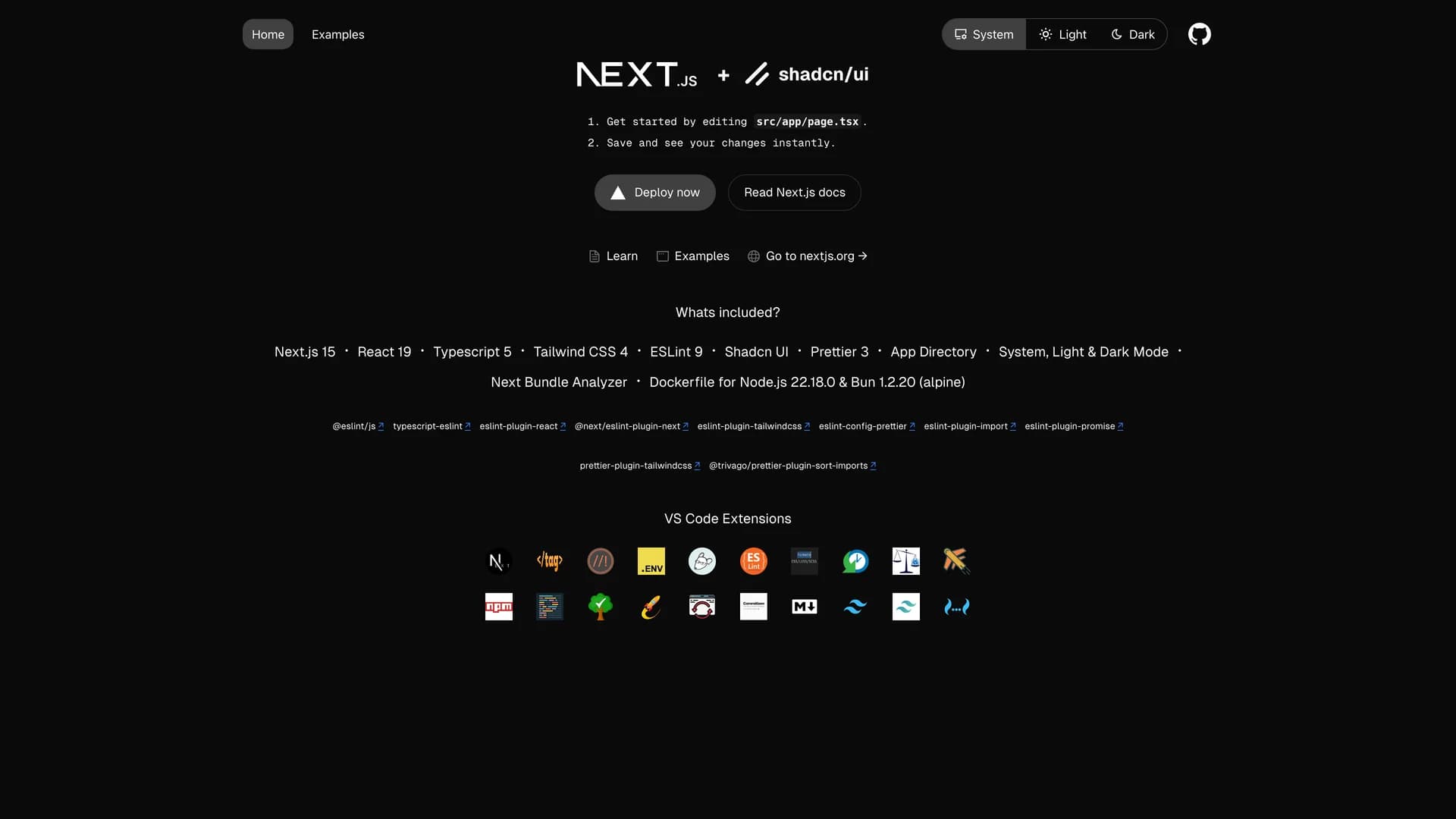
 Scss
Scss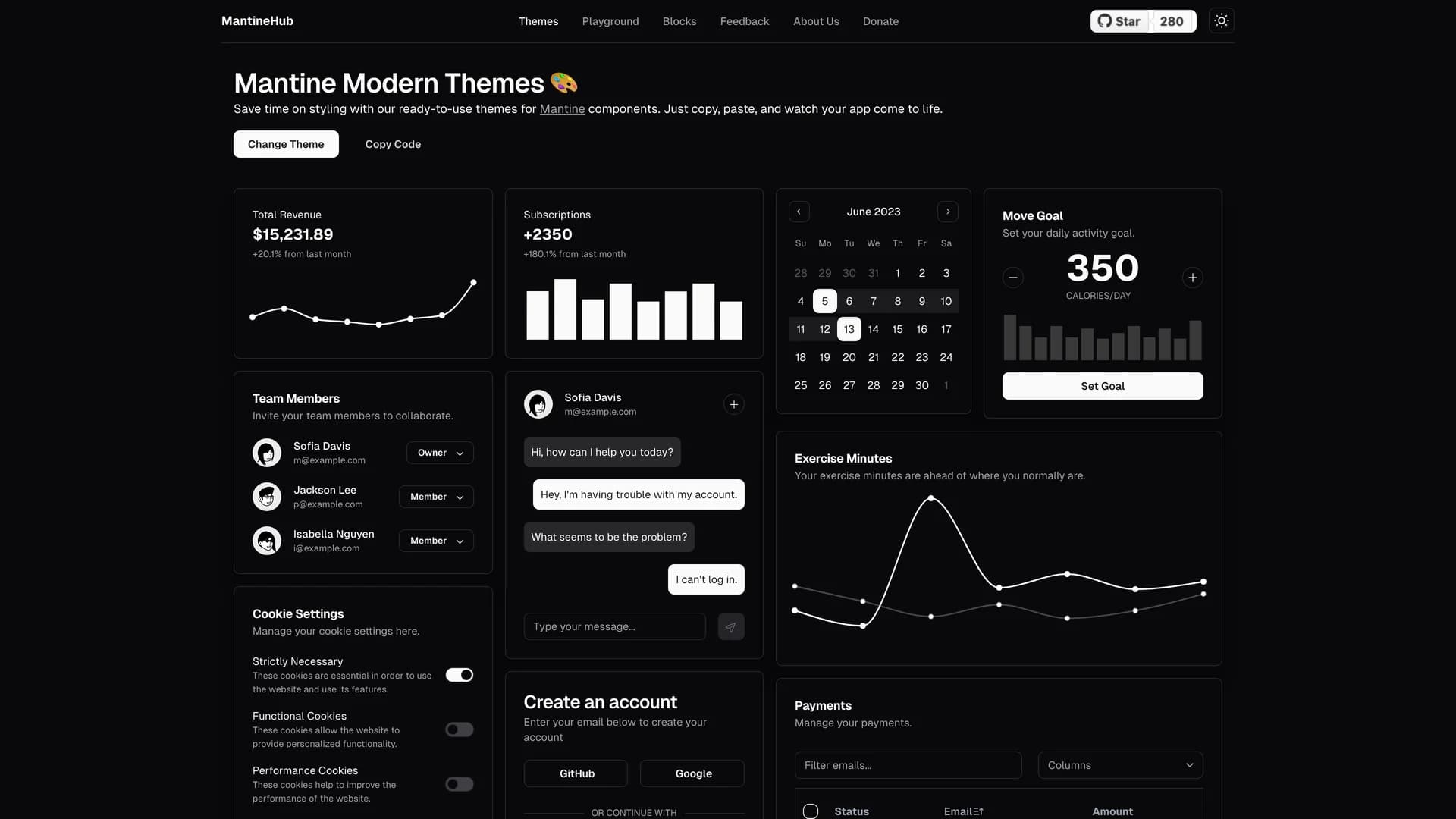
