React Templates - Vite
23 templates • 20 contributors • Open source & free
Available Templates (23)
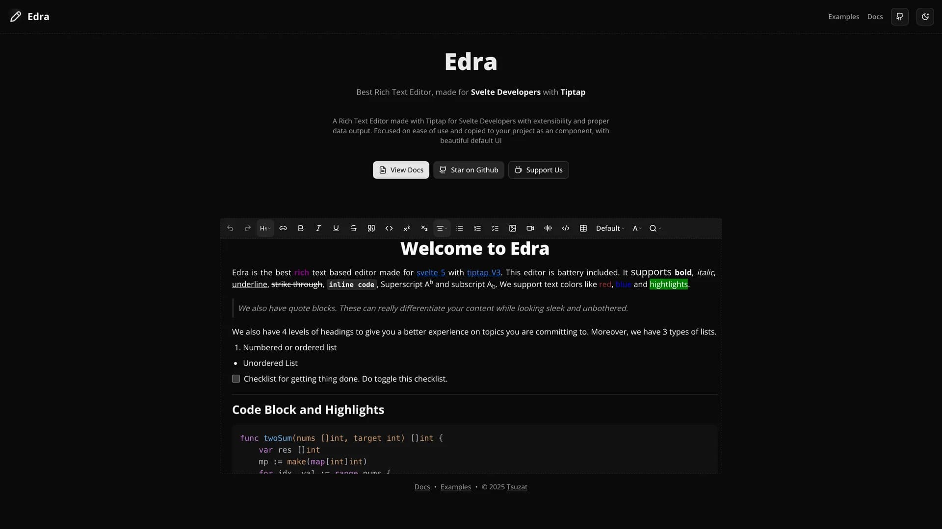
- EdraEdra is a fully controllable rich text editor specifically designed for Svelte developers, built with Tiptap and offering extensive customization through flexible UI options and comprehensive formatting tools. The MIT-licensed editor provides rich text editing with markdown shortcuts, comprehensive formatting (bold, italic, underline), color picking and highlighting, table creation and manipulation, media embedding (images, videos, audio), code blocks with syntax highlighting, slash commands, math and LaTeX support, drag-and-drop functionality, and search and replace capabilities. Built with Svelte, TypeScript, and Tiptap with optional headless or Shadcn-based UI, Edra offers extensive configuration capabilities and seamless integration as a Svelte component. The editor emphasizes developer experience with the ability to add or remove features as needed while maintaining full control over functionality and appearance. Perfect for content management systems built with Svelte, blogging platforms, documentation sites, note-taking applications, or any Svelte project requiring sophisticated rich text editing with complete control over features and customization, Edra demonstrates Tiptap's power within the Svelte ecosystem.
- EdraEdra is a fully controllable rich text editor specifically engineered for Svelte developers, built on the powerful Tiptap editor framework with TypeScript. This comprehensive editing solution offers two flexible UI options: a headless mode for complete customization and a shadcn-based interface for rapid implementation. The editor features markdown shortcuts, comprehensive text formatting (bold, italic, underline, strikethrough), color picking and highlighting, table creation and manipulation, media embedding (images, videos, audio), code blocks with syntax highlighting, drag-and-drop functionality, slash commands, and math/LaTeX support. With its bubble menu for quick editing and extensive extensibility, Edra addresses the lack of powerful, Svelte-native rich text editors in the ecosystem. Perfect for building content management systems, note-taking applications, documentation platforms, and any Svelte application requiring sophisticated text editing capabilities, Edra provides developers with a production-ready component that can be easily integrated and customized to match specific application requirements while maintaining full control over functionality and appearance.
- UnoCSS Preset ShadcnUnoCSS Preset Shadcn is a framework-agnostic preset that enables seamless integration of shadcn/ui components across React, Vue, Svelte, and SolidUI applications using UnoCSS instead of Tailwind CSS. This innovative preset provides developers with easily customizable themes, dynamic theme switching capabilities, and Tailwind-like utilities while leveraging UnoCSS's superior performance and flexibility. Built with TypeScript and offering utility functions for class merging, this preset simplifies component styling and theming across different web frameworks without sacrificing the developer experience that makes shadcn/ui popular. Perfect for teams working across multiple frameworks who want consistent design systems, developers seeking UnoCSS performance benefits while using shadcn components, projects requiring advanced theming capabilities beyond Tailwind's default offerings, or any application where build-time CSS generation and atomic CSS advantages matter. Based on earlier work by fisand and maintained by the UnoCSS community, this preset demonstrates how modern CSS frameworks can bridge component libraries across ecosystem boundaries while providing developers with powerful theming tools and maintaining the copy-paste simplicity that defines the shadcn philosophy.
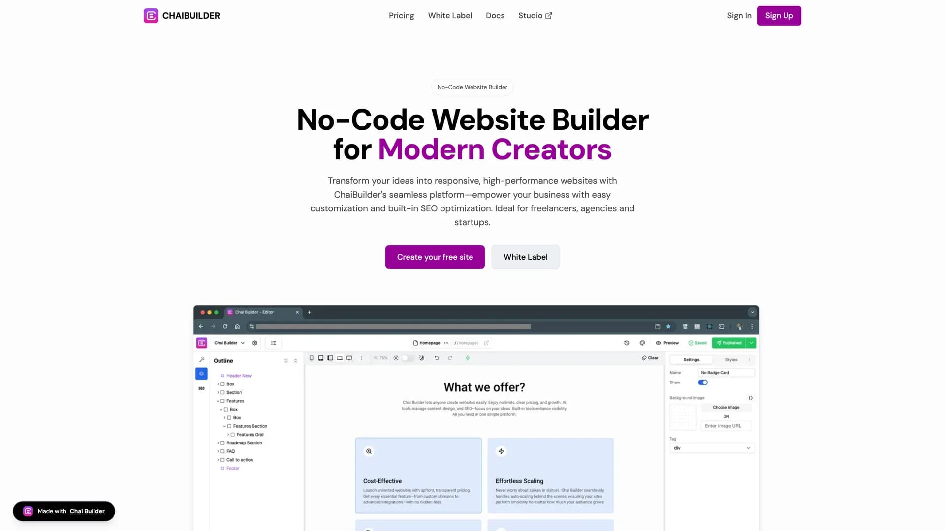
- Chai BuilderChai Builder is an AI-enabled, open-source low-code visual builder for React and Tailwind CSS that allows developers and non-technical users to create web pages through intuitive drag-and-drop interactions. This innovative platform integrates seamlessly with React applications, uses Tailwind CSS for styling, supports custom block rendering, and provides a simple React component for embedding the builder directly into existing applications. The visual page building interface enables rapid web page development without extensive coding, making it possible for designers, product managers, and other team members to contribute to UI development while developers maintain control over component libraries and design systems. Perfect for agencies building client websites quickly, SaaS platforms offering customizable user-facing pages, marketing teams needing landing page flexibility without developer bottlenecks, or any project where visual development accelerates iteration cycles and enables non-technical stakeholders to participate in UI creation. As a community-driven, extensible platform with a Next.js starter project and live demo at chaibuilder-sdk.vercel.app, Chai Builder demonstrates how low-code tools can enhance rather than replace traditional development workflows, providing a bridge between visual design tools and production-ready React applications while maintaining code quality and customization capabilities.
- Frontvibe FluidFluid is a Hydrogen theme built with React Router V7, Shopify Hydrogen, React, Tailwind CSS, Sanity CMS, Radix UI, shadcn/ui, Motion, and Embla Carousel, enabling developers to easily build modern headless Shopify storefronts by organizing content with modular sections similar to Shopify Liquid themes. This comprehensive e-commerce solution provides real-time visual editing for content editors, page building through modular, reusable sections, seamless Shopify integration for product data and checkout, and flexible content management with Sanity CMS offering advanced content modeling and preview capabilities. Drawing inspiration from Shopify's Dawn theme, Sanity's Akva demo, the Hydrogen demo store, and Build UI recipes, Fluid combines the best patterns from established e-commerce solutions into a unified, headless architecture. Perfect for brands seeking full design control over their storefronts, agencies building custom e-commerce experiences for clients, growing businesses outgrowing Shopify theme limitations, or any project where content-driven commerce and unique customer experiences differentiate products in competitive markets. The separation of content management (Sanity) from commerce functionality (Shopify) enables marketing teams to iterate on content without developer involvement while developers maintain control over the storefront implementation, performance optimization, and custom features that standard Shopify themes cannot support, creating a scalable foundation for modern e-commerce that adapts to business growth and changing market demands.
- Radix NG PrimitivesRadix NG Primitives is an Angular port of Radix UI Primitives built with TypeScript (82.6%), MDX, CSS, and Astro, providing a low-level, headless UI component library focused on accessibility, customization, and developer experience for Angular applications. This comprehensive toolkit offers unstyled, functional primitives including Accordion, Avatar, Checkbox, Dialog, and many others based partially on @angular/cdk, supporting incrementally adoptable components that can serve as the base layer of design systems or be adopted gradually into existing projects. As an unofficial but API-compatible port maintaining the original Radix UI principles, the library brings the proven accessibility patterns and headless component architecture popularized in the React ecosystem to Angular developers who previously lacked equivalent tooling. Perfect for Angular teams building accessible design systems, enterprises requiring WCAG-compliant interfaces, developers transitioning from React familiar with Radix patterns, or any Angular application where accessibility compliance, customization freedom, and high-quality component foundations are non-negotiable requirements. With strong community engagement through Discord and GitHub Discussions, Radix NG Primitives demonstrates how successful component architectures can transcend specific frameworks, enabling the Angular ecosystem to benefit from the accessibility research, usability testing, and developer experience refinements that made Radix UI valuable in React while adapting patterns to Angular's different component model, dependency injection, and change detection systems, ultimately improving accessibility standards across the entire web development landscape.
- Soybean UISoybean UI (published as soy-ui on npm) is an elegant and accessible UI component library for Vue 3 that brings shadcn/ui's philosophy of copy-paste components and design principles to the Vue ecosystem. Built on top of @soybean-ui/primitives and UnoCSS for styling and theming, this library provides Vue developers with the same level of customization, accessibility, and developer experience that React developers enjoy with shadcn/ui. The library features accessible, unstyled UI primitives built specifically for Vue 3's Composition API, flexible theming system powered by UnoCSS with customizable colors, radius, and dark mode support, automatic component resolution with unplugin-vue-components for streamlined imports, copy-paste component approach giving developers full ownership of their UI code, and comprehensive documentation with interactive examples and usage guides. Installation is straightforward via pnpm add soy-ui with additional UnoCSS configuration for theming, and components can be used directly in Vue templates with full TypeScript support. Unlike monolithic Vue UI libraries that lock you into specific design decisions and bundle sizes, Soybean UI follows the copy-paste paradigm where developers add components to their codebase and customize them freely without fighting against library constraints. This approach is perfect for Vue developers who want shadcn/ui's flexibility and accessibility patterns, teams building design systems that need full control over component styling and behavior, projects requiring accessible UI components with ARIA support out of the box, applications that benefit from UnoCSS's atomic CSS approach, and developers who prefer owning their UI code rather than depending on external component libraries. The library demonstrates how to build accessible component primitives for Vue 3, implement flexible theming with UnoCSS, create developer-friendly component APIs with the Composition API, and apply shadcn/ui's design principles to the Vue ecosystem.
- WordPress Plugin BoilerplateThe WordPress Plugin Boilerplate is a comprehensive starter template that brings modern web development practices to WordPress plugin development by integrating React, TypeScript, SASS, Tailwind CSS, shadcn/ui components, Vite for blazing-fast builds, Storybook for component development, and Hot Module Replacement for instant feedback during development. This boilerplate eliminates the traditional pain points of WordPress plugin development by providing a Laravel-inspired custom ORM for database operations, flexible API routing for REST endpoints, simplified shortcode generation with custom rendering, seamless data passing between PHP backend and React frontend, and a CLI tool for rapid plugin scaffolding and configuration. The development workflow is streamlined with npm run dev for full development mode with HMR, separate npm run dev:frontend and npm run dev:admin commands for focused development, npm run build to compile production-ready assets, and npm run release to create distributable plugin packages. The boilerplate includes Storybook integration for isolated component development and documentation, TypeScript for type safety across JavaScript code, SASS and Tailwind CSS for flexible styling options, shadcn/ui and Headless UI for accessible component primitives, and proper WordPress hooks and filters integration maintaining compatibility with the WordPress ecosystem. This template is invaluable for developers building commercial WordPress plugins with modern UIs and complex functionality, agencies developing multiple client plugins who need consistent, maintainable architecture, teams transitioning from jQuery-based WordPress development to React, freelancers who want professional development experience in WordPress projects, and anyone frustrated with traditional WordPress plugin development workflows. The project demonstrates how to integrate modern JavaScript frameworks into WordPress without fighting the platform, structure plugin code for maintainability and testability, implement database models and API routes in WordPress context, build component libraries with Storybook for WordPress admin interfaces, and accelerate WordPress plugin development with contemporary tooling.
- React Vite NStackReactViTenStack is a modern, full-stack starter template that kickstarts web application development with an efficient, flexible architecture offering seamless integration and complete type safety from frontend to backend. Combining React with Vite for blazing-fast development, TanStack Suite (Router, Query, Form) for powerful data management and routing, HonoJS as a lightweight, Express-like backend framework, Drizzle ORM for type-safe database operations, Postgres via NeonDB for scalable cloud database hosting, shadcn/ui components for accessible UI, Tailwind CSS for styling, TypeScript throughout for end-to-end type safety, and Zod for runtime validation, this template eliminates weeks of configuration by providing a cohesive stack that works together seamlessly. The architecture features Vite's instant hot module replacement for rapid iteration, TanStack Router for type-safe routing with automatic code splitting, TanStack Query for efficient server state management with caching and invalidation, TanStack Form for performant form handling with validation, HonoJS backend providing familiar Express-like APIs with better TypeScript support, Drizzle ORM offering SQL-like queries with full type inference, NeonDB's serverless Postgres eliminating database infrastructure management, and Zod schemas ensuring data integrity across the stack. The monorepo structure managed by PNPM workspace demonstrates professional project organization, keeping frontend and backend code in logical separation while sharing types and utilities. This template is perfect for developers building SaaS products who want full-stack type safety without complexity, teams establishing modern development standards across projects, indie developers launching MVPs with scalable architecture, developers learning contemporary full-stack patterns with best-in-class tools, and anyone frustrated with the complexity of configuring modern JavaScript stacks. The comprehensive documentation and demo video help developers understand architectural decisions and get productive quickly. ReactViTenStack demonstrates how to achieve complete type safety from database to UI, structure monorepos for fullstack applications, integrate modern tools for optimal developer experience, and build performant applications with contemporary best practices.
- Downshift Shadcn ComboboxDownshift Shadcn Combobox is a sophisticated autocomplete component that combines the accessibility and state management of Downshift with the elegant styling of shadcn/ui. Built with React and TypeScript, it provides developers with a production-ready combobox solution that handles complex selection scenarios while maintaining full keyboard navigation and screen reader support. The component features customizable filtering and search, multi-select capabilities, grouped options support, virtual scrolling for large datasets, and comprehensive keyboard shortcuts. It integrates seamlessly with shadcn/ui's design system, providing consistent styling with Tailwind CSS and full theme customization. Perfect for building search interfaces, tag selectors, data filters, and any application requiring accessible autocomplete functionality with professional UI design.
- Downshift Shadcn ComboboxDownshift Shadcn Combobox provides a powerful autocomplete component that merges Downshift's robust state management with shadcn/ui's elegant design system for React applications. This production-ready component handles complex selection scenarios while maintaining full accessibility compliance and keyboard navigation support. The combobox features intelligent filtering and search algorithms, single and multi-select modes, grouped and nested options support, virtual scrolling for handling thousands of items efficiently, and comprehensive ARIA attributes for screen readers. Built with TypeScript for complete type safety, it integrates seamlessly with shadcn/ui styling using Tailwind CSS and supports full theme customization including dark mode. The component includes customizable rendering for options and selected items, async data loading capabilities, and extensive keyboard shortcuts. Perfect for building advanced search interfaces, tag selection systems, data filtering controls, or any application requiring accessible autocomplete functionality with professional UI design and optimal performance.
 Svelte
 Vite
Vite Tailwind
 React
React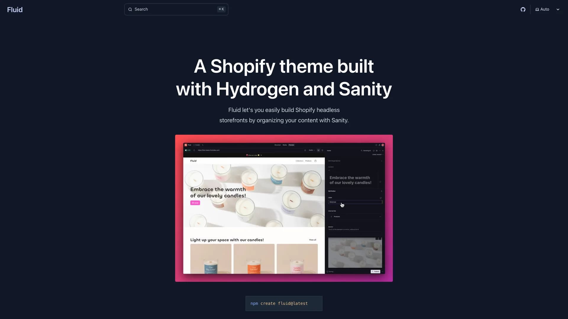
 Remix
Remix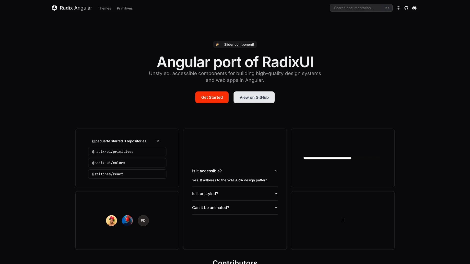
 Angular
 Express
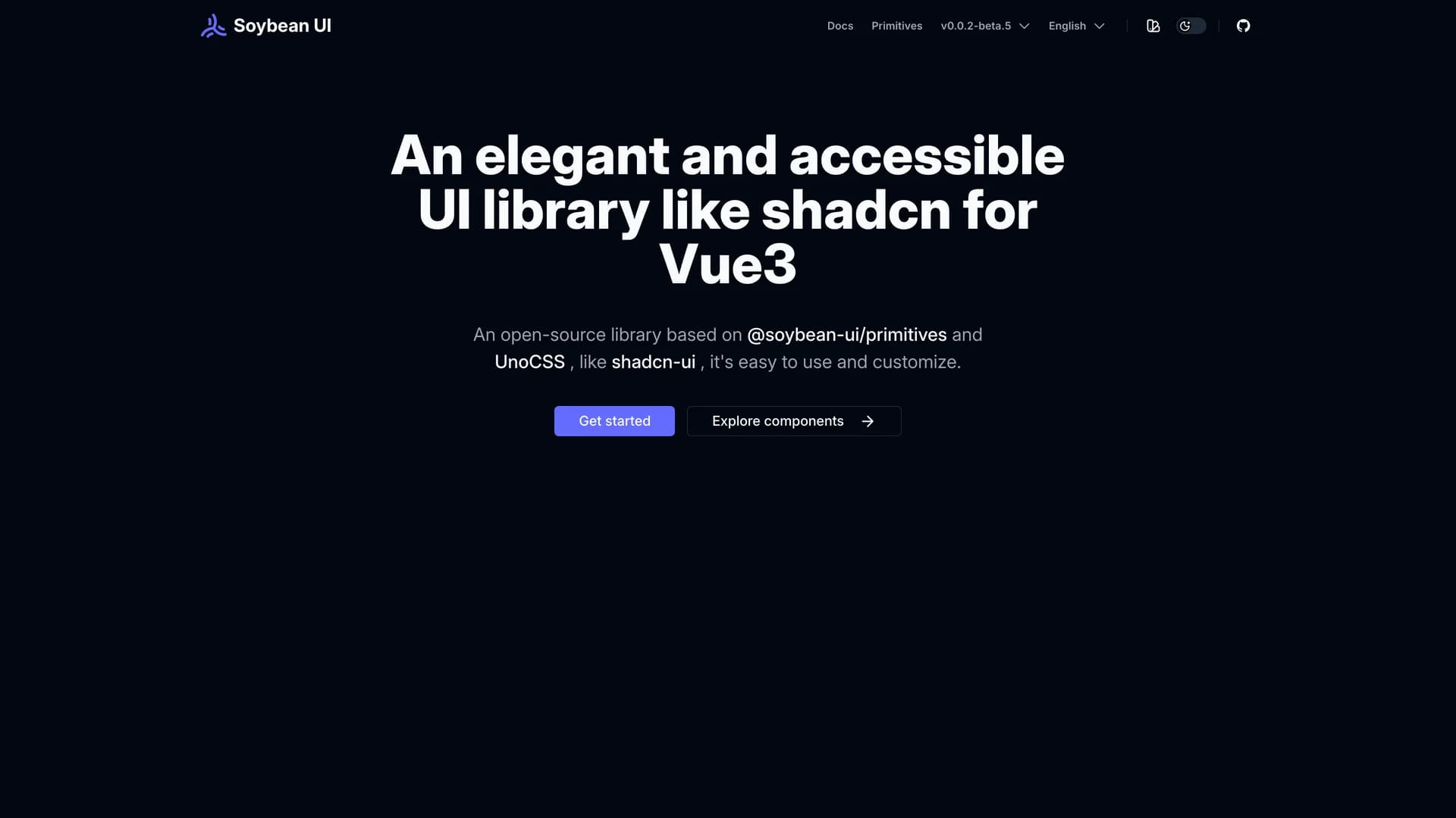
 Vue
Vue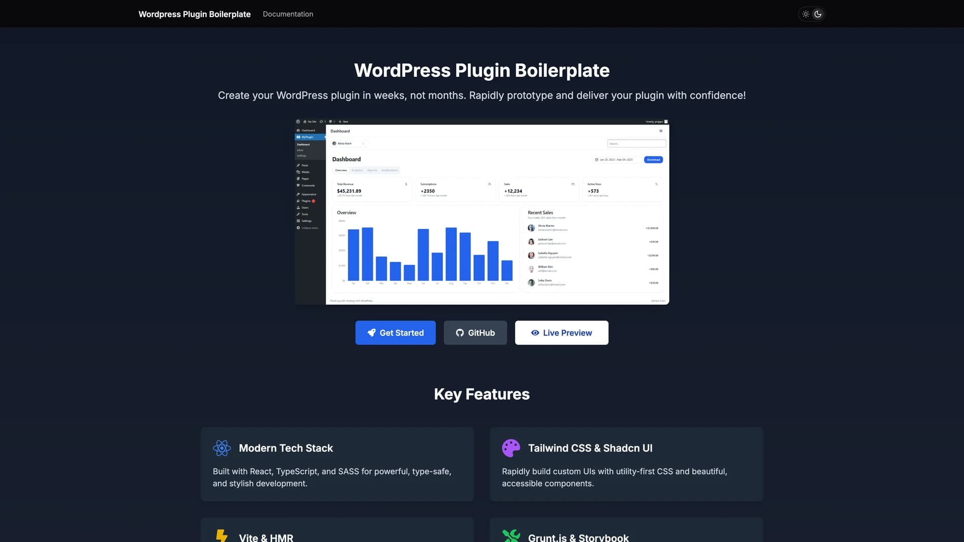
 Scss
Scss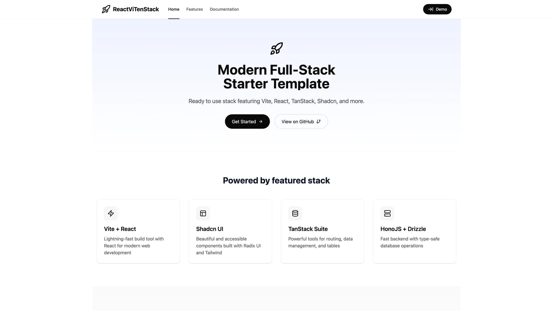
 Drizzle orm
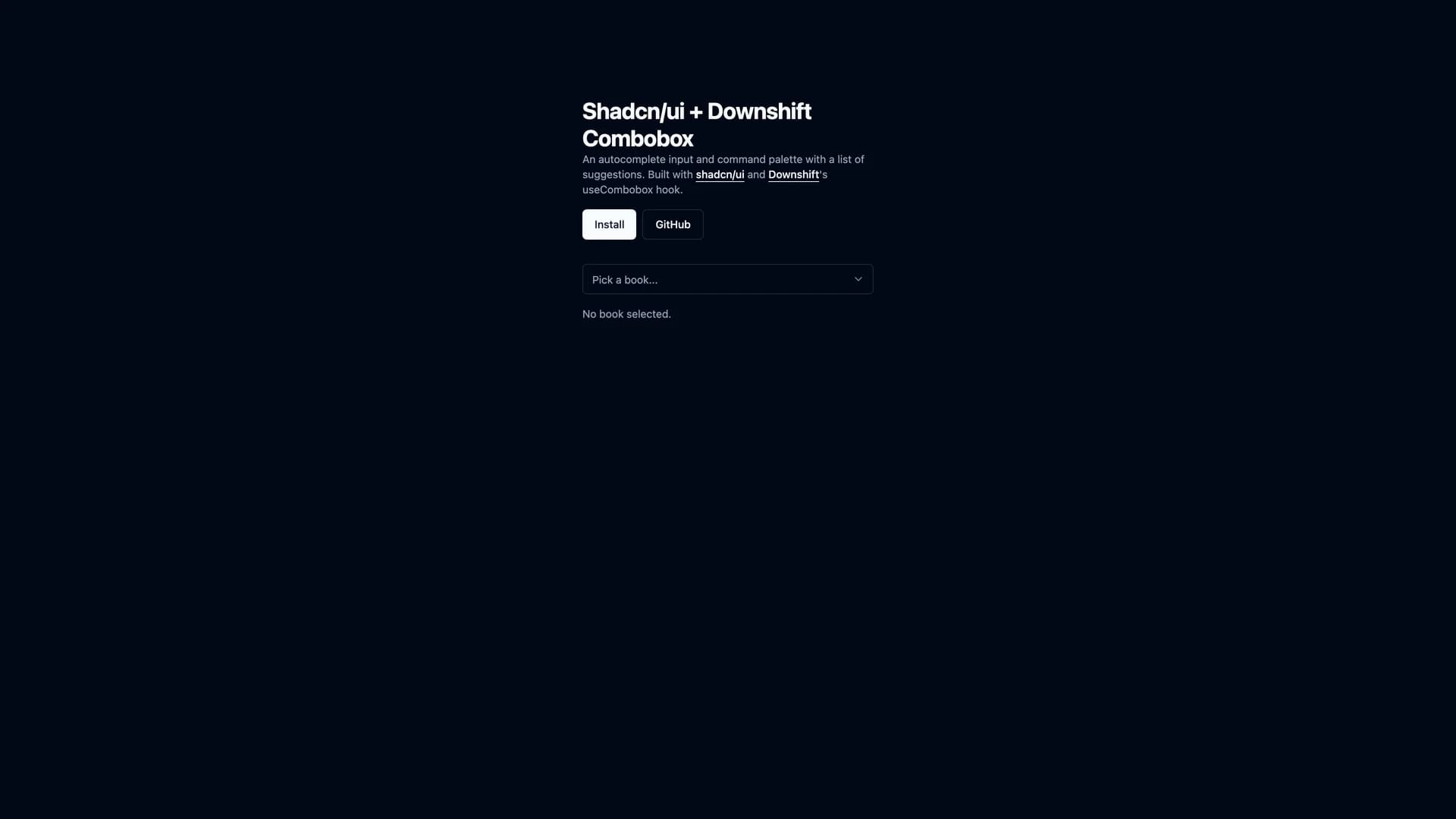
