Join our Discord Community
Date Range Picker template preview

Date Range Picker

Date Range Picker For Shadcn

J

Created by Johnpolacek

Last updated October 8, 2025

About This Template

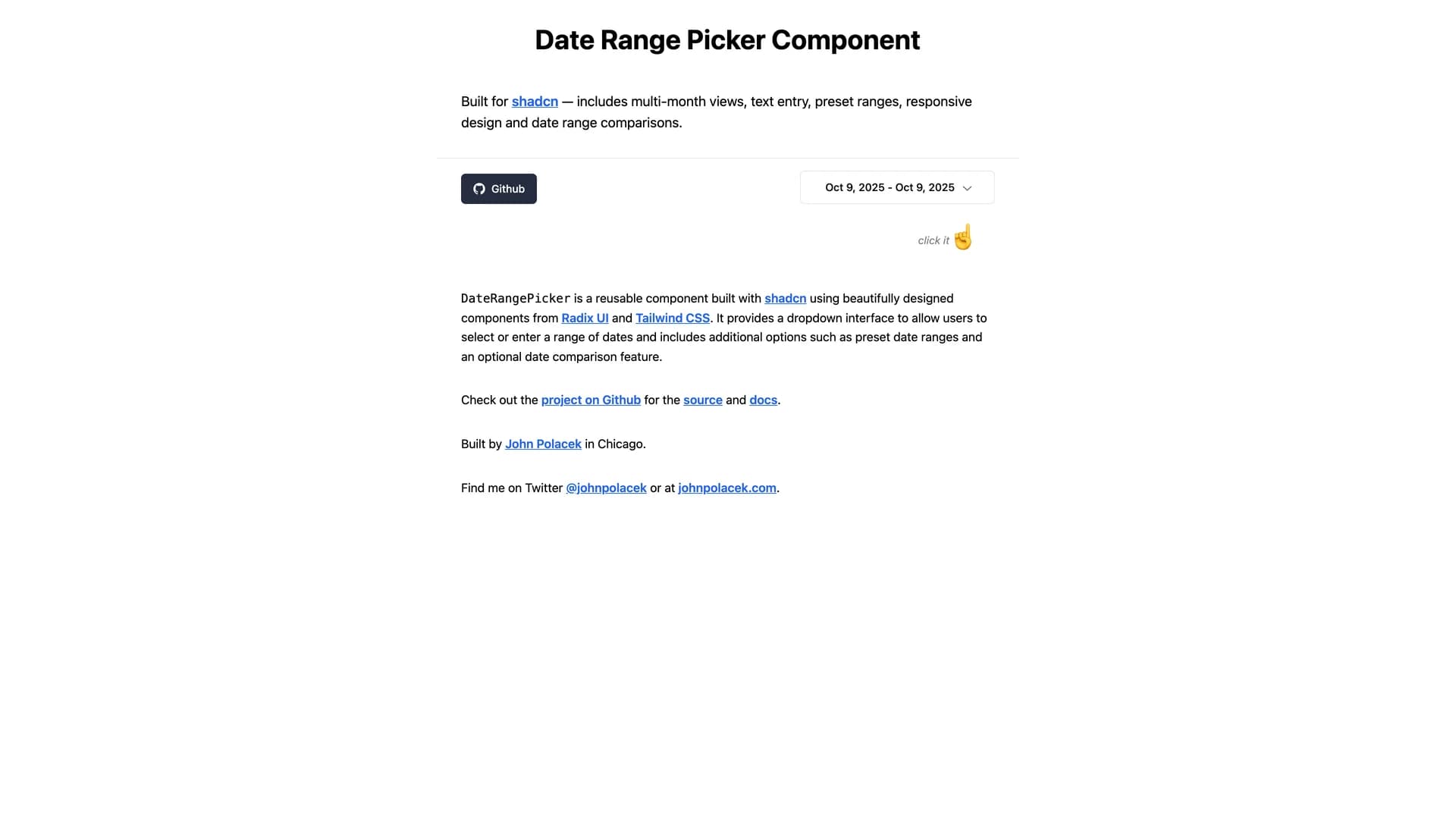
Date Range Picker for shadcn is a comprehensive date range selection component built on shadcn/ui's design system with support for presets, comparison ranges, and advanced filtering. The MIT-licensed component integrates seamlessly with shadcn/ui projects, providing a polished interface for selecting date ranges with pre-defined options like "Last 7 days," "Last 30 days," and "This month" alongside custom range selection. Built with React, TypeScript, and date-fns for reliable date handling, the picker includes comparison mode for analyzing period-over-period metrics, single date selection mode, and customizable preset configurations. The component follows shadcn/ui's philosophy of being copy-and-paste ready rather than installed as a dependency, allowing developers to customize styling, behavior, and presets directly in their codebase. Perfect for analytics dashboards, reporting interfaces, booking systems, or any application requiring sophisticated date range selection with user-friendly presets and comparison capabilities common in platforms like Google Analytics or business intelligence tools.

Related Templates

Tremor template preview
Tremor
Tremor is a React component library featuring 35+ customizable, accessible components designed for building data-rich dashboards and analytics interfaces. Built with React, TypeScript, Tailwind CSS, and Radix UI, it provides pre-built chart components (line, bar, area, donut charts, sparklines), KPI cards, data tables, and layout components that follow accessibility best practices. Like shadcn/ui, Tremor uses a copy-paste approach, letting developers integrate component source code directly into projects for complete customization control. The library handles common dashboard requirements including loading states, error boundaries, empty states, and responsive breakpoints, with each component fully typed and integrating seamlessly with Tailwind CSS utilities. Actively maintained by Tremor Labs with comprehensive documentation at tremor.so and community support via Slack and Twitter, it's perfect for building internal tools, SaaS analytics dashboards, and business intelligence applications by providing battle-tested components for data visualization.
Kokonut UI template preview
Kokonut UI
Kokonut UI is a collection of animated, accessible UI components built with React, Tailwind CSS, and Framer Motion, providing production-ready components with smooth animations and modern design patterns. The open-source library offers copy-and-paste components following shadcn/ui's philosophy, including animated cards, interactive buttons, smooth transitions, and engaging micro-interactions that enhance user experience. Built with TypeScript for type safety, the components integrate Framer Motion's animation capabilities with Tailwind CSS utility classes, creating visually polished interfaces without complex animation code. Each component is designed for accessibility with proper ARIA attributes, keyboard navigation support, and responsive behavior across devices. Perfect for marketing websites, landing pages, SaaS applications, or any project requiring eye-catching animations and professional polish beyond basic UI primitives, Kokonut UI demonstrates how to combine animation libraries with utility-first CSS for components that are both beautiful and maintainable.
Prompt Kit template preview
Prompt Kit
Core building blocks for AI apps. High-quality, accessible, and customizable components for AI interfaces.