Join our Discord Community
Shadcn Tree View template preview

Shadcn Tree View

M

Created by Mrlightful

Last updated October 8, 2025

About This Template

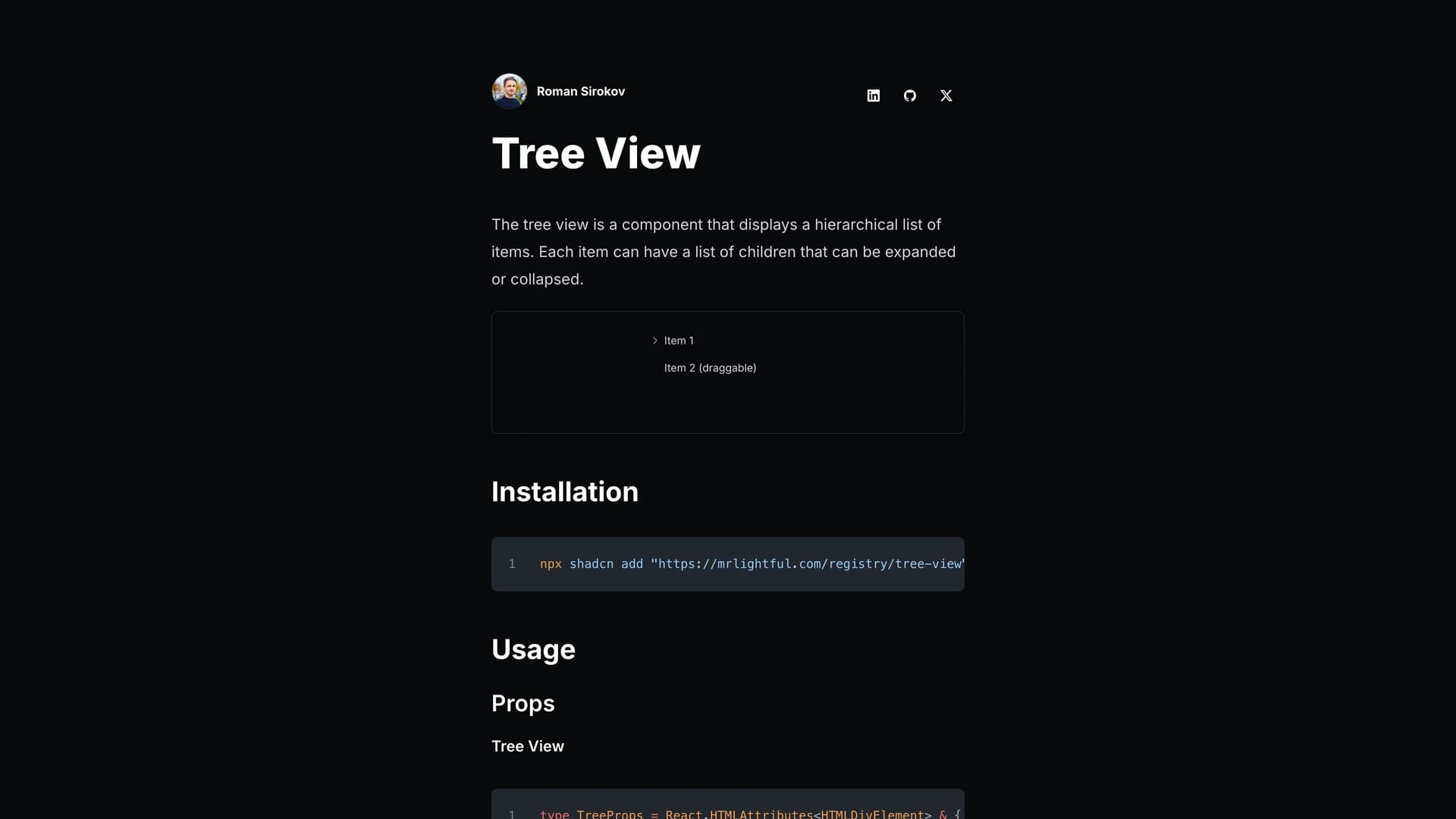
Shadcn Tree View is a React component built with TypeScript, Tailwind CSS, and shadcn/ui, designed for creating hierarchical tree views with nested, expandable, and collapsible data lists that support custom icons, action buttons, drag-and-drop functionality, and disabled states. This versatile component enables developers to navigate complex hierarchical data structures through expand, collapse, and select operations, customize icons for different item states (default, open, selected), add action buttons to individual tree items, implement click handlers for both individual items and the entire tree, support drag-and-drop reordering, and disable specific items when needed. Based on community implementations by WangLarry and bytechase while following shadcn/ui design principles, the component provides modular, configurable tree views with a roadmap including programmatic item control, striped/non-striped variants, and custom item renderers. Perfect for file system browsers, organizational hierarchies, category navigation, nested menu systems, or any application requiring visual representation of hierarchical relationships with user interaction. Installable via 'npx shadcn add' from the author's registry, this component fills a gap in the shadcn/ui ecosystem by providing tree view functionality that many applications need but few component libraries include, making it valuable for developers building admin panels, content management systems, or any interface where hierarchical data visualization and navigation are essential to user workflows and information architecture understanding.

Related Templates

Tremor template preview
Tremor
Tremor is a React component library featuring 35+ customizable, accessible components designed for building data-rich dashboards and analytics interfaces. Built with React, TypeScript, Tailwind CSS, and Radix UI, it provides pre-built chart components (line, bar, area, donut charts, sparklines), KPI cards, data tables, and layout components that follow accessibility best practices. Like shadcn/ui, Tremor uses a copy-paste approach, letting developers integrate component source code directly into projects for complete customization control. The library handles common dashboard requirements including loading states, error boundaries, empty states, and responsive breakpoints, with each component fully typed and integrating seamlessly with Tailwind CSS utilities. Actively maintained by Tremor Labs with comprehensive documentation at tremor.so and community support via Slack and Twitter, it's perfect for building internal tools, SaaS analytics dashboards, and business intelligence applications by providing battle-tested components for data visualization.
Kokonut UI template preview
Kokonut UI
Kokonut UI is a collection of animated, accessible UI components built with React, Tailwind CSS, and Framer Motion, providing production-ready components with smooth animations and modern design patterns. The open-source library offers copy-and-paste components following shadcn/ui's philosophy, including animated cards, interactive buttons, smooth transitions, and engaging micro-interactions that enhance user experience. Built with TypeScript for type safety, the components integrate Framer Motion's animation capabilities with Tailwind CSS utility classes, creating visually polished interfaces without complex animation code. Each component is designed for accessibility with proper ARIA attributes, keyboard navigation support, and responsive behavior across devices. Perfect for marketing websites, landing pages, SaaS applications, or any project requiring eye-catching animations and professional polish beyond basic UI primitives, Kokonut UI demonstrates how to combine animation libraries with utility-first CSS for components that are both beautiful and maintainable.
Prompt Kit template preview
Prompt Kit
Core building blocks for AI apps. High-quality, accessible, and customizable components for AI interfaces.