Join our Discord Community
React Native Reusables template preview

React Native Reusables

M

Created by Mrzachnugent

Last updated October 8, 2025

About This Template

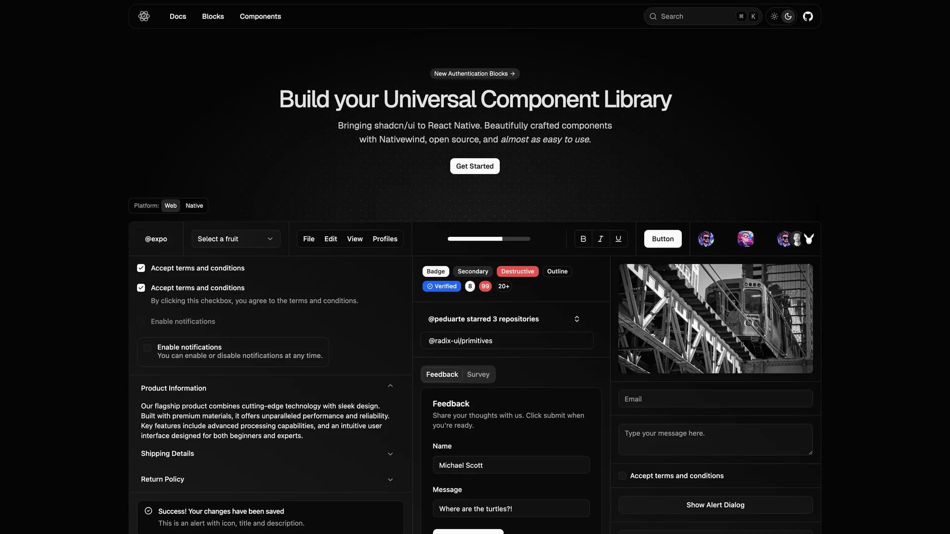
React Native Reusables is an open-source UI component library that brings the design philosophy and component quality of shadcn/ui to React Native mobile applications. Built with NativeWind (React Native's Tailwind CSS implementation), this library provides beautifully crafted, highly customizable components that are almost as easy to use as their web counterparts, making cross-platform mobile development more accessible. The project offers a comprehensive set of reusable UI elements specifically designed for iOS and Android applications, including buttons, forms, cards, sheets, dialogs, and navigation components, all optimized for mobile touch interactions and native performance. Each component leverages React Native's primitive components while maintaining the same copy-paste philosophy as shadcn/ui, allowing developers to directly integrate components into their Expo or React Native CLI projects with complete ownership and customization freedom. With extensive documentation at reactnativereusables.com, the library supports both light and dark themes, follows mobile accessibility best practices, and provides consistent design patterns across iOS and Android platforms. Perfect for mobile developers building consumer apps, enterprise mobile solutions, or cross-platform applications with Expo, React Native Reusables bridges the gap between web and mobile UI development, enabling teams to maintain design consistency across all platforms.

Related Templates

Radix UI Primitives template preview
Radix UI Primitives
Radix Primitives is an open-source UI component library designed for building high-quality, accessible web applications and design systems with React. It provides low-level, unstyled, and highly customizable components with a strong focus on accessibility, customization, and developer experience. Maintained by WorkOS, Radix UI serves as the foundational layer that powers shadcn/ui and many other popular component libraries. The library offers primitives for common UI patterns like dialogs, dropdowns, popovers, and tooltips, all built with WAI-ARIA compliance to ensure screen reader support and keyboard navigation. Developers can use Radix Primitives as a complete foundation for their design system or incrementally adopt individual components, making it a flexible solution for teams building robust, inclusive user interfaces that meet modern accessibility standards while maintaining full styling control.
Shadcn UI template preview
Shadcn UI
shadcn/ui is an open-source component library that provides beautifully designed, accessible, and customizable UI components built with React, Radix UI, and Tailwind CSS. Unlike traditional component libraries, shadcn/ui uses a unique copy-paste approach where developers directly copy components into their projects, giving them full ownership and control over the code. The library includes a comprehensive collection of reusable components ranging from basic elements like buttons and inputs to complex components like data tables, calendars, and command palettes. Built with TypeScript for type safety, it supports dark mode, offers a powerful CLI for easy installation, and integrates seamlessly with modern tools like Next.js, React Hook Form, and Zod. This developer-friendly approach makes shadcn/ui the perfect foundation for building custom design systems and production-ready applications across SaaS dashboards, e-commerce platforms, and admin panels.
Origin UI template preview
Origin UI
Origin UI is an open-source React component library offering an extensive collection of hundreds of copy-and-paste components designed for rapidly building modern application interfaces. Powered by Tailwind CSS v4 and built for seamless integration with Next.js and React projects, Origin UI follows the same shadcn conventions and copy-paste philosophy that developers love, giving you full ownership and control over your components. The library provides beautifully designed, production-ready UI elements spanning forms, navigation, data display, feedback components, and complex interactive widgets, all styled with Tailwind's utility-first approach for easy customization. Each component is built with accessibility in mind, leveraging Radix UI primitives and React Aria for keyboard navigation and screen reader support. Perfect for developers who want a comprehensive component library without the overhead of npm dependencies, Origin UI enables you to quickly scaffold application UIs by simply copying the components you need directly into your codebase, customizing them to match your brand, and shipping faster without sacrificing quality or flexibility.