solaris.shadcn.io

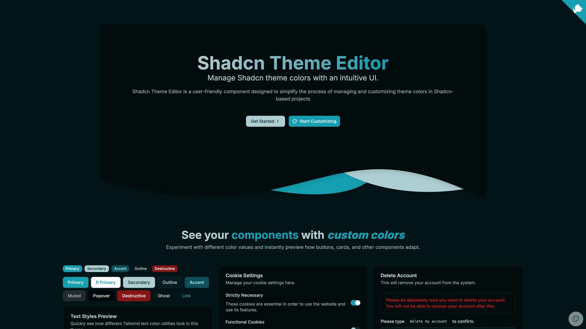
Shadcn Theme Editor is an intuitive visual tool for customizing and managing color themes in shadcn/ui projects, eliminating the need to manually edit CSS variables or understand HSL color spaces.
by Programming with ia · Updated October 8, 2025
Interact with the actual deployed template — every section, every interaction, no mockups.
Built as a React component with TypeScript and Tailwind CSS, this theme editor provides a user-friendly interface where developers and designers can interactively adjust theme colors, preview changes in real-time, and export the resulting CSS configurations. The editor features interactive color pickers for all shadcn/ui theme tokens including background, foreground, primary, secondary, accent, destructive, and border colors, real-time preview of components with the selected theme applied, support for both light and dark mode customization, automatic HSL to CSS variable conversion, one-click copying of generated CSS for integration into projects, preset theme templates to start from popular color schemes, and accessibility contrast checking to ensure readable color combinations. The interface displays all theme tokens organized by their purpose, making it easy to understand how each color is used across the component library.
This tool is invaluable for designers customizing shadcn/ui themes without CSS knowledge, developers building white-label applications requiring multiple brand themes, teams experimenting with color palettes before committing to design decisions, projects needing to match specific brand guidelines with precise color control, and anyone frustrated with manually converting hex colors to HSL format for shadcn/ui configuration. The Theme Editor bridges the gap between visual design and technical implementation, making theme customization accessible and efficient.
Hand-built premium templates from shadcn.io — production-ready and bundled in Pro.


