Join our Discord Community
Radix NG Primitives template preview

Radix NG Primitives

Primitives

R

Created by Radix ng

Last updated October 8, 2025

About This Template

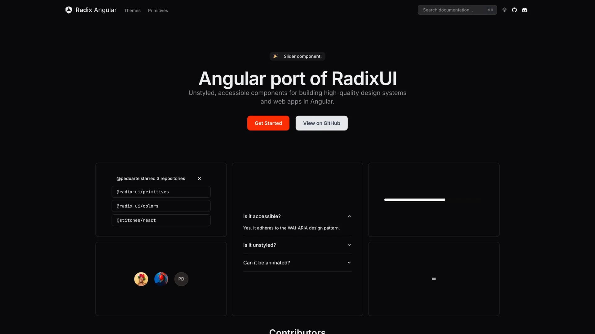
Radix NG Primitives is an Angular port of Radix UI Primitives built with TypeScript (82.6%), MDX, CSS, and Astro, providing a low-level, headless UI component library focused on accessibility, customization, and developer experience for Angular applications. This comprehensive toolkit offers unstyled, functional primitives including Accordion, Avatar, Checkbox, Dialog, and many others based partially on @angular/cdk, supporting incrementally adoptable components that can serve as the base layer of design systems or be adopted gradually into existing projects. As an unofficial but API-compatible port maintaining the original Radix UI principles, the library brings the proven accessibility patterns and headless component architecture popularized in the React ecosystem to Angular developers who previously lacked equivalent tooling. Perfect for Angular teams building accessible design systems, enterprises requiring WCAG-compliant interfaces, developers transitioning from React familiar with Radix patterns, or any Angular application where accessibility compliance, customization freedom, and high-quality component foundations are non-negotiable requirements. With strong community engagement through Discord and GitHub Discussions, Radix NG Primitives demonstrates how successful component architectures can transcend specific frameworks, enabling the Angular ecosystem to benefit from the accessibility research, usability testing, and developer experience refinements that made Radix UI valuable in React while adapting patterns to Angular's different component model, dependency injection, and change detection systems, ultimately improving accessibility standards across the entire web development landscape.

Related Templates

Radix UI Primitives template preview
Radix UI Primitives
Radix Primitives is an open-source UI component library designed for building high-quality, accessible web applications and design systems with React. It provides low-level, unstyled, and highly customizable components with a strong focus on accessibility, customization, and developer experience. Maintained by WorkOS, Radix UI serves as the foundational layer that powers shadcn/ui and many other popular component libraries. The library offers primitives for common UI patterns like dialogs, dropdowns, popovers, and tooltips, all built with WAI-ARIA compliance to ensure screen reader support and keyboard navigation. Developers can use Radix Primitives as a complete foundation for their design system or incrementally adopt individual components, making it a flexible solution for teams building robust, inclusive user interfaces that meet modern accessibility standards while maintaining full styling control.
Tremor template preview
Tremor
Tremor is a React component library featuring 35+ customizable, accessible components designed for building data-rich dashboards and analytics interfaces. Built with React, TypeScript, Tailwind CSS, and Radix UI, it provides pre-built chart components (line, bar, area, donut charts, sparklines), KPI cards, data tables, and layout components that follow accessibility best practices. Like shadcn/ui, Tremor uses a copy-paste approach, letting developers integrate component source code directly into projects for complete customization control. The library handles common dashboard requirements including loading states, error boundaries, empty states, and responsive breakpoints, with each component fully typed and integrating seamlessly with Tailwind CSS utilities. Actively maintained by Tremor Labs with comprehensive documentation at tremor.so and community support via Slack and Twitter, it's perfect for building internal tools, SaaS analytics dashboards, and business intelligence applications by providing battle-tested components for data visualization.
Date Range Picker template preview
Date Range Picker
Date Range Picker for shadcn is a comprehensive date range selection component built on shadcn/ui's design system with support for presets, comparison ranges, and advanced filtering. The MIT-licensed component integrates seamlessly with shadcn/ui projects, providing a polished interface for selecting date ranges with pre-defined options like "Last 7 days," "Last 30 days," and "This month" alongside custom range selection. Built with React, TypeScript, and date-fns for reliable date handling, the picker includes comparison mode for analyzing period-over-period metrics, single date selection mode, and customizable preset configurations. The component follows shadcn/ui's philosophy of being copy-and-paste ready rather than installed as a dependency, allowing developers to customize styling, behavior, and presets directly in their codebase. Perfect for analytics dashboards, reporting interfaces, booking systems, or any application requiring sophisticated date range selection with user-friendly presets and comparison capabilities common in platforms like Google Analytics or business intelligence tools.