
eraser-kaif.vercel.app
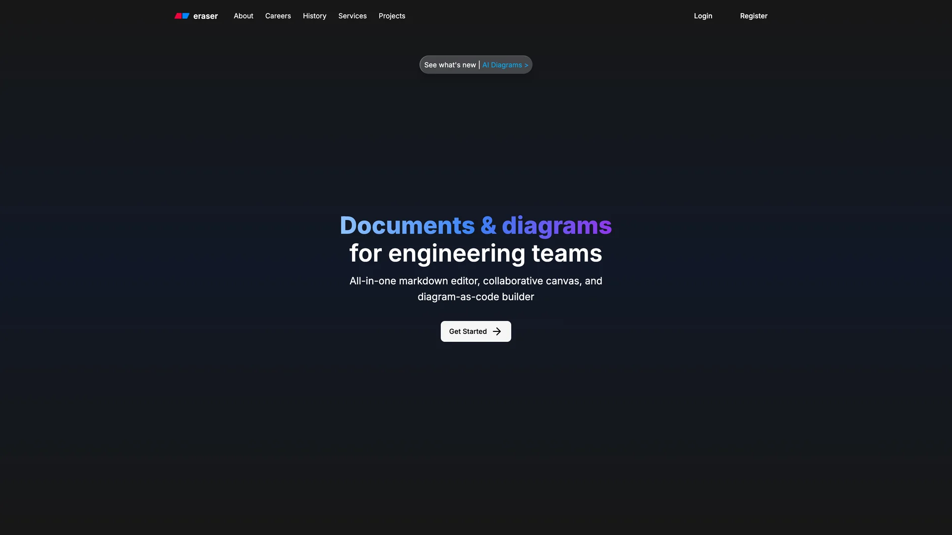
Hand-built Next.js + shadcn/ui templates — production-ready landing pages, portfolios, and SaaS dashboards bundled in Pro.
Discover the best open source templates built by the community. Production-ready Next.js starters you can copy and customize.
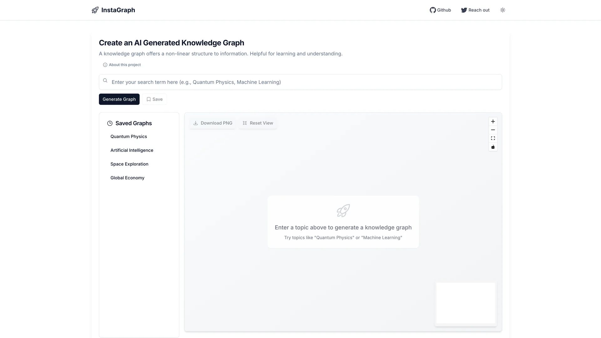
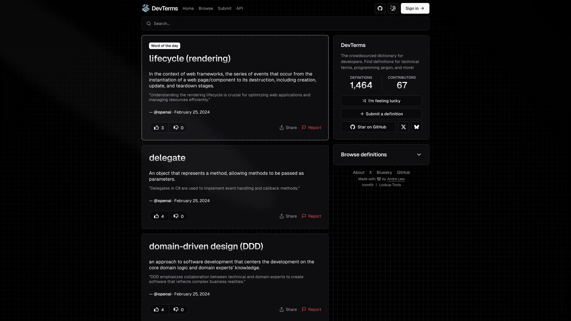

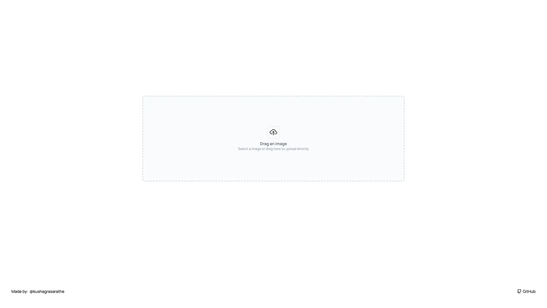
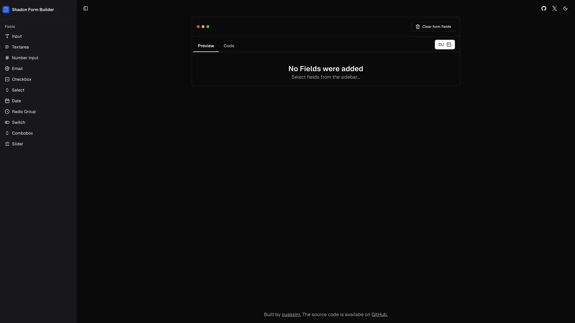
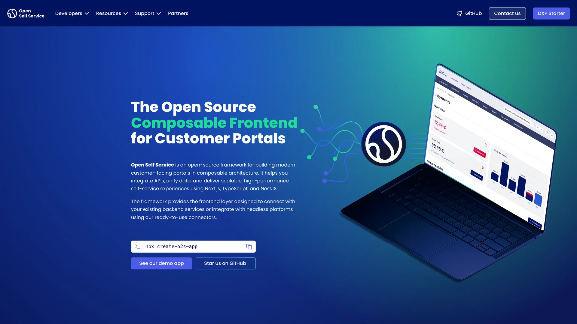
Find templates organized by technology stack, use case, and purpose. From Next.js dashboards to React landing pages.
Meet the talented developers building open source templates with shadcn/ui, React, and Next.js.
Everything you need to know about this community-curated collection of open source shadcn/ui templates.