React Templates - React
179 templates • 146 contributors • Open source & free
Available Templates (179)
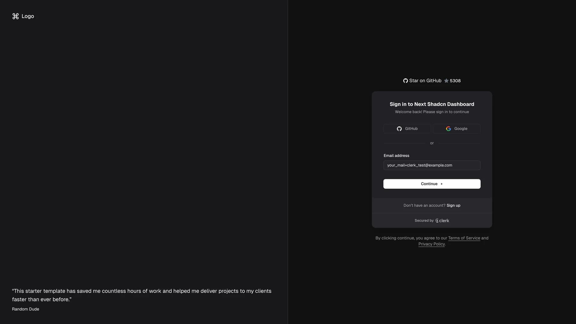
- Next Shadcn Dashboard StarterNext Shadcn Dashboard Starter is a comprehensive, production-ready admin dashboard template built with Next.js 16, TypeScript, shadcn/ui, and Tailwind CSS, designed to accelerate the development of modern web applications. This feature-rich starter comes pre-configured with Clerk authentication for secure user management, Sentry integration for error tracking and performance monitoring, Zustand for lightweight state management, and a complete set of essential dashboard components. The template includes pre-built pages for user management, analytics, settings, and data visualization, along with ready-to-use components like advanced data tables with sorting and filtering, comprehensive form components with validation, a Kanban board for task management, and customizable charts and graphs. Built with developer experience as a priority, the starter follows Next.js best practices with App Router architecture, server components for optimal performance, and TypeScript strict mode for type safety throughout the codebase. Perfect for building SaaS admin panels, internal business tools, analytics dashboards, or content management systems, this template eliminates weeks of initial setup by providing a solid foundation with authentication flows, error handling, responsive layouts, and a clean, professional design that works across devices. The modern tech stack and thoughtful architecture make it easy to customize and extend for specific project requirements while maintaining code quality and scalability.
- Neobrutalism ComponentsNeobrutalism Components is an open-source React UI library featuring a unique collection of Tailwind CSS components styled in the distinctive neobrutalism design aesthetic, characterized by bold colors, thick borders, hard shadows, and raw, unapologetic visual elements. Inspired by shadcn/ui's component architecture, this library provides pre-built components including buttons, cards, forms, inputs, navigation elements, and layout components, all designed to help developers quickly implement the bold, minimalist neobrutalism style that has gained popularity in modern web design. The project serves as both a learning resource for those interested in neobrutalism design principles and a practical component library for creating brutalist-style layouts with minimal effort. Each component showcases the characteristic features of neobrutalism including high contrast color schemes, prominent borders and outlines, deliberate lack of rounded corners, strong geometric shapes, and intentionally raw aesthetics that reject modern design polish. While the project is no longer actively maintained, it remains a valuable design resource with comprehensive documentation at neobrutalism.dev, providing developers with ready-to-use components and code examples for creating websites and applications that embrace the neobrutalist movement's philosophy of digital authenticity, functional simplicity, and visual boldness that stands out from conventional sleek designs.
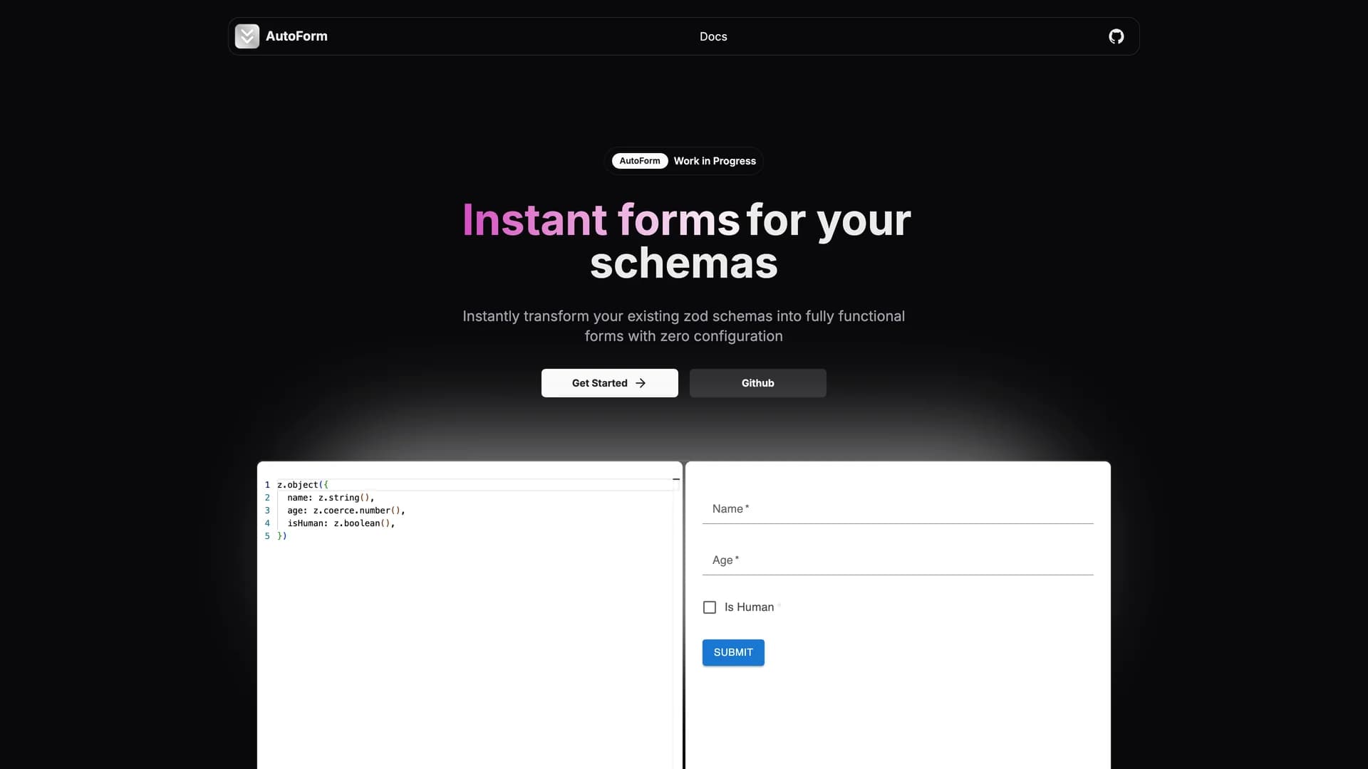
- AutoFormAutoForm is an open-source React library that automatically generates dynamic, fully-functional forms from existing data schemas with built-in validation, eliminating the need to manually build form components. By simply passing a schema definition (such as Zod, Yup, or other validation libraries), AutoForm instantly renders production-ready forms with proper input types, validation rules, error messages, and submit handling. The library supports multiple UI frameworks including shadcn/ui, Material UI, Mantine, and custom renderers, making it incredibly versatile across different design systems and project requirements. Perfect for rapidly prototyping internal tools, admin panels, settings pages, or any scenario where forms need to be created quickly without sacrificing functionality, AutoForm handles complex field types including text inputs, checkboxes, select dropdowns, date pickers, file uploads, and nested object structures. The schema-agnostic design means it integrates seamlessly with your existing validation logic, while the customization options allow overriding default behavior for specific fields when needed. Developers save hours of repetitive form-building work, as AutoForm automatically infers field types from schema definitions, applies validation rules client-side and server-side, generates accessible form markup with proper labels and ARIA attributes, and handles form state management internally. Ideal for MVPs, prototypes, and low-priority forms where development speed is crucial, this library demonstrates how schema-driven development can dramatically accelerate UI implementation while maintaining type safety and code quality.
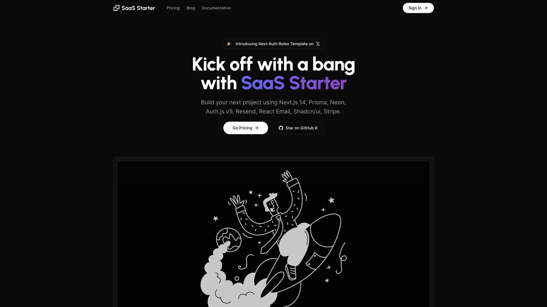
- Next SaaS Stripe StarterNext SaaS Stripe Starter is a production-ready boilerplate that combines Next.js 16 with Stripe payments, Auth.js v5 authentication, and a comprehensive admin panel to launch subscription-based SaaS applications quickly. Built with TypeScript, Prisma ORM, Neon PostgreSQL, and shadcn/ui components, it provides essential features like user authentication with multiple providers, role-based access control, subscription management, payment processing with webhooks, customer billing portals, and transactional emails via Resend. The starter follows Next.js best practices with server components, server actions, and optimized data fetching, while the admin dashboard enables platform administrators to manage users, monitor subscriptions, and control access levels. Perfect for building productivity tools, analytics platforms, or B2B applications, this starter eliminates weeks of setup by providing authentication infrastructure, payment processing, database schemas, and deployment-ready code that can be customized for specific business requirements.
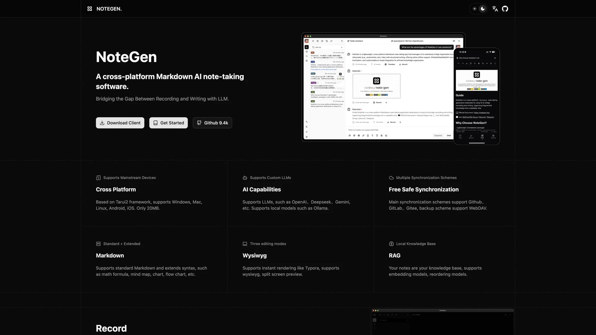
- Note GenNote Gen is an AI-powered Markdown note-taking application that combines traditional writing with advanced features like automatic note generation, semantic search, and retrieval-augmented generation (RAG) to enhance knowledge management. Built with Next.js 16, TypeScript, and shadcn/ui, it enables users to write in Markdown, organize with tags and folders, and leverage OpenAI's GPT models for intelligent content creation. The application uses vector embeddings for semantic search that finds notes by meaning rather than keywords, RAG technology that references existing notes when generating new content, and auto-completion for writing assistance. With a clean interface featuring real-time Markdown preview, syntax highlighting, and keyboard shortcuts, Note Gen transforms note-taking into an active knowledge management system. Perfect for students, writers, developers, and professionals, it helps brainstorm ideas, discover connections between notes, and synthesize information across your knowledge base.
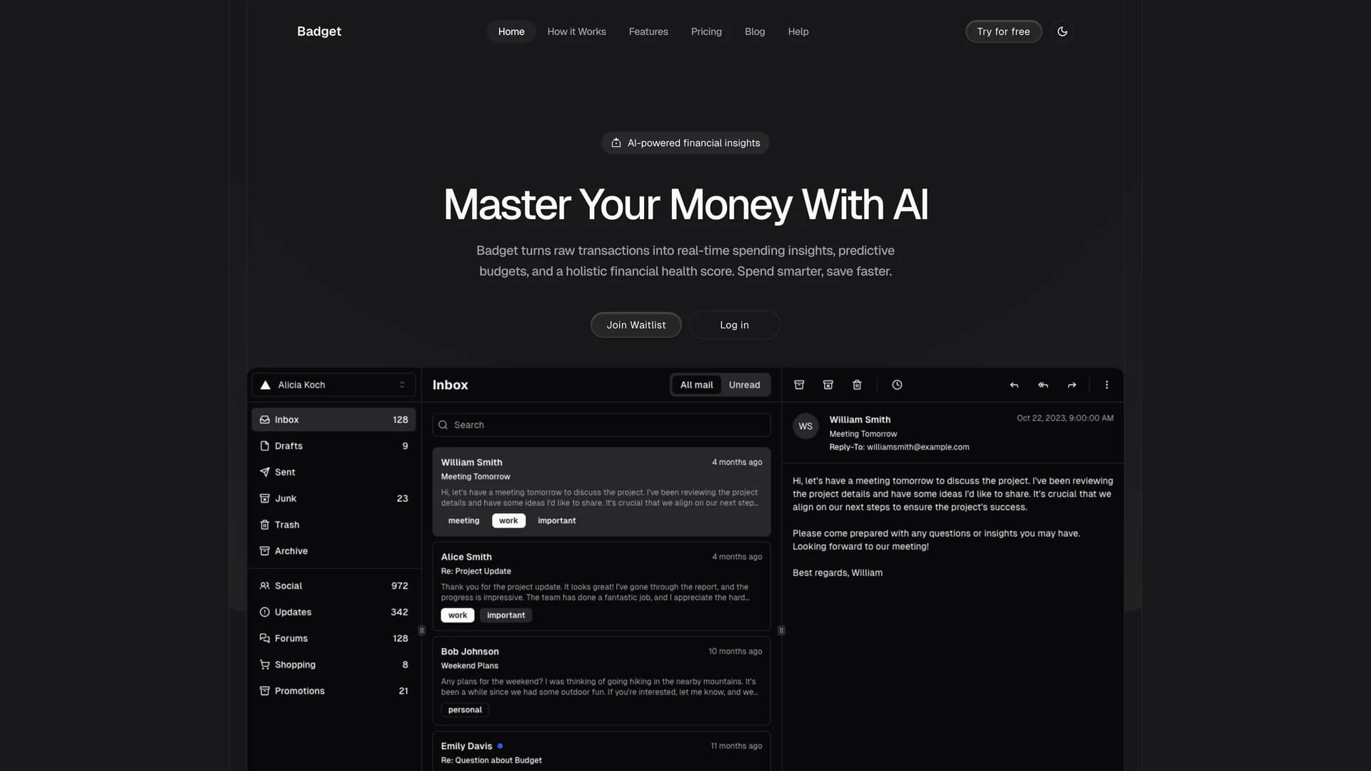
- BadgetBadget is an AI-powered personal finance management platform that helps users track expenses, create budgets, and achieve financial goals through automated categorization and smart insights. Built with Next.js 16, TypeScript, Prisma ORM, and shadcn/ui components, it provides automatic transaction import from bank accounts, AI-powered expense categorization that learns from behavior, customizable budget creation, and visual analytics with charts showing spending trends. The platform uses secure APIs to import transactions while maintaining bank-level encryption, and its AI analyzes spending habits to identify rarely-used subscriptions, suggest budget adjustments, predict future expenses, and highlight savings opportunities. Features include an intuitive dashboard with account balances, budget progress, and financial health scores, plus detailed reporting by category, merchant, and time period. Perfect for individuals and families seeking better money habits, Badget transforms transaction data into actionable intelligence for informed financial decisions.
- TremorTremor is a React component library featuring 35+ customizable, accessible components designed for building data-rich dashboards and analytics interfaces. Built with React, TypeScript, Tailwind CSS, and Radix UI, it provides pre-built chart components (line, bar, area, donut charts, sparklines), KPI cards, data tables, and layout components that follow accessibility best practices. Like shadcn/ui, Tremor uses a copy-paste approach, letting developers integrate component source code directly into projects for complete customization control. The library handles common dashboard requirements including loading states, error boundaries, empty states, and responsive breakpoints, with each component fully typed and integrating seamlessly with Tailwind CSS utilities. Actively maintained by Tremor Labs with comprehensive documentation at tremor.so and community support via Slack and Twitter, it's perfect for building internal tools, SaaS analytics dashboards, and business intelligence applications by providing battle-tested components for data visualization.
- TremorTremor is a React component library featuring 35+ customizable, accessible components designed for building data-rich dashboards and analytics interfaces. Built with React, TypeScript, Tailwind CSS, and Radix UI, it provides pre-built chart components (line, bar, area, donut charts, sparklines), KPI cards, data tables, and layout components that follow accessibility best practices. Like shadcn/ui, Tremor uses a copy-paste approach, letting developers integrate component source code directly into projects for complete customization control. The library handles common dashboard requirements including loading states, error boundaries, empty states, and responsive breakpoints, with each component fully typed and integrating seamlessly with Tailwind CSS utilities. Actively maintained by Tremor Labs with comprehensive documentation at tremor.so and community support via Slack and Twitter, it's perfect for building internal tools, SaaS analytics dashboards, and business intelligence applications by providing battle-tested components for data visualization.
- Cult UICult UI is an open-source React component library crafted for design engineers, offering accessible and customizable components with sophisticated animations that integrate seamlessly with shadcn/ui through a copy-paste workflow. Built with React, TypeScript, Next.js, Tailwind CSS, and Framer Motion, it provides components with built-in animations and micro-interactions that create polished interfaces without requiring animation expertise. The library includes enhanced UI elements like buttons and cards, plus complex patterns like animated navbars, feature sections, testimonial carousels, and landing page blocks for marketing sites and SaaS applications. With full component code ownership, developers can customize animations, adjust styling, and extend functionality while learning from well-crafted examples. The project offers full-stack Next.js templates at newcult.co and comprehensive documentation at cult-ui.com with live previews and code examples. Perfect for marketing websites, SaaS landing pages, and portfolio sites, Cult UI bridges basic components and custom design work with beautiful, animated elements.
- Form BuilderForm Builder is a dynamic web application that enables developers and non-technical users to create sophisticated, validated forms through a drag-and-drop interface, eliminating repetitive form coding while maintaining full customization. Built with React, Next.js, TypeScript, Tailwind CSS, and shadcn/ui, it provides a visual interface for constructing forms by dragging input types like text fields, dropdowns, checkboxes, and date pickers onto a canvas and configuring properties through an intuitive panel. The application uses Zod for schema-based validation, ensuring type-safe client and server-side validation that catches errors during development. It handles common requirements like required fields, email validation, number ranges, regex patterns, and error messages through visual configuration. Supporting multiple input types with customizable labels, placeholders, defaults, validation rules, and conditional visibility, Form Builder generates forms that work seamlessly in React applications with optimized performance and accessibility. Perfect for admin panels, surveys, and registration flows, it accelerates development with clean, maintainable code and robust validation.
- Cult UICult UI is an open-source React component library crafted for design engineers, offering accessible and customizable components with sophisticated animations that integrate seamlessly with shadcn/ui through a copy-paste workflow. Built with React, TypeScript, Next.js, Tailwind CSS, and Framer Motion, it provides components with built-in animations and micro-interactions that create polished interfaces without requiring animation expertise. The library includes enhanced UI elements like buttons and cards, plus complex patterns like animated navbars, feature sections, testimonial carousels, and landing page blocks for marketing sites and SaaS applications. With full component code ownership, developers can customize animations, adjust styling, and extend functionality while learning from well-crafted examples. The project offers full-stack Next.js templates at newcult.co and comprehensive documentation at cult-ui.com with live previews and code examples. Perfect for marketing websites, SaaS landing pages, and portfolio sites, Cult UI bridges basic components and custom design work with beautiful, animated elements.
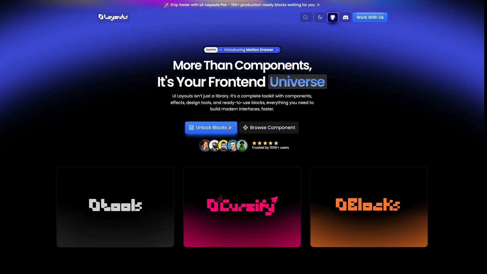
- UI LayoutsUI Layouts is an open-source component library featuring 100+ free, beautifully designed interactive React and Next.js components built with Tailwind CSS, Framer Motion, and GSAP for creative and engaging web experiences. Created by Naymur Rahman with TypeScript, the library offers visually striking components like R3F Blob Effects, Image Ripple, File Upload, animated navbars, hero sections, and interactive UI elements that emphasize modern design trends and smooth animations. Each component is designed to be reusable and easily integrated into projects, providing developers and designers with ready-to-use building blocks that make website development faster while maintaining high visual quality. The library focuses on interactivity and animation, offering components that go beyond basic UI elements to create memorable user experiences with fluid motion and creative effects. Available at ui-layouts.com, the project is open for community contributions and sponsorship, providing comprehensive documentation and live demos for all components. Perfect for developers building marketing websites, portfolios, SaaS landing pages, or any project where creative design and interactivity matter, UI Layouts bridges the gap between design ambition and development reality with production-ready animated components.
 Nextjs
 React
React Tailwind
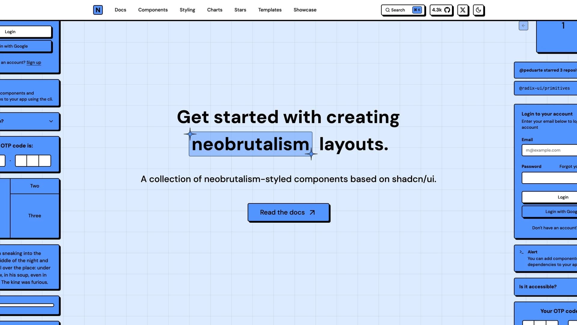

 Vite
Vite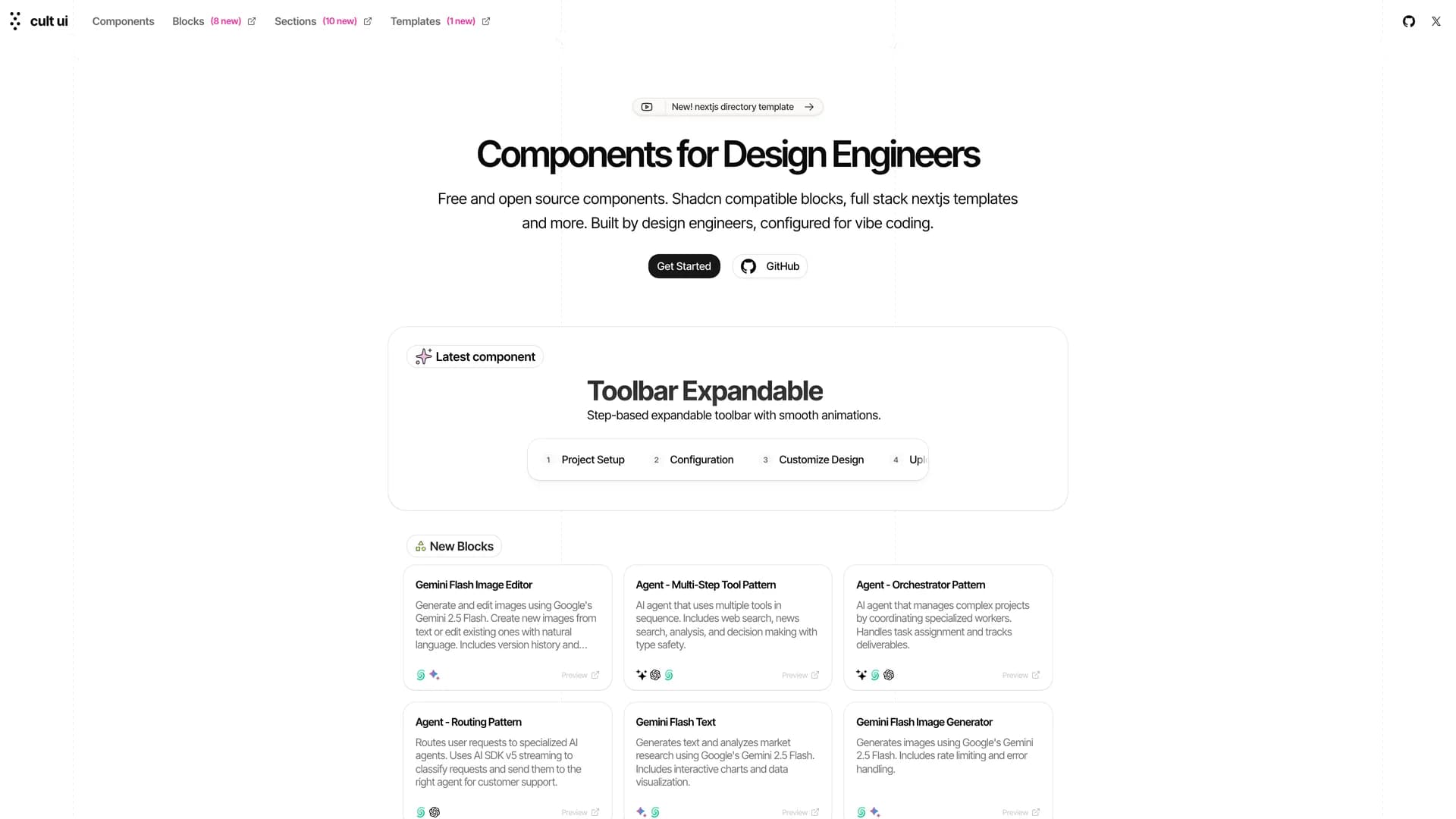

 Ui kits & component libraries