React Templates - Tailwind
194 templates • 158 contributors • Open source & free
Available Templates (194)
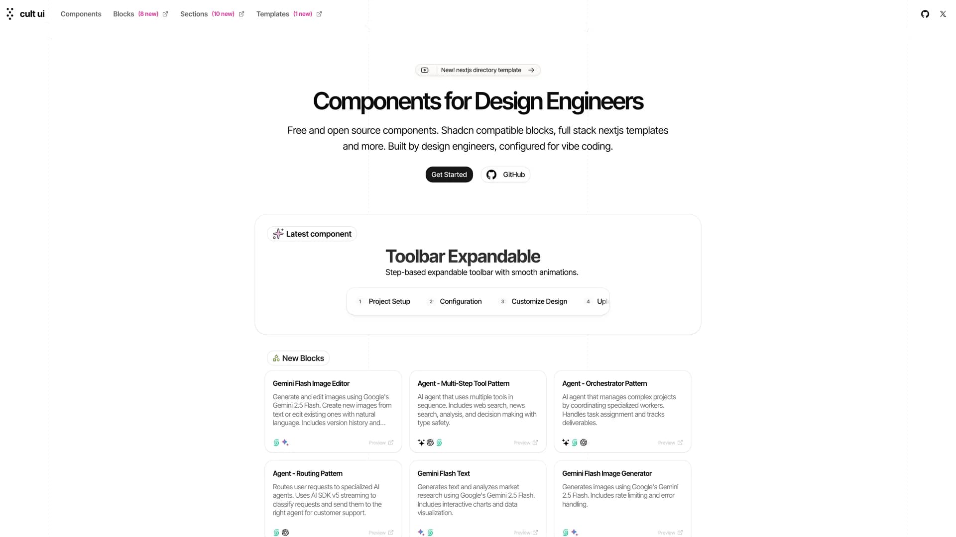
- Cult UICult UI is an open-source React component library crafted for design engineers, offering accessible and customizable components with sophisticated animations that integrate seamlessly with shadcn/ui through a copy-paste workflow. Built with React, TypeScript, Next.js, Tailwind CSS, and Framer Motion, it provides components with built-in animations and micro-interactions that create polished interfaces without requiring animation expertise. The library includes enhanced UI elements like buttons and cards, plus complex patterns like animated navbars, feature sections, testimonial carousels, and landing page blocks for marketing sites and SaaS applications. With full component code ownership, developers can customize animations, adjust styling, and extend functionality while learning from well-crafted examples. The project offers full-stack Next.js templates at newcult.co and comprehensive documentation at cult-ui.com with live previews and code examples. Perfect for marketing websites, SaaS landing pages, and portfolio sites, Cult UI bridges basic components and custom design work with beautiful, animated elements.
- Form BuilderForm Builder is a dynamic web application that enables developers and non-technical users to create sophisticated, validated forms through a drag-and-drop interface, eliminating repetitive form coding while maintaining full customization. Built with React, Next.js, TypeScript, Tailwind CSS, and shadcn/ui, it provides a visual interface for constructing forms by dragging input types like text fields, dropdowns, checkboxes, and date pickers onto a canvas and configuring properties through an intuitive panel. The application uses Zod for schema-based validation, ensuring type-safe client and server-side validation that catches errors during development. It handles common requirements like required fields, email validation, number ranges, regex patterns, and error messages through visual configuration. Supporting multiple input types with customizable labels, placeholders, defaults, validation rules, and conditional visibility, Form Builder generates forms that work seamlessly in React applications with optimized performance and accessibility. Perfect for admin panels, surveys, and registration flows, it accelerates development with clean, maintainable code and robust validation.
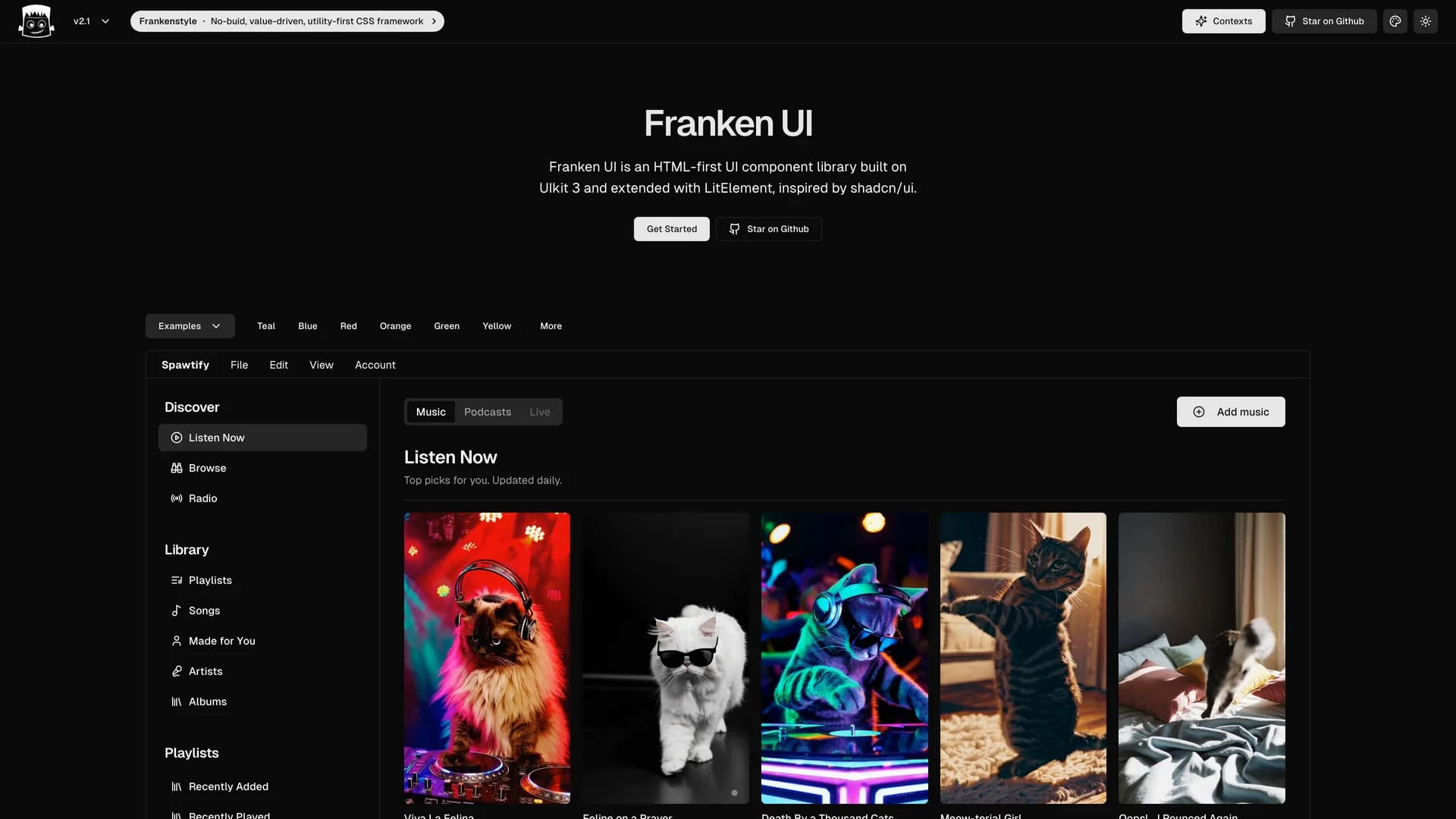
- Franken UIFranken UI is an HTML-first, open-source component library built on UIkit 3 and extended with LitElement, featuring a design aesthetic inspired by shadcn/ui. Written primarily in TypeScript with Tailwind CSS styling, it provides a feature-complete collection of UI components optimized for Svelte and built with Vite. The library emphasizes an HTML-first approach, allowing developers to use components with minimal JavaScript while maintaining modern functionality through web components. Franken UI is currently in Version 2 and actively maintained with a focus on stability and gradual improvements. The MIT-licensed project offers a unique blend of UIkit's robust component foundation with modern web component architecture and shadcn/ui's clean design principles. Perfect for developers seeking HTML-centric components with the flexibility of web components, Franken UI provides a stable, well-maintained alternative for building modern web applications with Svelte, Tailwind CSS, and TypeScript.
- Cult UICult UI is an open-source React component library crafted for design engineers, offering accessible and customizable components with sophisticated animations that integrate seamlessly with shadcn/ui through a copy-paste workflow. Built with React, TypeScript, Next.js, Tailwind CSS, and Framer Motion, it provides components with built-in animations and micro-interactions that create polished interfaces without requiring animation expertise. The library includes enhanced UI elements like buttons and cards, plus complex patterns like animated navbars, feature sections, testimonial carousels, and landing page blocks for marketing sites and SaaS applications. With full component code ownership, developers can customize animations, adjust styling, and extend functionality while learning from well-crafted examples. The project offers full-stack Next.js templates at newcult.co and comprehensive documentation at cult-ui.com with live previews and code examples. Perfect for marketing websites, SaaS landing pages, and portfolio sites, Cult UI bridges basic components and custom design work with beautiful, animated elements.
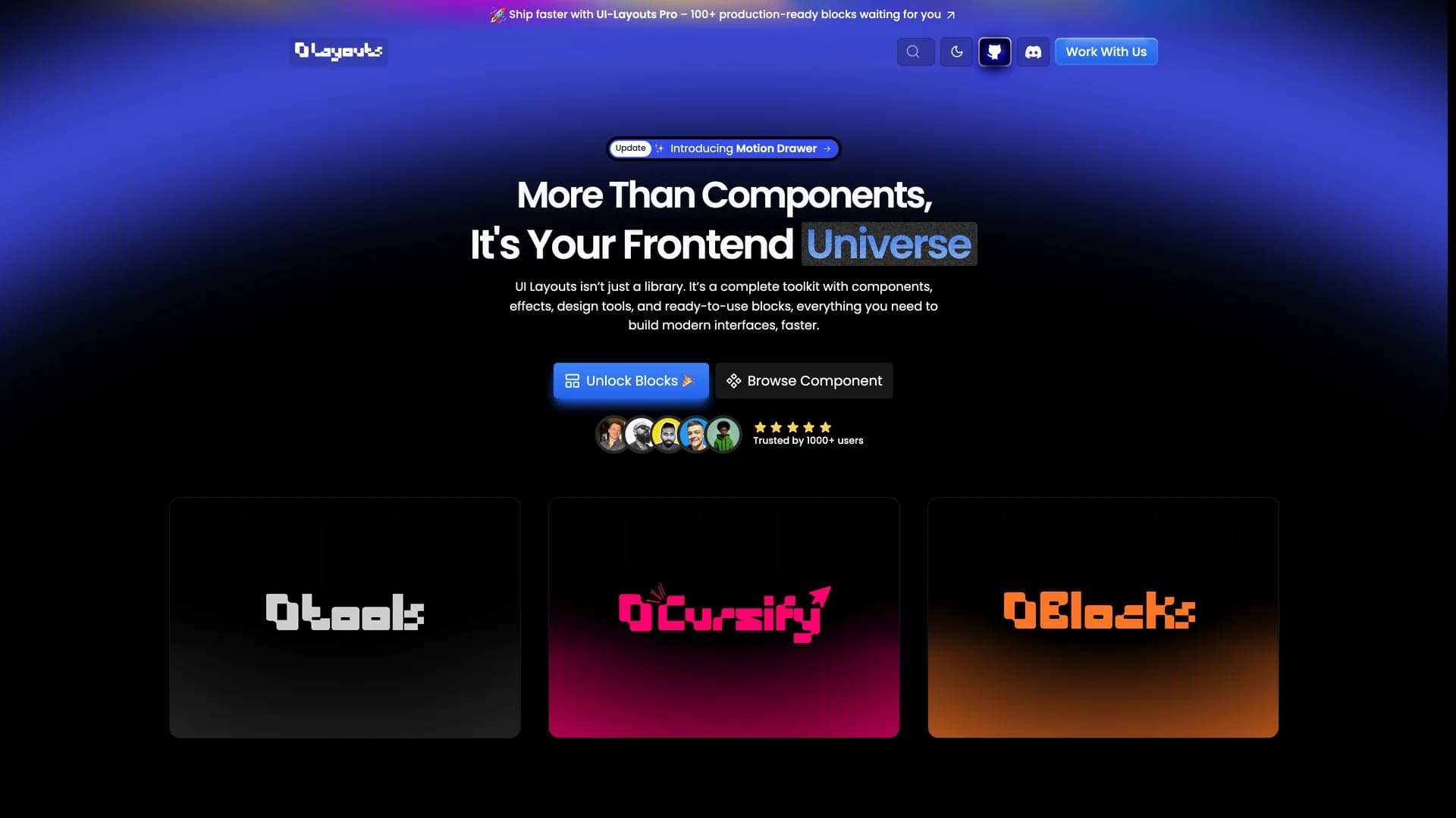
- UI LayoutsUI Layouts is an open-source component library featuring 100+ free, beautifully designed interactive React and Next.js components built with Tailwind CSS, Framer Motion, and GSAP for creative and engaging web experiences. Created by Naymur Rahman with TypeScript, the library offers visually striking components like R3F Blob Effects, Image Ripple, File Upload, animated navbars, hero sections, and interactive UI elements that emphasize modern design trends and smooth animations. Each component is designed to be reusable and easily integrated into projects, providing developers and designers with ready-to-use building blocks that make website development faster while maintaining high visual quality. The library focuses on interactivity and animation, offering components that go beyond basic UI elements to create memorable user experiences with fluid motion and creative effects. Available at ui-layouts.com, the project is open for community contributions and sponsorship, providing comprehensive documentation and live demos for all components. Perfect for developers building marketing websites, portfolios, SaaS landing pages, or any project where creative design and interactivity matter, UI Layouts bridges the gap between design ambition and development reality with production-ready animated components.
- Shadcn UI ExpansionsShadcn UI Expansions is an open-source collection of additional components built on top of shadcn/ui, extending the library with specialized UI elements for React and Next.js applications. Built with TypeScript and Tailwind CSS, the project provides useful components like Autosize Textarea, Floating Label Input, Infinite Scroll, Loading Button, Multiple Selector, Datetime Picker, Responsive Modal, and Typewriter effect that complement shadcn/ui's core components. Following shadcn/ui's copy-paste philosophy, all components are free for personal and commercial use with full code ownership—simply copy the code into your project and customize to your needs. The MIT-licensed library is maintained by Hsuan Yi Chou with contributions from the community, offering live demos at shadcnui-expansions.typeart.cc where developers can preview components before integration. Perfect for projects that need specialized functionality beyond shadcn/ui's base components, Shadcn UI Expansions fills common gaps with well-designed, accessible components that maintain consistency with the shadcn design system while adding frequently requested features like datetime selection, infinite scrolling, and advanced input types.
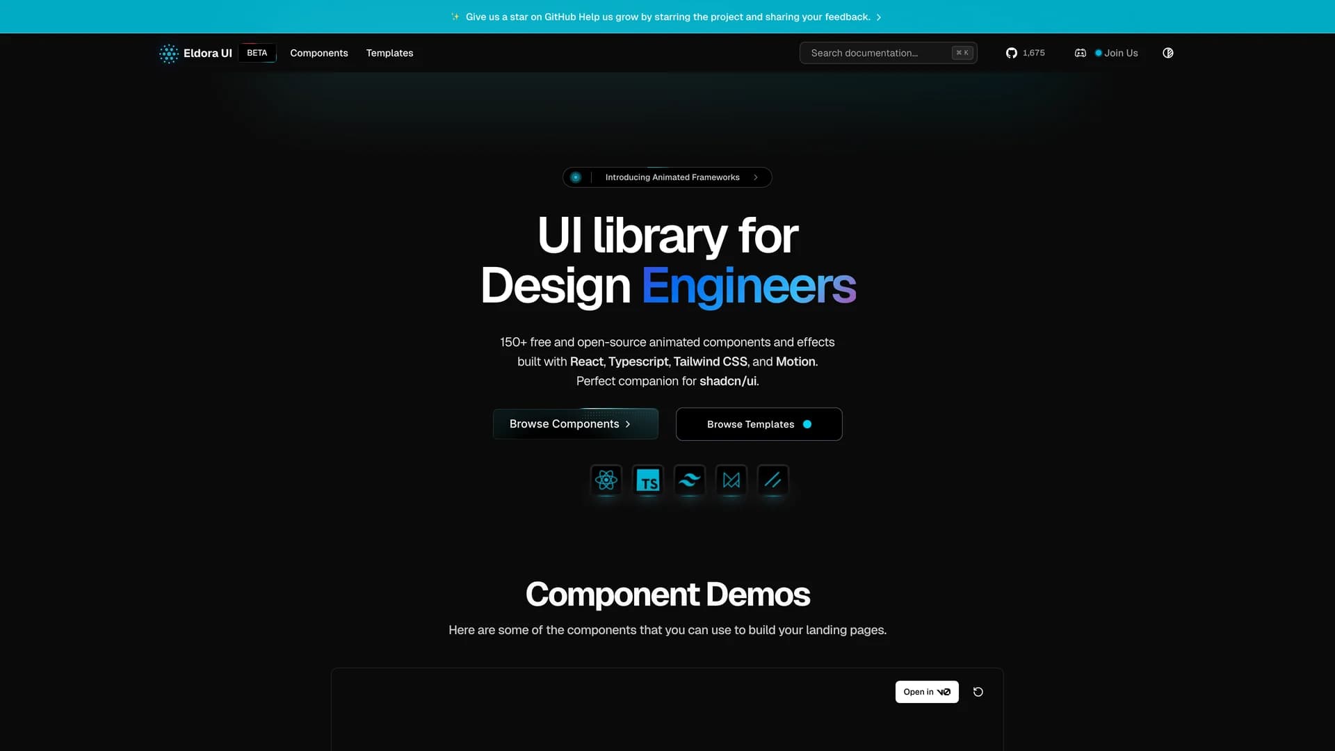
- Eldora UIEldora UI is an open-source UI library designed for design engineers, offering a comprehensive collection of reusable components, blocks, and templates that can be easily copied and pasted into web applications. Built primarily with TypeScript (87.7% of the codebase), Next.js, React, Tailwind CSS, and Headless UI, the MIT-licensed library simplifies UI development by providing ready-to-use interface elements that maintain consistency and quality. The project features comprehensive documentation at eldoraui.site/docs and an active Discord community for support and collaboration. Eldora UI focuses on helping developers quickly integrate pre-built components into their projects without sacrificing customization flexibility, following a copy-paste approach where the code becomes yours to modify. With components ranging from basic UI elements to complex blocks and full templates, it provides building blocks for various application types. Perfect for design engineers and developers seeking high-quality, customizable components that accelerate development while maintaining professional design standards, Eldora UI bridges the gap between rapid development and polished user interfaces.
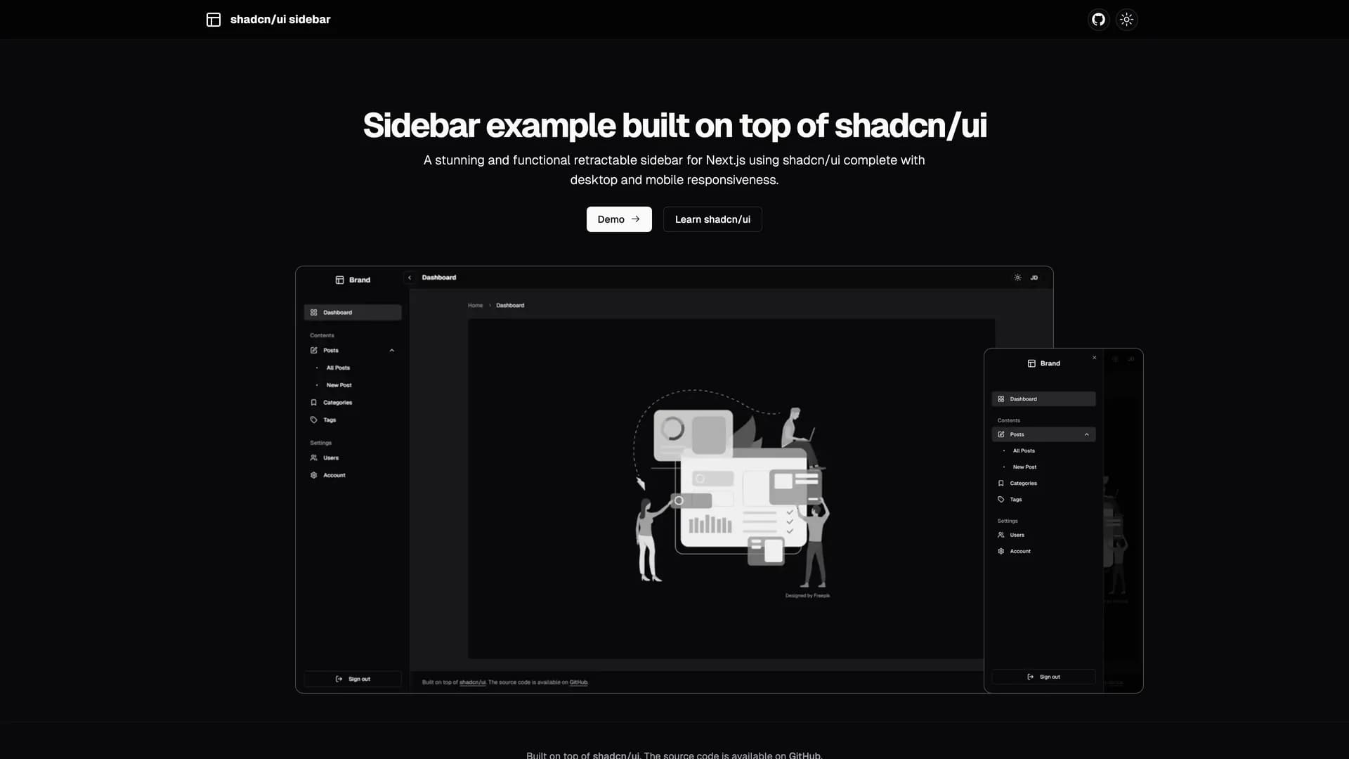
- Shadcn UI SidebarShadcn UI Sidebar is a stunning, functional, and fully responsive retractable sidebar component for Next.js applications built with shadcn/ui, TypeScript, and Tailwind CSS. The sidebar features multiple viewing modes including retractable mini and wide layouts, scrollable menu navigation, grouped menu items with labels, collapsible submenus, and a mobile-friendly sheet menu implementation. Built with Zustand for state management, it provides smooth transitions between expanded and collapsed states while maintaining full responsiveness across all device sizes. The component includes extracted menu items list for easy customization, supports both light and dark modes, and offers flexible navigation options that adapt to different screen sizes. Perfect for building admin dashboards, SaaS applications, or any project requiring professional navigation, the sidebar delivers a polished user experience with minimal setup. Available as open-source with comprehensive documentation and live demo at shadcn-ui-sidebar.salimi.my, it demonstrates best practices for building complex, interactive components with shadcn/ui and Next.js 16.
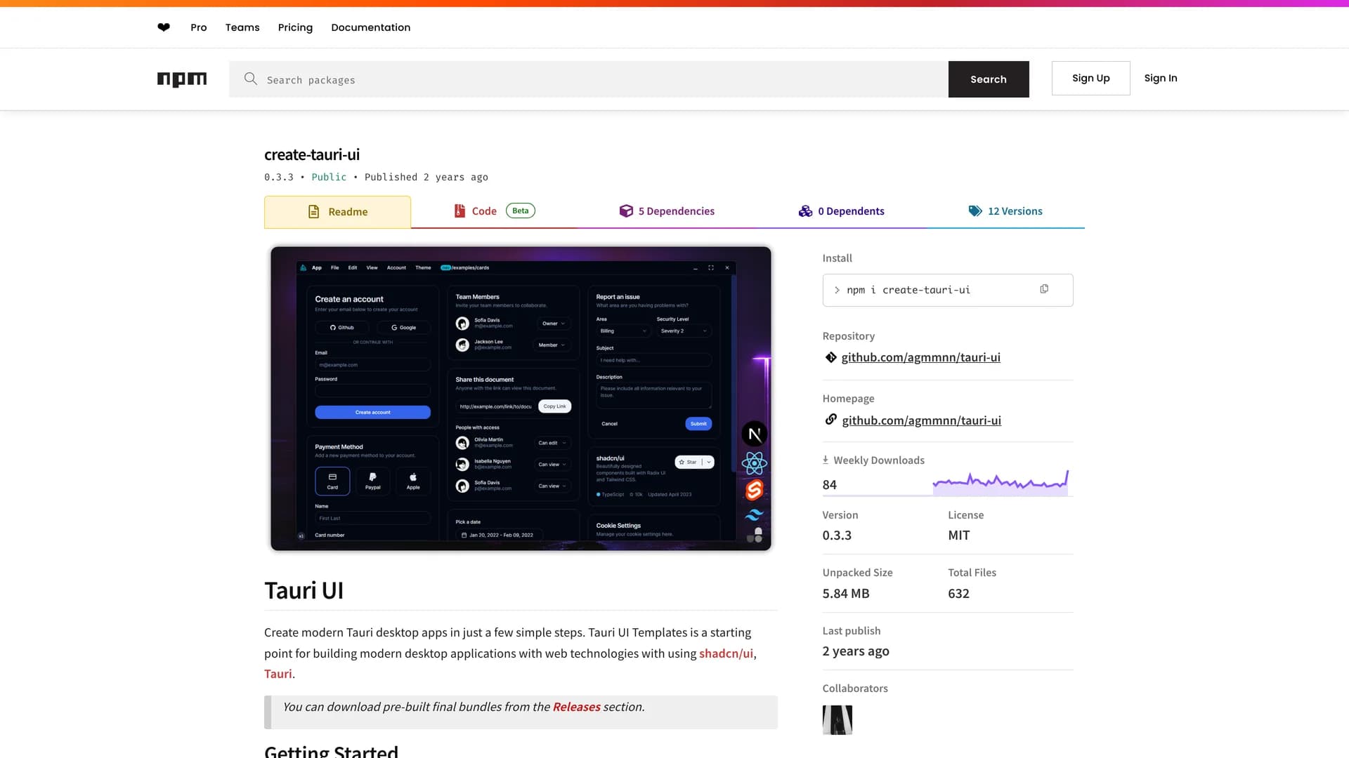
- Tauri UITauri UI is a project scaffolding tool for creating modern, lightweight cross-platform desktop applications using Tauri and shadcn/ui with support for multiple frontend frameworks including React, Next.js, and SvelteKit. The CLI tool (create-tauri-ui) enables developers to quickly set up new desktop app projects with a single command, providing templates that include native-looking window controls, dark and light mode support, Radix UI primitives, Lucide/Radix icons, and optimized bundle sizes around 2-2.5 MB per platform. Built with TypeScript and Tailwind CSS, Tauri UI bridges web development and native desktop apps, allowing developers to build performant, system-native applications using familiar web technologies. The templates follow best practices for Tauri development while maintaining the flexibility and design consistency of shadcn/ui components. Perfect for developers looking to create desktop applications for Windows, macOS, and Linux without learning platform-specific languages, Tauri UI simplifies the setup process and provides a modern development experience with hot reload, TypeScript support, and production-ready configurations.
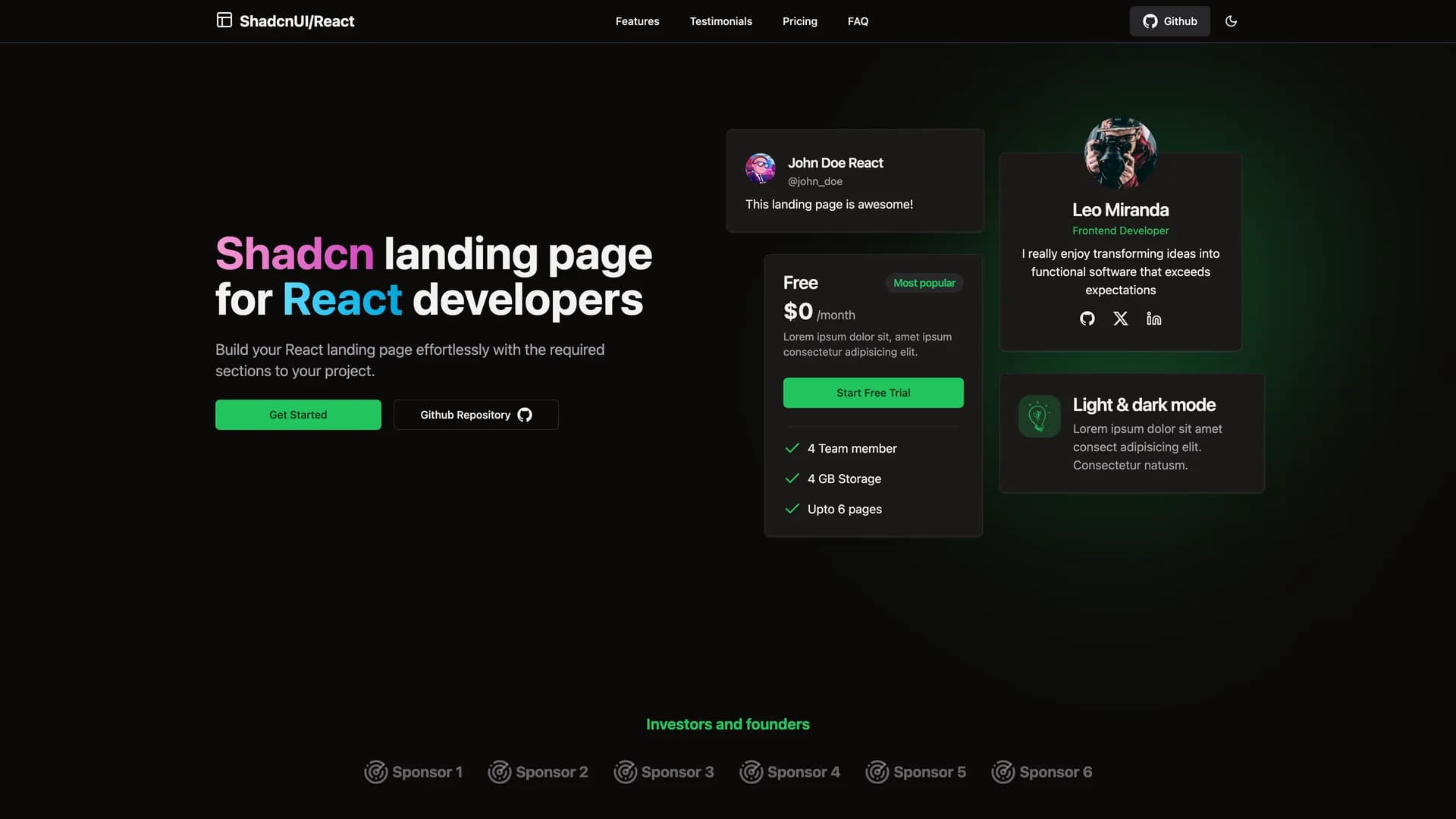
- Shadcn Landing PageShadcn Landing Page is a free, comprehensive landing page template built with shadcn/ui, React, TypeScript, Tailwind CSS, and Vite, providing developers with a quick-start solution for creating modern, professional marketing websites. The fully responsive template includes 16 pre-designed sections including Navbar, Hero, Sponsors, About, Stats, Features, Services, Testimonials, Team, Newsletter, FAQ, Pricing, CTA, Footer, and ScrollToTop, all optimized for various device sizes. With built-in dark mode support and user-friendly navigation, the modular design allows developers to easily customize and combine sections to match their project requirements. Each component is carefully crafted with shadcn/ui's accessible primitives and styled with Tailwind CSS for consistent, modern aesthetics. Perfect for startups, SaaS products, portfolios, or any project needing a professional landing page, this template eliminates hours of initial setup and design work by providing a polished, production-ready foundation. The template demonstrates best practices for React component architecture and responsive design while maintaining the flexibility to adapt to specific branding and content needs.
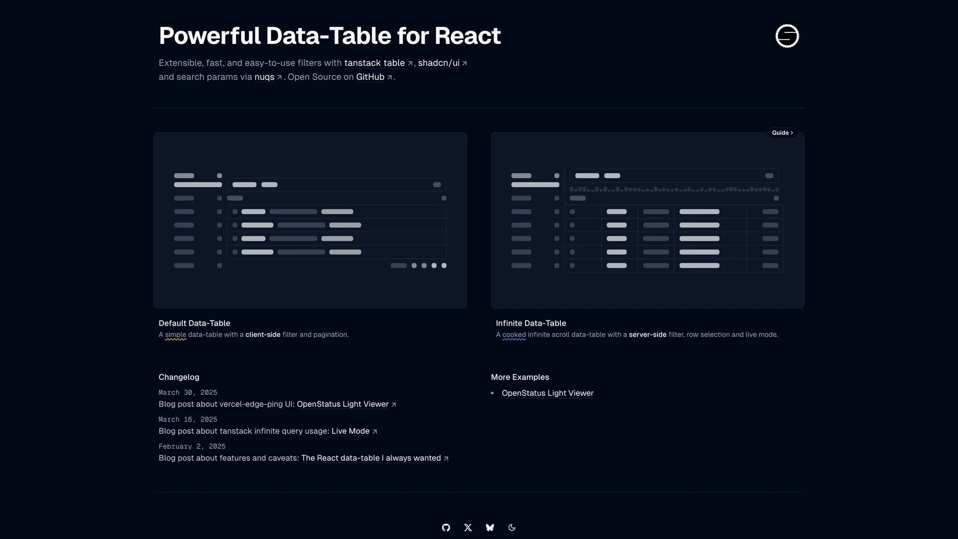
- Data Table FiltersData Table Filters is a standalone demo playground by OpenStatus showcasing advanced data table implementations with Tanstack Table, featuring both client-side pagination and server-side infinite scroll with click-through details. Built with Next.js, Tanstack Query, shadcn/ui, cmdk, nuqs, and dnd-kit, the project demonstrates flexible, reusable data table patterns inspired by Datadog and Vercel log tables. The implementation includes sophisticated features like dynamic filtering, sorting, column management, drag-and-drop functionality, and URL-based state persistence for shareable filtered views. Designed as a reference implementation for the OpenStatus dashboard, it provides developers with production-ready patterns for building complex data tables in React applications. The project emphasizes accessibility and user experience while handling large datasets efficiently through virtualization and optimized rendering strategies. Perfect for developers building admin panels, analytics dashboards, or any application requiring powerful data visualization and manipulation, Data Table Filters demonstrates best practices for integrating Tanstack Table with modern React ecosystem tools and offers a foundation for MVP development with advanced table functionality.
- Intent UIIntent UI is an accessible React component library built on React Aria Components and Tailwind CSS, emphasizing web accessibility while providing easily customizable components through a copy-paste workflow. Written primarily in TypeScript (78.2%), the MIT-licensed library offers components designed with accessibility as a core principle, leveraging React Aria's robust primitives for keyboard navigation, screen reader support, and ARIA compliance. The chill, developer-friendly approach allows you to copy components directly into React projects and customize them to match specific design requirements without dealing with npm dependencies or version conflicts. With comprehensive documentation at intentui.com and design templates to accelerate interface creation, Intent UI bridges the gap between accessible component libraries and the flexibility of owned code. Perfect for developers who prioritize accessibility standards like WCAG while maintaining full control over component styling and behavior, Intent UI demonstrates how to build inclusive web applications with React Aria's powerful primitives and Tailwind's utility-first approach.
 Nextjs
 React
React Tailwind
 Svelte
 Vite
Vite
 Ui kits & component libraries
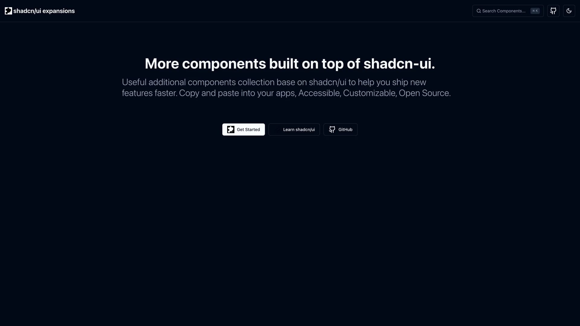
