React Templates - Tailwind
194 templates • 158 contributors • Open source & free
Available Templates (194)
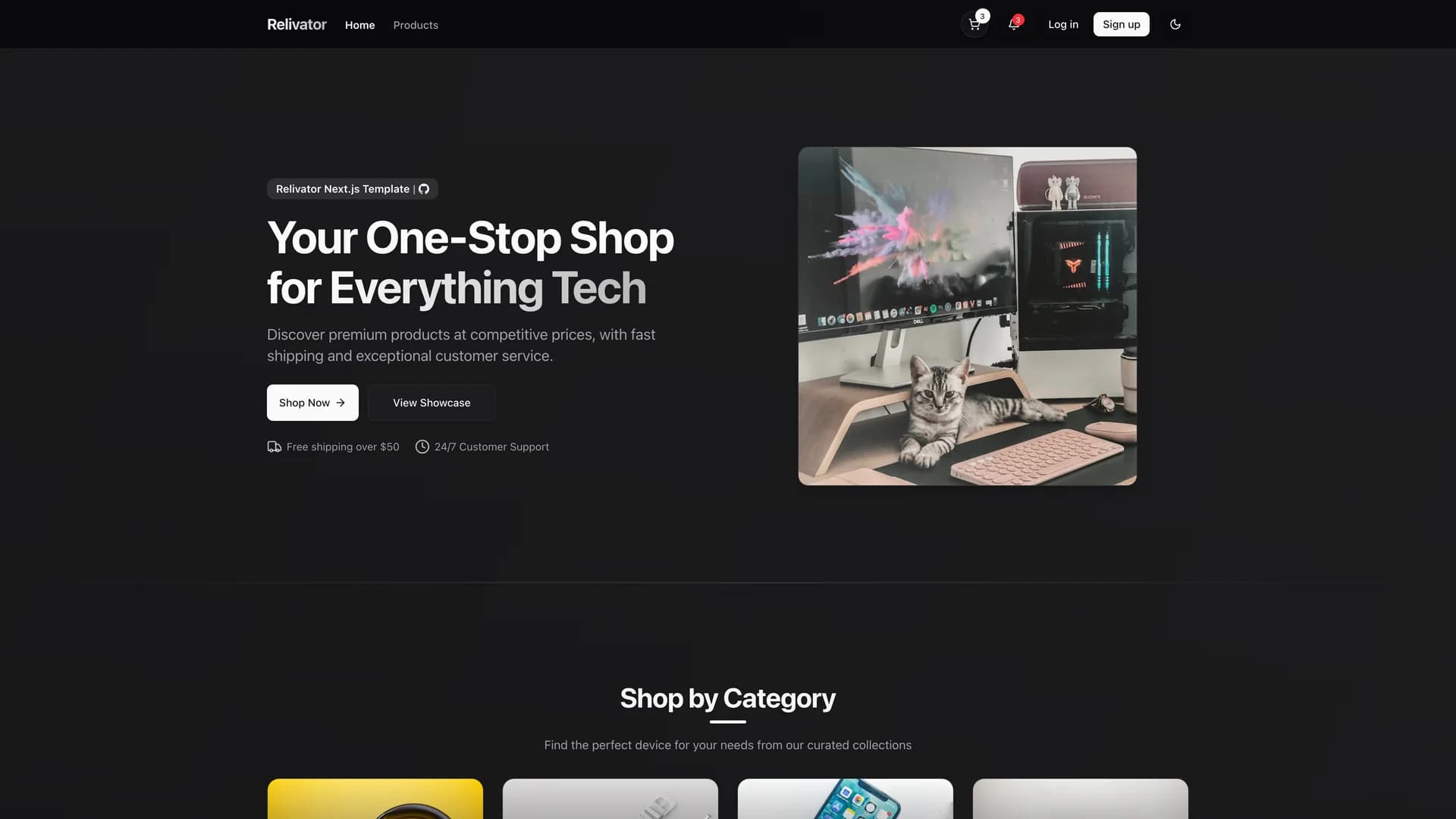
- RelivatorRelivator is a comprehensive Next.js 16 and React 19 ecommerce template designed for developers seeking a modern, scalable foundation for building full-stack web applications with robust commerce functionality. Built with TypeScript, Tailwind CSS, shadcn/ui, Drizzle ORM with Postgres/Neon database, better-auth for authentication, and Polar for payment processing and subscription management, it provides a feature-complete starting point for ecommerce projects. The template includes subscription checkout flows, dark mode support, AI-friendly development environment optimized for AI-powered IDEs, and a flexible, extensible architecture that scales from MVPs to production applications. Released under MIT license, Relivator emphasizes developer experience by integrating modern technologies without requiring extensive setup, allowing teams to focus on business logic rather than infrastructure. The comprehensive tech stack handles authentication, database operations, UI components, payments, and deployment, making it suitable for building SaaS products, online stores, marketplaces, or any application requiring ecommerce capabilities. Perfect for developers who want the productivity of a batteries-included template while maintaining the flexibility to customize every aspect of their application.
- File UploaderFile Uploader is a modern, user-friendly file upload component built with Next.js, shadcn/ui, Tailwind CSS, react-dropzone, uploadthing, and Zod for validation. The application provides a reusable file upload hook, drag-and-drop functionality with real-time progress bars, react-hook-form integration for seamless form workflows, and a file dialog for adding and removing files. Bootstrapped with create-t3-app, it offers a clean, modern interface that makes file uploading intuitive and visually appealing while handling validation, error states, and upload progress. The component supports multiple file uploads, file type restrictions, size limits, and custom validation rules through Zod schemas. With uploadthing integration, files are securely stored and managed with automatic URL generation and metadata tracking. Perfect for applications requiring document uploads, image galleries, profile pictures, or any file management functionality, File Uploader demonstrates best practices for building accessible, production-ready upload experiences. The project includes comprehensive documentation for local setup and deployment to platforms like Vercel, Netlify, and Docker.
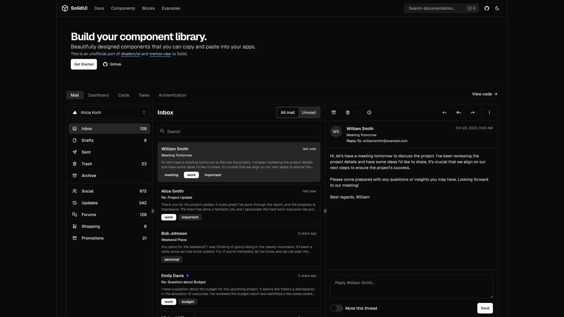
- Solid UISolid UI is an unofficial port of shadcn/ui and tremor-raw to SolidJS, providing accessible and customizable components built with Kobalte, corvu, and Tailwind CSS that developers can copy and paste into their applications. With over 1,300 GitHub stars, this MIT-licensed library brings the shadcn/ui philosophy of component ownership to the SolidJS ecosystem, allowing developers to build their own component libraries with well-designed, accessible primitives. Built with TypeScript and leveraging Kobalte and corvu for headless, accessible component foundations, Solid UI offers a comprehensive collection of UI components styled with Tailwind CSS for rapid customization. The project maintains compatibility with SolidJS's reactive programming model while providing familiar patterns from the React ecosystem through shadcn/ui's design language. With comprehensive documentation at solid-ui.com and active community contributions from maintainers including stefan-karger and michaelessiet, Solid UI serves developers who prefer SolidJS's performance and reactivity model but want the component quality and design consistency of shadcn/ui. Perfect for building SolidJS applications that require professional UI components without sacrificing the framework's unique advantages in bundle size and runtime performance.
- Solid UISolid UI is an unofficial port of shadcn/ui and tremor-raw to SolidJS, providing accessible and customizable components built with Kobalte, corvu, and Tailwind CSS that developers can copy and paste into their applications. With over 1,300 GitHub stars, this MIT-licensed library brings the shadcn/ui philosophy of component ownership to the SolidJS ecosystem, allowing developers to build their own component libraries with well-designed, accessible primitives. Built with TypeScript and leveraging Kobalte and corvu for headless, accessible component foundations, Solid UI offers a comprehensive collection of UI components styled with Tailwind CSS for rapid customization. The project maintains compatibility with SolidJS's reactive programming model while providing familiar patterns from the React ecosystem through shadcn/ui's design language. With comprehensive documentation at solid-ui.com and active community contributions from maintainers including stefan-karger and michaelessiet, Solid UI serves developers who prefer SolidJS's performance and reactivity model but want the component quality and design consistency of shadcn/ui. Perfect for building SolidJS applications that require professional UI components without sacrificing the framework's unique advantages in bundle size and runtime performance.
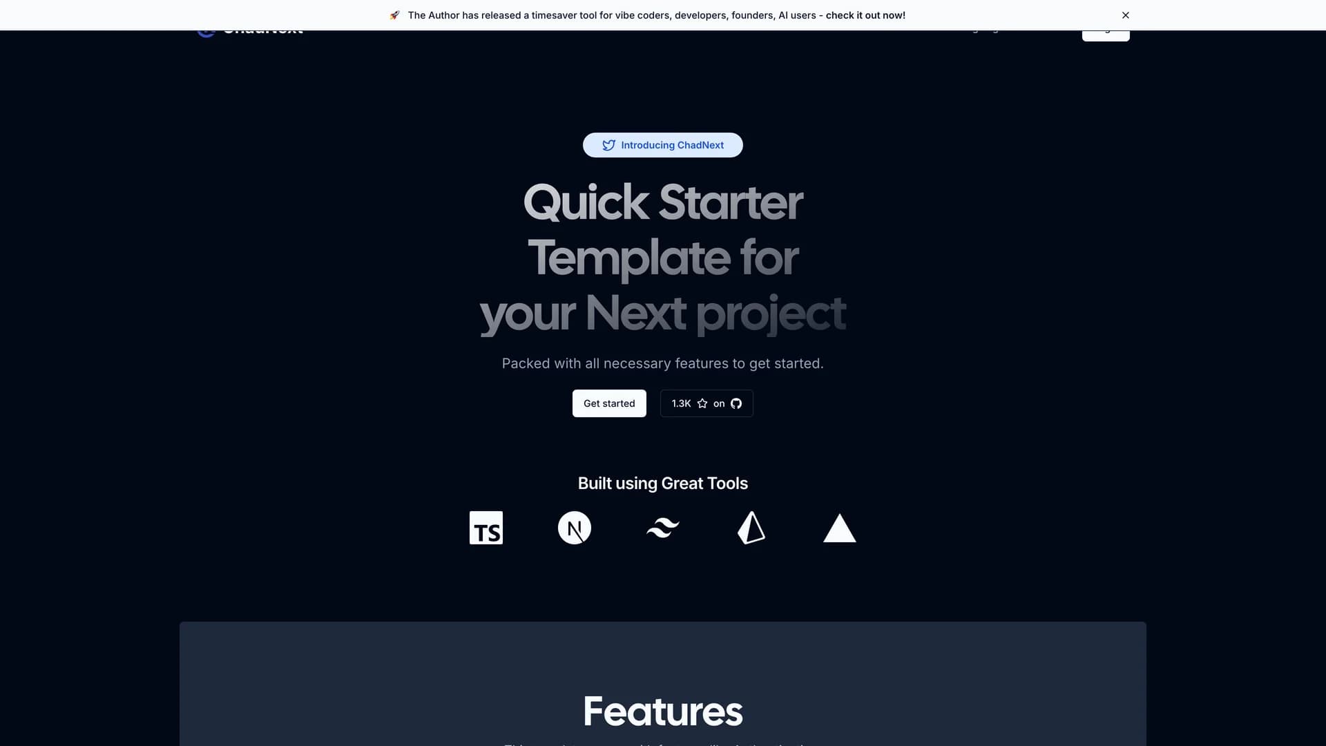
- ChadNextChadNext is a comprehensive Next.js 16 starter template designed to accelerate web development with a feature-rich stack including App Router, shadcn/ui, Lucia Authentication, Prisma ORM, Server Actions, Stripe integration, and internationalization support. Built with TypeScript, Tailwind CSS, and Radix UI primitives, this MIT-licensed template provides developers with a quick-start solution for building performant, full-stack applications with excellent developer experience. The template saves time and effort by providing pre-configured authentication flows, database interactions through Prisma, payment processing with Stripe, and beautiful UI components from shadcn/ui, all working together seamlessly. With support for rapid prototyping and streamlined deployment to platforms like Vercel, ChadNext eliminates hours of initial setup by providing a cohesive, production-ready foundation. The project includes server actions for type-safe mutations, internationalization for multi-language support, and a well-organized project structure that scales from MVPs to production applications. Perfect for developers building SaaS products, web applications, or any project requiring authentication, database management, and payment processing, ChadNext demonstrates best practices for modern Next.js development while maintaining flexibility for customization.
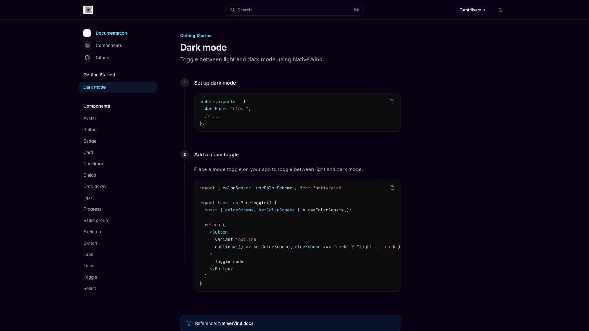
- Nativecn UINativecn UI is a beautiful, customizable React Native component library inspired by shadcn/ui, bringing the copy-paste component philosophy to mobile development with NativeWind and Tailwind CSS. Written primarily in TypeScript (91.5%), the MIT-licensed library provides essential components including Avatar, Badge, Button, Card, Checkbox, Dialog, Input, Progress, Radio Group, Skeleton, Switch, Tabs, Toast, Dropdown, and Select, all optimized for React Native and Expo. With built-in dark mode support using CSS variables and NativeWind's utility-first styling approach, Nativecn UI offers developers familiar Tailwind patterns for building mobile interfaces. The library includes a CLI for easy component initialization, making it simple to add components to React Native projects without managing complex dependencies. Comprehensive documentation at nativecn.mintlify.app provides light and dark mode examples, installation guides, and usage patterns. Perfect for developers building mobile applications with React Native and Expo who want the design consistency and developer experience of shadcn/ui combined with mobile-optimized components, Nativecn UI bridges web and mobile development with shared design principles and familiar tooling.
- Shadcn ExtensionShadcn Extension is an open-source component collection that extends UI libraries with additional shadcn/ui components, built using a Turborepo monorepo architecture with TypeScript, Next.js, Tailwind CSS, and Radix UI. The project provides a structured framework for developing and sharing reusable React components with a CLI that automates repetitive tasks like creating new components and managing dependencies. Organized into apps and packages directories, the extension offers a component registry mechanism that makes it easy to add custom components to projects while maintaining consistency with shadcn/ui's design principles. Built with pnpm for efficient package management, the monorepo structure allows developers to work on multiple related packages simultaneously while sharing common configuration and tooling. Perfect for teams building design systems or developers creating component libraries, Shadcn Extension provides the infrastructure to develop, test, and distribute high-quality UI components. The project demonstrates best practices for component library development including TypeScript for type safety, modular architecture for maintainability, and automated tooling for developer productivity.
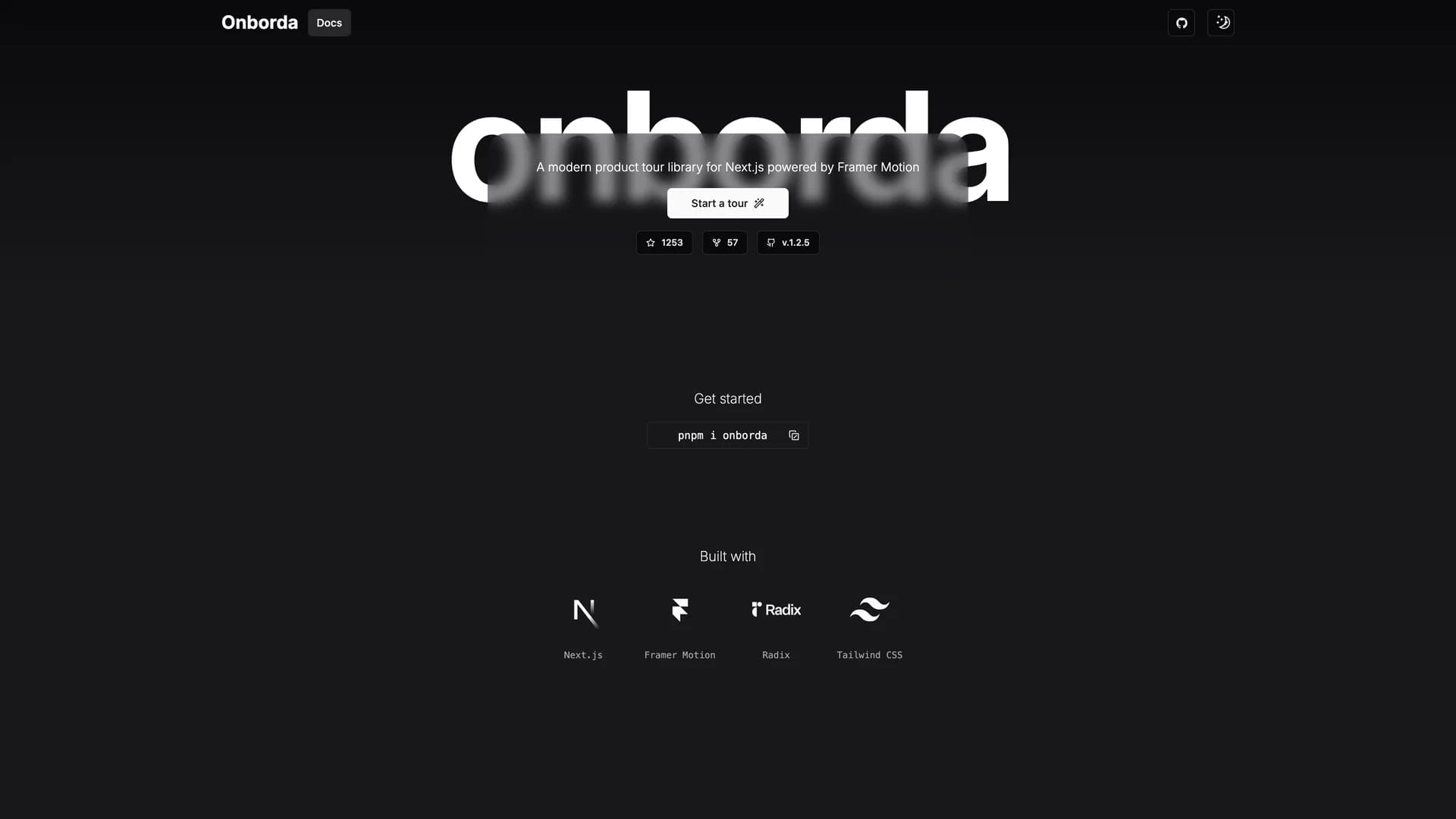
- OnbordaOnborda is a lightweight onboarding wizard and product tour library for Next.js applications that uses Framer Motion for smooth animations and Tailwind CSS for styling, with full shadcn/ui compatibility. The library enables developers to create customizable, interactive product tours that guide users through application features with configurable tooltips, pointers, and step-by-step flows. Supporting multiple tours in a single implementation, Onborda provides flexible step configuration including custom icons, positioning options (top, bottom, left, right), route navigation between steps, and custom card/tooltip designs. Features include customizable shadow and overlay effects, interactive overlay controls, smooth transitions between steps, and declarative tour definitions using simple selector-based targeting. The library handles complex scenarios like multi-page tours that navigate between routes, conditional step display, and custom styling for each tour step. Perfect for SaaS applications needing user onboarding, feature announcements, or guided walkthroughs, Onborda provides a polished user experience with minimal setup. With comprehensive documentation at onborda.dev, the library demonstrates how to create engaging product tours that improve user adoption and feature discovery.
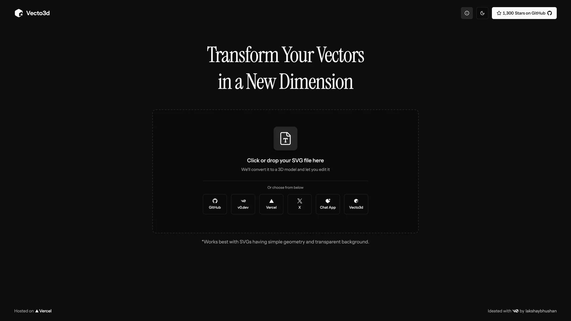
- Vecto3DVecto3d is a web-based tool that converts SVG files, particularly logos, into customizable 3D models with adjustable geometry, materials, and export options. Built with Next.js, Three.js, Tailwind CSS, and shadcn/ui, the MIT-licensed application provides an intuitive interface for transforming 2D vector graphics into 3D models without complex 3D software like Blender. Users can customize thickness and bevels, experiment with different materials including glass, metal, and plastic, preview models in various environments, and export in STL, GLB, and GLTF formats for use in 3D printing or rendering software. The application includes a unique vibe mode that adds dreamy effects with bloom and soft shadows to the preview panel, creating artistic visualizations of 3D models. With the ability to export high-resolution PNG images alongside 3D files, Vecto3d serves designers, marketers, and developers who need to quickly create 3D versions of logos or simple graphics for presentations, websites, or 3D printing. Perfect for creating 3D logos, product mockups, or promotional materials, the tool makes 3D model creation faster and easier than traditional 3D modeling workflows while maintaining quality output suitable for professional use.
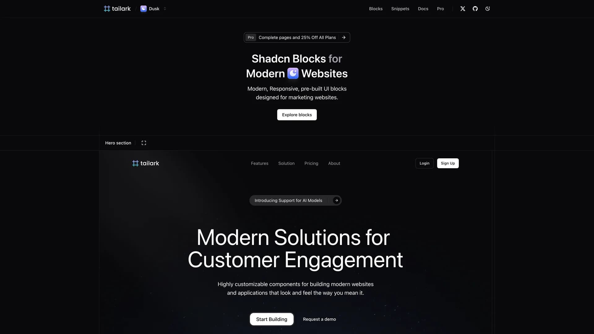
- Tailark BlocksTailark Blocks is a collection of responsive, pre-built UI components specifically designed for marketing websites, built with shadcn/ui, Tailwind CSS, Next.js, and TypeScript to accelerate website development. With over 1,800 GitHub stars, this MIT-licensed project provides ready-to-use marketing blocks including hero sections, feature showcases, pricing tables, testimonials, call-to-action sections, and footer designs that can be copied directly into projects. Written almost entirely in TypeScript (99%), Tailark Blocks eliminates the time-consuming process of designing and coding common marketing page sections by providing professionally designed, conversion-optimized components. The responsive design ensures all blocks work seamlessly across desktop, tablet, and mobile devices, while the integration with shadcn/ui and Tailwind CSS allows for easy customization to match brand requirements. Developers can quickly assemble landing pages, product pages, or marketing sites by combining pre-built blocks, then customize colors, spacing, typography, and content to fit specific needs. Perfect for startups needing quick landing pages, agencies building client websites, or developers creating marketing sites for SaaS products, Tailark Blocks demonstrates how component libraries can accelerate web development while maintaining design quality and responsiveness.
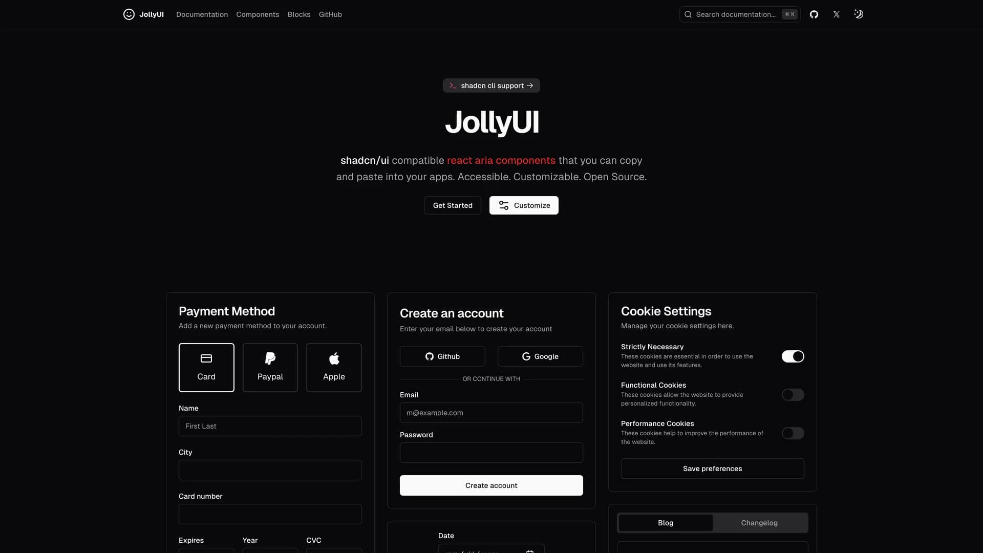
- Jolly UIJolly UI is an open-source React component library that provides accessible, customizable components built with React Aria and compatible with shadcn/ui, allowing developers to copy and paste production-ready accessible components into their applications. Written primarily in TypeScript (86.9%), the library combines React Aria's robust accessibility primitives with Tailwind CSS styling and shadcn/ui's design language to deliver components that are both beautiful and fully accessible. Maintained by James Shopland with community contributions, Jolly UI offers comprehensive documentation at jollyui.dev covering component APIs, usage examples, and integration guides. The library focuses on providing high-quality, accessible alternatives to standard UI components, ensuring keyboard navigation, screen reader support, and ARIA compliance work correctly out of the box. Built with Next.js and leveraging React Aria's proven accessibility foundations, Jolly UI components handle complex interactions like focus management, keyboard shortcuts, and touch interactions while maintaining visual consistency with shadcn/ui projects. Perfect for developers who need shadcn/ui-compatible components with React Aria's superior accessibility features, Jolly UI demonstrates how to build inclusive user interfaces that meet WCAG standards without sacrificing design quality or developer experience.
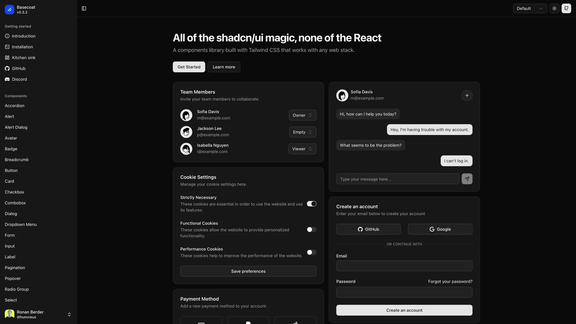
- BasecoatBasecoat is a lightweight, framework-agnostic UI component library built with Tailwind CSS that brings shadcn/ui's design philosophy to traditional web applications without requiring React. The MIT-licensed library provides accessible, themable components using primarily CSS with minimal JavaScript, making it compatible with any frontend or backend stack including vanilla JavaScript, PHP, Ruby on Rails, Django, or static sites. Components use simple class names like btn, input, and card rather than complex utility combinations, offering a more intuitive API while maintaining Tailwind CSS's customization capabilities. With built-in dark mode support, accessibility best practices, and easy extensibility, Basecoat delivers professional UI components for developers who prefer server-rendered applications or progressive enhancement over JavaScript frameworks. The library demonstrates how to create beautiful, accessible interfaces using Tailwind CSS without the complexity of modern JavaScript build tools or component frameworks. Perfect for traditional web applications, content management systems, server-side frameworks, or any project where React isn't suitable, Basecoat provides the design quality and component patterns of modern UI libraries while working with established web development workflows and technologies.
 Nextjs
 React
React Tailwind
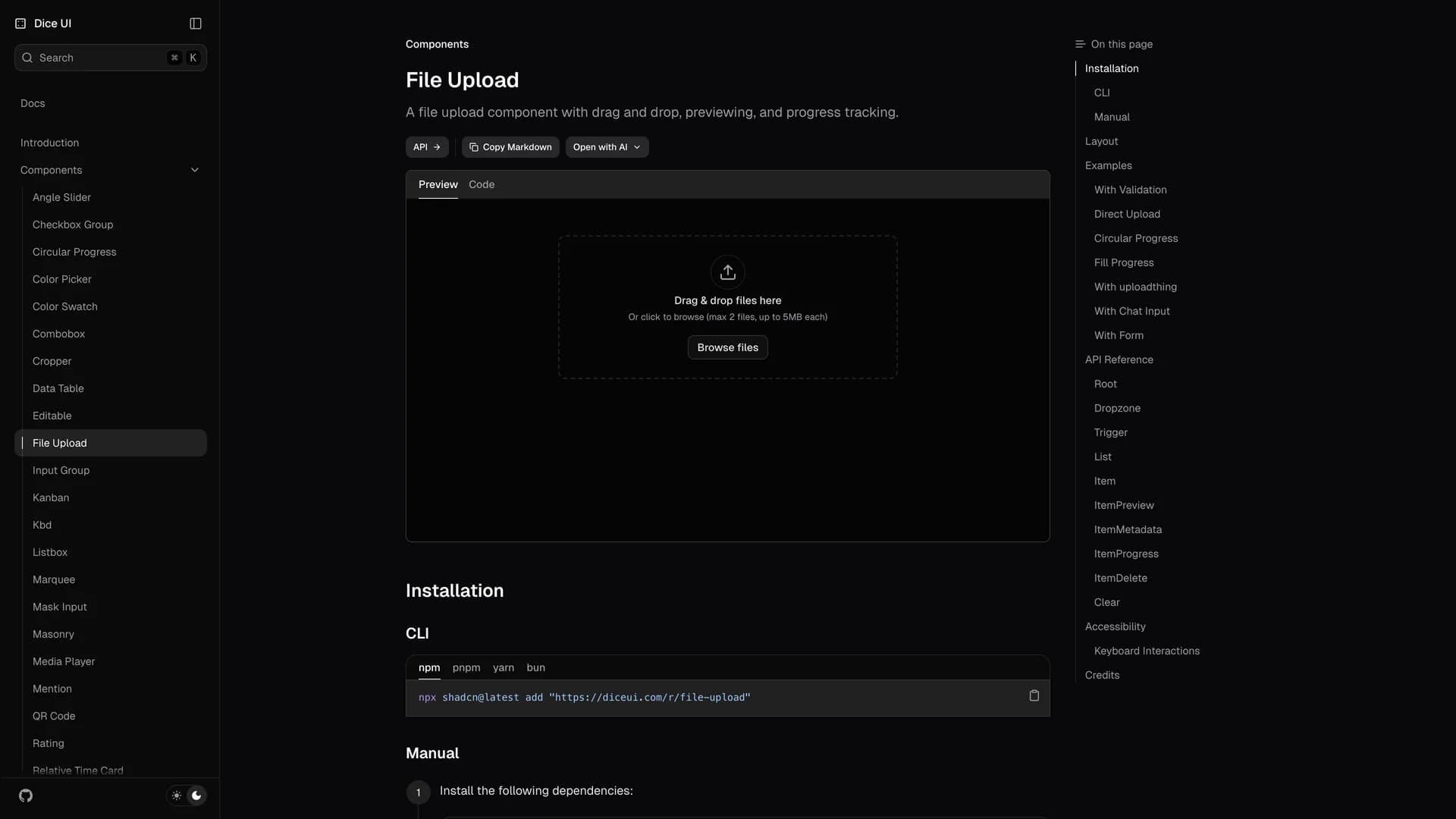
 Solid
Solid Ui kits & component libraries
 React native
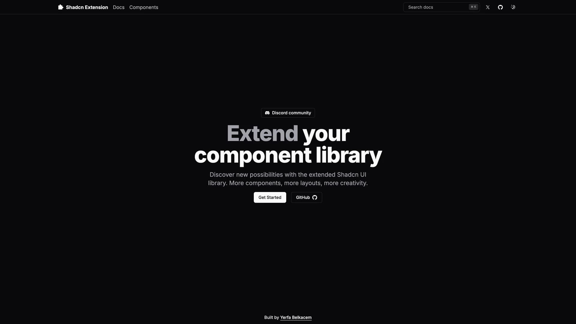
 Alpinejs