Join our Discord Community
Shadcn Landing Page template preview

Shadcn Landing Page

L

Created by Leomirandaa

Last updated October 8, 2025

About This Template

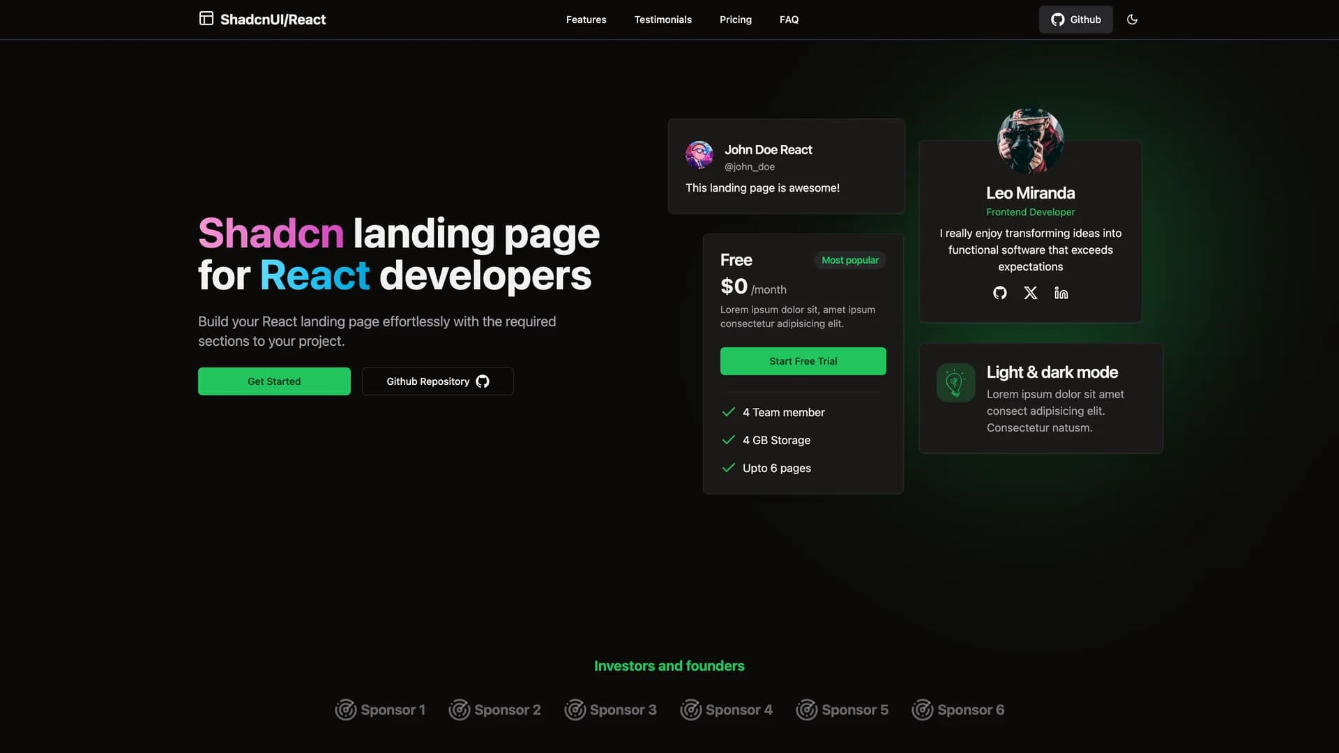
Shadcn Landing Page is a free, comprehensive landing page template built with shadcn/ui, React, TypeScript, Tailwind CSS, and Vite, providing developers with a quick-start solution for creating modern, professional marketing websites. The fully responsive template includes 16 pre-designed sections including Navbar, Hero, Sponsors, About, Stats, Features, Services, Testimonials, Team, Newsletter, FAQ, Pricing, CTA, Footer, and ScrollToTop, all optimized for various device sizes. With built-in dark mode support and user-friendly navigation, the modular design allows developers to easily customize and combine sections to match their project requirements. Each component is carefully crafted with shadcn/ui's accessible primitives and styled with Tailwind CSS for consistent, modern aesthetics. Perfect for startups, SaaS products, portfolios, or any project needing a professional landing page, this template eliminates hours of initial setup and design work by providing a polished, production-ready foundation. The template demonstrates best practices for React component architecture and responsive design while maintaining the flexibility to adapt to specific branding and content needs.

Related Templates

Tremor template preview
Tremor
Tremor is a React component library featuring 35+ customizable, accessible components designed for building data-rich dashboards and analytics interfaces. Built with React, TypeScript, Tailwind CSS, and Radix UI, it provides pre-built chart components (line, bar, area, donut charts, sparklines), KPI cards, data tables, and layout components that follow accessibility best practices. Like shadcn/ui, Tremor uses a copy-paste approach, letting developers integrate component source code directly into projects for complete customization control. The library handles common dashboard requirements including loading states, error boundaries, empty states, and responsive breakpoints, with each component fully typed and integrating seamlessly with Tailwind CSS utilities. Actively maintained by Tremor Labs with comprehensive documentation at tremor.so and community support via Slack and Twitter, it's perfect for building internal tools, SaaS analytics dashboards, and business intelligence applications by providing battle-tested components for data visualization.
Kokonut UI template preview
Kokonut UI
Kokonut UI is a collection of animated, accessible UI components built with React, Tailwind CSS, and Framer Motion, providing production-ready components with smooth animations and modern design patterns. The open-source library offers copy-and-paste components following shadcn/ui's philosophy, including animated cards, interactive buttons, smooth transitions, and engaging micro-interactions that enhance user experience. Built with TypeScript for type safety, the components integrate Framer Motion's animation capabilities with Tailwind CSS utility classes, creating visually polished interfaces without complex animation code. Each component is designed for accessibility with proper ARIA attributes, keyboard navigation support, and responsive behavior across devices. Perfect for marketing websites, landing pages, SaaS applications, or any project requiring eye-catching animations and professional polish beyond basic UI primitives, Kokonut UI demonstrates how to combine animation libraries with utility-first CSS for components that are both beautiful and maintainable.
Prompt Kit template preview
Prompt Kit
Core building blocks for AI apps. High-quality, accessible, and customizable components for AI interfaces.