Shadcn UI Big Calendar
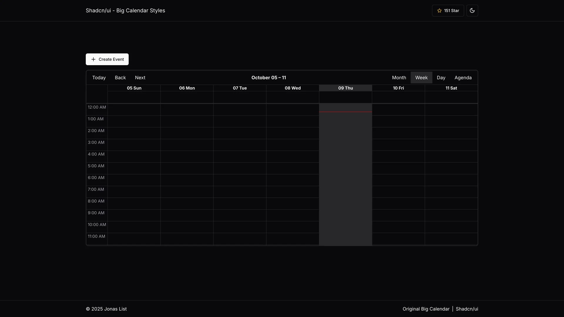
The shadcn/ui Big Calendar is a beautifully styled integration of React Big Calendar with shadcn/ui's design system, providing seamless light and dark theme support through pure CSS variable-based theming without JavaScript manipulation.
- Author
 List jonas
- Updated
Live preview
Live Preview
Interact with the actual deployed template — every section, every interaction, no mockups.
shadcn-ui-big-calendar.vercel.app
Open in a new tab (opens in a new tab)Loading preview…
About
About Shadcn UI Big Calendar
Built with Next.js, React, Tailwind CSS, and shadcn/ui components, this reusable calendar component automatically adjusts its appearance based on the selected theme using shadcn's CSS variables, creating smooth theme transitions and consistent visual experiences across your application. The implementation features automatic theme switching that respects user preferences and system settings, pure CSS-based theming eliminating JavaScript overhead for theme management, Next.js compatibility with server-side rendering support, multiple calendar views including month, week, day, and agenda layouts, full React Big Calendar functionality for event scheduling and management, responsive design adapting to mobile and desktop screen sizes, and a dedicated CSS stylesheet that leverages shadcn's color tokens for unified styling. Unlike standard React Big Calendar implementations that require manual theme configuration or complex JavaScript solutions, this integration uses CSS variables to ensure calendar colors, backgrounds, borders, and text automatically match your shadcn/ui theme, whether users prefer light mode during the day or dark mode at night.
The component is perfect for building appointment scheduling applications for services, healthcare, or consulting, team calendar interfaces for project management and collaboration, event management platforms for conferences or community events, resource booking systems for meeting rooms or equipment, and any application requiring a full-featured calendar with professional, theme-aware styling. This project demonstrates how to integrate third-party React components with shadcn/ui's theming system, implement CSS variable-based theming for complex UI components, create reusable calendar solutions for Next.js applications, and maintain visual consistency across light and dark modes.
Get started
Free, open source, and ready to ship.
Clone the repo, install dependencies, and start customising. Shadcn UI Big Calendar is free and open source: its license is in the repository.
- Clone the Shadcn UI Big Calendar repository from GitHub.
- Run
npm installorpnpm installto install all required packages. - Run
npm run devto start the development server and begin customizing. - Check the repository’s README and license before you ship.
Terminal
$ git clone https://github.com/list-jonas/shadcn-ui-big-calendar
$ cd shadcn-ui-big-calendar
$ npm install
$ npm run dev
Included in Pro
More Templates
Hand-built premium templates from shadcn.io — production-ready and bundled in Pro.
- Solarisshadcn.io/demos/solaris
 Pro
- Reframe Labsshadcn.io/demos/reframe
 Pro
- Spheruleshadcn.io/demos/spherule
 Pro
- Maxshadcn.io/demos/max
 Pro
- Zel Designsshadcn.io/demos/zel
 Pro
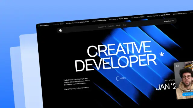
- Areteshadcn.io/demos/arete
 Pro
- Lightboxshadcn.io/demos/lightbox
 Pro
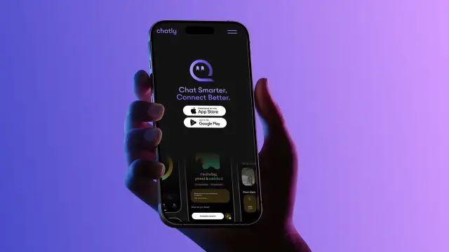
- Chatlyshadcn.io/demos/chatly
 Pro
Every template, every block. One Pro plan unlocks all 14, with 6,000+ blocks and MCP for your AI editor.
Get ProMore like this
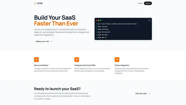
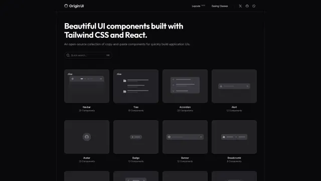
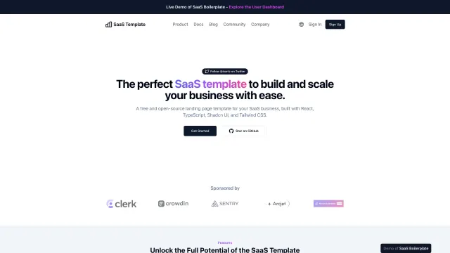
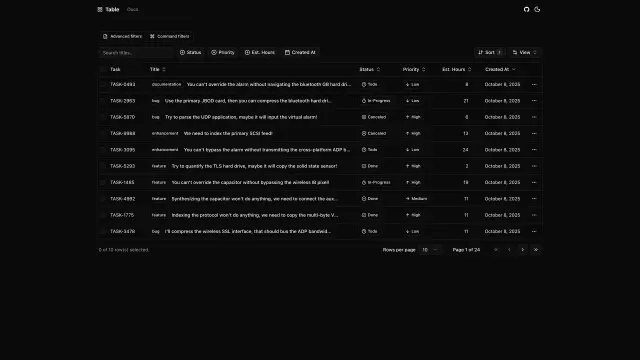
More Next.js templates
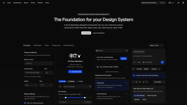
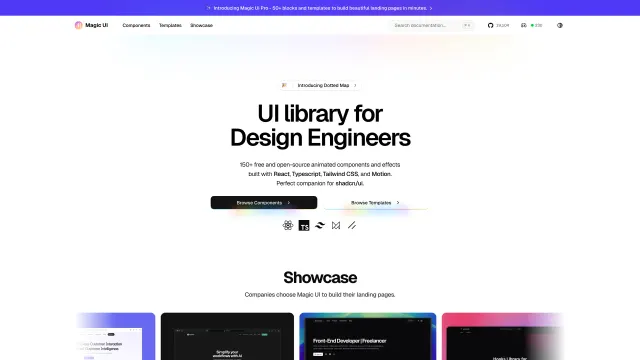
Open source Next.js templates like Shadcn UI Big Calendar, those with the most in common first.
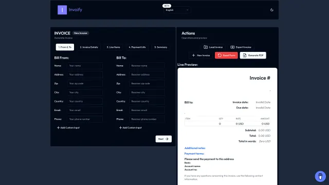
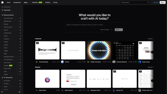
Pricing
Every premium template, with Pro
All 14 premium templates come with every Pro plan, with 6,000+ blocks and the MCP server. Pick the seats you need.
4.9/5 out of 5 · 150+ reviewsfrom 150+ founders and developers.
- Secure checkout via Stripe
- Code lives in your repo
- Keep what you've shipped if you cancel
- License terms
FAQ
Frequently asked questions
Everything you need to know before you ship with Shadcn UI Big Calendar.
The shadcn/ui Big Calendar is a beautifully styled integration of React Big Calendar with shadcn/ui's design system, providing seamless light and dark theme support through pure CSS variable-based theming without JavaScript manipulation. It is an open source template in the shadcn.io collection of 215.
Shadcn UI Big Calendar is made by List jonas, an independent developer; shadcn.io lists it but did not make it. List jonas has 1 template in the collection, and the author's page lists them.
The listing tags Shadcn UI Big Calendar with Next.js, React and Tailwind. Those are its categories, not a dependency list: the exact packages and versions are in the repository's package.json.
Yes. The Shadcn UI Big Calendar page embeds its live demo from shadcn-ui-big-calendar.vercel.app, and links to it so you can open the real deployment before you clone.
The Shadcn UI Big Calendar listing was last updated on October 8, 2025. That date is the listing's, not the repository's: check the repository's commits for recent activity.
Clone the repository (git clone https://github.com/list-jonas/shadcn-ui-big-calendar), then follow the README. The Shadcn UI Big Calendar page shows the usual steps and a terminal block with the commands to copy.
Install dependencies with npm install or pnpm install, then run npm run dev. The README in the Shadcn UI Big Calendar repository says which package manager and environment variables it needs.
No. Shadcn UI Big Calendar is cloned from its own GitHub repository, so shadcn.io isn't involved. Browsing the page and its live demo need no account either; Pro adds the premium templates, the blocks and the MCP server.
Shadcn UI Big Calendar is tagged Next.js, so it deploys wherever a Next.js app does, such as Vercel, a Node.js server or a container. Its README may add steps for its own services.
The Shadcn UI Big Calendar listing doesn't record a license. Check the LICENSE file in its repository (https://github.com/list-jonas/shadcn-ui-big-calendar), and ask the author if there isn't one.
That depends on Shadcn UI Big Calendar's license in its repository, which shadcn.io does not set. Read the LICENSE file before you use it in a client or paid project, and ask the author if it is unclear.
Attribution follows Shadcn UI Big Calendar's license. Many permissive licenses ask you to keep the copyright notice and license text in your copy; its LICENSE file says exactly what.
No. The Pro license covers shadcn.io's own Pro code, blocks and premium templates. Shadcn UI Big Calendar is the author's project, under the terms in its repository.
List jonas supports Shadcn UI Big Calendar, through its GitHub repository: read the docs, open an issue or look for discussions. shadcn.io does not maintain it.
Yes. Once you clone it, Shadcn UI Big Calendar is your own code: change the theme, add pages and connect your backend. It uses shadcn/ui, so you can also add more components the same way.
Yes. Components are free with a free account and the blocks are in Pro; both are copied into your project with the shadcn CLI. Check that Shadcn UI Big Calendar uses Tailwind CSS and the shadcn/ui setup (a components.json) before you add them, and pick the base library your project already uses.
Yes, with Pro. The shadcn.io MCP server's search_templates tool finds templates by what they are, and returns each one's repository and live demo, so your editor can set up Shadcn UI Big Calendar for you. Your files stay on your machine.
The collection has 151 other open source Next.js templates like Shadcn UI Big Calendar, shown at the foot of its page with the ones sharing most categories first. All of them are at /template/category/nextjs.
List jonas has no other templates in the collection.
Yes. The 14 premium templates (Solaris, Reframe Labs, Spherule and Max and more) are built by shadcn.io and come with every Pro plan, if you want maintained code with a design file.
4.9 out of 5 from 150+ developers


Ship your next site this weekend
14 premium templates, 6,000+ blocks and MCP in every Pro plan. Shadcn UI Big Calendar and the other 214 open source templates stay free.
Get Pro