Open source and free shadcn templates using UI Kits & Component Libraries
22 templates • 20 contributors • Open source & free
22
Templates
20
Authors
Available Templates (22)
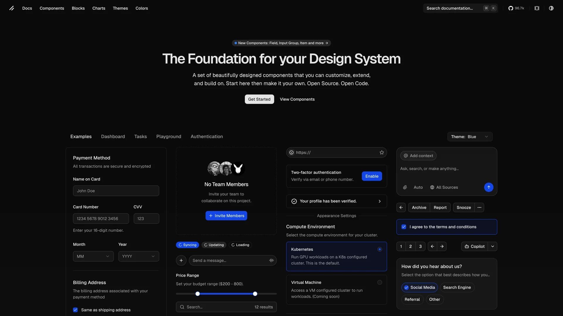
Shadcn UI
shadcn/ui is an open-source component library that provides beautifully designed, accessible, and customizable UI components built with React, Radix UI, and Tailwind CSS. Unlike traditional component libraries, shadcn/ui uses a unique copy-paste approach where developers directly copy components into their projects, giving them full ownership and control over the code. The library includes a comprehensive collection of reusable components ranging from basic elements like buttons and inputs to complex components like data tables, calendars, and command palettes. Built with TypeScript for type safety, it supports dark mode, offers a powerful CLI for easy installation, and integrates seamlessly with modern tools like Next.js, React Hook Form, and Zod. This developer-friendly approach makes shadcn/ui the perfect foundation for building custom design systems and production-ready applications across SaaS dashboards, e-commerce platforms, and admin panels.
 Nextjs
 React
React Tailwind
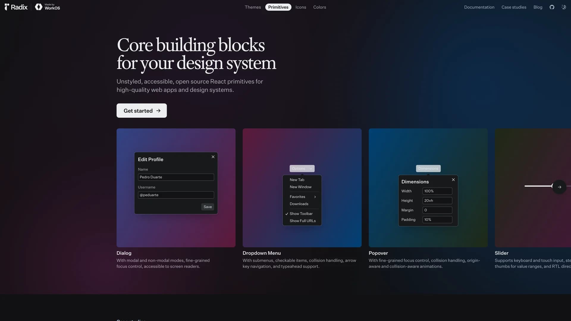
Radix UI Primitives
Radix Primitives is an open-source UI component library designed for building high-quality, accessible web applications and design systems with React. It provides low-level, unstyled, and highly customizable components with a strong focus on accessibility, customization, and developer experience. Maintained by WorkOS, Radix UI serves as the foundational layer that powers shadcn/ui and many other popular component libraries. The library offers primitives for common UI patterns like dialogs, dropdowns, popovers, and tooltips, all built with WAI-ARIA compliance to ensure screen reader support and keyboard navigation. Developers can use Radix Primitives as a complete foundation for their design system or incrementally adopt individual components, making it a flexible solution for teams building robust, inclusive user interfaces that meet modern accessibility standards while maintaining full styling control.
 Vite
Vite Radix ui
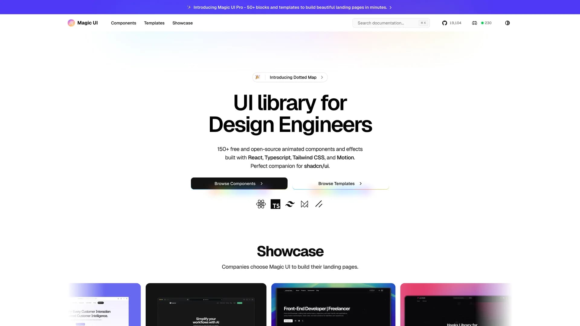
Magic UI
Magic UI is an open-source component library designed specifically for design engineers, offering a collection of over 50 animated components and visual effects that can be easily copied and pasted into React applications. Built with TypeScript, Next.js, Tailwind CSS, and Framer Motion, this library focuses on providing high-quality, visually engaging UI elements that bring motion and interactivity to modern web projects. With over 19,000 GitHub stars and an MIT license, Magic UI streamlines the process of creating dynamic user interfaces by offering ready-to-use components like animated backgrounds, text effects, interactive cards, and smooth transitions. The library follows the same copy-paste philosophy as shadcn/ui, giving developers full ownership of the code while eliminating external dependencies. Perfect for landing pages, marketing sites, and applications that need eye-catching animations, Magic UI helps developers quickly enhance their projects with professional, customizable design elements.
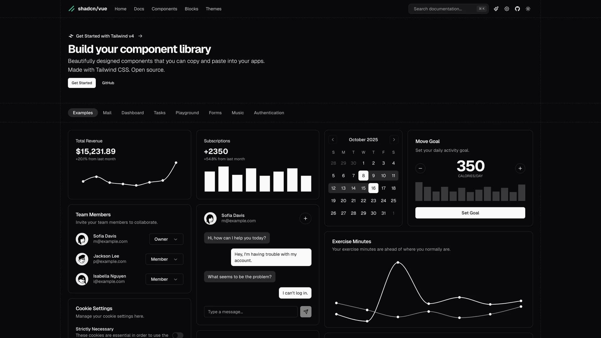
Shadcn Vue
Shadcn Vue is an unofficial, community-driven Vue.js port of the popular shadcn/ui component library, bringing the same accessible, customizable, and copy-paste component philosophy to the Vue ecosystem. Developed with the blessing of shadcn/ui's original creator, this open-source project provides Vue developers with beautifully designed components built on Radix Vue primitives and styled with Tailwind CSS, offering the same flexibility and ownership model that made shadcn/ui successful in the React community. The library includes a comprehensive collection of Vue components like buttons, dialogs, dropdowns, forms, and data tables, all designed with accessibility as a priority following WAI-ARIA standards. Unlike traditional Vue component libraries that require npm installations and updates, Shadcn Vue allows developers to copy components directly into their projects, giving them full control to customize, modify, and adapt components to their specific needs without dealing with dependency management. Perfect for Vue 3 applications, Nuxt projects, and any Vue-based web application, this library provides a solid foundation for building modern, consistent design systems while maintaining the composability and reactivity that Vue developers love, making it an ideal choice for teams seeking accessible, production-ready components with complete customization freedom.
 Vue
Vue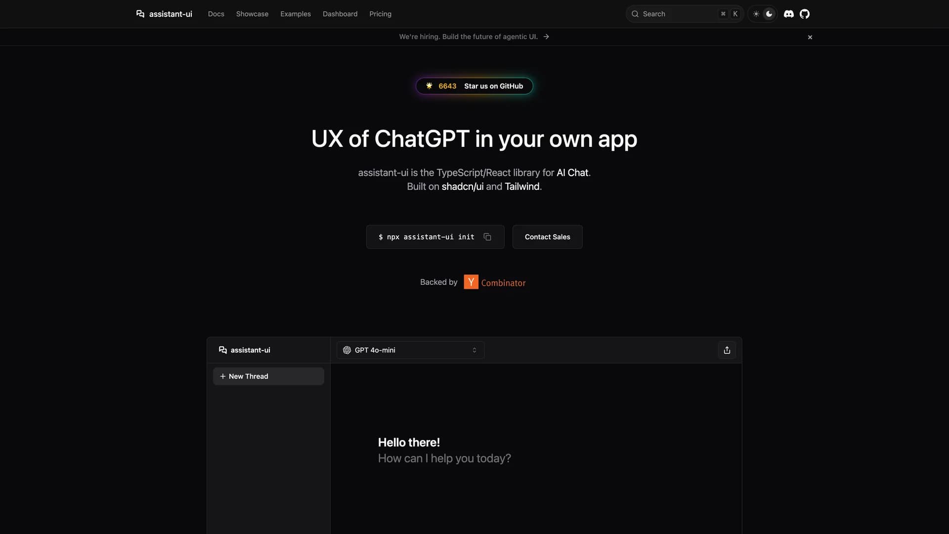
Assistant UI
Assistant UI is an open-source TypeScript/React library designed for rapidly building production-grade AI chat interfaces with ChatGPT-like experiences. This comprehensive UI toolkit provides fully composable primitives built on Radix UI with built-in features like message streaming, automatic scrolling, typing indicators, and complete accessibility support through WAI-ARIA compliance. The library supports integration with major AI providers including OpenAI, Anthropic Claude, Google Gemini, and any backend compatible with Vercel AI SDK, offering maximum flexibility for AI application development. With enterprise-ready components, developers get features like markdown rendering, code syntax highlighting, file attachments, voice input support, conversation threading, and customizable themes that work seamlessly with shadcn/ui styling. The composable architecture allows fine-grained control over every aspect of the chat interface, from message bubbles and input areas to suggestion chips and action buttons, while maintaining excellent performance and developer experience. Perfect for building AI assistants, customer support chatbots, documentation helpers, or any conversational AI application, Assistant UI eliminates weeks of UI development by providing battle-tested components that handle the complexity of real-time streaming, state management, and user interactions, allowing teams to focus on AI logic rather than interface implementation.
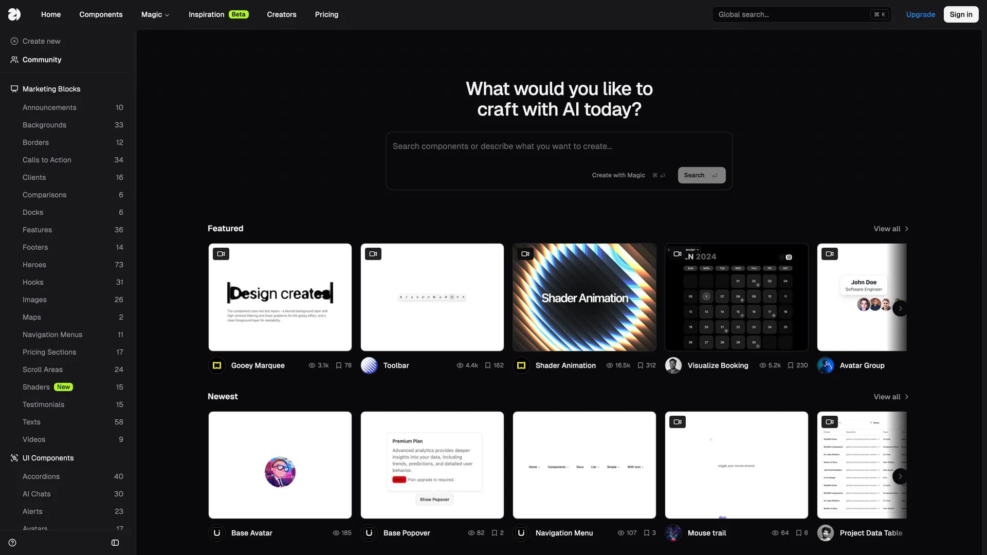
21st.dev
21st.dev is an open-source community registry and marketplace for shadcn/ui-based React components, serving as the npm for design engineers who want to publish, discover, and install minimal, modern, and reusable UI components. Inspired by shadcn/ui's philosophy, this platform provides a comprehensive collection of high-quality React components, blocks, and custom hooks powered by Tailwind CSS and Radix UI primitives, all installable with a single npx shadcn command. The registry emphasizes TypeScript support throughout, offers multiple live demos for each component to showcase different variations and use cases, and maintains a community-driven curation process ensuring component quality and consistency. Developers can browse components by category, search for specific functionality, preview components with interactive examples, and install them directly into their projects with full source code access for customization. Perfect for design engineers and React developers looking to accelerate UI development, 21st.dev eliminates the need to build common components from scratch by providing battle-tested, production-ready implementations that follow modern React patterns and accessibility best practices. The marketplace includes everything from form components and navigation elements to complex data visualizations and interactive widgets, making it an invaluable resource for teams building Next.js applications, design systems, and component libraries with shadcn/ui as their foundation.
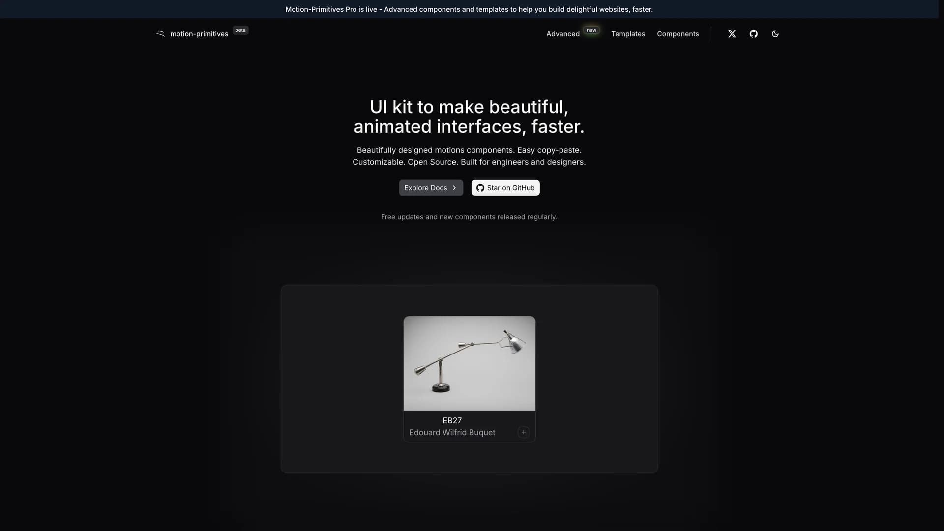
Motion Primitives
Motion Primitives is an open-source UI component library designed to help engineers and designers create beautiful, animated interfaces faster using Framer Motion and Tailwind CSS. This comprehensive animation toolkit provides ready-to-use motion components that simplify the process of adding sophisticated animations to web applications without requiring deep animation expertise. The library offers a growing collection of customizable components including animated buttons, cards, modals, page transitions, scroll-triggered animations, and interactive micro-interactions, all built with performance and accessibility in mind. Each component is crafted to be developer-friendly with clear documentation, live previews, and copy-paste installation, following the same philosophy as shadcn/ui. Currently in active development with regular component releases and updates, Motion Primitives eliminates the complexity of configuring Framer Motion from scratch by providing pre-built, production-ready animation patterns that work seamlessly with Next.js and React applications. Perfect for developers building landing pages, marketing sites, SaaS applications, or any project requiring engaging user experiences, the library helps teams add professional-grade animations and transitions that enhance usability and delight users, while maintaining clean code and excellent performance through optimized animation techniques and GPU-accelerated transforms.
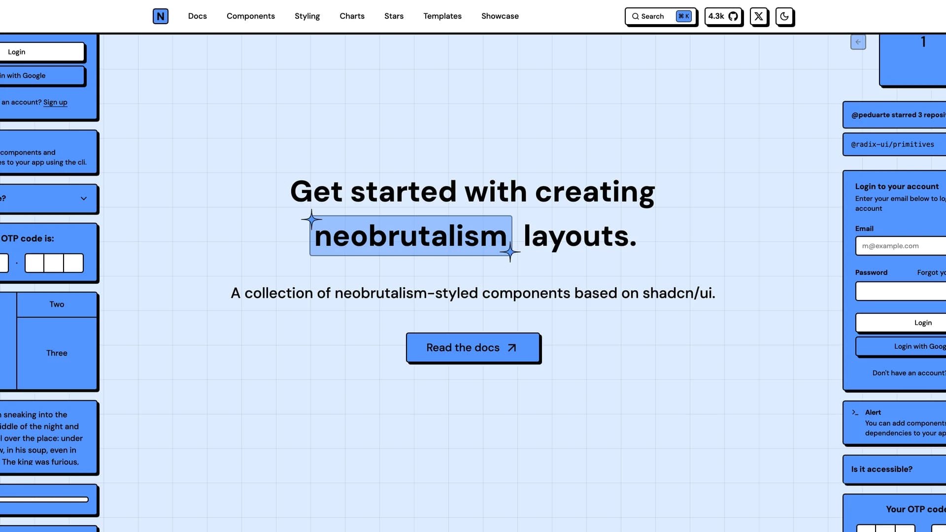
Neobrutalism Components
Neobrutalism Components is an open-source React UI library featuring a unique collection of Tailwind CSS components styled in the distinctive neobrutalism design aesthetic, characterized by bold colors, thick borders, hard shadows, and raw, unapologetic visual elements. Inspired by shadcn/ui's component architecture, this library provides pre-built components including buttons, cards, forms, inputs, navigation elements, and layout components, all designed to help developers quickly implement the bold, minimalist neobrutalism style that has gained popularity in modern web design. The project serves as both a learning resource for those interested in neobrutalism design principles and a practical component library for creating brutalist-style layouts with minimal effort. Each component showcases the characteristic features of neobrutalism including high contrast color schemes, prominent borders and outlines, deliberate lack of rounded corners, strong geometric shapes, and intentionally raw aesthetics that reject modern design polish. While the project is no longer actively maintained, it remains a valuable design resource with comprehensive documentation at neobrutalism.dev, providing developers with ready-to-use components and code examples for creating websites and applications that embrace the neobrutalist movement's philosophy of digital authenticity, functional simplicity, and visual boldness that stands out from conventional sleek designs.

Tremor
Tremor is a React component library featuring 35+ customizable, accessible components designed for building data-rich dashboards and analytics interfaces. Built with React, TypeScript, Tailwind CSS, and Radix UI, it provides pre-built chart components (line, bar, area, donut charts, sparklines), KPI cards, data tables, and layout components that follow accessibility best practices. Like shadcn/ui, Tremor uses a copy-paste approach, letting developers integrate component source code directly into projects for complete customization control. The library handles common dashboard requirements including loading states, error boundaries, empty states, and responsive breakpoints, with each component fully typed and integrating seamlessly with Tailwind CSS utilities. Actively maintained by Tremor Labs with comprehensive documentation at tremor.so and community support via Slack and Twitter, it's perfect for building internal tools, SaaS analytics dashboards, and business intelligence applications by providing battle-tested components for data visualization.
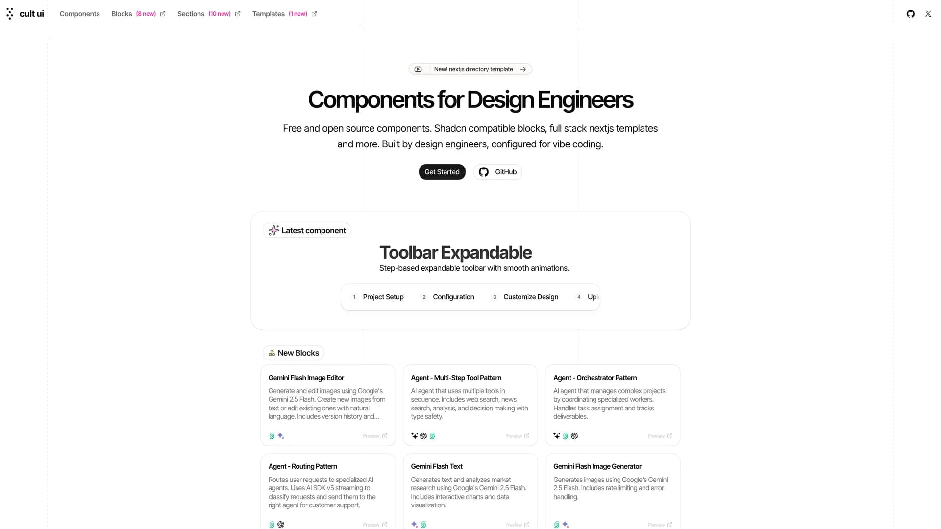
Cult UI
Cult UI is an open-source React component library crafted for design engineers, offering accessible and customizable components with sophisticated animations that integrate seamlessly with shadcn/ui through a copy-paste workflow. Built with React, TypeScript, Next.js, Tailwind CSS, and Framer Motion, it provides components with built-in animations and micro-interactions that create polished interfaces without requiring animation expertise. The library includes enhanced UI elements like buttons and cards, plus complex patterns like animated navbars, feature sections, testimonial carousels, and landing page blocks for marketing sites and SaaS applications. With full component code ownership, developers can customize animations, adjust styling, and extend functionality while learning from well-crafted examples. The project offers full-stack Next.js templates at newcult.co and comprehensive documentation at cult-ui.com with live previews and code examples. Perfect for marketing websites, SaaS landing pages, and portfolio sites, Cult UI bridges basic components and custom design work with beautiful, animated elements.
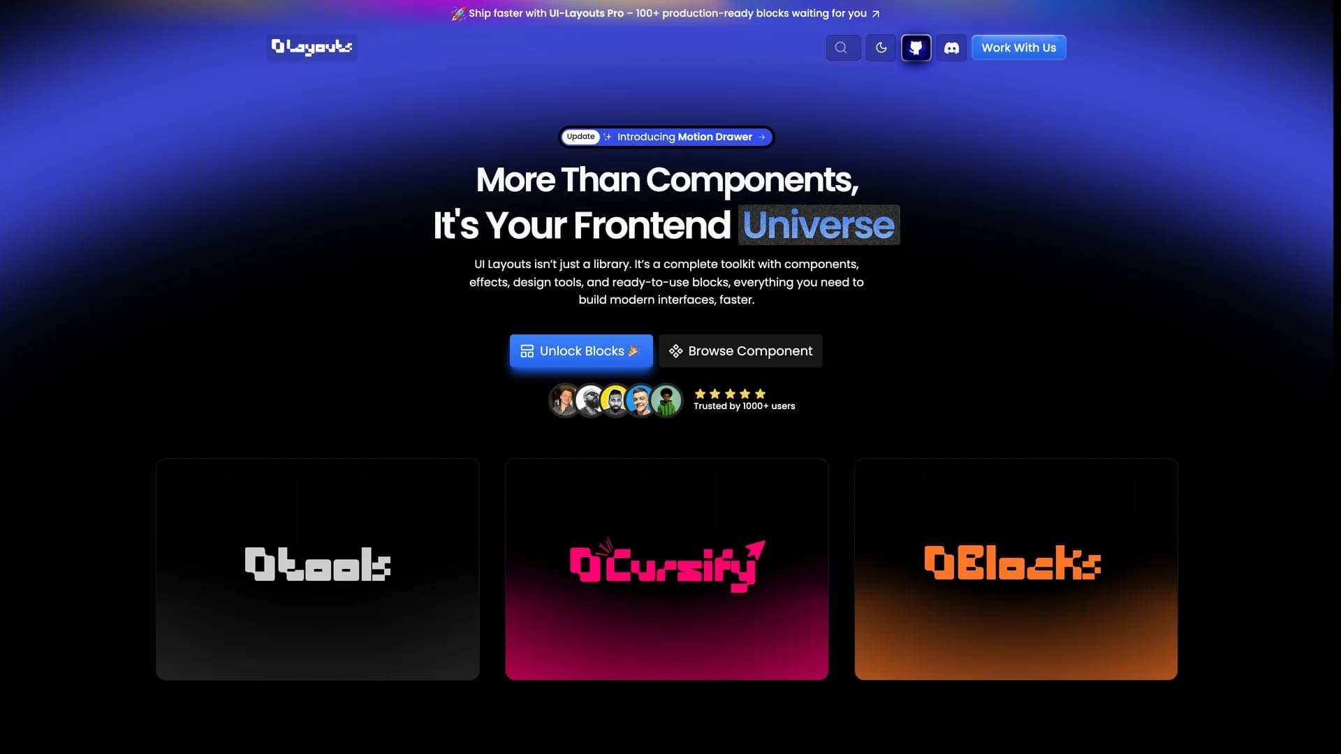
UI Layouts
UI Layouts is an open-source component library featuring 100+ free, beautifully designed interactive React and Next.js components built with Tailwind CSS, Framer Motion, and GSAP for creative and engaging web experiences. Created by Naymur Rahman with TypeScript, the library offers visually striking components like R3F Blob Effects, Image Ripple, File Upload, animated navbars, hero sections, and interactive UI elements that emphasize modern design trends and smooth animations. Each component is designed to be reusable and easily integrated into projects, providing developers and designers with ready-to-use building blocks that make website development faster while maintaining high visual quality. The library focuses on interactivity and animation, offering components that go beyond basic UI elements to create memorable user experiences with fluid motion and creative effects. Available at ui-layouts.com, the project is open for community contributions and sponsorship, providing comprehensive documentation and live demos for all components. Perfect for developers building marketing websites, portfolios, SaaS landing pages, or any project where creative design and interactivity matter, UI Layouts bridges the gap between design ambition and development reality with production-ready animated components.
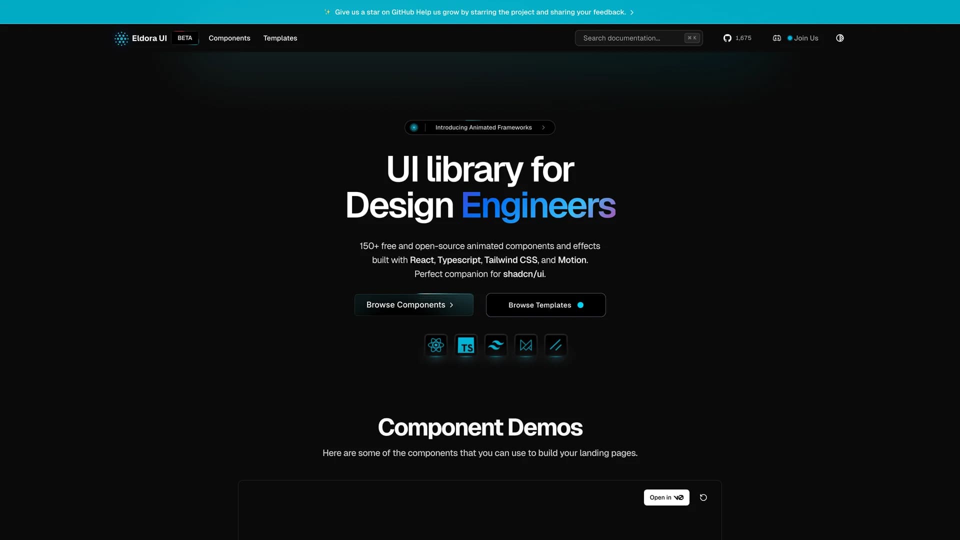
Eldora UI
Eldora UI is an open-source UI library designed for design engineers, offering a comprehensive collection of reusable components, blocks, and templates that can be easily copied and pasted into web applications. Built primarily with TypeScript (87.7% of the codebase), Next.js, React, Tailwind CSS, and Headless UI, the MIT-licensed library simplifies UI development by providing ready-to-use interface elements that maintain consistency and quality. The project features comprehensive documentation at eldoraui.site/docs and an active Discord community for support and collaboration. Eldora UI focuses on helping developers quickly integrate pre-built components into their projects without sacrificing customization flexibility, following a copy-paste approach where the code becomes yours to modify. With components ranging from basic UI elements to complex blocks and full templates, it provides building blocks for various application types. Perfect for design engineers and developers seeking high-quality, customizable components that accelerate development while maintaining professional design standards, Eldora UI bridges the gap between rapid development and polished user interfaces.