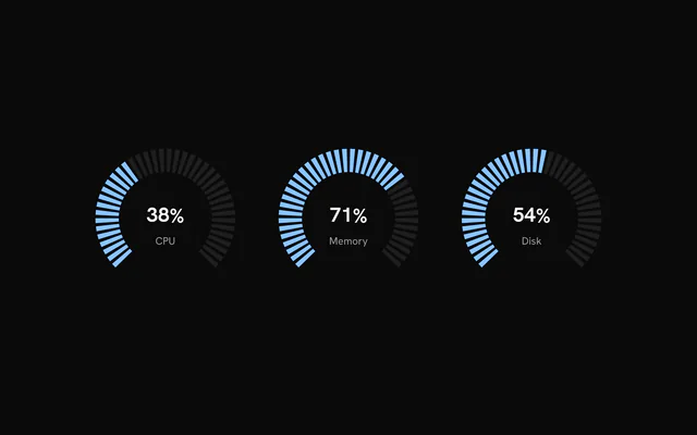
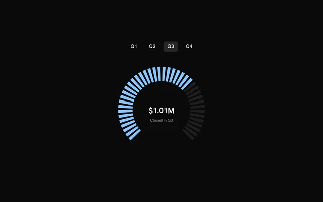
shadcn.io is an independent project built on shadcn/ui
Installation
Usage
import { ChartGaugeCenterDisc } from "@/components/charts/chart-gauge-center-disc";<ChartGaugeCenterDisc />API Reference
Gauge
orientation?GaugeOrientation
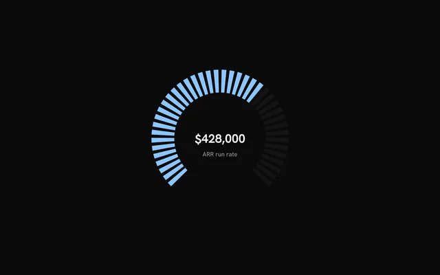
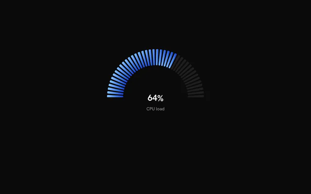
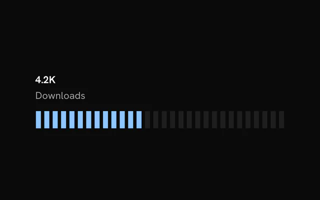
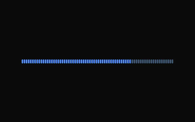
"arc" draws the notches around an arc; "linear" lays them out along a horizontal track.
- Default
"arc"
valuenumber
Fill level from 0 to 100: the share of notches drawn in the active colour.
totalNotches?number
Number of notches.
- Default
40
spacing?number
Share of the track, in percent, reserved for the gaps between notches.
- Default
25
notchCornerRadius?number
Radius in pixels used to round the corners of each notch. 0 keeps them sharp; large values are limited by the notch size and approach a capsule shape.
- Default
0
uniformWidth?boolean
true draws notches with parallel sides; false tapers them toward the centre (arc) or midline (linear). Defaults to false for arc gauges and true for linear gauges.
startAngle?number
Angle where the arc starts, in degrees. Arc gauges only.
- Default
135
endAngle?number
Angle where the arc ends, in degrees. Arc gauges only.
- Default
405
useGradient?boolean
Colour the notches along a gradient instead of one solid colour.
- Default
false
activeGradient?readonly [string, string]
[from, to] colours for the active notches, interpolated along the notch index. Used when useGradient is on; defaults to --chart-1 to --chart-5.
inactiveGradient?readonly [string, string]
[from, to] colours for the inactive notches. Used when useGradient is on; defaults to activeGradient.
centerValue?number
Number shown in the label, which is drawn only when this is set. It is independent of value, so it can show a related figure such as revenue.
defaultLabel?string
Caption shown under (arc) or next to (linear) the centerValue.
- Default
"Total"
prefix?string
Text shown before the centerValue, for example "$".
suffix?string
Text shown after the centerValue, for example "%".
formatOptions?GaugeStatFormat
Number format for the centerValue, in Intl.NumberFormat terms (notation, currency, fraction digits and so on).
- Default
{ maximumFractionDigits: 0, notation: "standard" }
labelPlacement?GaugeLabelPlacement
Where the label sits relative to a linear track. Arc gauges always draw the label in the centre.
- Default
"top"
labelAlign?GaugeLabelAlign
Alignment of the label across the linear track: "start", "center" or "end".
- Default
"start"
inactiveFill?string
Colour of the inactive notches. Defaults to the --border colour.
activeFill?string
Colour of the active notches. Takes precedence over the gradient options. Defaults to --chart-1.
inactiveFillOpacity?number
Fill opacity of the inactive notches, from 0 to 1.
- Default
0.8
activeFillOpacity?number
Fill opacity of the active notches, from 0 to 1.
- Default
1
children?ReactNode
SVG definitions (a pattern tile such as PatternLines) the gauge renders in a hidden <defs>, so activeFill, inactiveFill or a sector's color can paint with url(#id). Their ids are the page's: give each gauge its own.
className?string
Extra class name for the root element.
width?number
Fixed width in pixels. Omit to fill the parent. An arc gauge is fixed-size only when both width and height are set.
height?number
Fixed height in pixels. For a linear gauge this is the track thickness; when omitted the thickness is linearHeight.
minWidth?number
Minimum width in pixels when the gauge fills its parent.
- Default
300 for arc gauges, 200 for linear gauges
notchLengthPercent?number
Length of the notches as a percentage of their full length, clamped to 5 to 100.
- Default
100
notchWidthPercent?number
Width of each notch as a percentage of its slot, along the track. Linear gauges only.
- Default
80
linearHeight?number
Track thickness in pixels when height is not set. Linear gauges only.
- Default
24
ruler?boolean | GaugeRulerOptions
Arc only: the scale ticks inside (or outside) the notches, brightening up to the value. true for the defaults, or options.
- Type
boolean | GaugeRulerOptions
needle?boolean | GaugeNeedleVariant | GaugeNeedleOptions
Arc only: a pointer that sweeps to the value. true (the gradient needle), a variant name, or options.
- Type
boolean | GaugeNeedleVariant | GaugeNeedleOptions
arcStyle?GaugeArcStyle
Arc only: notches, one rounded solid stroke, or none (a sector, ring or dots carry the value).
- Default
"notches"
arcThickness?number
Arc only: the solid stroke's thickness as a fraction of the gauge size.
- Default
0.035
zones?readonly GaugeZone[]
Arc only: coloured ranges on the 0–100 scale, such as a red zone; later zones win where they overlap.
zoneDisplay?GaugeZoneDisplay
How zones render: a thin band ringing the track, the fill taking the zone colour, or both.
- Default
"band"
sector?boolean | GaugeSectorOptions
Arc only: a filled wedge from the start to the value (conic, radial, flat or pattern).
- Type
boolean | GaugeSectorOptions
progressRing?boolean | GaugeProgressRingOptions
Arc only: a thin value ring around the track.
- Type
boolean | GaugeProgressRingOptions
dots?boolean | GaugeDotsOptions
Arc only: concentric rings of dots that light up to the value.
- Type
boolean | GaugeDotsOptions
glow?boolean | GaugeGlowOptions
Arc only: a soft glow on the fill (lit notches, the solid arc, the progress ring).
- Type
boolean | GaugeGlowOptions
centerDisc?boolean | GaugeCenterDiscOptions
Arc only: a ringed disc behind the centre label.
- Type
boolean | GaugeCenterDiscOptions
enterTransition?GaugeEnterTransition
Transition of the fill's sweep (and of the needle, sector, ring and dots riding it), in the shape used by the motion library (type, duration or visualDuration in seconds, bounce, ease, spring values). Notches light up in order as the sweep passes them; a new value sweeps on from wherever the fill is, keeping its speed.
- Default
{ type: "spring", visualDuration: 0.9, bounce: 0 }
enterStaggerScale?number
Scales the delay between the track fading in and the fill starting to sweep (limited to 0.25 to 2.5).
- Default
1
geometryScrubbing?boolean
Draw at the value at once, with no fade or sweep (bklit's Studio sets it while a geometry control is scrubbed).
ariaLabel?string
Accessible name of the gauge.
- Default
"Gauge: <value>%"
ariaDescription?string
Longer accessible description of the gauge, written as the svg's <desc>. Defaults to the reading ("72%") when ariaLabel is set, so a named gauge still announces its value.