Notion Design System
Notion's design system as a DESIGN.md file.
About Notion DESIGN.md
Curated by Dov AzencotUpdated Source notion.com
- Productivity & SaaS
- Documentation & Knowledge
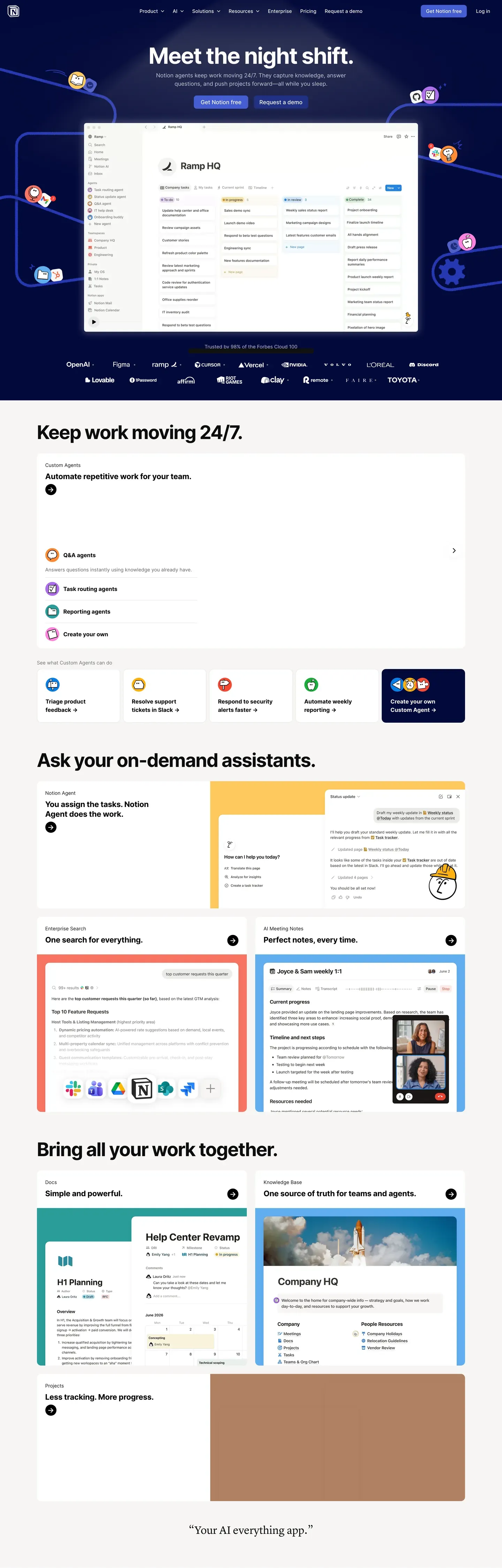
Notion's design system reads as a workspace, not a marketing site. The homepage opens with "Meet the night shift." centered over a deep navy band ("#0a1530") decorated with brand-colored sticky-note dots and mesh wire illustrations — atmosphere rather than chrome. The dominant action is a single purple pill button at "#5645d4", and a real "Ramp HQ" kanban mockup floats below the buttons with a 24px diffuse drop shadow. The voice is confident and illustration-rich without leaning maximalist.
This DESIGN.md packages the whole spec into one machine-readable file. Inside: 53 color tokens grouped into brand purples, a 10-color brand spectrum, 9 pastel card tints, surface, hairline, text, and semantic scales; 17 typography tokens running Notion Sans (Inter-based) from 80px hero-display down to 11px micro-uppercase; 8 corner radii from 4px chips to 24px feature cards; 12 spacing tokens up to 120px hero gutters; and 50+ components covering buttons, pastel feature cards (peach, rose, mint, lavender, sky, yellow, cream), inputs, pill and segmented tabs, badges, the 4-tier pricing comparison, the embedded workspace mockup, FAQ accordions, and the multi-column footer. Format follows the Google Labs DESIGN.md spec.
A working React developer feeds this file to Claude, Cursor, or Copilot and gets components that match Notion's discipline — rectangular 8px buttons, 12px-rounded cards, purple reserved for one CTA per page, navy bands paired with sticky-note decoration — instead of a generic shadcn theme. Reference the tokens directly inside Tailwind config, CSS variables, or your own component library. The system is worth studying for one reason: it proves that "all-in-one workspace" branding can be illustration-rich and colorful without resorting to gradient bling or pill-button-everywhere uniformity.
What makes it distinct
- Signature purple voltage#5645d4 reserved for the dominant 'Get Notion free' CTA, never decorative
- Deep navy #0a1530 hero band with scattered sticky-note dots and mesh wire illustrations
- Nine pastel card tintspeach, rose, mint, lavender, sky, yellow, cream, gray, plus bold yellow #f9e79f
- Rectangular 8px buttons, not pillssober-editorial geometry distinguishes it from Stripe and Linear
- Live workspace mockup card embedded in the hero with a 24px diffuse drop shadow
Live at notion.com
A snapshot of the brand in production. Hover the frame to scroll the page; click to visit.
 notion.com
Explore Notion
Pick what you want to see — mockups, colors, typography, layout, or the full component list.
Brand & Accent
Sparing, CTA-only voltage.
Surface
Page and card backgrounds.
Text
Headlines, body, captions, muted.
Borders & Hairlines
Dividers, outlines, structural rules.
Semantic
Status, errors, success, inline links.
Other
Specialty colors.
Notion design system FAQ
Common questions about Notion's tokens, components, and how to use this DESIGN.md in your project.
Related reading
Specs, directories, and component libraries that pair with this design system.
The DESIGN.md specification
Google Labs' open spec for machine-readable design system files — the format this page is built on.
Browse all design systems
The full directory of DESIGN.md files on shadcn.io, with live mockups for each.
React blocks for shadcn/ui
Production-ready hero, pricing, CTA, and dashboard sections built with the same Tailwind + shadcn primitives.